
Part two of a six-part series on the application of design thinking for data practitioners, business intelligence analysts, researchers, and anyone working with data.
Catch up on the conversation with part one. In the spirit of collaboration, we want to hear from you! We’d love to hear your thoughts via the three questions we’re added to the bottom of this article!
Despite the growing prominence of data visualization, our practice is surprisingly light on methodology. While there are many methodologies across sectors, disciplines, and teams for building alignment, many of them are also siloed by role and skill. Similarly, audience research (focused on users, consumers, patients, or communities) is a common practice, but is often “owned” by a single role or department.
Building a shared understanding is a process and a team sport. Taking a more holistic approach to organizing multi-disciplinary teams will help you to craft more focused, intuitive, and equitable data visualizations and to arrive at a shared understanding of how to communicate your data in a meaningful way.
High-quality dataviz and information design does not have to remain solely in the realm of media outlets and celebrity practitioners. Empowered information is the result of a team of people that take responsibility to commit to the nuanced meaning of the data.
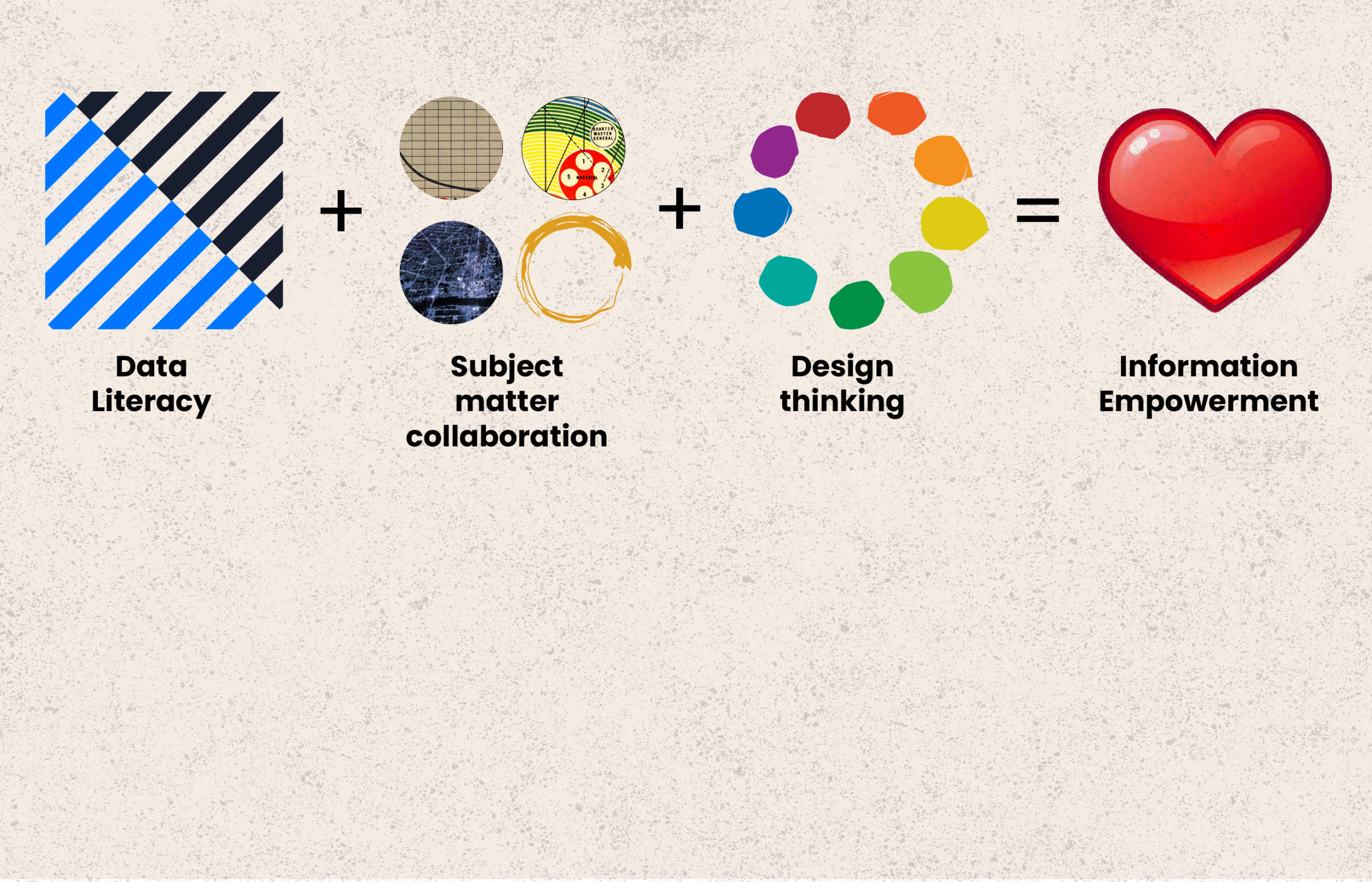
Information Empowerment is an attempt to join some high-level frameworks in order to improve impact. In doing so, you can begin to bridge the divides that exist between practices, roles, and the people that inhabit them. It is an end-to-end process that connects the dots from how your data is captured all the way to how it is communicated to your audience.
Okay, let’s take a look at what we mean:

Simple enough, right? By starting with a foundation of data literacy, your team expands its understanding of the data by collaborating with subject matter experts, then applies design thinking techniques to prototype their work and test its effectiveness. Through this collaboration, you leverage the strengths of your team to amplify the impact of your data and how well it communicates to your audience. Additionally, the whole team learns more about the data (and each other), which broadens their respective skillsets. This kind of reciprocal investment in the people and process inspires a sense of collective responsibility, not only for the quality of the work, but also for the outcomes.
We’re advocating for taking a more holistic approach when assembling the “team” and defining the project scope. In order to build an accurate understanding of the data, functional practitioners (e.g., designers, researchers, data practitioners) need to collaborate with subject matter experts (SMEs). The resulting collaborative environment creates a trust-based culture dedicated to a common goal and a guiding practice.
The above process is not necessarily linear, and the three core ingredients of Data Literacy, SME Collaboration, and Design Thinking can be applied in any order — and are often applied in parallel. This is not a bug — it’s a feature! The various steps may be shuffled or repeated in iterative cycles themselves; however it plays out, the goal is to dedicate your team to building a culture of understanding and a commitment to the ethical underpinnings of the data itself.
Leverage the strengths of the team to amplify your insights
To some practitioners, there’s nothing new here, but few teams leverage a defined process for empowering the influence of their work. Outlining a process for your team will help to keep the focus on your audience, their needs, and effective communication of the data. Information Empowerment can be applied to almost any kind of data use case (from business intelligence to research and development to data art and everything in between) and by teams of all sizes.
An early step in a data-driven initiative should include the identification of and outreach to subject matter experts who understand exactly what questions the data could answer, what the data means, how the data should or could be collected and socialized — and even how to refine project goals. Depending on the nature of the initiative, these resources could be internal (e.g., dashboard end users) or external (e.g., small businesses and community members).
Key to the concept is broadening our understanding of who constitutes a subject matter expert (a core tenet of Data Feminism). Data visualizations can be interfaces to expose injustice and inspire change. But, so can people. They bring context. They help prevent misinterpretation. For example, when data artist Jer Thorp was developing the Map Room Project, he reconsidered the potential for reinforcing damaging narratives related to neighborhood characteristics after consulting with Detroit artists, Complex Movements.
The project encouraged visitors to consider multiple realities of where they lived. “On the maps they can come up with other ways to portray their neighborhoods beyond low-income.” Jer said. “Every map based on census data shows the poor neighborhoods in bright red…One of the guiding considerations came out of a meeting with Detroit artists from Complex Movements. They challenged us to consider how our project was reinforcing the master narrative. These institutional maps remove community from the commentary of their own lives. What other stories do the data tell? What about mapping the churches to illustrate the strength of the community?”
A common objection to SME collaboration in general, and design thinking in particular, is that it is time-consuming. The worry is that workshops, sprints, or research can elongate timelines and impact budgets. That may not be so. Graham Kenny, in Harvard Business Review, makes the point, illustrated by the case study organization’s surprise, that saturation — the point at which you stop hearing new insights — occurred after only 18-20 stakeholder interviews (in this example, the stakeholders were the SMEs).
Collaboration is not something that can be “tacked” on to a project mid-stream. It must be planned from outset. Reciprocity and role equality are necessary when collaborating with subject matter experts. Some subject matter experts, such as patients, nonprofits, and the communities they represent, can feel undervalued due to their lack of technological or methodological expertise. Likewise, certain analysts or scientists may not grasp the significance of design or their own expertise as a barrier towards other people’s understanding. Care should be taken to prevent team members from feeling disenfranchised, patronized — or worse, exploited — which can stem from a lack of understanding about the outcomes that resulted from their participation. In this process, every person should feel valued for the expertise they bring to the collective intelligence of the team.
In summary, Information Empowerment is a process that promotes collaboration to amplify meaning. By examining the context around the data and the real-world expertise that may accompany it, your team will instinctively make a more focused and human appeal. Who knows, you might even have fun doing it.
In the next installment, we’ll take a deep dive into Data Literacy as part of the larger methodology.
What do you think?
- Where have you seen evidence of converging disciplines or practices within your work, if at all?
- Do you have an example of your project taking a different course as a result of the contribution of a subject matter expert?
- How would you interpret the diagram above related to your current process at your organization or work?
Share your thoughts with us at nightingale@datavisualizationsociety.org.

For 20 years, Mary Aviles has stewarded projects driving strategy and content, human experience, concept development, and systems change. A graduate of the University of Michigan, her work has spanned the business-to-business, health care, and nonprofit sectors. Mary is a mixed-method UX researcher at Detroit Labs and the managing editor of Nightingale. She writes about dataviz in real life (IRL) in an effort to help practitioners and "non-data" people enjoy better understanding and experiences in their shared ecosystems.

Jason Forrest is a data visualization designer and writer living in New York City. He is the director of the Data Visualization Lab for McKinsey and Company. In addition to being on the board of directors of the Data Visualization Society, he is also the editor-in-chief of Nightingale: The Journal of the Data Visualization Society. He writes about the intersection of culture and information design and is currently working on a book about pictorial statistics.
-
Jason Forrest

-
Jason Forrest

-
Jason Forrest

-
Jason Forrest


