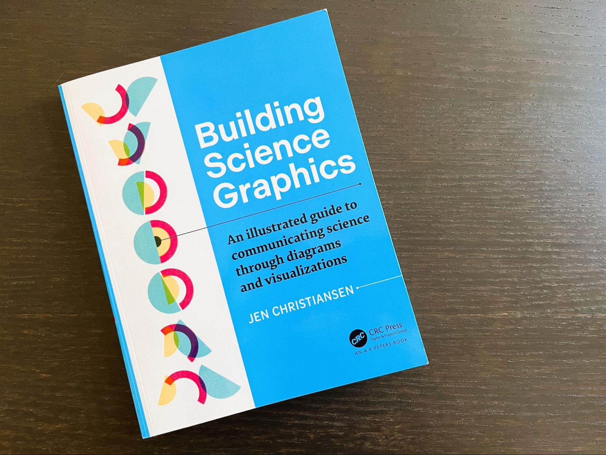
Building Science Graphics by Jen Christiansen provides a comprehensive framework for communicating scientific information using explanatory diagrams. While the book focuses specifically on science graphics, there are many relevant ideas for data visualization and communicating information as a whole.
I really enjoyed reading this book as a data visualizer because the guidance about color, typography, organizing information, considering audience, goal, context, and seeking user feedback all apply to data visualization, as well. Plus, it was fascinating to learn about science graphics, which, prior to reading this book, I’d only encountered as a reader of textbooks, magazines, and research papers.
Jen, a senior graphics editor at Scientific American, has filled the book with excellent examples and case studies that illustrate her points. For example, after introducing guidelines for making better graphics, she demonstrates how those guidelines work in practice, by walking the reader through a series of infographic “makeovers,” complete with “before” and “after” images that showcase her points.
Jen has included several Q&As with content experts in the book, including one interview with information designer Sheila Pontis, who specializes in researching how audiences engage with design. Sheila offers several examples of how to seek audience input beyond traditional interviews, such as workshops, or asking users to keep a diary or make a video of themselves as they try to understand what’s in front of them. This was a fascinating interview, and very applicable to the broader field of data visualization design as well as science graphic development.

Credit: Building Science Graphics
The book is organized into four parts. Part one, which encompasses the first half of the book, provides an introduction to science graphics and design fundamentals. Most of this section is applicable to data visualization, as well. I particularly liked Jen’s ideas for laying out information, details about color and typography, exploration of science communication, and thoughts on collaborating with communities to improve communication of scientific findings and concepts.
Jen emphasizes the importance of considering different visual styles based on both the audience and the goal of the science graphic—advice that translates to data visualization, too. For example, she recommends a more inviting style for a general audience and a more abstract and minimalist one for an expert audience. She also covers storytelling strategies and provides many methods that can be applied to data visualization, especially introducing characters (including a narrator), showing not telling, and adding context to present a more complete story.
The second half of the book is more specific to science graphics. Part two covers frameworks and structure for science graphics, including ways to add context and communicate uncertainty. Part three lays out a comprehensive and detailed process for creating science graphics along with illustrative case studies. Jen also includes a helpful step-by-step guide—drawn as a decision tree—to structure the processes behind making a graphic. Part four covers collaboration and includes advice for working together as scientists and designers.

Credit: Building Science Graphics
It’s clear throughout the book that Jen has a thoughtful and reflective approach to her work. This, in turn, prompts the reader to reflect and dive deeper into topics of their interest. I loved that each chapter ends with a “More to Explore” section with additional resources for further learning about the topic covered. The book also includes footnotes throughout, providing another source for more exploration and independent discovery.
While the focus of this book is on creating science graphics, I found many of the ideas and frameworks applicable to data visualization. If you’re a data visualizer looking for a slightly different take on data and science communication, I’d highly recommend this book. I have never made a science graphic, but I learned a lot from Building Science Graphics, and if I were tasked with making one in the future, this is the first book I would pick up.
I especially recommend this book as a resource to anyone in the field of science communication—it’s a very comprehensive guide with beautiful examples and clear guidance from an author whose expertise clearly comes through along with her deep reflections on design, process, and the field as a whole.
Disclaimer: Some of the links in this post are Amazon Affiliate links. This means that if you click on the link and make a purchase, we may receive a small commission at no extra cost to you. Thank you for your support!
Jenn Schilling is the founder of Schilling Data Studio, a data visualization training and consulting agency. She has a decade of experience applying data science and data visualization in a variety of industries, including supply chain, market research, and higher education. Jenn loves telling compelling stories with data and teaching others how to create impactful visualizations.


