
SNEAK PEEK: Nightingale Issue 2 is in design now! We’re so excited for you to see how your community has interpreted the theme of “Inspiration.” We’re shipping in late November 2022 so place your order now!
My copy of the fabulous Nightingale magazine took a little while to arrive, so when I first saw the Paper and NO Pencil Challenge, I didn’t think I had enough time to complete it. But then the deadline was extended, and since I spend most of my time creating graphs and charts on the computer (and I’ve loved the Dear Data project for quite some time), I thought it would be fun to try my hand at creating a physical dataviz.
Data collection
First, I had to figure out what to visualize. In the spirit of Dear Data, I decided to track something personal. I do a lot in the morning before I have breakfast, so my first idea was to write down everything I did from the first time my alarm went off to eating breakfast each day. I did keep track of this in a note on my phone for five days, but I wasn’t quite sure how I would visualize it – the first day alone had a list of 23 things! I also noted what I listened to as I completed certain tasks (like putting away dishes or walking the dog), and I thought I might do something with that information, but there wasn’t much consistency other than the binary of a podcast or audiobook.
On the first day, I noticed that I drank quite a few glasses of water during the morning, so I started a second note on my phone and began tracking the different beverages I consumed during the day. It was easier to see how I could create a visual representation of this data because it was more consistent, not as complex, and lower volume than all the different things I do before I eat in the morning.
I tracked my data by type of drink: water and tea mostly, with one pumpkin spice latte and one smoothie and time of day: morning and afternoon/evening. On Wednesday (the third day of my tracking), I started documenting the sequence in which I consumed beverages. For example, five glasses of water before the pumpkin spice latte in the morning and six glasses of water before a cup of tea in the afternoon. For Monday and Tuesday, I estimated the sequence based on my patterns from the other days and what I remembered. I tracked my data from Monday, August 29 through Friday, September 2.
Sketching
On Thursday, the fourth day of data collection, I started sketching out ideas for my viz. My first idea was a kind of stacked bar graph for each day where the total length of the day would correspond to the number of beverages I consumed. I also sketched out different shapes and colors for the different types of drinks. My second idea was to divide the page in half lengthwise with the left side representing the morning and the right side representing the afternoon and evening. I kept the same shapes and colors I’d created in my first idea, but this time the shapes would be smaller where I consumed more in a day or part of a day. In both the first and second idea, I sketched out one row per day going down the page. My third idea was to create some sort of cluster of shapes for each part of each day – I thought about creating some sort of spoked visual or just a grouping of shapes.

Materials
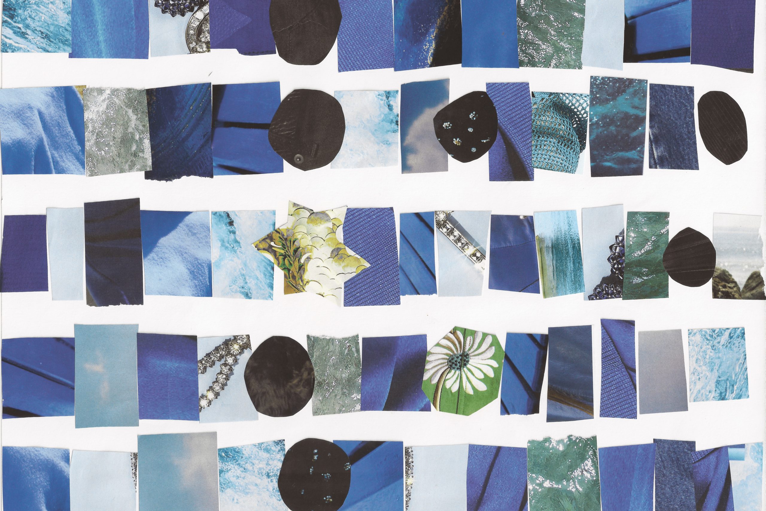
My next step was to figure out what type of material to use for my dataviz. For a while, I regularly received Vogue magazines, and I kept old ones hoping I would find a use for them more than putting them in the recycling. They turned out to be a perfect source for materials for this project. I wanted to use one color and shape for each type of beverage. I decided on blue for water, black for tea, gold for pumpkin spice latte, and green for smoothie. Then I flipped through two magazines and ripped out pages of the right color. I focused on collecting a lot of blue pages because I drink a lot of water!
After I ripped out the pages, I cut them into strips of the right colors. I also ripped out some text pages because I thought about making the key in letters cut out from the magazines too, but in the end, I just wrote the key by hand. I saved my leftover pages for another project.

The final preparation step was to cut out the shapes. I decided to use rectangles for water, circles for tea, a star for pumpkin spice latte, and an octagon for smoothie. Blue rectangles for water felt right since blue is a color I strongly associate with water, and rectangles felt like a solid, consistent shape, which seemed fitting since I mostly drink water. I used black circles for tea because I usually drink black tea and the circular shape reminded me of the mugs and tea ball I use. I very rarely drink coffee, and I love pumpkins and fall, so I wanted to make the pumpkin spice latte very special, which is how it ended up as a star cut out from a sequined gold dress. On Thursday afternoon I made a smoothie from spinach and other greens with a banana and frozen fruit, so an octagon cut from a green jacket with daisies seemed appropriate.
Construction
Once I knew I was going to use pieces cut from magazines, I did a small internet search on magazine collages for inspiration. I found inspiration in the following pages: one, two, three. I decided on the layout from my second sketch because I liked the idea of filling up the page like the collages I saw online. I ended up leaving a little space between each row in my collage to separate out each of the five days, but each row extends across the whole page. I varied the size of the shapes slightly depending on the number of beverages I drank throughout the day.
To construct my dataviz, I first finished sketching out the final layout. This helped me keep track of which shape I was on as I put the collage together. It was also a good way to double check my data – I realized that my sketch left out a glass of water on Tuesday, and I added it back in on the drawing so I wouldn’t miss it in the collage.

Then I started laying out pieces for each day. I found that I’d cut the first set of pieces a little too large, so I had to cut everything down slightly as I placed it on the page. I selected magazine pages of different shades and textures, especially for the blue rectangles, so as I planned out the collage, I altered the colors and patterns to add variation. Once I was happy with the layout, I began gluing pieces in place. The repetitive process of picking up a piece and gluing it into place was an enjoyable rhythmic pattern, and it was exciting to see my collage come together. I’m really pleased with how it came out. This is certainly different from anything else I’ve made, and creating it made me want to explore both collage in general and more physical forms of sharing and representing data.

Reflection
Making something physical was delightful. It made me think in a different way, and it felt more creative than writing code to generate a visual on my computer, which is what I do most of the time. I generally think of my computer-based dataviz process as creative, but cutting things out and gluing them down had a physicality to it that was distinct. It was a different kind of challenge to get the pieces all the right sizes to go across the page. It was fun to vary the shades and textures of the pieces. In each row, I included two blue rectangles that were cut from pictures of water, and I enjoyed figuring out how to place those pieces so they didn’t overlap with any water pieces from the row above.
I am remarkably (or maybe unremarkably) consistent in my daily beverage consumption. I was particularly surprised to see how consistent I am with the amount of water I drink each morning. On four out of five days, I drank four glasses of water, then one mug of tea and then one more glass of water before noon. I know I’m a person of habit and routine, but I hadn’t realized it extended to my daily beverage consumption as well. This project reminded me once again of the benefit of visualizing data to see and understand patterns and trends.
This challenge helped me think differently about how to represent data. The limitation of creating something physical without drawing stimulated my creativity to make something completely novel. Thank you so much to Giorgia Lupi, Stefanie Posavec, and Nightingale for such a fun and engaging dataviz challenge!

Jenn Schilling is the founder of Schilling Data Studio, a data visualization training and consulting agency. She has a decade of experience applying data science and data visualization in a variety of industries, including supply chain, market research, and higher education. Jenn loves telling compelling stories with data and teaching others how to create impactful visualizations.
- Jenn Schilling

- Jenn Schilling

- Jenn Schilling

- Jenn Schilling


