
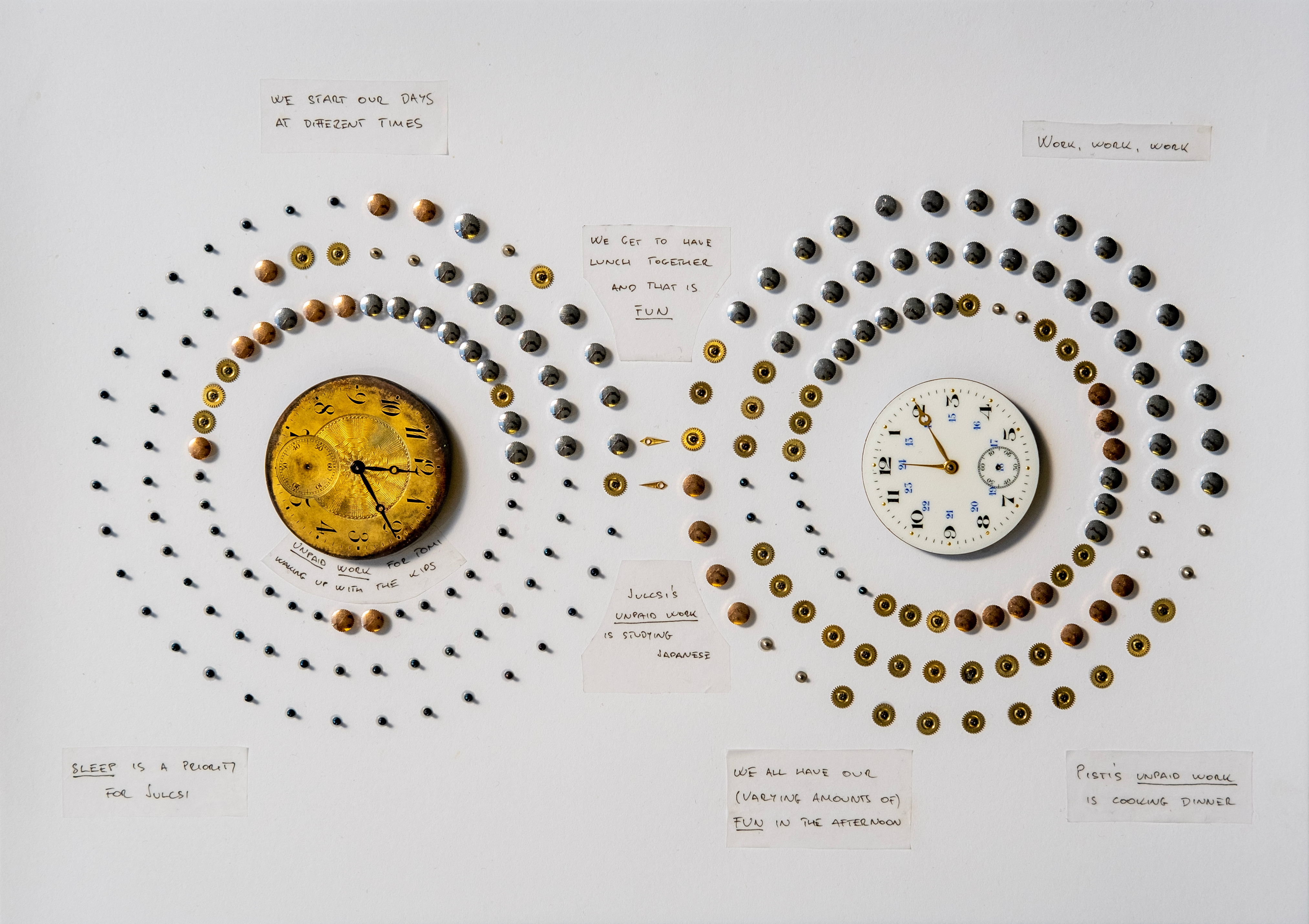
This is an unusual viz — for a variety of reasons — so here’s a quick guide to reading it: the two dials represent twelve hours of the day (a.m. and p.m.) with each circle around the dials showing the daily routine of one of the authors in twenty-minute intervals.
SNEAK PEEK: Nightingale Magazine, Issue 2, is in design now! We’re so excited for you to see how your community has interpreted the theme of “Inspiration.” We’re shipping in late November 2022 so place your order now!
At the Starschema data visualization team, we pride ourselves on keeping up and engaging with the global dataviz community, including industry trends and publications. Sometimes, that inspires us to throw our tried-and-true, state-of-the-art tools out the window and try our hand at unconventional approaches to our craft. This post tells the story of our most recent collaborative experimentation with what we’ve seen referred to as “analog data art” or “handmade data objects” — read on to find out how we ended up hunched over old watch parts to create this physical data visualization:

The challenge
The first edition of the Data Visualization Society’s Nightingale magazine arrived at our mini-library on a rainy day and one of the things that left us fascinated immediately upon our very first flip through of the magazine was the Dear Nightingale challenge.

Born out of Giorgia Lupi and Stefanie Posavec’s delightful Dear Data project, the challenge calls for vizzes focused on personal details, created in physical form — and no drawing allowed. Our team knew that this could inspire us to approach a viz idea from a wildly different perspective than usual. We knew we wanted to take part in the challenge — but we didn’t have The Idea yet.
Luckily, this was right before the team participated in a workshop designed to help us engage with our creativity in new ways. One of the core ideas discussed at the workshop was that creativity really is about constraints — and once we connected that idea to the fact that we had access to an almost unlimited amount of watch parts, we realized we had a visual hook for a project. After some consideration, the team settled on visualizing daily routines.

Getting down to design
We divided our weekdays into five categories: sleep, commute, paid work, unpaid work (anything from household chores to learning), and fun. It was fascinating to see in a visual format how our days differ from each other’s and how they’re similar. For example, we arrive at and leave the office at very different hours, but we always make sure to get lunch and coffee together — which is categorized as fun, obviously.
We wanted to make sure the design we had in mind was bulletproof before moving on to the physical implementation. We measured all the parts we wanted to use and created an interactive digital prototype that proved super useful. The prototype allowed us to experiment with visual elements, spacing, banding, how many parts can we reasonably fit on a sheet of A4 paper, etc. Now, we just had to put watch parts to paper.

Our lives in viz
Here is another closeup of the afternoon section of our workdays, with the “fun lunches” visible on the left side of the circles. It also shows that unpaid work means very different things for the three of us, with our evenings spent on different chores — tending the kids for Tamás, learning Japanese for Júlia and cooking for István.

The experience
Working on this project gave us a renewed appreciation for physical media. We thoroughly enjoyed the tangible collaboration of gluing the watch parts onto the paper, one-by-one, together, our monotone efforts contributing to a single, shared product. This experience is not something one can easily get from working on a computer, behind a screen — but we definitely expect its benefits to translate to projects carried out under our traditional work circumstances as well.

Júlia Borsi is a data visualization expert at Starschema. She is passionate about building effective and visually pleasing dashboards for her clients, staying up-to-date with anything dataviz-related, and snowboarding. Follow Júlia on Twitter: @juliaborsi.

Tamás Varga is a data visualization expert and data storyteller at Starschema, with years of experience building practical dashboards with sharp designs for global enterprises and major nonprofit organizations. In addition to his professional interest in data visualization, he’s also an active member of Tableau’s international dataviz community as a Tableau Public Ambassador. Follow Tamás on Twitter: @Imperativusz.

István Korompai is a data visualization expert at Starschema. He builds dashboards for Fortune 500 clients and trains their employees to do the same. Connect with István on Twitter: @_kpisti.
-
István Korompai


