
The inaugural Dear Nightingale analogue data visualization challenge prompted readers to create a handmade data object to visualise a personal dataset, using a piece of blank paper but without drawing. Check out the submissions:
Alejandra Gómez Ortega: This is part of a series of embroidery data visualizations that I did, inspired by the Dear Data project in 2020, at the beginning of the pandemic. I was alone, in a new city, starting a very challenging job as a PhD researcher and this project helped me put things into perspective and overcome the hardship of it all. I put together all the embroidery data visualizations I did here. But I’m attaching the most meaningful as it made me realize that I was alone and isolated and it was OK to feel that things were not OK. I also learned a new stitch just for this one 🙂

Alexandra Pintilie: I started an arts and crafts project and documented the process by:
- keeping track of home many hours I invested on each of the days I worked on it;
- taking pictures doing various activities, and keeping track of how much time I was engaged in those activities;
- self-evaluating my satisfaction with the work, on a 1 to 10 point scale, before and after the active period of work.
By combing all these aspects, resulted this 3-dimensional visualizer.
Being satisfied with the things that I do on a daily basis is something I struggle with, so I wanted to document “the variation of satisfaction in everyday life” really – in the small things, so that I might get some understanding of the overall influence of the concept.
You can look at the model from different angles and get different data:
- from above, the distribution of time of work by day of work;
- from the side, the maximum value of self-reported satisfaction with the project by day of work;
- from the front, fluctuation levels self-reported satisfaction with the project during each day of work and the overall distribution of arts and crafts activities during each day of work by time of work.

Ana Slavec: The visualisation is based on the data of the Slovenian real estate register and represents the % of buildings in Slovenia based on the material of their supporting structure: brick (40%), wood (16%), stone (10%), concrete (10%) or other (25%). I accessed the data through the online portal of the Geodetic Administration and it was used within a project at the InnoRenew CoE institute in Slovenia where I am employed as a researcher.

Angelica Hom: Anti-AAPI Incidents

Anneke ter Schure: Sorrow is the deepest honour that can be paid to joy.

Anton Mizinov, Sabina Vakhitova, and Andrey Strizhkov: Burning Wishes. Check out the interactive feature here.

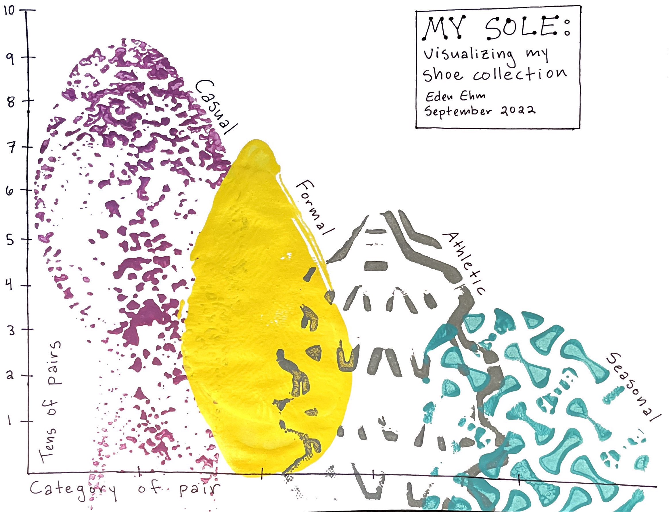
Eden Ehm: Shoes are my favorite accessory, even though I work from home wearing slippers every day! I sorted my massive shoe collection into just four categories. In a new take on a bar chart, I visualized the volume of pairs in each category using footprints.

Ekaterina Kustova

Emilia Ruzicka: I recently moved and chose to visualize my bookshelf now that I’ve been forced to reorganize it due to relocating. The physicalization is a painted cardboard box backing (courtesy of moving) with miniature books sewn onto it using dental floss.

Emily Murphy: For this challenge, I imagined my travel pin collection in a way I had never thought of it before: as a data set! I started collecting pins at each city I traveled to in 2018 while studying abroad. (Pins from years before that were acquired later from friends or by re-visiting the city 🙂 I loved getting to visually see my collection of memories grow with each year.

Galina Chikunova: My emails during the day/week as if they would be written on a piece of paper.

Jenna Morabito

Jenn Schilling: I tracked the drinks I consumed for five days (Monday, August 29 through Friday, September 2) and created a collage using pages from Vogue magazines. Read more about the process here.

Jerusha Govender:
Size: A4
Medium: paper and red wine
Data source: Best friend Whatsapp group chat Mar 2021 to Jul 2022
Description: The visualisation presents the frequency of the mention of wine and other alcohol on a whatsapp group from the start of planning a friend’s holiday (which we decided would be a wine holiday in Franshoek, South Africa) to over 1 year later. Chats about needing a glass of wine or shot of tequila brings humor to our friendship and symbolizes both really fun and stressful moments in our lives. The viz is finger painted using wine and creating blots for every alcohol mention. These are clustered by month in three rows.

Jon Heggestad

Kate Miller

Kateryna Bilobrova: The idea to analyse the plants I have at home came to me when I was doing exercises from Observe, Collect, Draw. I sketched a few ideas and realised one of them in Illustrator. This was a couple of weeks before I saw the article about the Paper and NO Pencil project. I decided this could be a fun experience with a fresh dataset, and after listing some ideas I chose embroidery, even though I didn’t have any experience with it. It took some time to test different types of paper, then to plan and draw the grid on the back side and meticulously embroider every single item.

Laura Ellis: Read the story behind the viz here.

Lucía Stefanuto

Majda Johaardien: I decided I would take a personal approach and submit a data visual measuring my anxiety levels over three working days. My working day starts at 7am and ends (not always the case) at 5pm. I decided I would track how I feel every 30 mins, and set a timer for myself. Distinguishing between a feeling of being overwhelmed, nervous or just full blown anxiety was not easy but I tried to record it as best as I could. That feeling of “all eyes on me”, needing to reach for my anxiety meds was strong but this exercise helped me reduce my need to take medication. I hope this data visual helps anyone who suffers from anxiety and makes them realise “you are not alone in this”.

María Braeuner: My Summer Harvest hanging-chili’s-bar-plot

Nina Koch

Shriya Patel

Starschema/István Korompai & Tamás Varga & Júlia Borsi: Creativity really is about constraints, and once our team at Starschema realized that we had stacks of watch parts, the idea for our visualization of daily routines was born. We divided our weekdays into five categories: sleep, commute, paid work, unpaid work (anything from household chores to learning), and fun. We measured the watch parts and created a digital prototype to experiment with visual elements, spacing, banding, how many parts we could reasonably fit on an A4 paper, etc. Working on this project gave us a renewed appreciation for physical media.
How to read: the two dials represent twelve hours of the day (a.m. and p.m.) with each circle around the dials showing the daily routine of one of the authors in twenty-minute intervals.
Read more about the process here.

Vivian Yun Huang

You can still order your own copies of Nightingale Magazine, Issues 1 and 2 here, while supplies last!
Nightingale Editors
Our Nightingale editorial team currently consists of Alejandra Arevalo, Brian Cort, and Teo Popescu. Reach us at Nightingale(at)Datavisualizationsociety.org
- Nightingale Editors

- Nightingale Editors

- Nightingale Editors

- Nightingale Editors


