
Charles Apple, the “Further Review” page editor of The Spokesman-Review of Spokane, Washington, talks about bar charts and other data visualizations in an exclusive chat with tksajeev.
What are the benefits of using bar charts in data visualization?
I consider bar charts one of the most useful tools in creating rapid-read data visualizations or “alternative story forms ”(ASF).
That’s my job these days. I build ASF that we’ve branded “Further Review” pages. My paper runs four times a week, plus we distributed the pages to other papers around the U.S.
Most of my pages try to explain a lot of material. Bar charts are extremely helpful in my work — they’re fairly quick to build but they’re very VERY quick to read. Anything that speeds the reader’s comprehensive of the data or of my topic is welcome.
When should bar charts be used?
Different types of data require different types of charts.
If you’re trying to show parts or percentage of a whole, then you may want a pie chart. If you’re showing one number fluctuating over time — think fuel or food prices or temperature throughout a hot day — then you probably want a fever graph.
But if you’re showing and comparing quantities, then bar charts are the way to go.
In this example, we wanted to compare fuel prices heading into the American Memorial Day holiday weekend, over the past 10 years and then the year we were in: 2017.

A bar chart did the job nicely. Note how we highlighted the current year by using a slightly darker color.
This also had the advantage of being a small graphic. Which meant it was easy for our page designer to work it into their page.
Now, here’s a sample from sports, showing wins and losses for each month over six months of a baseball season.

Notice that there are actually TWO bar charts here: One for wins and one for losses. I’ve tucked them tail-to-tail, making it clear with color and labelling which is which. I’ve found this to be an effective technique, even when I include a LOT more data — in this case, going back 130 seasons for the football team at the University of Georgia.

Wins are up top. Ties (silver) and losses (black) are below. And I noted significant events in the history of Georgia’s football program across the top, with tiny little arrows pointing to the appropriate years.
Across the bottom — carefully lined up with the year-by-year bars, is data showing how Georgia did each year against it’s three primary opponents: Auburn, Florida and Georgia Tech.
Much more information made for a much more complicated presentation. But if you’re a Georgia football fan, this might be worth keeping to enjoy time and time again.
What are some common mistakes to avoid when creating bar charts?
I like to tell people that bar charts are difficult to screw up. Unless you do something obviously wrong, of course, like mislabel them. Or use them for a type of data that would be better served by another type of chart.
One common mistake is when chart designers don’t use “zero” as the baseline of their chart. This can make the data seem different from what it really is — or different from what’s being described in the text.
This one from Fox News is fairly typical of deceptive charts. It shows how many people had enrolled in health insurance under “Obamacare,” compared to the goal for just four days later.

Looks like they have a long way to go, right? The Obamacare officials are unlikely, perhaps, to make their goal?
But take a moment and look closer. Where is “zero” on that chart? The designer didn’t show you. And Fox News was famous for slanting their news reports to make certain politicians — including Barack Obama — look bad.
What happens if we rechart that same data and use a “zero” baseline?

Well! Now, the data looks entirely different, doesn’t it?
But that’s not the story Fox News wanted you to believe. So they didn’t chart it accurately for you.
Here’s an example from a large American sports magazine, showing the number of baseball players who hit a certain number of home runs per year.

It’s a very nice little chart… until you begin looking at it closely. See the “2” bars, just left of centre? They’re nearly the same height as the “4” bar. But isn’t “2” half of “4”? Those bars should be half the size as the “4” bar, right? What are we missing here?
What we’re “missing” is that the designer drew a chart but then decided to add photos of baseball players. In order to make it clear which player goes with which bar, the designer simply lengthened the bottoms of the bars to include photos.
Cute. But this changed the content of the chart. It no longer accurately shows us data. The designer here might have been better off simply building a list or something, with photos tossed in.

Another problem with bar charts, however, is when designers get bored with “old-fashioned” bars and try to show that same data with circles or “bubbles.” Here’s an example from a large newspaper, several years ago, showing who were, at the time, the 10 highest-paid players in Major League Baseball. Notice that the sizes of those circles are very difficult to compare to one another.

This data would have been instantly read and understood if the designer had used simple bars. I blogged about stuff like this extensively at the time.
In this next one — from that same newspaper — it’s easier to see the difference in sizes of some of the “bubbles.” But not all of them. Again, if this data is worth charting, it’s worth charting in a form that readers can see and understand quickly. And this isn’t it.

Now THIS next one has a slightly different problem. This also ran in a large newspaper, about a decade or so ago. You can instantly see how much, much larger that one big blue bubble is compared to the others. It makes a big point about the enormous cost of putting on the 2008 Summer Olympics.

But here’s the BIG mistake the designer made: He didn’t calculate his “bubbles” correctly. I went back and recharted that same data, building the “bubbles” properly.

You can still see that the Beijing number is larger than the others. But the difference in size isn’t nearly so impressive.
The REALLY funny thing here is that if the designer had opted for a good, old-fashioned bar chart, that Beijing number would have popped out at the reader in a much more impressive way.

See? Much better!
But there were a lot of designers out there who complained that bar charts were old-fashioned and boring. I would argue they’re easier to read, easier to understand and harder to mess up.
What are some tips for creating effective bar charts?
Sometimes, it’s not the chart itself that can make or break a presentation of data. It’s the labels on that chart.
By now, your readers may be wondering why I build so many of my bar charts sideways. It’s because I like to include the value on each bar when I can. And those numerals typically fit better when the bars are sideways.
Take this page, for example. It’s about the 1948 Presidential election.

That election was especially known because the Chicago Tribune printed a front page prematurely declaring the Republican challenger had defeated Democratic incumbent President Harry Truman. In fact, Truman won the election.
See the little charts along the left side of the page? Those are showing electoral vote totals of the previous four elections. Those three-digit numbers wouldn’t fit comfortably atop those narrow little bars had the bars been turned vertically.

The same applies to the second chart, further down that page.

But look at the third chart, which shows three poll results — suggesting Dewey might defeat Truman — and then the actual results of the election.

Each bar consists of three pieces — a blue segment showing the percentage of votes for Harry Truman, a red segment showing the percentage of votes for Thomas Dewey and then an “others” category in the center that I colored a neutral brown/grey.
Each adds up to 100%, so all four bars are the same total length. They’re just split up differently. We call this a “stacked bar chart.” This can be a very helpful tool… when used properly.
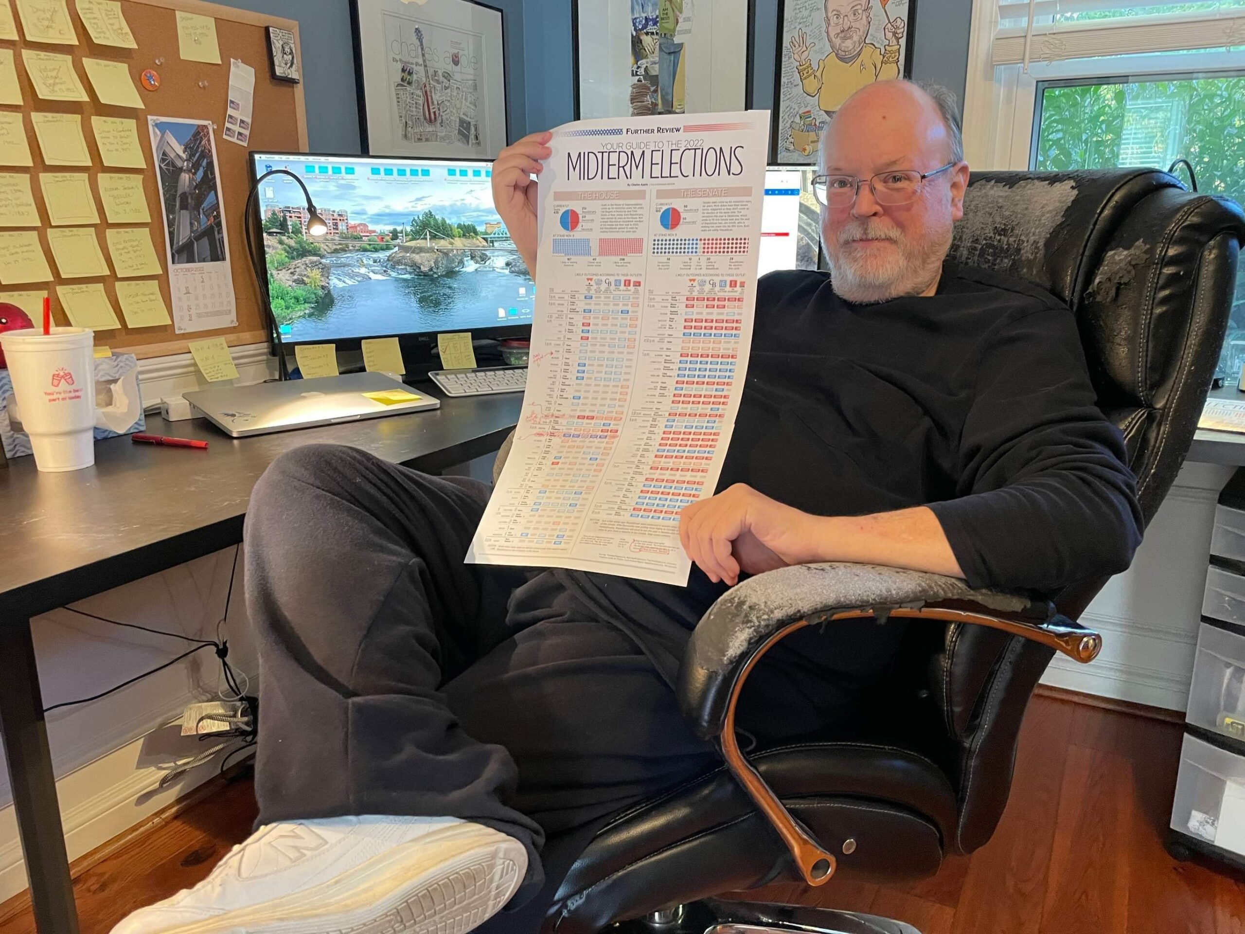
Now, here’s one where each midterm U.S. election is represented by two sets of data: One for our House of Representatives and one for the U.S. Senate. And then each of THOSE is represented by two bars — one for each of our major political parties. The red bars show Republicans and the blue bars show Democrats.

The point is to show how control of each of our two legislative bodies has swung back-and-forth over the years. The bars show how many members of each party were in each house during the session shown. And to make sure it’s clear which party was in control, I made the bar for the party with greater numbers brighter and dimmed the other party.
You can see right away that Democrats controlled the house for many, many years in the 1950s, 1960s and 1970s. But Republicans have been the dominant party since 1995 or so.
Now, there is actually a THIRD value shown in this giant chart: That of “other” or “vacant.” Typically, though, those numbers are so tiny that they hardly show up at all. One exception: The set of bars at the extreme upper right.
Also, note this chart shows every Congress going back to 1899. That’s a lot of data! When you pack this much material into a page, it’s important to use plenty of space around your elements to keep things from becoming too cluttered. A cluttered page will frighten off your readers.
What are some examples of well-designed bar charts?
This was one I was particularly proud of: Last year, I built a page on the 110th anniversary of the sinking of the Titanic.

I had always heard that as the ship was sinking that night, many of its lifeboats were sent out not completely filled. This, of course, contributed to the large number of people who were killed when it sank.
What I didn’t know, however — until I came across it as I was doing my research — was that there was actual data out there on exactly how many lifeboats had been aboard the Titanic and exactly how many people were loaded onto each one!
This meant that I could chart this data — data I had never seen before. Nothing makes me more excited than creating a chart for data I had never seen before. Here’s a closer look at that part:

The blue bars show how many people were aboard each lifeboat. The grey part of the bar shows how many people CAN fit aboard each lifeboat. So this is actually another “stacked bar chart,” right?
You can see that two lifeboats were sent away with 70 people aboard — when they were supposed to hold only 65. But some of the others were put into the water with a great number of empty seats. Lifeboat No. 7 could have held another 46 people! Lifeboat A could have have held another 34!
While we’re at it, let’s look at the smaller sets of bars at the bottom right of that page…

This one simply shows how many people were saved via those lifeboats vs. how many died that night. Notice that of the people who were saved, a lot of them had traveled first or second class. Third-class passengers were not taken care of very well that night.
Now, here’s one that’s fairly simple, I think. But, at first glance, APPEARS to be complicated. This page shows sales figures in the United States of various formats of recorded music.

There are six bar charts here. But a) each is drawn to the same exact scale, and b) each is carefully positioned so the years all line up, from chart to chart, through the length of the page. This means readers can compare numbers for each year.
The first batch of grey/black bars show the decline of vinyl record sales in the 1980s to very little by the 1990s. But the blue bars show cassette tape sales increasing throughout the 1980s, peaking in 1990 and then tapering off by the 2000s.
But it’s the red bars that I really wanted to jump out at readers: That was the topic of my story: sales of compact discs. Not only can you see them increasing from 1983 and peaking in 2000, but you can tell from the height of those bars how much greater CD sales were than either tapes or vinyl!
The purple charts at the bottom right show digital downloads and streaming. The numbers are nowhere near what CD numbers had been 20 years ago. Which tells us that record companies are not making anywhere close to the revenues they had been making.
And now for another one that’s rather complex, but I feel like our presentation made the story fairly easy to understand…
Every once in a while, the U.S. Post Office increases the cost of mailing a letter. They raised it again just a few weeks ago, in fact.
I built this page when they raised the price last year. The actual cost of a stamp is shown by a fever chart: The blue line you see running down the left side of the page. For many, many years, the price of a stamp was under 10 cents.

What I wanted to do here, however, was to show both the actual price of postage — going back to 1863, which was nearly 160 years ago — and the price of that postage when adjusted for inflation. Only then would readers truly understand how much they’re paying.
So while the blue line shows actual prices, the grey/blue bars behind them show the price adjusted for each year. Yes, this meant I had to go to the web site I use to calculate inflation and come up with a number for each of the 159 years I showed here.
The result shows that the price of postage, when adjusted for inflation, really hasn’t gone up much in 136 years! Which is not something the average reader is aware of.
Note the five little sets of bars over on the bottom right. Those were meant to show this particular increase — the one that fell into place in July 2022.

What is the main message that you want to communicate with your bar chart?
Bar charts allow for easy comparison of quantity. So if you want to show the amount of something for this month compared to each of the past few months: That’s a bar chart. If you want to show the amount of something for your nation or your area compared to other nations or areas: That’s a bar chart.
I especially like them because they’re so easy to understand and don’t require a reader to spend an awful lot of time with them. So they’re great to support a main point I might be making in the text. Or the chart itself can be a nice sidebar to the main part of a story.
What are some design and text strategies that you use to highlight key data points?
Earlier, I showed you a bar chart that used a darker color on the current year’s data. That works well sometimes.

This one does the same thing, except it also adds a black box to show how many U.S. states had the same level of minimum wage as our state — which was Texas.
This one is actually a table — rows of numbers — in which we’ve taken the most important set of numbers and charted just those.

But again, note that I highlighted five of the 18 bars. Those were schools in our metro area. The point we were trying to make: Participation in playing American football at our area schools was lower than that of other large schools around the state.
A tip: Use your introductory copy at the top of the chart to make it clear what you are hoping the reader will learn from your chart. And then make sure the chart shows them the data to bake up that statement.
And in this example from 2016, we were trying to show how candidates from the two major U.S. political parties were progressing in winning the nomination for president.

I color-coded the charts with the colors the two parties use. And I made the leading candidates a darker color than their opponents of the same party.
But in each case, I wanted to make it clear how many delegates each candidate had earned and how much further to go they had to be nominated. So the little dotted line on the end of the chart was just as important at the bars themselves.
What is the target audience for your infographics?
I work in print, so it’s newspaper readers I’m trying to reach with my work.
For several years, my organization gave up trying to post digital versions of my pages. Which makes sense, I suppose: Especially when I use VERY large charts, building a version that can be easily read on a laptop computer as well as a smart phone can be extremely difficult.
Over the past few weeks, however, we’ve started up again. My newspaper is the home of the only paid high school internship program in the United States. They assigned one of those interns to build digital versions of my full page presentations.
We’re still relearning everything. But this digital version of one of my pages contains two bar charts. See what you think.
And this one has a collection of VERY simple bar charts, down near the end.
What is the overall tone and style of your infographics?
With my full-page presentations, I’m generally trying to explain a complex topic but in a way that makes it easy for the reader to understand. I often work with historical anniversaries or science topics. Not just what happened, but also why it’s important to remember or to know about.
Some of these pages contain bar charts. Some contain other types of visualizations. And some are just text and pictures.
Here’s one from three years ago, about the settlers who sailed to what is now the U.S. back in 1620. We call them “the Pilgrims.” But what I didn’t really know — until I built this page — is that there is data on everyone aboard the Mayflower ship: Men, women, and children; ages and who lived and who died.

It’s stunning to see the huge percentage of them who didn’t make it through their first winter in North America. I had never seen this charted out before. I take particular joy in creating a visual out of data I’ve never seen before.
Here’s another one — also from several years ago — that shows the D-Day invasion of June 6, 1944 and includes a visualization of how many men came ashore in Normandy and how many were killed.

Some days, I use no data visualization at all. Some days, it’s just diagrams and text…

… or just photos and text. This one ran after the horrific riot and attack on the U.S. Capitol on Jan. 6, 2021, listing eight previous times the Capitol had come under attack — or where various people had come under attack.

And on occasion, I don’t mind having a little fun with a page. This bar chart shows the run times of all the Marvel super hero movies, compared to the one that was opening in theaters that day: “Avengers Endgame.”

I also compared the run time to that of four other famously lengthy movies.
Why did we chart that? Because people were already complaining that the movie was so long, it was difficult to find time to sneak out of the theater to find a restroom!

That was one of the first pages I ever did for the Spokesman-Review.
Like I said: Sometimes, my chart is a bar chart and sometimes it’s another type of chart. Sometimes, instead of a chart, I’ll build a timeline. Or tell the story with small chunks of text — think of them as mini-stories, or story chunks.
I’m honored when someone refers to me as a data journalist. I see and admire the cutting-edge work that data journalists are doing these days.
But I’d argue I’m just an old graphics guy trying to stretch his career just a few more years by telling different stories in different ways. And I’m lucky enough to find a newspaper that will give me a home where I can do that.

TK Sajeev Kumar
- TK Sajeev Kumar

- TK Sajeev Kumar

- TK Sajeev Kumar

- TK Sajeev Kumar


