
Today, I describe my previous 2008 efforts to colorize a Perfect Storm data simulation while I was at the Renaissance Computing Institute at North Carolina State University. This project, defined as a scientific visualization effort, focused on illustrating data from the scientific processes of weather research forecasting. The work was done as part of research with the United States Department of Energy (US DOE). The animation won an award from the US DOE and is in the public domain. A Youtube video of the visualization can be found at the bottom of this piece.

The Hurricane Visualization Effort
In climatology research, meteorologists use computational models to study the dynamics of weather. This includes exploring the formation of hurricanes. Using a computational data set based on the Hurricane Katrina storm of 2005, a perfect storm was simulated on a supercomputer using the Weather Research Forecasting model. The resulting data was then visualized with the VisIt tool, an open source and freely available tool for Unix, Windows and Macintosh workstations. VisIt was originally developed by the United States Department of Energy’s (U.S. DOE) Advanced Simulation and Computing Initiative (ASCI) to visualize and analyze results from extremely large computer simulations. My task, as a member of the visualization team, was to colorize the time series animation that depicted the evolution of the hurricane over time.
Building the Time Series Animation
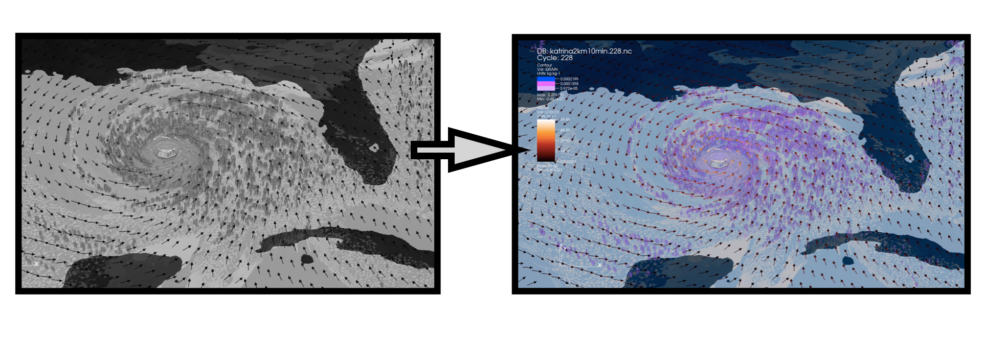
To build the Perfect Storm animation, several data sets were combined together in VisIt to produce the visual effect of a hurricane. Each data set produced its own three dimensional (3D) isosurface with its own unique colormap. To produce the time series effect, each individual time step of the visualization was rendered and assembled together to produce the final animated sequence. Playing back the complete time series in VisIt resulted in a “movie” or timelapse of the isosurfaces as the modeled hurricane progressed. Our meteorologists requested that the variance in the wind direction of the hurricane be depicted with wind vectors. The wind vectors are shown in conjunction with the evolution of the 3D isosurfaces. To examine how the various data elements came together to create the hurricane visual effect, our initial visualization efforts were in black and white. An example of these efforts is shown below.

Designing the Color Scheme for the Visualization
My initial step in coloring the Perfect Storm visualization was to establish the basic color context for the build-up of the animation. Since the hurricane forms in the ocean, starting with a Blue background and allowing the 3D isosurfaces to develop seemed optimal. As the Black and White image above indicates, a dark color for the reference map is effective for indicating the geographic region while keeping the emphasis on the Gulf of Mexico region as the storm develops. I chose a deep shade of Blue as the background color for this reference map. As noted in my prior “The Blues of Color Harmony” article, a shade of Blue is created by adding Black to an original Blue hue.
The next step was to establish the color scheme to depict the 3D isosurfaces and the wind vectors. In the formation of the eye of the hurricane, two separate data sets merge together to form the eye while the wind vectors remain distinct. This is shown in the Black and White image above. The visualization will require two colors for the isosurfaces that blend together during the time series animation to form the eye of the hurricane and a high contrast color that continues to stand out for the wind vectors.
Turning to the ColorBrewer tool for color suggestions, I selected the 4 data class Purple and Orange diverging color scheme with the Purple color representing the 3D isosurfaces and the Orange color representing the wind vectors. I also examined the ColorBrewer option for evaluating if a suggested color scheme can be viewed by individuals with color deficiencies. This is the “Eye” icon shown in the ColorBrewer software. Fortunately, the selected Purple and Orange color scheme passes this color deficiency test. The selected color scheme is shown below with the Black map border lines removed and the “Eye” color deficiency icon noted.

Borrowing from Color Theory to Colorize the Isosurfaces
In VisIT, two hurricane data sets fluctuate over a time series to establish the center of the hurricane. Each of the data points that form the isosurfaces can be considered to be a dot. In color theory, there is a concept called pointillism, a technique initially developed by Impressionist painters in the 1880s and later applied to color printing and color display technologies of today.
Applying pointillism to the two hurricane data sets, Magenta dots and Blue-Cyan dots combined together in close proximity will produce the visual appearance of a Purple isosurface. ColorBrewer can be used to help diagram this color design concept. In the illustration below, sequential Magenta and sequential Blue-Cyan color schemes are shown to form a sequential Purple color scheme. This mixing functionality is not actually possible in the ColorBrewer tool itself.
To better understand the sequential, divergent and categorical concepts of color selection in ColorBrewer, please see Michael Yi excellent Nightingale discussion on “How to Choose Colors for Your Data Visualization” (October 24, 2019).

A Magenta sequential color scheme is selected for one data set and a Cyan-Blue sequential color scheme is selected for the second data set. When the two data sets that form the isosurfaces blend together, the animation process creates the Purple eye of the hurricane visualization.
Colorizing the Perfect Storm Visualization
Below, we show a still image from our animation of the Perfect Storm data visualization in VisIT. The Magenta and Cyan-Blue data sets combine to produce a simulated Purple Hurricane Eye. The Orange wind vectors effectively contrast against the Purple Hurricane and Blue Ocean elements. This allows for observing the variance in the wind direction of the storm as the eye of the hurricane simulation develops.

The complete time series movie of the Perfect Storm data, entitled “WRF (Weather Research Forecasting) Simulation of Hurricane Katrina” is available as a video on Youtube.
Concluding Remarks
There are many approaches to building color schemes for data visualizations. In this Nightingale piece, the ColorBrewer tool was featured since it was the actual tool I used to colorize my work from the 2008 “WRF (Weather Research Forecasting) Simulation of Hurricane Katrina.” I show below my complete process as a flow chart.
Another viewpoint on colorizing this hurricane data set is also highlighted in Chapter 6 of my 2016 book on “Applying Color Theory to Digital Media and Visualization” published by CRC Press. You might see other additional approaches as well with the color tools you use in your practice of visualization.
About the Author
Theresa-Marie Rhyne is a Visualization Consultant with extensive experience in producing and colorizing digital media and visualizations. She has consulted with the Stanford University Visualization Group on a Color Suggestion Prototype System, the Center for Visualization at the University of California at Davis and the Scientific Computing and Imaging Institute at the University of Utah on applying color theory to Ensemble Data Visualization. Prior to her consulting work, she founded two visualization centers: (a) the United States Environmental Protection Agency’s Scientific Visualization Center and (b) the Center for Visualization and Analytics at North Carolina State University.

Theresa-Marie Rhyne is a Visualization Consultant with extensive experience in producing and colorizing digital media and visualizations. She has consulted with the Stanford University Visualization Group on a Color Suggestion Prototype System, the Center for Visualization at the University of California at Davis and the Scientific Computing and Imaging Institute at the University of Utah on applying color theory to Ensemble Data Visualization. Prior to her consulting work, she founded two visualization centers: (a) the United States Environmental Protection Agency’s Scientific Visualization Center and (b) the Center for Visualization and Analytics at North Carolina State University.
- Theresa-Marie Rhyne

- Theresa-Marie Rhyne

- Theresa-Marie Rhyne

- Theresa-Marie Rhyne


