
I spent December 2020 recovering from COVID. I got sick via an outbreak at my children’s daycare during the third U.S. COVID wave that overwhelmed my hometown of Los Angeles and strained the capacity of our local healthcare system. It was a rough month, made worse by the overall lack of an adequate national public health response. I am a scientist by training and a professional librarian, so I knew there was good guidance coming from the scientific community – guidance that could save lives – but it wasn’t being followed. In short, I was both sick and frustrated.
In response to my frustration, I turned to crafting and visualization. Others have written of the power of data visualization as grief and the therapeutic effects of knitting. I’ve personally experienced the benefits of knitting on mental health, as I knit non-stop during the first six months of the pandemic to combat pandemic-induced anxiety and alleviate the tedium of endless Zoom meetings. It seemed logical to me to combine crafting with visualization – merging my professional interest in data with my personal love of knitting and fiber craft – to help process the trauma of living through a pandemic.
There is an established history of mixing yarn and visualization. One of the best known examples from the knitting community is the temperature scarf. The knitter adds a row to the scarf every day in a color that corresponds to that day’s temperature; after 365 days, she has a scarf that shows the weather in that location for a full year. Other fiber-based examples of data visualization include a handknit climate-change sweater, an embroidered visualization of garbage washed up on a beach, the periodic table interpreted in cross stitch, and crocheted hyperbolic planes for use as mathematical models.
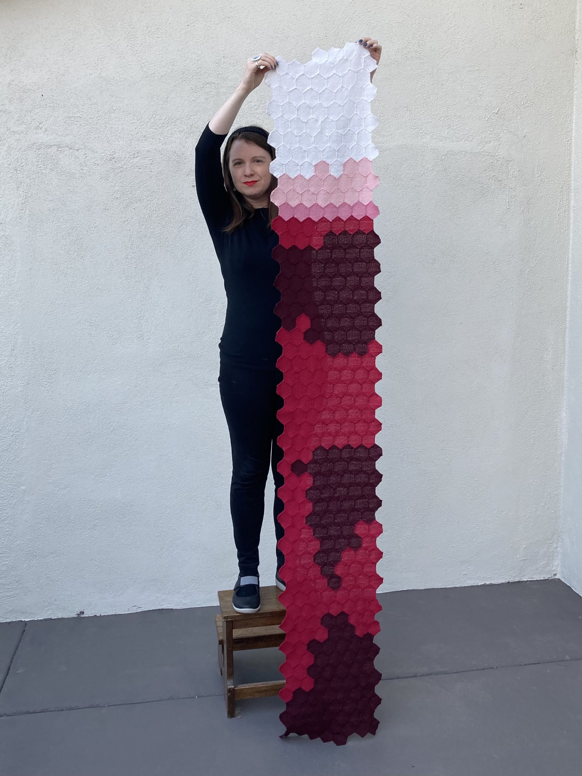
I decided to visualize the U.S. COVID daily fatalities in 2020 as a way to process my frustration and grief. While I predominately knit and sew, handweaving ended up being the right method for this project. I had recently purchased a 2-inch hexagonal pin loom that would yield a reasonable-sized visualization of a year’s worth of data, using one hexagon to represent each day. I used data under a CC BY license from The Atlantic’s COVID Tracking Project.

As with every visualization, visualizing with yarn required making design decisions that affected the accuracy and efficacy of the final visualization. The biggest planning challenge was choosing colors. Due to the macabre nature of visualizing COVID fatalities, I decided to use a simple color gradient from white to blood red. This forced me to plot data on a logarithmic scale, as I couldn’t reasonably find more than five yarn colorways on this color spectrum that coordinated. I ended up buying eleven different balls of yarn in white, pinks, and reds to determine which worked together best (though I’m still not 100% satisfied with one of the pinks). The final color key is:
- white = 0 U.S. COVID deaths
- light pink = 1-9 U.S. COVID deaths
- dark pink = 10-99 U.S. COVID deaths
- red = 100-999 U.S. COVID deaths
- dark red = over 1000 U.S. COVID deaths

The process of creating the visualization was both soothing and saddening. The repetitive nature of weaving and joining together 366 hexagons (2020 was a leap year) was comforting. This feeling was punctuated by grief, especially when weaving the 163 dark red hexagons that each represented over 1,000 U.S. COVID deaths per day; a 2-inch hexagon is a small thing to encapsulate such a profound loss. The weaving process also made me think of those lost to the pandemic whose deaths are not included in the official count, especially in the early stages of the pandemic before we had reliable testing. I explicitly recognize how incomplete the final visualization is, both through the presence of data artifacts (e.g., lower reported fatalities on Sundays and Mondays) and difficulty in representing the emotional toll of the national loss.

The final visualization is over a foot wide and almost 8 feet long and used almost 1000 yards of yarn (technical specifics are available on my Ravelry page). I spent almost three months of early 2021 planning, weaving, and joining the hexagons together, with most of the hand work done during endless hours on Zoom. While I could wear this visualization as a scarf or a shawl, I think it’s more impactful when viewed as a whole, so the final visualization became a wall hanging. It now hangs in my university office where I use it to engage others in conversations about data, visualization, and shared anxiety around the ongoing pandemic.

I’m still frustrated by our inadequate collective response to the pandemic to the point where I’m already planning the 2021 version of this visualization. I’m heartbroken that the 2021 U.S. COVID daily fatality visualization will look similar to the 2020 visualization despite the existence of vaccines and known prevention strategies like ventilation and masking. I had originally hoped to visualize U.S. daily vaccination data for 2021, but this year has simply not provided enough relief from COVID. So for me and my own mental health, I’m coming back to crafting and visualization as a way to work through the continued trauma of living in a pandemic.
Kristin Briney is the Biology Librarian at Caltech, where she specializes in the management of scientific research data. She is author of the book Data Management for Researchers and writes generally about data management on her blog, Data Ab Initio. Her passion for science and data sometimes spills over into her hobbies of knitting, sewing, and general fiber craft.
- Kristin Briney


