
There is one ongoing data visualization debate where the best-practice answer has not yet been settled: the question of dark mode dashboards, those that place visuals on black or very dark backgrounds.
The internet is filled with opinions, false claims that something is better based purely on preference (“I like it, so it should be good”), and little research. However, dark mode is increasingly common—there is one for Apple, one for Android, one for Windows, and even one for Power BI. Should your dashboards also be dark?
While I, personally, believe that a white background is like a pie chart—it is used because it is the default option, and everyone likes it because everyone is used to it—I am still hesitant to recommend dark mode right away, and most of the dashboards I make are on a light background.
If you are in doubt about what you should do, you are in the right place: I hope to make your choice between dark and white backgrounds easier.
What is the deal with dark mode?
The reason we all type in black letters on a white background is that computers try to emulate real life—and in real life it is easier to put dark ink onto a light surface; we have done this for hundreds of years. Unless your ancestors were wizards and wrote in glowing ink.
Computers operate differently—screens actively emit light, and the natural way of displaying information is by emitting light at the place where there is something to display. This is what the MS-DOS interface looks like—it is not that its designers liked fancy design; it is the way computers naturally work. Only later did we start typing on white surfaces because we wanted computers to emulate reality.
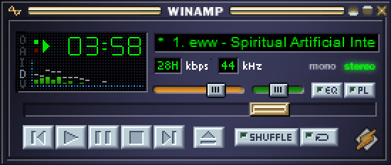
Now, since more and more time is spent in front of computers, and organizations are even going paperless, with all documents electronic, the question arises: Should we keep emulating the ink-on-paper effect or embrace light pixels against dark pixels? It’s like ditching the old floppy disk icon 💾 used as the “Save” button in favour of something more contemporary.
There are a few trends influencing this shift.
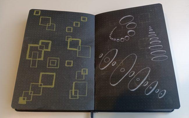
One trend is novelty in design—since we have spent so much time writing on white, let’s try to switch things up and write on black just because we can. It is even possible to buy a black notebook and a white-ink pen (see one in the image below); writing with such ink feels fancy and surreal. It is even easier to get this effect on a computer screen. Brands and products want this fancy and surreal effect for their branding, and they embrace white on dark just for novelty.
Another trend is accessibility and inclusion. We realize that not everyone, at all times, is able to read your tiny text written in Times New Roman. Dark mode may improve readability and accessibility and reduce eye strain (and even prevent migraines) simply because there is less light emitted from the screen. More about accessibility later (dark mode is not a cure-all!), but brands and apps considering themselves “responsible” will contemplate dark mode for their products as well.
And now we have dark modes available in major operating systems and most apps. Is that good?
Whenever there is another option, that is, of course, good, because those who care about backgrounds or have accessibility issues can now choose. I believe the same approach would benefit all dashboard creators—including an option to switch to dark mode would make the people who prefer it happy. What I would like to explore more in this article is the case when you have to select only one.
I will answer the question of which mode—light or dark—is “safer to use in more cases.” I will consider these aspects:
- Effects on eyes and accessibility
- Effort to create it in a dashboard
- Preferences of the audience
- Printing
1. Effects on eyes and accessibility
I have not yet encountered a serious study on the long-term effects of looking at light-background screens versus dark-background ones, but smart and tech-savvy people who look at screens for prolonged periods—programmers—often (so often that it has become a stereotype) look at colourful text against a dark background. Is that a tradition from the times when everyone worked on MS-DOS, or a measure that helps reduce eye strain? I seriously doubt that they do it because they want to look cool in photos and secretly switch to light mode when no one is watching. This definitely points to some undocumented and unresearched benefit.

This relief might come from the fact that direct light (coming from the light background) forces pupils to constrict—a muscle activity—and thus those muscles might get tired. This is my personal speculation, not necessarily a scientific fact.
And then we have light sensitivity. There are people who are more sensitive to sensory input, and according to sources listed on this page (Light Sensitivity), about 80% of people who have migraines also have light sensitivity. To make the dashboard accessible to those people, it is only logical to reduce the amount of light coming from the screen by making the dashboard in dark mode.
There is also the Hunt effect: The perceived colourfulness of things increases as lighting increases. We do not usually look at things in extremely well-lit environments, so it is not natural to look at colour in a perfectly lit environment, which is emulated by a white background. Seriously—how often do you look at things in real life against a perfectly white background that is also glowing?
Finally, for low-light environments, there is just too much contrast between light mode and the environment. That is why car dashboards are often dark and have glowing arrows and numbers.
All this means that dark mode can tremendously improve accessibility by reducing eye strain, making dashboards legible for people with light sensitivity, and making them look more natural in general.
However, there are also downsides to dark backgrounds.
First, dark backgrounds might produce an optical glare effect, in which light bleeds from letters or shapes into their surroundings. This effect makes images blurry and harder to read. However, this effect can be easily countered by choosing the right contrast.
Second, there is the halo effect, in which a halo appears around a bright object on a dark background. Those halos also make images harder to read. Both halo and glare effects are more intense for people with certain eye conditions, such as astigmatism.
Finally, remember that pupils constrict in response to a light background? The flip side is that against a dark background, pupils dilate and focus less sharply, which can blur the image even for people with normal vision.
So, dark mode can reduce accessibility by creating glare and halo effects and by reducing the sharpness of vision through pupil dilation.
That is getting contradictory. Is dark mode better or worse for accessibility? As you can see, the answer is complicated. So there is some room for opinion here, and my opinion is this:
If your dashboards contain countless tiny objects (for example, tiny numbers in tables), they will definitely be obscured by those light effects, so use light mode. If the dashboard features text and objects of a readable size and sensible contrast, a dark background will serve you well. People checking your dashboard at night (in a low-light environment) will certainly thank you.
On the other hand, no one spends long periods looking at a dashboard, so the eye-strain reduction programmers get will be less noticeable for dashboard readers.
Both options are fine if your design is sensible. What if you are not sure about your design skills? Then read on.
2. Effort to create it in a dashboard
Dashboards are business objects, and business objects usually have to be created very fast. When do we need this? Yesterday! That’s why the required effort is worth considering.
Generally, a white-background dashboard is easier to create than a dark-background one, simply because most people have more experience creating white-background dashboards, and software has better defaults aimed at them.
Due to the so-called Bezold effect and the simultaneous contrast illusion, colours appear different depending on the colours around them. You cannot simply switch an existing background to dark and call it done.
- First, you have to adjust the colours so the contrast is right—now the light colours are the ones that pop.
- Second, you have to adjust the colours in general, because they just look different. While dark red is a great colour for grabbing attention on a white background, light red against a dark background might look pink. Is that something you want?
Here is an example of what would happen if you quickly inverted the colours of a colourful white-background dashboard. I call the result a Lazy Dark Dashboard. People see Lazy Dark Dashboards and decide that dark mode is not for them.
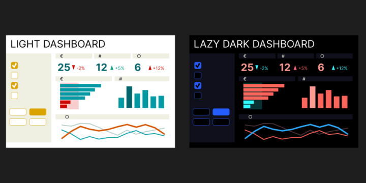
Making a better dark mode dashboard requires effort, just as making a better light mode dashboard does; you cannot simply switch colours.
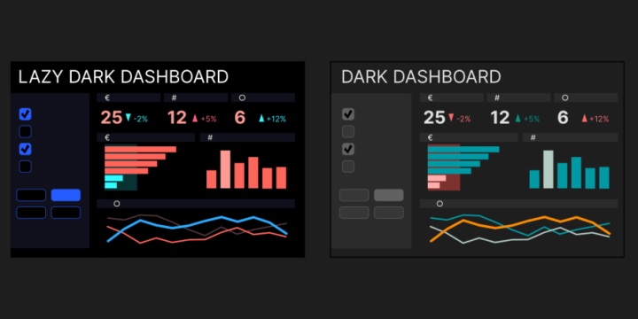
Unfortunately, at least as of 2026, making everything look right in dark mode takes more effort than it does in light mode, even for experienced dashboard creators—unless they specialize in dark mode. What’s more, there are still few resources explaining best practices for dark mode dashboards. Here is one that I have found: Valerie Junk’s “Power BI Dashboards Dark Mode Design.”
But keep the faith. This drawback will disappear with time as more dark-background dashboards are created, and this is the main reason I say dark backgrounds are the future, not yet the present.
In the end, go with a white background unless you are ready for some experimentation and discovery.
3. Preferences of the audience
In a survey of 2,514 people on Android Authority, 81.9% said they use dark mode on their phones and in all their apps. If an audience uses dark mode on Windows, Android, and Apple devices, a sudden white dashboard will feel like a jump scare.
Similarly, a dark mode dashboard will look like a descent into a dungeon for someone who stares at Excel all day. Or maybe they will feel relief? Things are getting complicated again.
Also, there are strict traditionalists who will frown upon a dark mode dashboard as bad practice. Usually, those are other data viz practitioners, not real users. We can ignore their opinions.
As an illustration of the complexity of the matter, here is an interesting debate from LinkedIn. Author and data visualization educator Anh Leimer posted this:
“Most of the time, I choose a light theme since it’s easier to set up and pleasant to the eyes, allowing the focus to be more on the visuals.
Interestingly, in a recent post of mine about light versus dark themes, many expressed a preference for dark themes for exactly the same reasons.”
This means people cannot even agree on what is more pleasant to the eyes and what gives focus to data.

Some people simply listen to metal music, and some decorate their homes with flowers. Or both. Or neither. They will have different preferences.
In the end, you have to learn about your audience and consider their preferences. Look at what their screens look like: Is it a programmer with a dark IDE or someone with a flashy Excel sheet? Look at the dashboards they have created, and maybe even ask them directly which mode they want. But for now, don’t assume they will like one or the other, even if 81.9% of 2,514 people in an internet survey use dark mode all the time.
4. And now printing
This is obviously the single biggest argument against dark backgrounds. If there is any chance someone will print your dashboard, you have to use a white background—not even a shade, just plain white. A page covered entirely in ink will not look nice, nor is it practical. Unless you have a good printer, people handling those pages will get ink on their hands.
At the same time, we are still fighting against people exporting dashboards to Excel, and printing seems even more archaic. Should we use dark mode to discourage printing?
Dark or white?
All this writing has been very inconclusive. But you came here for answers. So, dark or white?
White for now. Dark is the future. But not yet.
While both dark and white have accessibility benefits and drawbacks, white is still easier to implement and might still be the most common and obvious option for most users.
But if you are ready to be careful about design and you’re not afraid that your users will accuse you of being involved in satanic rituals, try dark. One thing: Don’t go dark because you like it or because it looks fancier. Dashboards are about how they work, not how they look. Try it because you believe it will be better for the user experience.
Of course, the best option is to do both (plus a third: high-contrast mode) and offer a switch so the user can decide.
Dark dashboards won’t become widespread without a massive shift in mindset—we have to perceive black not as darkness but as the default absence of colour. We already saw this happen when computers and their accessories changed from white to dark. No one accuses the owner of a black laptop of being a disciple of the dark side. Dark refrigerators and dark microwave ovens are slowly becoming accepted in our society. The time for dark air conditioners and dark dashboards will definitely come.


Martynas is Data and Analytics Consultant - that means dashboards and presentations - that means UX, storytelling and communication. Pie charts are ok, just overused. Less is not always more. Pineapple on pizza is ok. He is doing Visual Storytelling trainings, with colleagues runs Data Visualization Society Meetup in Lithuania and occasionally speaks at events about visual stuff for tech people.
- Martynas Jočys
- Martynas Jočys


