
Today’s mail, with a sprinkle of charts
It all started with an obscure book about mathematically themed postage stamps. A page titled “Statistics” showcased official postage stamps from Germany and Austria, both displaying population pyramids, as well as a stamp from Norway with a line chart tracking GNP over 100 years. The postal artists had managed to shrink these data visuals to thumbnail size, small enough to balance on one finger! This unlikely intersection between philately (stamp collecting) and data visualization surprised me. These stamps were essentially government-issued miniature data artworks. I wondered if there was more to this story than the samples given on the page. This curiosity led me on an obsessive hunt for any postage stamp featuring a chart. Thanks to a tip from a Redditor who specializes in collecting stamps with charts, I learned the best keywords for searching online stamp catalogs: census, population, statistics, data, graph, and, of course, chart. I soon discovered dozens of chart-decorated stamps from a vast assortment of countries. On many of them, the chart designs were incredibly beautiful. Be still, my chart-loving heart!
As of this writing, I have discovered 180 postage stamps that incorporate some type of chart or data visual into their artwork. While I can’t claim to have found every single stamp that features (or implies) a data visual, this handpicked collection is a great start, and I’ve compiled it into an accompanying spreadsheet.
As I browsed the stamps, I wondered how to synthesize this sidebar of philatelic history into a data story. In the world of stamp collecting, data visualization is not the most popular subject. And in the world of data visualization, the idea of creating a chart to be printed on a postage stamp is practically unheard of. So I studied the collection for themes and patterns. The first thing I noticed was the sheer breadth of all the stamps in style, design, and approach, spanning 88 countries and about 20 different chart types.
How governments compressed data stories into a square inch
Postage stamps are a way for governments to communicate with the people they serve. Government post offices have used a surprisingly wide array of stylized charts and real data visuals in their official stamps to celebrate, commemorate, communicate, and decorate. The beauty of these stamps is in how they incorporate charts into the graphic design, itself as diverse as the multitude of countries, cultures, and histories.
As I pored over stamp-collecting sites, blogs, and Reddit, the stamps began to fall into distinct buckets: the national census, Statistics Day, child weight monitoring, economic and industrial growth, computers, data processing, and maps. So many maps. From China to Curaçao, Botswana to Belgium, a melting pot of countries (and a few territories) have issued data visual stamps to proudly trumpet their economic development, celebrate their population data, and even encourage the regular weighing of babies for healthy growth.
Beyond the topical categories, the stamp art fell into two distinct groups. About two-thirds are what I would call “chart art,” meaning that no actual data is shown. These are symbolic, stylized charts implying the concept of data, often as a small graphic element within a larger design. Through chart art, the artists prioritized visual metaphor and borrowed data visual grammar without encoding any actual data. For instance, it seems the universal symbol for “chart” is a grid or graph paper with a single, upward-surging trend line overlaid on top.
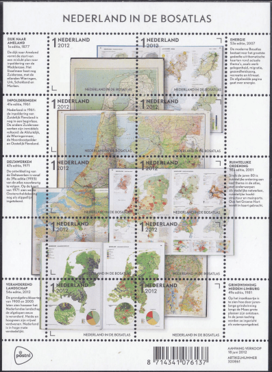
The remaining one-third of the stamps I found encode actual data. For a tiny piece of perforated paper, this is incredible. One outstanding specimen is a 2012 commemorative sheet of 10 stamps from the Netherlands celebrating the Bosatlas, a national atlas in print since 1877. It reproduces several choropleth maps along with two impossibly small pie charts.
In a 1989 stamp for pension insurance from Germany—the one that sparked my initial curiosity—not one but three population pyramids chart the changing shape of German age demographics from 1889 to 1989 and project it to the year 2000. We can clearly see the progression to lower birthrates and an aging society, and the jagged indents of 1989’s pyramid indicating war losses.
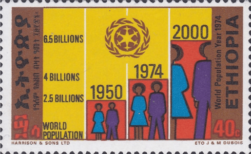
An Ethiopian stamp from 1974 celebrating World Population Year charts the increase in world population from 1950 (2.5 billion) to 1974 (4 billion) and a forecast for the year 2000 (6.5 billion). The stamp combines icons of people scaled to fit within a bar chart.
In a 1986 stamp from India celebrating the 40th anniversary of UNICEF (more on this topic later), a small child reaches upward with a clearly marked growth chart behind them showing kilograms on the y-axis and ages on the x-axis. We can easily see the ideal weight-age correspondences plotted on this tiny line graph.
Population pride and census enchantment
Celebrating the national census was the most common theme among the stamps. Stamp artists illustrated this topic using a variety of inventive chart types and graphic design. I was surprised to see several fairly detailed population pyramids from Botswana, China, Ecuador, and Sri Lanka (to name a few). The government stamp designers of these countries understood the educational power of data visualization, even at miniature scale.
For example, in Antigua and Barbuda (a small country in the Caribbean), a four-stamp set commemorating the 2001 Population and Housing Census is so intriguing, I ordered my own copies on eBay. At a scant 1.25 inches square, the stamps are much tinier than I expected. Using a magnifying glass, I strained to decipher the data being shown in the population pyramid, bar chart, line chart, and what I’m guessing is a vertical histogram composite of the population pyramid. Since the country comprises two islands, there is a second inset chart for Barbuda on each stamp in excruciatingly small detail. I could not discern the actual data. However, comparing the country’s online census data might enlighten the reader. I have yet to go down that rabbit hole!

In a 2011 Botswana stamp, we can easily discern the distribution of age bars plotted on clearly marked axes in a population pyramid colored blue for male, red for female. In a 1981 stamp from Sri Lanka, the population pyramid is combined with stylized housing icons to create all-in-one chart art celebrating the Census of Population and Housing.
Countries used charts of all kinds as design devices for getting their citizens excited about the census. In most cases the stamps celebrated years of population growth or the distribution of people within a country’s borders. Other designs featured detailed representations of people, from simple geometric icons to full-body drawings that included traditional clothing, as in a 1965 stamp from Kuwait showing a family of four standing under an ascending line chart.
Trend graphs are trendy
While the census is the most popular subject, let’s now talk about the most popular chart type. A stylized, upward-surging line chart is present in about half of all the stamps. This graphic element is the ubiquitous symbol for economic growth, population expansion, or industrial progress, among other things. The ascending line is often layered over a grid background, reinforcing the concept of graph, communicating scientific rigor, and building public trust. Occasionally the line zigzags wildly, sometimes terminating in a jubilant arrow, almost always trending upward and usually at a steep angle.

Curiously, a 1975 stamp from The Gambia shows the trend line for four major industries moving from right to left, perhaps charting the improving economic situation, but not over time. As with many of the stamps, it’s hard to tell what exactly is being charted. In a 1961 stamp from Cuba celebrating the stabilization of raw material prices, we see a sharply fluctuating zigzag that levels off to a flat, horizontal line, accompanied by iconic symbols of wheat, a cow, and mining.
A set of two stamps from Belgium, however, breaks the rule of ascending-only lines. One stamp displays a healthy fish population dwindling to a single skeleton. In the other, a bountiful forest becomes withered and dead. Both ominously depict a descending line superimposed over a grid, thickening as it trends downward and becomes bright red, until it falls right off the edge of the stamp. The year is 1986, and these stamps are an ecological warning bell, bringing awareness to polluted fish populations and deforestation from acid rain.
Tiny designs, global patterns
As my digital stamp collection grew, more patterns emerged:
Choropleth maps in miniature
In the totality of the philatelic universe, there are thousands of stamps depicting geographic maps. This subject even has its own name—cartophilately. Within this group is a small subset of maps encoding specific data, usually nautical or weather maps. And in a few rare cases, we find captivating choropleths. One shining example comes from Cameroon. To celebrate World Leprosy Day in 1978, this stamp shows the global distribution of leprosy hotspots with color-coded countries. Unfortunately, there is no legend to understand the values of the colors. Perhaps darker means a higher density? A portrait of humanitarian and leprosy advocate Raoul Follereau stares sternly from between continents.
A 2011 Botswana choropleth map stamp charts the country by population density with a clear legend showing persons per square kilometer. In this carefully detailed map—impressive for its small size—we learn that the eastern half of the country is more populous.
A delightful 1989 stamp from Colombia features a world map of color-coded countries: red for coffee producers and green for coffee consumers. Commemorating the International Coffee Organization, this miniature world map is easy to understand and tells a complete data story in the smallest of spaces.
UNICEF and child survival
Stamps featuring children’s health campaigns sponsored by UNICEF (the United Nations Children’s Fund) were ubiquitous between 1985 and 1988. These government-sponsored public awareness programs promoted healthy child-rearing on stamps from Bangladesh, Brazil, Ethiopia, Ghana, India, Indonesia, Rwanda, Tanzania, and the United Arab Emirates.
The UNICEF programs often had bold names like “Child Survival Revolution,” and the stamps depicted scenes of mothers and babies, usually with a small line chart nearby implying a growth curve. The stamps promoted proper hydration, nutrition, breastfeeding, weight monitoring, and vaccination. In a Brazilian stamp from 1985, a topless mother nurses her child with an ascending line chart in the background, while an array of five child icons grows in size beside her, emphasizing the importance of breastfeeding and immunization for optimum growth.
An exquisitely detailed 1968 stamp from Nicaragua titled “Let’s Save the Children” encourages a balanced diet with three line charts for different age groups (0 to 1 year, 1 to 2 years, 2 to 3 years) plotting ideal weights with progress lines for male and female. Below the charts, the stamp artist still found room to include a cornucopia of nutritious food and mention Incaparina, a dietary supplement developed for children. This stamp is one of many that show (or imply) the importance of child growth monitoring, often sorted by percentiles.
It’s admirable to see a priority on maternal health and child vitality. The campaigns were successful. In Ghana, UNICEF’s GOBI program made massive strides in reducing childhood mortality with four basic health interventions that gave it its name: growth monitoring, oral rehydration therapy, breastfeeding, and immunization. One of two stamps from this campaign shows a woman administering oral rehydration therapy to her baby with a simplified line chart in the background. In the other, immunization is the theme with a doctor aiding two mothers and their babies. A repeat of the same green, yellow, and red line chart floats in the background, a symbol for health and progress.
Into the digital age: computers and data processing
Both Russia and Mongolia issued stamps showing a person creating data charts at a computer workstation in 2021 and 2024, respectively. In Mongolia’s case, it’s a first-day cover (printed envelope) commemorating the 100th anniversary of the National Statistics Office. A woman stares at dual monitors filled with bar charts. On her desk we see a printout emblazoned with a pie chart. The scene is superimposed over a large bar chart with detailed numerical labels. On the Russian stamp, a seated designer casually gazes at a screen filled with a vaguely circular chart.
In a 1998 Malaysian stamp commemorating the APEC Economic Leaders’ Meeting, we see a montage of office workers at computer workstations with a 3D pie chart on one screen, highlighting the country’s contribution to computing, data, and business. A 1993 stamp from Uruguay features a drawing of a printer and a computer with a line chart on-screen. Nearby, surging upward at a steep angle, a pink trend line commemorates financial data for the Centenary of the College of Doctors of Economic Sciences and Accountants.
The African country of Mauritius in 1985 issued a stamp with a drawing of a desktop computer, keyboard, and floppy disk drive. On the computer screen is a 3D pie chart with slices for agriculture, industry, and service. We can clearly see that service is the largest sector, encompassing a little more than half the pie. It was the heyday of pie charts!
Lastly, combining themes of population and technology, a Japanese stamp from 2020 commemorating “100 Years of the National Census” features a woman using a smartphone. Surrounded by colorful person symbols, she stands casually atop a pastel pie chart.
Florence Nightingale and the tiniest coxcombs
While numerous countries have paid postal stamp homage to Florence Nightingale for her nursing contributions, only Portugal, Italy, and Spain featured her coxcomb diagrams.

In recent commemorative stamps, all from the 2020s, the three European countries focused on her legendary data visualizations by reproducing the tiniest coxcombs you’ve ever seen. The Italian and Portuguese stamps are practically indecipherable. The data is a bit clearer in the Spanish stamp, whose artist chose to use bold red and blue on a white background highlighting the Crimean War fatalities data. While I don’t know for sure, it is my guess that these stamps opened the public’s eyes (in three countries, at least) to Nightingale’s pioneering data science, in addition to her nursing fame.
Conclusion
Many countries have issued postage stamps featuring stylized charts and graphs, as well as actually encoded data visuals like population pyramids and choropleth maps. Whether their postage stamp charts display symbolic or real data, the variety of goals is clear:
• to promote a government office or national day
• to spread a positive message about national progress
• to encourage public support for a cause like public health or child survival
• to celebrate the census or statistics office
I believe that over time, these stamps have likely strengthened the public’s relationship with data. From literally educating people with real data charts on stamps to symbolically showing data trends and concepts, the core idea is that numbers can be made visual. They can tell a story of financial growth, weather changes, expanding populations, or the long-term benefits of nourishing a healthy baby. Charts were used as a prideful shorthand for population explosion and economic prosperity, all communicated on diminutive sheets of gummed paper.
But that’s enough of me talking about these stamps! To really enjoy the collection, you must see it for yourself. I’ve included a link to the spreadsheet with visuals of all 180 stamps. Additionally, I’ve created an appendix with some stats about the collection.
Enjoy!
See the spreadsheet of all the stamps.
See the images (stamps are organized by continent/region).
Appendix: Stamp data
The 180 stamps can be sorted and studied from many angles. Below I explore different rankings from my handpicked collection, so bear in mind this is not perfectly scientific data.
Time span
Oldest: 1940 population census stamp from Türkiye.
Newest: 2025 topographical map from Estonia mapping spatial data.
Encoding data vs. chart art
One-third of the stamps actually encode data.
The remaining two-thirds I categorize as “chart art.”
Absolute quantity and percentage of stamps encoding data (by continent/region)
North America: 13 (81%)
Oceania: 1 (50%)
Europe: 21 (40%)
Africa: 13 (37%)
South America: 4 (27%)
Asia (Central): 4 (25%)
Asia (East): 5 (19%)
Middle East: 1 (6%)
Number of countries/territories
From the Åland Islands to the former Yugoslavia, the collection includes 88 different countries and territories across all continents except Antarctica. A great majority of the stamps are from developing countries. Notably, there is only one stamp from the US, a 2014 Earth Day globe showing sea surface temperatures. The stamp is uniquely circular and depicts a color choropleth map of the oceans.
Total number of stamps by continent/region
Africa: 35
Asia (Central): 16
Asia (East): 26
Europe*: 52
Middle East: 18
North America: 16
Oceania: 2
South America: 15
*There is one stamp from the United Nations (Geneva) that I am categorizing as Europe.
Stamps by category
I organized the stamps into the following main categories:
Census/Population: 66
Economics: 26
Statistics: 23
Children’s Health: 15
Maps: 12
Science: 8
Education: 5
Finance: 5
Climate: 3
Environment: 3
Florence Nightingale: 3
Health: 3
Medicine: 2
Business: 1
Customs Administration: 1
Geography: 1
Insurance: 1
Spiritual: 1
Technology: 1
Stamps by chart type
When sorted by chart type, the line chart leads by a wide margin. In second place is the bar chart, in third place icon charts, and, to my surprise, population pyramids in fourth place (in a tie with pie/donut charts). That’s likely because population pyramids are a natural way to show census data. A handful of stamps feature more than one chart, but none exceed three.
Area Line Graph: 2
Astrological Chart: 1
Astronomical Map: 3
Bar Chart: 33
Choropleth Map: 9
Coxcomb: 3
Dot Matrix: 2
Gauge Chart: 1
Histogram (vertical): 1
Icons: 21
Line Chart: 87
Nautical Map: 5
Number Scale: 1
Pie/Donut Chart: 10
Population Pyramid: 10
Radial Bar Chart: 1
Scale Diagram: 1
Stacked Bar Chart: 1
Topographical Map: 1
Weather Map: 1
Stamp art themes
In tandem with the upward-trending line graph, we see the ubiquitous grid background, because nothing screams “this is a chart” more than graph paper lines. A whopping 78 stamps (43% of the collection) used this design combo. Of those, 16 (21%) were charts encoding readable data.
Chronological trends
The theme of census and population persists from beginning to end across the entire time span covered by these 180 stamps. A few loose themes emerge by decade. The most clear-cut time trend was the introduction of the UNICEF programs in 1985. We see child development charts across many countries until 1988.
1960s: industry and economics, the beginnings of the children’s health campaigns, celebrating statistics in general
1970s: education, economic development, and industrial growth
1980s–2000s: economics, computers, data processing
1985–1988: UNICEF campaign
2020–2023: Florence Nightingale
Acknowledgments
Special thanks to Rachel Braun at “The Giddy Grid.” Thanks to Redditor RelativeLiving957 for helping spark my curiosity and for posting their extensive collection of charts on postage stamps. Thanks to the Maps on Stamps site, and also to the Maths History graph and Nightingale pages on their site.

Julie Peasley
Julie Peasley has been a graphic designer for 25 years and began specializing in data visualization and information design in 2022. She loves to create data visuals on topics in science, aviation, education, and global politics. She is an advocate for dataviz literacy and finding the fun in data with passion projects like her dataviz board game. She lives in southern California near Joshua Tree National Park.


