
The inaugural Data Is Plural visualization challenge prompted readers to explore the London Stage Database, which describes 100,000+ performances in London from 1660 to 1880. Check out the submissions:
Iva Brunec: In my visualization, I wanted to map individual performances in space and time. I focused on the ten longest-running plays and plotted the evolving number of performances over time in a streamplot, excluding those without an exact date. I then visualized where these plays occurred by plotting their performances in the five most popular (frequently-listed) theatres using a stacked area chart, each square representing a single performance.
These space-time maps reflect the popularity of different plays rising and falling over time, and situate these events on a present-day map of London. Some of these plays are still running in the same theatres, while others are mostly forgotten to time, whispers in modern city noise.

Michiel Duvekot: The London Stage Database presents information on the theatrical culture from the Stuart Restoration to the end of the eighteenth century. This data visualization shows every performance in the database. Each pixel represents a day. The brightness of a pixel corresponds to the number of events staged on a single day; as many as 12. Absence of data can be as meaningful as its presence. Even for a non-expert, the lacunae can reveal a surprising amount of information.
I wanted to explore what you can see when you look at “gaps”. Quite a lot, it turns out.

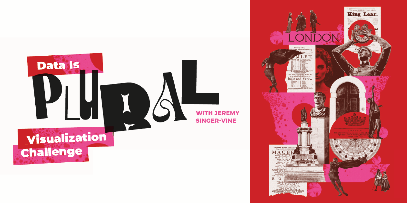
Kat Greenbrook: I used AI art to visualise text analysis data, which is something I’ve wanted to experiment with for ages! The data shows 140 years of performances between 1659 and 1800. I used text analysis to rank the frequency of words in performance titles, removing stop words (a, the, and, etc.). The top 50 words and their frequency formed the prompt word and word weight for the Midjourney AI. I didn’t specify any design aesthetic because I wanted the data to “speak” for itself. After a painful process of image selection, I used Photoshop to edit and join the final images and added the top performance titles for the time periods analysed in Illustrator.

Milán Janosov: In this visualization I show the collaboration network between performers based on shared titles, where each node represents an individual, while links correspond to shared plays. After processing about 17k titles, cleaning their data and the network, I arrived at a network with 6k nodes and 56k links. The nodes, as performers, are sized by their PageRank centrality, edge weights correspond to the number of shared events, and colors encode network communities, all visualized in Gephi.

Georgios Karamanis & Lee Olney: We created a network plot of the theaters and plays in 1735, the year with the most plays in the dataset. The network and bar plots were made in R. Overall layout, colors, additional labels, legend, title and text made in Figma.

Lisa Pederson: As I was exploring the London Stage database and creating visualizations to see what the data had to say, I started doing research on the various theatres that seemed to be most prominent, and historical events from the time period. A picture formed around the Drury Lane Theatre and eventually a story emerged of this theatre surviving the plague, three fires, the 1737 Licensing Act, and competition from other theatres. The theatre is still in existence today, albeit in a different location and under a slightly different name than it started with.

Nikita Rokotyan: This visualization is a graph of London theatrical performances from 1660 to 1880. Orange points are theaters; blue points are performances. Lines connect theaters and the performances that were played there.

Guillermina Sutter Schneider: This artwork is a visual analysis of the London Stage Database. It explores the top 5 performances in London measured in number of shows from 1700 to 1800, where these performances took place most frequently, and the top performers in each play. I analyzed the data using Python, drafted some initial charts in RAWGraphs, and worked on the overall look of the visualization in Adobe Illustrator.

You can still order your own copies of Nightingale Magazine, Issues 1 and 2 here, while supplies last!
Nightingale Editors
Our Nightingale editorial team currently consists of Alejandra Arevalo, Brian Cort, and Teo Popescu. Reach us at Nightingale(at)Datavisualizationsociety.org
- Nightingale Editors

- Nightingale Editors

- Nightingale Editors

- Nightingale Editors


