
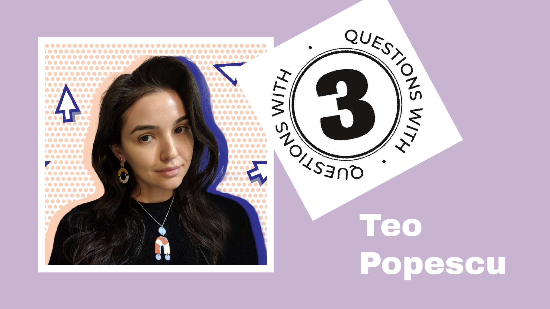
The Nightingale team is thrilled to introduce our new content editor, Teo Popescu! We’re excited for the new energy, ideas, and experience she is already bringing to our team. In true Nightingale fashion, we’ve asked her to introduce herself via Three Questions With.
Teo Popescu is the creative manager at KUOW, one of the Seattle branches of National Public Radio. She manages all data visualizations, graphics, interactive pieces, illustrations, and video projects across the station. She also serves on the board of the Society of Professional Journalists of Western Washington. In her spare time, she runs data visualization workshops for young journalists. You can follow her actively on Instagram and TikTok.
1. What is one visualization that has inspired you and why?
If you have yet to introduce a history buff to “Horizontal History” by Tim Urban, I implore you to do so immediately. Done? Great! Did you clock their joy at seeing history contextualized in one chart? Was it followed by a list of additions and notes on chart styling? That is fair: The chart operates more like a living document than a complete work of art. What it lacks in style, it makes up for in approach and impact.
“Horizontal History” connects the dots between history lessons. It allows the audience to better understand world events by placing influential figures among their contemporaries. What were they seeing out in the world? Who was in the metaphorical group chat? My goal as a visual professional in the news business is to take complex topics and clarify them. Tim Urban does the opposite with this chart. He takes a topic that is often presented as a flat timeline and brings back complexity to tell a richer story. I think that is pretty impressive.
2. What’s one topic you would love to visualize but have not yet had the chance to?
As a policy nerd, I’m always looking for ways to show people the impact of government paper on their lives. I would love to create an input calculator—similar to ProPublica’s “Chicken Checker” visualization—that allows people to chart their major life events against policy changes. For example, my family moved to the United States following a big change in immigration policy. I spent my summers swimming in a community-funded pool. In my teens, my family purchased a home thanks to a new homebuyer program. I would love to see an interactive visualization that attempts to bridge the gap between our personal experiences and the policies around us.
3. Your mission, should you choose to accept it, is to make a chart expressing something about your life using only objects currently around you (computers and pen/paper not allowed!). Look around you — what would you use to make your chart, and what data would it reflect?
This was quite a challenge! My house is full of Dungeons & Dragons figurines that would do well in a pictogram. Ultimately, I opted for a column chart that reveals my vinyl record collection habits. Enjoy!

Nightingale Editors
Our Nightingale editorial team currently consists of Alejandra Arevalo, Brian Cort, and Teo Popescu. Reach us at Nightingale(at)Datavisualizationsociety.org
- Nightingale Editors

- Nightingale Editors

- Nightingale Editors

- Nightingale Editors


