
There’s really nothing as visually satisfying as a pictorial map. Each densely packed, illustrated map is a visual feast for the eyes; a fusion of illustration, editorial copy, and cartographic skill. The pictorial map had its heyday from the 1930–60s and eventually fell out of the public eye with the advancement of color photography.
The 2016 book “Picturing America: The Golden Age of Pictorial Maps” by Stephen J. Hornsby helps bring many of these unsung artists back to the fore. Hornsby explores the massive collection held by the Library of Congress and not only tells the story of the discipline but also outlines the biographies of many of its practitioners. The book is a must-buy; each lusciously illustrated map reveals more on each viewing and Hornsby is a storyteller who is clearly passionate about representing such under-explored works.
Of course, illustrations have occurred in maps since the very beginning of map making, but pictorial maps push the boundaries of supplemental information, by inserting thumbnail size illustrations into any empty space. Though inspired by the work of MacDonald Gill in London, Hornsby argues that the maximalist cartography genre is inherently American in nature — an unlikely by-product of an incredibly skilled workforce of illustrators, innovations in offset printing, and American optimism. The pictorial map is inherently entertaining, a mixture of marketing, hucksterism, and graphical brilliance. Each map a brazen declaration by showboat illustrators begging to be viewed.

While many of these artists are not well-known, the hands-down most famous of the bunch is Ernest Dudely Chase.
A proud resident of Winchester, Massachusetts, Chase began his carer illustrating greeting cards and went on to become very well-known in the industry. Culminating in 1925, when he published “The Romance of Greeting Cards” which became a sort of industry bible. Then, at the age of 49, Chase began his first pictorial map of Germany. An immensely talented illustrator who loved to travel, Chase chose the pictorial map to tell the stories and point out the landmarks of the places he’d visited on his travels.
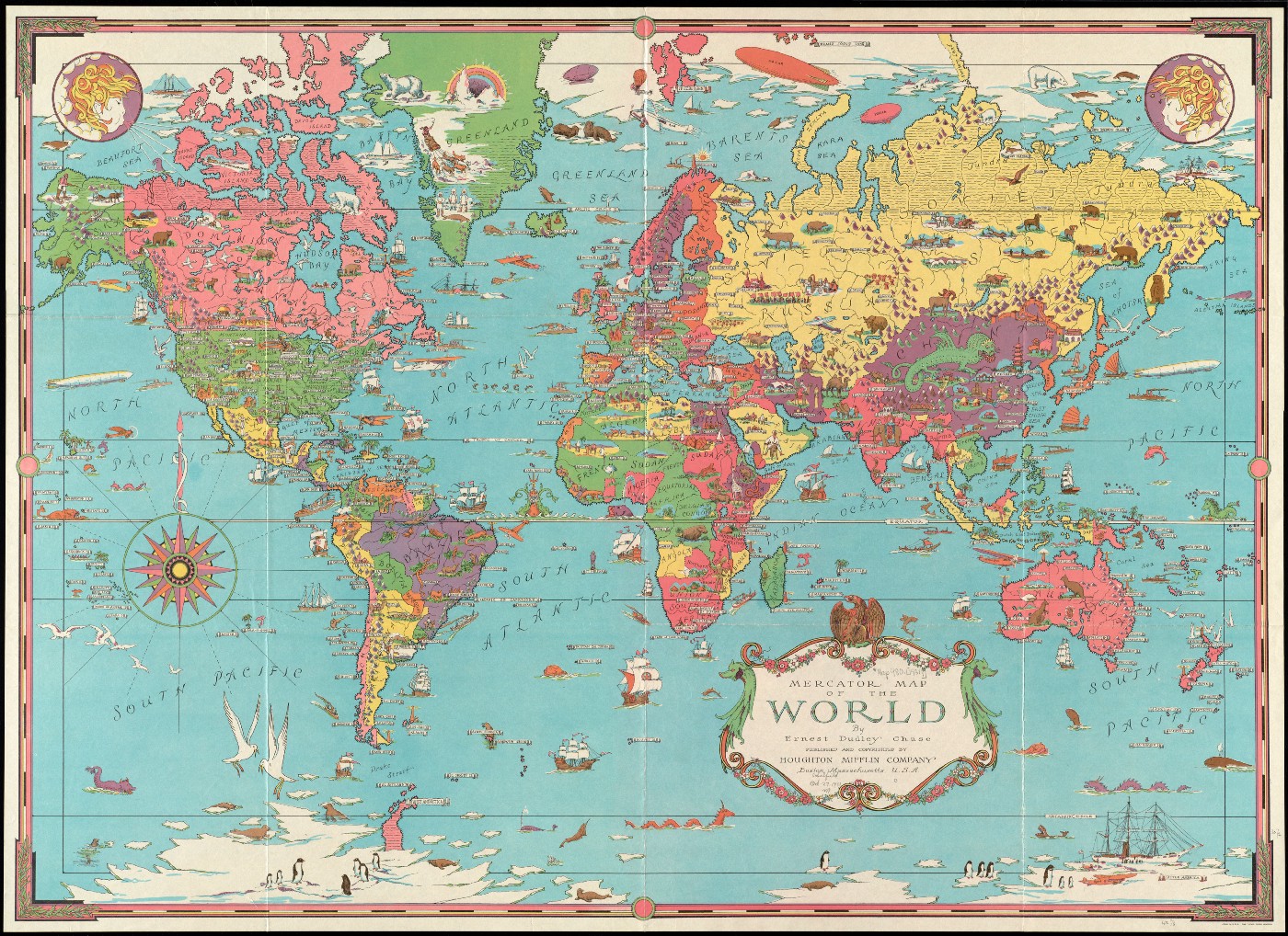
Hornsby writes “Chase crafted his maps with care, each taking from six months to a year to complete. He worked with a magnifying glass, inking in, dot by dot, the tiny scenes that covered many of his maps. These stamp-sized scenes were based on his own sketches, still and motion picture collection (he reputedly shot an estimated one hundred thousand feet of cine-film), postcards, and other illustrative materials.”
By the mid-40’s Chase had enough maps to fill his own mail-order catalog. The maps came in 3 varieties: full color, in sepia with colored compass, and black on ivory paper. They even came in a decorative tube and Chase would throw in autographed versions for $1.50.


Ernest Dudley Chase, “The Ernest Dudley Chase decorative pictorial novelty maps,” 1944–5, David Rumsey Map Collection link
Inherently maximalist in nature, each of Chase’s maps shows a visual flair that only a master craftsperson could pull off. The combination of layout, framing, color, type style, type design, and illustration style is all clearly on display. Chase flaunts his many skills in a way that makes the viewer lean in and start reading. But these maps are more than just skill, Chase puts his worldview on clear display as well.


Reading the text, you can see how these maps were sold to an America just returning from the second world war. No doubt the “Libraries, offices, homes, dens, and game rooms” of the burgeoning American middle class were more than ready for Chase’s maps. The explosion of the suburban middle class in the 1950s echoed the utopian ideals of the pre-war world’s fairs and the establishment of the UN in 1945 enhanced the allure of a global worldview.
Chase’s maps are brimming with American optimism and champion the shrinking globe as a result of the advancement of aeronautics. In chase’s 1944 masterpiece, “Mercator Map of The World United: A Pictorial History of Transport and Communications and Paths to Permanent Peace” what was once far-flung is now seen under the equatorial headline “No Spot On Earth Is More Than Forty Flying Hours From Your Local Airport.” Airplanes, zeppelins, trains, and steamliners are everywhere and Chase maps the resulting travel times between the continents. In this worldview travel, cooperation, and technical innovation go hand-in-hand, depicting a world as it exists only in Chase’s ideological projection. Science becomes the tool of cultural progress — the transistor, the diesel engine, and the radio tower are the harbingers of freedom.


It’s this editorial position that really makes Chase’s maps different. They are not mere depictions of places (which he excels at) but rather editorial views of the world. Many of Chase’s maps represent different ideals, such as “World Freedom: A Factual & Pictorial Map” which overlays a distinctly American flavor of democracy over the entire globe.
Created in 1950, the same year the Korean war started, this cold-war artifact focuses primarily on the difference between the Soviet Union and everywhere else. Dominated by a giant, pink Soviet Union, the map subtly highlights potential flashpoints for the expansion of Communism.
Chase focuses the map on Korea and calls out other areas where democracy might be threatened. The map includes a magnified callout showing the entire Korean peninsula with a tank rushing in from the side and the map’s compass incorporates the Korean flag. Chase even conveniently labels the Marianas Trench as “a suitable place to sink all the Communistic ideas and concepts.”
The United Nations again literally hangs large over the map, with its structure outlined at the top and the UN flag on each corner. While the map is certainly far from objective, it champions the international optimism of the post-war era more than focuses on the evils of communism. It’s American-isms literally written into world history more as a subjective response to the times than dogmatic propaganda.


The more-is-more aesthetic makes these among the most “slow” of visualizations, perfect for enjoyment over time. There’s just so much to love on each one of Chase’s map and civil engineering projects, natural phenomena and all types of sundry oddities populate his “World Wonders: A Pictorial Map.”
Chase strikes a sort of retro-futuristic chord in this map, his focus on the Aurora Borealis, caverns, and flying machines feels inspired by Jules Verne while the relatively modern Golden Gate Bridge stands among the great monuments of the world. The wonders themselves are nearly unlimited, Chase squeezes in lobsters, “skull worshipers,” Howard Hughes, rainbows, Easter Island, and Peru’s “weird rock formations.” The detail takes a long time to sort through.
Chase’s ‘infinite care and detail’ convey his sense of wonder. A banner below the 4-color compass elaborates: “Finally, the result of a delicate adjustment of conditions, marvelous to contemplate, the miracle of human life itself, reaching sublime fulfillment in the flowering genius and imagination, and their glorious attainments, the Sciences, and Art.”
What gets me about Chase’s work is his humanity. His personality is on display as much as his talent. He’s an interesting person who shares his passions, hopes, and dreams. His text is funny, it’s not meant to be scientific, and while he does intend to educate, he’s also very entertaining.
At left is a “brag map” of which several pictorial map makers created region/state-centric views of the world. In the above, California is a land blessed by perpetual sunshine and acts as the horn of plenty to the rest of the U.S. The map is distorted to show the Californian indifference toward the rest of the country. New York City is on the map, but Chase’s North East is clearly of more importance to your average Californian. Anyplace in-between, a spiderweb wrapped in clouds, blown by winds; a place you really just want to travel through as fast as possible. I mean, why not just fly over it?
This map is another graphic triumph by Chase. One you can’t really look away from, its masterful draftsmanship evident in the sun, clouds, and icicles peeking out of the frozen north.


While many of Chase’s signature tricks are evident, this 1945 map is particularly extravagant. The decoration verges on the rococo and the details are especially genteel. Chase goes the extra mile to delight his audience by hanging icicles from the arctic circle while the nearby magnetic pole sparks like an electrical company logo. It’s a candy-colored wonderland of places you’d like to visit with Greenland thrown in to boot.
I’m especially fascinated by the copious decoration on this map. Created about a decade into his pictorial map carer, it displays how Chase continued to challenge himself. The scale in miles is especially wonderful, its yellow and black checkerboard is surrounded by curlicue linework reminiscent of Mexican ironwork and halved in the middle just to make it extra exciting.
Some takeaways from Chase’s pictorial maps
There’s so much in each of Chase’s works that there’s plenty of inspiration to be had. Here are a few ideas that I’ll try to incorporate into my work:
1. Find ways to include your personality and perspective in your work
While Chase was certainly a gifted illustrator, what he did best was put himself on display. These works jump off the wall and announce themselves, and that is certainly something that I strive for in my work as well. Over the years, I’ve realized that we should apply our uniqueness whenever we can, especially in creative work. It may sound trite, but you’ll always be the #1 best version of yourself, so put that out there.
2. Copywriting counts
Crafting an interesting and human message makes a connection with your audience far more than something that plays it safe. Finding an editorial voice and inserting that into your work will really help with the previous step.
3. Visual power breeds interest
Of course, if you are presenting visual information, then you want people to actually *look* at it. Build on the language of design in order to pack more visual power into your work. Take chances with your colors and presentation to make your work as interesting as you can make it.
4. More is way more
If your data visualization is complex (ie: “slow”) then consider adding more content to make it more meaningful. That’s easier said than done, but if you are making something, like Chase, that is designed to reveal itself over time, then find a way to balance the quantity of all that information. Giving your audience something to dwell on will keep them coming back for more.
Ernest Dudley Chase crafted more than 30 of these pictorial maps plus some more supplemental materials. There’s just so much to see in Chase’s body of work that I’d urge you to visit the links below, download the high-res images and just enjoy the act of looking!
https://www.davidrumsey.com/luna/servlet/view/search?q=author=%22Chase%2C%20Ernest%20Dudley%2C%201878-1966%22
https://www.digitalcommonwealth.org/search/commonwealth:q524n371p
https://collections.leventhalmap.org/search/commonwealth:q524n353r

Jason Forrest is a data visualization designer and writer living in New York City. He is the director of the Data Visualization Lab for McKinsey and Company. In addition to being on the board of directors of the Data Visualization Society, he is also the editor-in-chief of Nightingale: The Journal of the Data Visualization Society. He writes about the intersection of culture and information design and is currently working on a book about pictorial statistics.
- Jason Forrest

- Jason Forrest

- Jason Forrest

- Jason Forrest


