
Political systems charts are frequently seen online but there is scarce information on the genre and on how it evolved throughout the decades. This article will attempt to define what they are and to sketch a short history based on older examples. I was particularly curious as to what modern political systems charts have as ancestors, and how the older examples differ from the ones we see today.


First of all, let’s look at a few examples from Wikipedia above to be clear what we mean by Political System Chart. We’ve all probably seen these types of diagrams once or twice.

But when talking about ‘Political Systems Charts’ (PSCs) it’s important to understand what they are and what they are not. They are not organisation charts. While they do contain information on hierarchical relationships, they are not, for example, a representation of the administrative divisions of the state. (Perhaps confusingly, some early examples do include elements of organisation charts.)
What PSCs show instead is the way the main powers of the state (legislative, executive, and at times the judiciary) interact with each other and what their relationship is with the electorate (i.e. the source of their legitimacy). In this respect, we can already see where these diagrams come from, as a typology.
Current political system charts are both aesthetically similar to flowcharts and substantially related. Much like flowcharts, PSCs depict both the flow of a process (political sovereignty) and the controls over said process (who makes decisions on which element). Flowcharts seem to have appeared in the 1920s and 1930s. While they probably influenced the aesthetic development of modern PSCs, the earliest example of a political system chart I could identify was actually from six decades earlier, though its aesthetics were quite dissimilar to today’s examples, integrating lots of allegorical and pictorial elements.
USA — 1862
The earliest occurrence I could find is N. Mendal Shafer’s “Diagram of the US Federal Government and American Union” published in 1862.

As we can see in subsequent early examples, this example contains within it both a political system part (showing political institutions and voting) and an administrative part (detailing the principal administrative divisions of the Union — i.e. its states).
A detail that I’ve noticed even in more recent American charts (such as the one below), is the tendency to depict the Constitution (rather than the electorate itself) as the element from which all political power emanates.

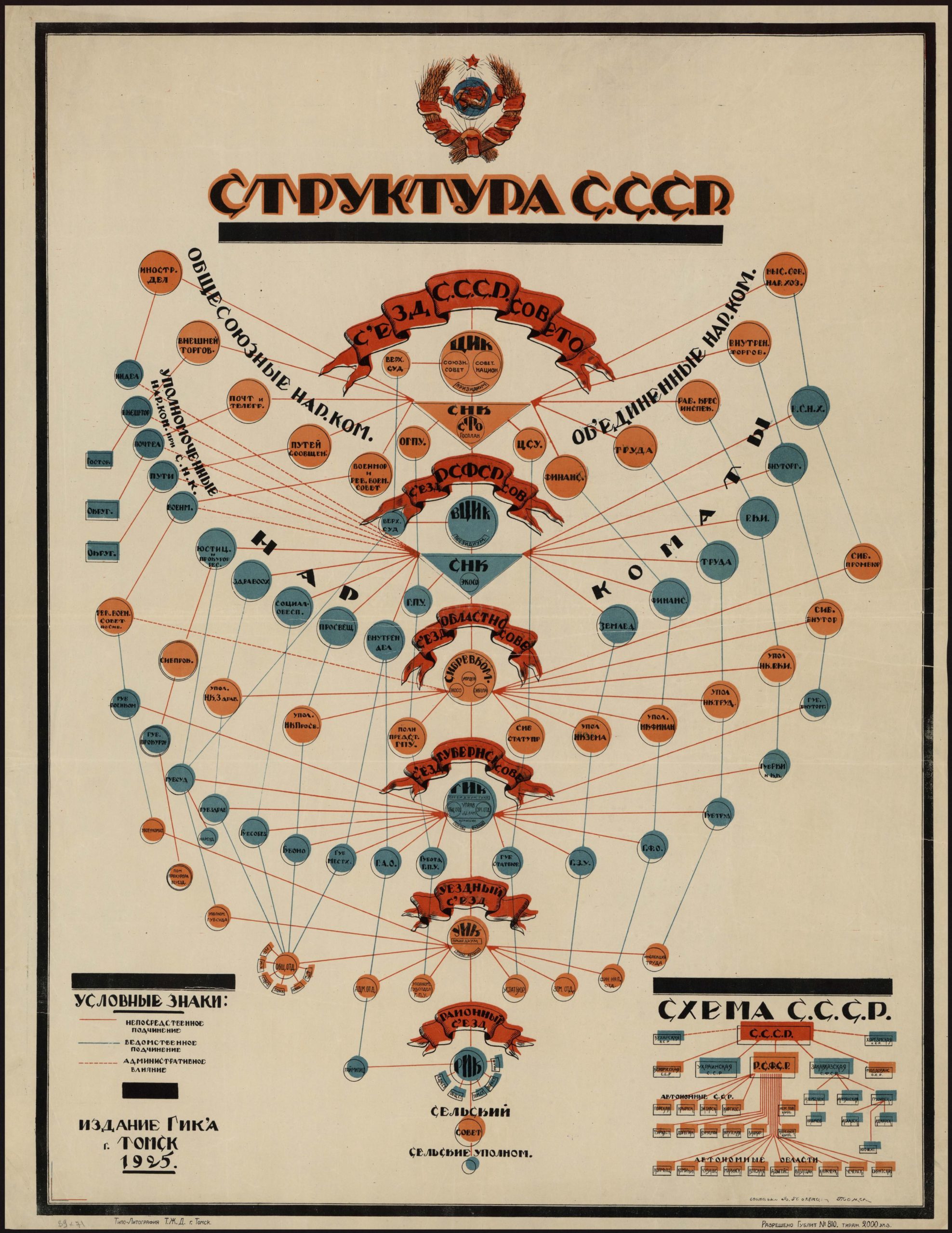
Soviet Union — 1925

These two examples from 1925 Soviet Russia, one created in the city Saratov (above), the second one in Tomsk (below), attempt to visually explain the recently approved 1924 Soviet Constitution. The first example inserts the chart in the middle of the constitutional text, to offer a schematic explanation of the text in front of one’s eyes.

In these two charts we see two fundamental changes towards contemporary PSCs:
1. The charts became more abstract, shedding the more figurative elements. Different institutions are shown with different geometric shapes (circles, rectangles, triangles, stars, etc) and the use of multiple linetypes (either of different colors or of different styles, such as continuous vs. dashed) to show relationships.
In contrast with the US example from six decades prior, the visual vocabulary here is clearly modernist, as this is the heyday of the Russian avant-garde.
2. The “administrative elements” become secondary or disappear entirely. While both show the political system and the administrative subdivision of the state, we already see in the one to our left that the administrative system is given a secondary role.As a personal note I appreciate the way in which the first graph takes center stage, right in the middle of the text of the constitution which it tries to visualy reflect.
Neurath — 1946, 1953
These first two pairs appeared in the book entitles “ America and Britain: Three Volumes in One” — “Our two democracies at work”, by K.B. Smellie.


These are PSCs in the purest sense, made in the unmistakeable Isotype style. Especially pages 5 & 6 above do a great job at distilling the ways in which the British and the American governments are elected and function in the context of their respective states.
The sketch below comes from the context of British decolonization of Nigeria and the constitutional discussions taking place in London with the premier of the Western Region of Nigeria, Obafemi Awolowo. The full story (link below the photo) is worth a read.

The Penguin Atlas of World History — 1964, 1974 (Austria-Hungary)

This pleasing marriage of map and chart seems to be from the 1974 Penguin Atlas of World History, itself a translation from the German original “Atlas zur Weltgeschichte” published ten years prior by Hermann Kinder and illustrated by Werner Hilgemann.
Anyone familiar with Austro-Hungarian history and the strange constitutional setup of the empire has to wonder how come charts like the one above haven’t been made earlier. The Austro-Hungarian Empire was a union of two countries, each with its own political setup, only linked at the very top by the institution of the monarchy, and a common foreign, military and financial policy.
Examples in the contemporary press — 21st c.
Variations of these charts seem to make an appearance in the mainstream press when there are significant political developments in countries with unfamiliar constitutional setups.
The examples below are from the 2009 Iranian elections (BBC), the 2012 election of Xi Jinpingto power (The Economist) and the 2013 German Federal elections (IDE/La Croix)


While Political Systems Charts are not an uncommon visualization, when doing research for my personal blog, I’ve discovered that there is little information on the genesis and evolution of this quite interesting chart form. It would be lovely to learn more about this chart type, and see more historical examples.
- Arnold Platon


