
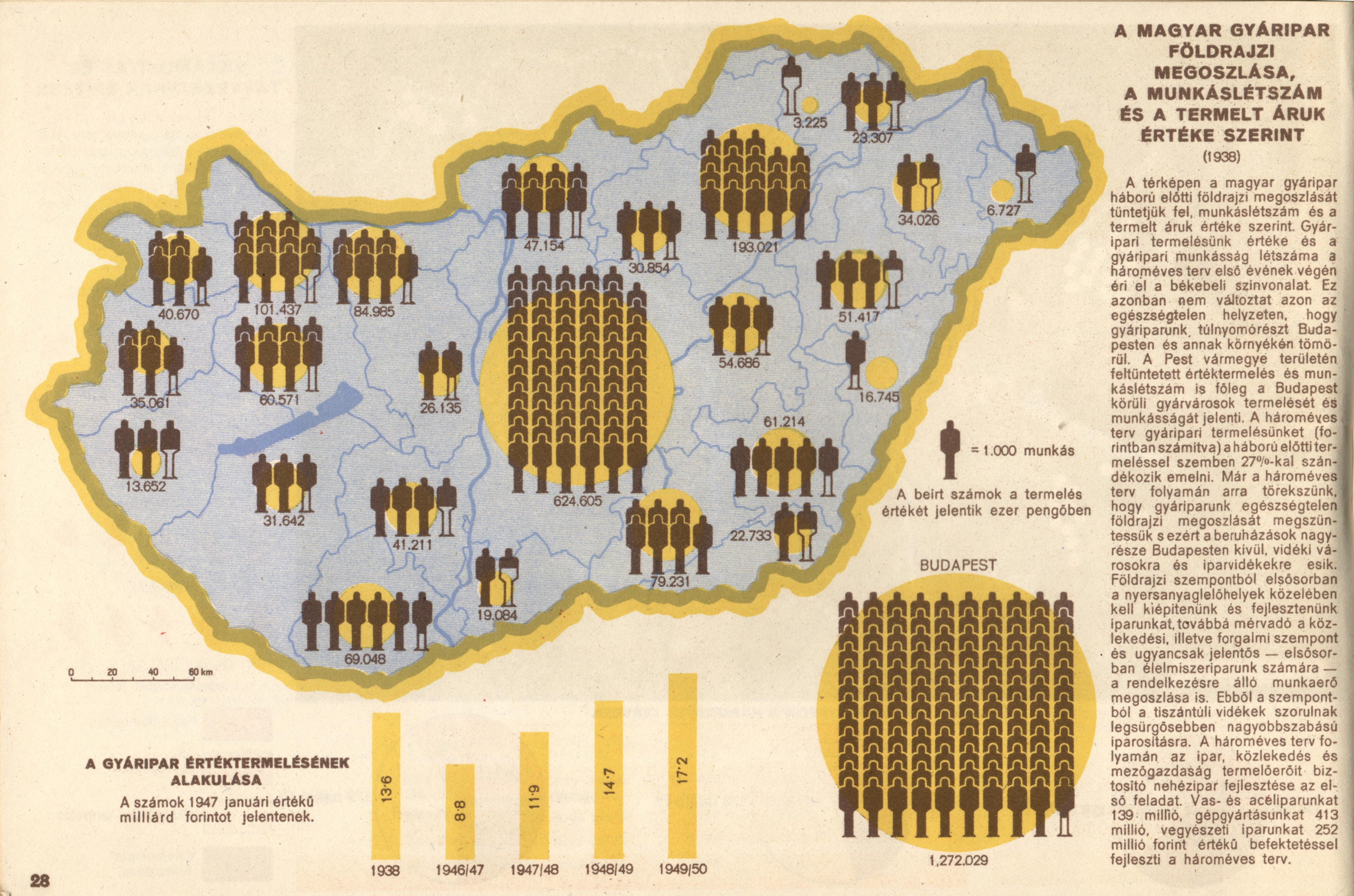
Geographical distribution of Hungarian manufacturing industry by the number of workers and value of goods produced (1938). In György Markos – Andor Berei: Magyarország gazdasága és a hároméves terv. (The Industry of Hungary and the Three Years Plan). Budapest: Szikra, 1948. p. 28. Image courtesy of Attila Bátorfy
Attila Bátorfy is a data visualization expert and media scholar based in Budapest. For years he has been sharing his discoveries of spectacular Hungarian data graphics. I got to catch up with him about some of his favorites in the interview below. An edited version of this went out in my newsletter a few weeks ago, but here are Attila’s unedited responses. ~ RJ Andrews
Tell me the story about how you first got into all of these historic graphics. What’s special about your background and vantage that led you to all of these wonders?
At first, I wanted to get good at graphing data, so I started buying a crazy amount of practical books, and I started reading papers, and watching tutorial videos. They always had specific references to old data graphics and more and more I asked the question, “Oh my god, how did they do that? Then, along with the practical manuals, the historical works on data visualization started to line up on the bookshelf, my wife throws me out of the house once she sees another new book, so I started to accumulate them at university.
In addition, I had an Eastern European pride, and I was annoyed that these books not only cited almost exclusively Western examples but also suggested that the representation of information was a typical Western phenomenon. This is understandable since no one was really doing local history or publishing them in English. Nor did I like the view of history that appeared in these works. This is probably why I started to look into Hungarian history, which obviously cannot be separated from global history.
That was five years ago, and since then I have spent untold hours in digital archives, libraries, and antiquarian bookshops. I share only the parts of the finds that I find interesting, exciting, or aesthetic, which may be barely one or two percent of the total output, while the remaining 98 percent is just as much part of the story.

No one has done this before in Hungary, so it’s a rewarding field, because you’re probably the first to find something cool, or you’re the first to recognize the data graphics quirk. Perhaps it has some sporting value if I can comment somewhere that it was not Harness who made the first flow map, but Imre Milecz in 1773, or that I can show that it was not England that started football visual analytics, but the Hungarian daily Nemzeti Sport from 1922 onwards.


Images from Nemzeti Sport (read more in Attila’s article “Three Sportviz Inventions By a Hungarian Newspaper“)
Then somebody will come along and find some earlier than that, and it’s fine. Fortunately, nowadays some archives or museums, or even some of my friends, will send it to me if they find something interesting. I also have a degree in art history, and I was a journalist for almost fifteen years, which helps me a lot in methodology and storytelling. I would add that I am less interested in the individual works, although they are spectacular and essential to historiography. I am much more interested in the social history of information graphics and the role they play in the history of humankind.
I am stunned by the enormous body of data graphics produced in Hungary, over many decades. Can you give me a rough understanding of how these came to be, related to Hungary’s history?
It is interesting that this is your impression, whereas I think that there are surprisingly few Hungarian data graphics, and even fewer that are worth mentioning. Moreover, it can be misleading, because there is a Hungarian guy who is churning them out, but there is no Czech, Austrian, Polish, Romanian, Japanese, or Egyptian researcher who is sharing the same quantity at the same speed. So we don’t really know how much we are talking about potentially. Maybe the Brazilians or the Swedes were the biggest data visualisers in history, but nobody is researching them. Three years ago, would you have thought we would be talking about Hungarian data graphics?
But to return to the point, if we see Michael Friendly’s statistical historiography on the graphic representation of data, we have to say that Hungary did not contribute to the golden age of the second half of the 19th century. Although the first known Hungarian data graphic dates from 1763, we have really few examples from the 19th century, and those from the 1880s onwards. There are several reasons for this. Firstly, there was little systematic data collection, partly due to the fact that there was no independent Hungarian statistical service within the Habsburg Empire until 1869. In addition, Hungarian statistics was still at the end of the 19th century an adherent of the German descriptive school of statistics, whereas in Europe mathematical/analytical statistics had been dominant for decades. Finally, it is not incidental that the great Hungarian theoretical statisticians of the 19th century, Sándor Konek, Elek Fényes and Károly Keleti, could not stand the graphic method. They considered it to be an inferior method for the intellect, which tended to mislead the mind, and therefore tried to dissuade statisticians and economists from using it. Keleti was only more permissive with the use of cartography, and this was not helped by the fact that the first international exhibition of data graphics was held at the 1876 Budapest Statistical Congress, which was attended by Georg von Mayr, William Farr, and Émile Levasseur.
It was not until the very end of the 19th century that the aversion to the graphical method abated, but the verdict remained that it was unworthy of the high mind, albeit a useful method for informing the uneducated and illiterate. After the turn of the century, however, graphic production increased, and from the 1920s onwards simpler graphs began to appear in some daily newspapers.
If we stick to the golden age concept, I think the golden age of Hungarian data graphics was between 1920 and 1945 – right in what Michael Friendly calls the dark age!


Three pages by Lajos Illyefalvi’s statistical albums of Budapest.
The absolute highlight of this period is Lajos Illyefalvi’s three statistical albums of Budapest. His contemporaries thought so too, they recognized its value and even realized that these expensive albums could function almost as a country, or city branding. The era ends with cartographer András Rónai’s less-known, but gorgeous Atlas of Central Europe in 1945. The communist takeover after the Second World War was a caesura. The quantity and quality of graphic production declined significantly, while factories, exhibitions, and TV newsreels were covered with ‘increasing graphs’, the simple and silly line or bar charts on productivity that the Communist Party had issued directives to produce. Only the end of the 1960s would bring some improvement, especially in cartography, where there was more than just the possibility of cheap and dumb propaganda.
Should we expect all countries to have as many unknown data graphics, or is Hungary special?
It is unlikely that Hungary was unique, the currents of the times did not stop at national borders. If local research were to get underway, we would have a lot of interesting and exciting data graphics to add to our knowledge. I note that until these studies are started, I don’t think we can talk about history. Charles Koestelnick and Miles Kimball write that the process that began with Howard Funkhouser is still only in the canonization phase, and I see more and more people recognizing that we still have a limited understanding of the history of information graphics.
How do these Hungarian data graphics relate to other Eastern European data graphics we also may not know as well as we should?
I can’t answer that because I know very little of the work of the region, but I’m probably not alone. I know of remarkable national statistical atlases from Lithuania, Finland, Latvia, the Czech Republic, Cuba, and Greece, there are many exciting Romanian statistical maps, and a few Polish examples, of which the methode polonaise is the best known. I can’t imagine what they have in their own archives waiting to be discovered!
Who is/are the dominant actor(s) responsible for motivating all of this work?
There are so many of you! Besides you, Michael Friendly, Jason Forrest, Alberto Cairo, Murray Dick, Sandra Rendgen, Howard Wainer, Manuel Lima, Paul Kahn and I could go on and on. You not only inspire me, but many of you support me in this research, however, these names also encourage me to argue with them. But let me also mention some names that may sound less familiar to us, but from whom we could learn a lot.
Art historians Horst Bredekamp, Ernst Gombrich, James Elkins, and of course one of the greatest minds of all time, Umberto Eco! And, of course, the list would not be complete without mentioning my former thesis supervisor, art historian Annamária Szőke, and my PhD supervisor, media theorist Ferenc Hammer.
Looking at these, I see some connections to Émile Cheyssons Albums de Statistique Graphique and Otto Neurath’s Isotypes. How do you relate these to Western European work we might be more familiar with?
Cheysson and the Albums, as well as the works of other French statisticians (Bertillon, Levasseur), were known to Hungarian statisticians of the time, but I see no connection in concept, graphic style, or diversity. The creativity and graphic splendour displayed in albums like Cheysson’s are absent not only from the few Hungarian works of the period but also from those thirty years later.
The work of the Neuraths and Isotype was almost completely unheard of in Hungary, with no trace of it being more widely known, apart from a few references in newspaper articles. In fact, surprisingly few Isotype-like works were produced in Hungary, most of them were by a single man, the Marxist geographer György Markos. Not once in his works or in his autobiography did he write down Neurath’s name or the word Isotype.


Graphics from György Markos’s A magyar ipar száz éve (One Hundred years of the Hungarian Industry). Budapest: Szikra. 1942. Image courtesy of Jason Forrest
If you had to pick just one, what’s your favorite Hungarian thematic map? What makes it great?—What do you love about it?


Ethnic and religious map of Pál Balogh & Kocsárd Proff, 1902, Image courtesy of Dániel Segyevy
The ethnic and religious map of Pál Balogh and Kocsárd Proff from 1902. Balogh, who was responsible for the concept, understood the distortion of the choropleth maps and tried to find a solution. This may be the first equal square tile map.
If I may say one more, it is the 3D column map of the population of Hungary published in the first Budapest album by Illyefalvi in 1933. They even drew the shadows of the columns!


A városok és községek népessége. = Bevölkerung der Städte und der Gemeinden by Lajos Illyefalvi, 1930 Image courtesy of David Rumsey Map Collection
If you had to pick just one, what’s your favorite Hungarian abstract statistical chart? What makes it great?—What do you love about it?
The graphics in the statistician Sándor Farkasfalvi’s Plant and production statistics for Budapest factories from 1930. Because of the use and abuse of polar diagrams, like pie, radar, star, and radial bar chart


I also really like this diagram of the Danube ice dams from 1865. Many of these were born in the 1860s, and this is perhaps the most beautiful of them. A very striking but simple depiction of where ice typically accumulates on the Danube at the city Szekszárd and in what quantities.

Dániel Sperlágh — Ice conditions, and water level of the Danube in 1859/60 in the Szekszárd-hegy k. k. river districts of Paks. D 257 1865 No 69 Hungarian National Archives (link)
If you had to pick just one, what’s your favorite Hungarian (pictorial?) diagram? What makes it great?—What do you love about it?
Could this be an infographic? If yes, then I would choose the Italian natural scientist and imperial general Luigi Ferdinando Marsigli’s fantastic graphic about the mining activities around the city of Selmecbánya, which was then in Hungary (now in Slovakia) from 1726.


Marsigli’s bird’s eye view – cross-section map of the Selmec mines. Luigi Ferdinando Marsigli: Mappa Metallographica In Danubius Pannonico-Mysicus. Observationibus geographicis, astronomicis, hydrographicis, historicis, physicis perslustratus Et in sex Tomos digestus ab Aloysio Ferd. Com. Marsili Socio Regiarum Societatum Parisiensis, Londinensis Monspeliensis. Image courtesy of Wikimedia Commons (link)
What does Hungarian data graphics do differently? Is there an overarching theme through some of the work that is distinctly Hungarian? Something that others do not do? Something that others could not do?
I don’t think there is a distinct Hungarian style, just as I don’t think there is an English, French, or American style. There are a lot of naïve and strange Hungarian data graphics, which are not the way they are because of the joy of experimentation, and creativity, but because they didn’t know the rules of data graphics at the time, or they didn’t know much about other works.
There is one subject that interested Hungarians more than any other when it came to representation: ethnicities. Many methodological innovations and experiments can be linked to Hungarian cartography and the fact that these maps were also used by Hungarian politics and science as evidence of Hungarian superiority. Probably the best-known Hungarian map of all time is the famous carte rouge, or red map, which showed the ethnic composition of Hungary according to the 1910 census using a special choropleth method. The Hungarian delegation took this map to the negotiations that ended the First World War at Trianon, in order to convince the winning powers that they were wrongly dismembering historical Hungary. This map, or a version of it, was burned into the Hungarian historical memory, hanging on the walls of schools and homes. Incidentally, the incredibly detailed room-sized base map on which the red map is based was rediscovered in 2014 by geographer Dániel Segyevy.

I know you are a working practitioner. How does studying these historic graphics help your craft today?
Studying old visualizations has made me realize how vulnerable and fragile software or code-written data graphics are. I have visualizations from six or seven years ago that no longer work, no copies exist, so they are lost forever. So I’ve started frantically documenting my work and, if possible, making a print version of it. I also started drawing by hand, and I ask my students, even if they are working with software, to make their work as if it were for print, forgetting that they have the possibility of interaction or animation. When we talk to students about the history of information graphics, we often find that the history of information graphics is also the history of human creativity and problem-solving.
Finally, where should we go to learn more?
I have already published a few short articles on the history of Hungarian information graphics on Nightingale. They can be accessed through my personal site. I’m also just about to finish my Ph.D., which is about the study of the history of information graphics and how Hungarian history fits into global history.
My website https://attilabatorfy.com/
Twitter https://twitter.com/attilabatorfy
Public Facebook page: https://www.facebook.com/batorfyattila

Attila Bátorfy is a master teacher of journalism and information graphics at the Department of Communication and Media Studies of Eötvös Loránd University Budapest. He is also the head of the first Hungarian visual journalism project ATLO (https://atlo.team/). He is currently working on his PhD-thesis about the early history of information graphics in Hungary.

Data storyteller RJ Andrews helps organizations solve information problems. His passion is studying the history of information graphics to discover design insights. See more at infowetrust.com. RJ’s published series, Information Graphic Visionaries, features three books, each celebrating the spectacular work of pioneering data visualization creators.
-
RJ Andrews

-
RJ Andrews

-
RJ Andrews

-
RJ Andrews


