The allure of data visualisation stems, in large part, from creativity.
Similar to other creative fields such as illustration, design, and architecture, every data visualisation practitioner approaches each project from their unique point of view. As we often witness during (and sometimes take part in) data visualisation challenges, the same dataset and the same creative brief can lead to a wide variety of distinct visualisations.
The creative process depends largely on the individual creator and on the topic of the project. Not having one “correct,” prescribed way of creating visualisations is what drives creativity in the first place.
But, one key first step that most data vis practitioners have in common is data exploration, and in some cases data analysis. Data visualisations are graphic representations of detailed research, data collation, analysis, and takeaways that the author wants to convey to the audience.
Is it possible for the visualisation to come before the analysis?
To answer that question, let’s go back to the late 1940s. After years of wartime rationing, the US economy was prospering: consumers were buying cars and houses filled with new appliances, sales of TV sets took off, the microwave oven was just invented and jazz and big band music dominated the radio waves.
On the heels of the discovery of atomic and subatomic structures, physicists in the late ‘40s were struggling to describe quantum interactions in a way that was consistent with Einstein’s special relativity. Even the basic interactions between these structures required a series of seemingly impossible calculations to describe them. Needless to say, the whole process was very labour-intensive, highly abstract, and definitely not something you could explain to your grandma during a family dinner. It took an out-of-the-box approach from one unconventional physicist to translate this mentally straining concept into a digestible one using an informational graphic.
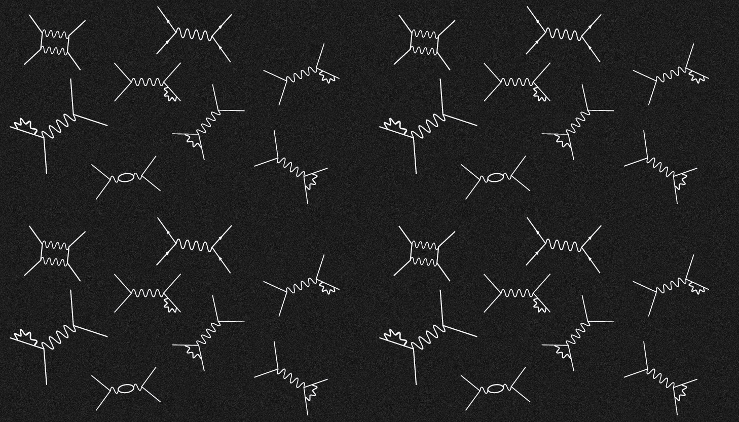
Richard Feynman, a theoretical physicist then in his early thirties, found the problem of quantum interactions too metaphysical. He wanted to make a conceptual switch from mathematically describing abstract quantum fields to describing particles we can actually perceive. So he started from scratch, drawing a sequence of lines and squiggles intersecting in “vertexes” that represented quantum interactions.
Each diagram component represented a specific particle or force interaction. The positioning of the lines on a page and the orientation of the little arrows indicated the time sequence of the process being described.

Despite having space and time components, the Feynman diagrams do not depict set trajectories. They are more flexible representations of processes, meaning “you can be quite sloppy about the shape and configuration of the lines and squiggles, as long as you get the connections right,” to cite F. Wilczek, awarded the 2004 Nobel Prize in physics.
The most fascinating element of Feynman’s approach is that each diagram component is associated with a specific part of an equation that can later be written down and solved (the painstaking part Feynman was trying to simplify in the first place). Feynman ended up developing a whole framework for visually describing quantum interactions known as Feynman diagrams.
By having mathematical expressions encoded in each diagram’s element, one could argue the Feynman diagrams exist at the intersection of graphic diagrams and data visualisation.
By having mathematical expressions encoded in each diagram’s element, one could argue the Feynman diagrams exist at the intersection of graphic diagrams and data visualisation. The majority of the population might look at them and only see squiggly-looking geometrical shapes but for some, they are much more. These funny-looking diagrams convey information about natural phenomena that can not be experienced by any of our physical senses. They demonstrate the conceptual switch from abstract to perceivable, and for some, they are a first step to writing down a quantum mechanical problem before delving into pages and pages of equations.
The introduction of this simple visual way to account for and quantify all the quantum interactions fueled the creation of today’s quantum electrodynamics and led to a 1965 Nobel Prize in Physics.

“Feynman diagrams remain a treasured asset in physics, because they often provide good approximations to reality. Plus, they’re easy (and fun) to work with. They help us bring our powers of visual imagination to bear on worlds we can’t actually see.” —F. Wilczek

Romana Popocovski
Romana Popocovski is a Business Intelligence Analystwho loves finding different ways of communicating data and information. She has experience working in academic and business settings and is passionate about building a culture of data literacy in her workplace.


