
We are all respected experts here, and we understand the specifics of dataviz; we criticize others, point out mistakes in their projects, and search for areas where they may improve…
I like taking a critical eye to data visualizations in articles and educational broadcasts: When I examine someone else’s project, I evaluate its strengths, mistakes, and suggest improvements. I call it ‘roasting.’
But once I had a situation where my own intern showed me my own flaws. I can’t say that I enjoyed it, but I believe it was more helpful than a dozen good reviews. It was difficult to accept criticism, but I believe I did so with grace. As a reflection on my sufferings, I will share this story with you!
Although some of these mistakes were minor, the devil is in the details! And now each of these little mistakes hurts my eyes! Ouch!
So, come suffer with me!
Best practice for the late 2010s
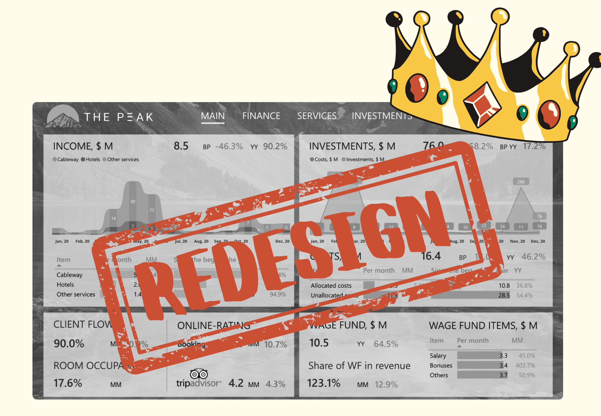
Once, in 2019, we were working on a ski resort project, and the goal was to “wow” investors with an advanced interactive dashboard and everything was going according to plan. The investors, however, came from a large fund, and they were big fans and frequent users of dashboards. Instead of PnL spreadsheets, they required an online dashboard.
We accepted the challenge, and made a set of four dashboards, one of which is below:

What do you think the client said? He and his stakeholders were happy and applauded us.
Then we anonymized the data, swapped out complex tables for simplified visuals, and started showing this to all our clients as a best practice. All of them applauded as well, noting that it is clear that the designer was at work here instead of just having analysts create dull gray bar charts on a white background.
***
Time passed and then one day last year my intern saw this demo-dashboard, and asked, “Who did this?”
She stumbled after I told her I had done it.
Once she started pointing out all the mistakes, I was silently screaming inside. I wanted to tell her, “Who are you, and how could you criticize me? I’ve been involved in data visualization since you were a child!” …But didn’t! And, trembling, I watched the editing process.
Red marker
The main page began to shine with red lines and notes, which this brave beginner specialist expertly used. What were those notes?
An outdated design.
The scenery in the background is seen through the layouts, and it simply looks really outdated. Mountains? Seriously, boss? Well, at least not a portrait of a beloved cat!
Uppercase titles.
Nowadays, it is simply considered impolite. Capital letters should only be used for abbreviations, but definitely not in all headings. The dashboard should not “yell” at anyone, even if at that moment I wanted to yell out the window!
Background color for data labels.
It definitely did not help to perceive the data, but only added visual noise. Of course, Tufte’s image immediately popped into my head—and his data-ink ratio!.. It’s nice to mention the masters in lectures, but it’s embarrassing to ignore their advice.
However, that was just the start of my suffering. I’ll try to tell you more about other mistakes because my intern not only criticized but also suggested a new version of the dashboard, changing the elements that you will see below.
Too many millions!
If something can be removed from the dashboard without losing information, it should be removed. In this example, the metrics are duplicated in both the chart title and the legend. Ah, those little things…

Even with a basic table, I made a mistake!
Three important words: pale column headings!
The rule of information levels applies not only to the dashboard as a whole but also to each visual element. Before seeing the bars themselves, the user must understand what these bars are about. And the column headings need to be clear and visible.
I regularly applied the hierarchy rule to font sizes and to dashboard elements, but somehow didn’t think to apply it to font color saturation.

Refuse the non-standard chart?! Yes!
The ribbon chart for “Income” had no data labels above the “months,” and this alone made the chart less informative. What was happening in the spring and autumn? Did the hotel rooms remain totally empty in April and November, or did they still generate a little income?
Each month was marked with a column, so we didn’t really need a ribbon chart in this case. Our intern decided to use a standard stacked bar chart here. And I was forced to agree that such an unusual and cute ribbon chart is far less effective than the good old bar chart.

Let’s put all the pieces together! Here’s what my dashboard looked like before and after a redesign by my gifted intern! It began to look accurate and understandable. And information was seen much more clearly through my eyes, which were washed with humiliation tears.

Well, after we have redesigned the main page, as Frank Sinatra sang:
“I prayed that she would finish, but she just kept right on” …and she opened the next page.
However, as I watched her critique the following pages, I felt more calm, and my soul was floating along the river of acceptance in the direction of self-improvement.
This is how the “Services” page was redesigned.

Don’t be afraid to make mistakes and update your frameworks
That was definitely a “roasting.”
And I’m sure that more ideas for improvement will come up if I take another look at this dashboard later.
I shared this case with Nightingale editor Jason Forrest, and he said that it is generally a good idea to reevaluate your approaches every two years and update the working framework. For me, it was the first painful experience, but I feel it will not be the last time I will look back and be ashamed of my work.
To experience situations like this, I remember a quote from Nobel laureate Frank Wilczek: “If you don’t make mistakes, you’re not working on hard enough problems. And that’s a mistake.”
I wish you all to make mistakes and solve difficult tasks! All together, by taking on the difficult, failing, gritting our teeth, getting negative feedback, being upset, losing in arguments, and trying again—we are developing the industry!

Alex Kolokolov
Alex Kolokolov has been working in the business intelligence industry for the last 15 years. His passion is dashboard design and development. He is the founder of Data2Speak Inc., an agency that provides BI services and trainings. Alex is also the author of three books: Dashboards for Executives (2019), Make your Data Speak (2023) and Data Visualization with Microsoft Power BI (2024). He organized the international dataviz conference and the “Make Your Data Speak“ award.
- Alex Kolokolov

- Alex Kolokolov

- Alex Kolokolov

- Alex Kolokolov


