
Has this ever happened to you: you’ve just read one of those articles outlining the perfect design process: understanding your audience, defining an idea or a problem to solve, conducting research and data exploration, sketching, then off you go to the development stage, and one or two iterations later you have a shining, perfect final dataviz!?
When you compare the process in that article to your own process, yours seems messy, inconclusive, and unclean. You decide to change this pronto and affirm that–starting on your next project–you’ll follow the orthodox path of impeccable, by-the-book design workflow!
Sure.
When something doesn’t work like you wish, one way to change it is to scrap it and take a different approach, often sourcing something else (e.g., a book, a blogpost, a colleague, etc.), but habits tend to stick and we’re not always aware of how our mind functions. When creating a data visualisation – as with any other activity – our mind often defaults to patterns under the surface of our conscious workflow. That’s how you inadvertently end up choosing the same colour palette, or no matter how hard you try your visualisations miss the mark. One day you create a nice, neat drawing of your dataviz, and the next day you discover that with the dataset you have, the final result would resemble a poor copy of a Pollock painting rather than anything related to data: visually interesting, but definitely not what you were looking for.
At this point you may think it’s a technical issue: maybe you should prep your data another way, or use another software: one that lets you create exactly that kind of chart you sketched. You go back to square one–the prep phase–you change your data model, try to viz it again, rephrase the initial question you’re trying to answer, take another online inspiration tour, draw another sketch, prep your data again, then back to vizzing. Eventually, you produce something, maybe even something good, but you can’t recreate the path you followed nor justify the decisions you made along the way. And above all, you’re exhausted and frustrated. You abandon your “process” and you muddle through. In addition to the personal frustration, if you’re working on a client project with a tight timeline, this can be a big problem.
You can also change a faulty process by debugging it from the inside, analysing in detail what you do, identifying what doesn’t work, and then trying to change that piece of the gears. One way to gain efficiency and satisfaction is to analyse your own process in order to identify exactly where your weak spots are. This way you can identify the one place where your mechanism jams.
When I examined my workflow, I noticed that my problem is often in the mockup. Sketching and mockups are based on research: about the audience, the topic and the data at hand. If the topic or the audience have not been properly researched, the dataviz will miss the mark with its target users.
But if a visualisation doesn’t look like the mockup, it’s probably because the specific dataset’s characteristics have not been fully considered. The shape of the viz doesn’t fit the shape of the data.
Through trial and error I discovered that dedicating an appropriate amount of time to data exploration before sketching spares me a few trips through the steps of my design process.
Here are a few things to watch for before sketching, based on my personal experience.
1. Too many data points
How many data points do you have? How many do you want to show on the visualisation? Space always has limits, be it on a page, a poster, or a screen. If you want to fit all your data in one visual, then you’ll probably have to either aggregate it or, if you choose to use a very granular display, you’ll need to assign a very small space to each data point. Another option would be to split your data in several charts, if that is consistent with the intended goals of the project.
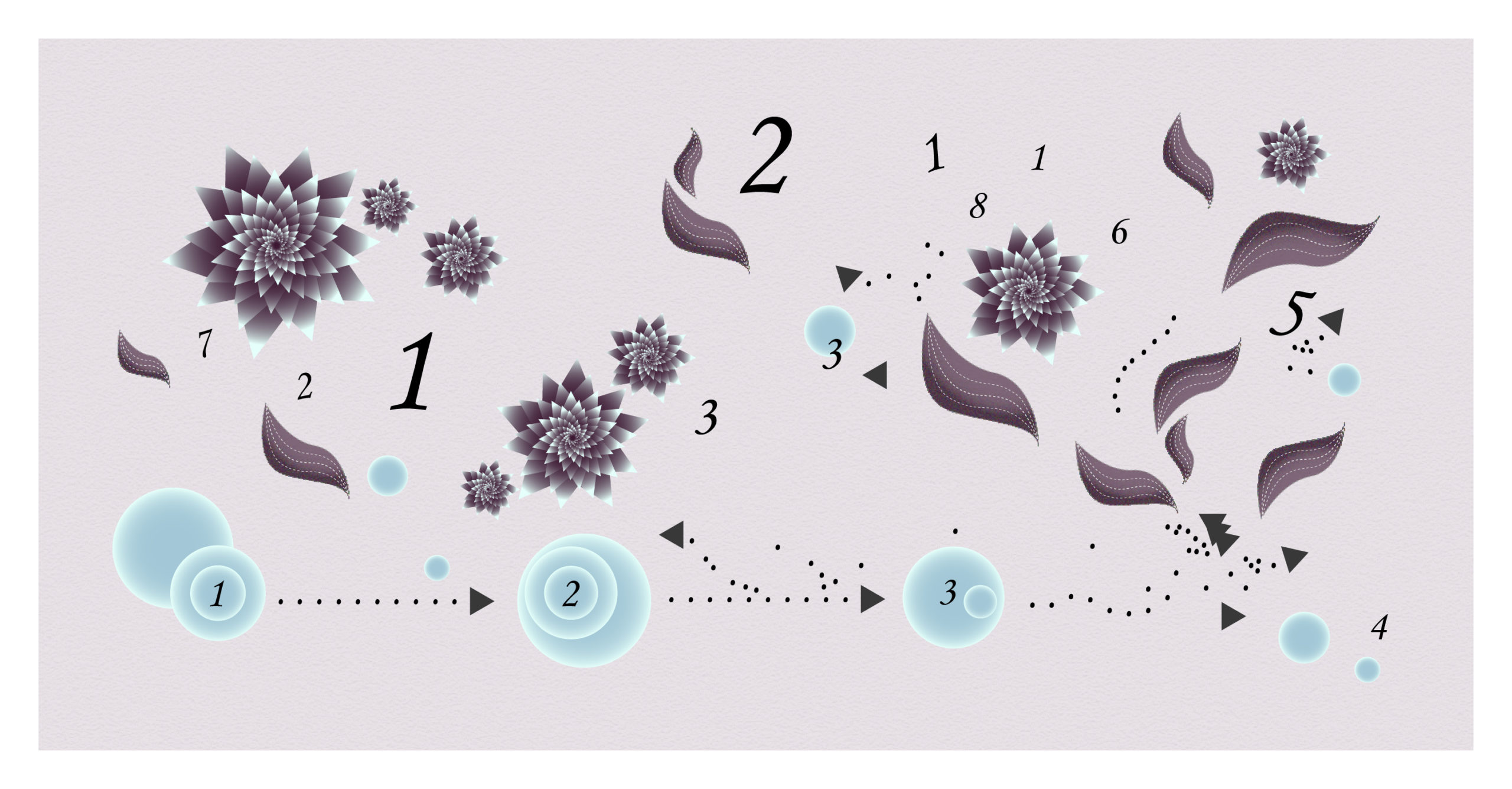
For this visualisation on languages at risk of extinction, my first sketch was very different from what I eventually ended up creating. I had designed a detailed shape of a flower in Illustrator. I intended to use it to show each one of the languages on a single radial chart divided into as many sections as continents. Depending on the degree of endangerment of the language, the flower would have a different colour shade. After a few tests, I soon realised there were too many languages for a single chart and for such a detailed shape.
I drew another sketch splitting that single chart into six: one for each continent – the final result should look less crowded.
I also abandoned the flower shape, and opted for a new shape reminiscent of an autumn leaf. It still had some details in it, but I was pretty sure it should work this time. I moved ahead to the next step without looking back.
Data preparation took me a while. When my data was finally prepped, I went ahead to visualise it and, oh my, what a disappointment to see that my pretty leaf shape was completely indistinguishable in the middle of that noisy crowd!
There were 2,469 languages on my viz: 2,469 tiny leaves with their colours overlapping, their minuscule details confusing the eyes.
I decided to give up using the leaf shape – not without a little sadness. I opted for simple dots instead – they are still small on the visual but can be identified as separate entities without visual confusion.

Afterwards, going back to my project notes, I noticed I had dedicated only 20 minutes to exploring the data. No wonder I underestimated the quantity of rows in my dataset! It took me two rounds of trial-and-error (and a fair amount of frustration) to fully grasp the volume I was dealing with.
Besides, if you’re working on a dynamic layout, depending on the technology, very granular views with many data points may take too much time to load, tiring and losing your users along the way. Make sure to test this before going too far in development.
2. Sparse data
When exploring a dataset, one of the first things I like to do is check how much data it contains. Simply counting the number of rows and columns is not enough, you have to look for null values. If a particular indicator has too many missing values, you’ll probably be wary of using some aggregate displays like averages and sums, or charts which could convey a misrepresentation of data.
Finally, if the volume of missing data is too big, you can lose credibility with your target audience.
3. Distribution and outliers
Once you’ve made sure you have enough data to visualise, one thing that is going to inform your chart choice is the distribution of the variables.
To get a sense of distribution, you can check the average and median values, as well as the maximum and the minimum. You can quickly try out a graph showing distribution: a box plot, a dot plot, a scatter plot, etc.
Distribution analysis allows you to spot outliers and big gaps and clusters in data values.
The problem with outliers is that, in a visualisation, they tend to attract all the attention and hide the small differences between the other values.
Imagine you’re drawing a sketch with a bar chart. You think you’re not taking too much risk with such an old friend as the bar chart, but if there’s an outlier you didn’t spot, all the other bars may look flattened and the differences amongst them unreadable.

If you’re working on an interactive device, you may consider the option of adding a button for end users to exclude outliers in order to see the rest in more detail if they wish to. But if your dataviz is supposed to be static, you should carefully consider your chart choice.
4. Flat data
In an opposite scenario, a given indicator may present low variability.
It could be something inherent to the indicator, and in some cases maybe there is no value in showing it. If it’s relevant to visualise it, the challenge in the sketch is to choose a chart able to make it interesting and readable.

In this visualisation about the sea level rise predictions in the Pacific Islands Region, I faced this type of situation. The predictions for each island nation are all between 61 and 65 cm of sea rise, a variability of only four points.
In my visualisation, each line around an island nation represents one centimetre of sea level rise. First I tried to draw all the lines for each country, but soon I realised the result lacked readability. There were too many lines and the small differences between one country and another were imperceptible. That’s why I decided to represent only centimetres above 60, using that as a baseline for all countries.
To fully discard the idea of showing all the lines I tested the visual result in Illustrator, but at that stage it was already pretty clear to me where I was heading because I had explored the data beforehand – this project came long after the one on endangered languages, so I had learnt a bit more from experience along the way!
5. Long text
Data often means numbers, but it can also mean words. You may see adding text as something to deal with only at the final stages of development. In sketches, it’s quite common to leave a place for text without writing the actual words, just scribbling something resembling text for titles, subtitles, introductions, and labels. In mockups and prototypes, lorem ipsum is used a lot.
This can backfire in some situations, as texts tend to take up a lot of space. Once I was working on a personal dataviz project about Himalayan peaks. I was towards the end of my work when I added the labels with the mountains’ names and locations. It turns out Himalayan peaks’ names are pretty long! I couldn’t find a way to make them fit into the design I had chosen and got stuck. (Sadly, I ended up setting that viz aside, waiting for inspiration – and it’s still there.) But the names of the mountains were long already in the dataset. Had I been more attentive in initial data exploration, I could have expected that outcome before reaching the final stages.
Observation and debugging
Frameworks are great tools to guide us through our practice, but they are not supposed to replace the reality of practice, which is different for every dataviz practitioner depending on their experience, skills, preferences, and personality. Anyone giving the impression that in their work they follow an absolutely smooth design process would be misleading.
This doesn’t mean you’re doomed to a vicious circle of unpredictable ups and downs of uncontrolled inspiration. Techniques – even creative techniques – can be refined through practice and observation.
After noticing these weak spots in my sketches and mockups, I learnt from them and now I’m less likely to make such misjudgements in the early steps of my workflow.The tips in this article are specific to me as a dataviz practitioner and my way of doing things. You may have your own habits and weaknesses.
In my case, these unconscious practices were sabotaging my design steps, making me feel like I had no control over my creative process. In order to change this, I had to fix my data design process from the inside out (and that’s a never-ending work in progress). No off-the-peg design thinking framework could solve that for me, for the simple reason that those are made to outline the general steps in iterating on a project.
Data visualisation is an iterative process. Design process diagrams may give the impression of a linear methodology, but that’s not how to read them. To some extent, it’s absolutely normal to go back and forth through the different steps. Some options can only be validated or discarded through testing, sometimes you have to cope with softwares or skills limitations, or you need more time to let your ideas sink in before making a design choice. It’s important to learn to let go of the mirage of a linear path and accept some messiness.
So, how do you track down the small bugs in your own design process ?
For me, something that helped was keeping track of what I was doing: design choices, steps in data prep and dataviz, tests and conclusions, and the time spent on each task. My project notes are always a bit messy and incomplete, but for now they do the job. At the end of a project I take some time to write down the main lessons learned, discoveries and questions. Once I have this log I can go back to it whenever I want and use it to make decisions, for that project or for another one.
My dataviz design process is similar to giving birth. Childbirth is painful, but once the baby arrives, as if by magic, the pain seems to disappear from memory. The same is true of dataviz, once the product of my work is out there, I can’t remember exactly the steps I took to create it anymore. That’s why I keep notes. I reference my notes, look for the bugs in my workflow, and gradually shape my own design process, blending the liberty to try, fail, and change direction into the solid structure of a design framework.

Silvia Romanelli is an Italian data visualization designer based in France.
Previously, she used to work in journalism and in digital communication in the non-profit sector. She's interested in datajournalism, information design in general, UX/UI, and the use of dataviz for social good.
- Silvia Romanelli

- Silvia Romanelli

- Silvia Romanelli

- Silvia Romanelli


