
You have probably already seen many different articles on bar and pie charts. It’s enough to suggest that they are the only chart options available for data analysis and reporting. Experienced data visualizers know that there are many other types of visualizations and that your choice depends on your goals, your audience, and your data structure. In this article, I want to show you one of the less common, but still useful charts. I present to you the Marimekko chart, which is especially useful if you are dealing with the overall assessment of categories by their common members, e.g., sales volumes of different product types, held constant, over different time periods (e.g., months or years).

What is the Marimekko chart?
Marimekko charts, also known as tiled charts or stacked charts, are used to visualize qualitative data on two or more variables. They function like two-sided 100 percent stacked bar charts, where all bars are the same length on the coordinate axes and are divided into segments.
Only in the Marimekko diagram are both axes a variable with a scale, whereby both the length and the height of each segment are determined. The column width is proportional to the total sum of the column values. The height of individual segments is a percentage of the total value of the respective column. In this way, the relationship between categories and their subcategories can be tracked across two variables.
The main disadvantage of Marimekko charts is that they are quite difficult to read, especially when there are a large number of segments. In addition, it is difficult to compare each segment from this type of diagram since they are not located on the same line relative to each other.
Accordingly, Marimekko charts are best suited for a general overview of the data. With a few characteristics – but not too many – you can see the percentage of the total composition compared with the total volume at the same time. That sounds like a versatile capability, doesn’t it?
As an example let’s take this dataset about car sales from Microsoft Power BI. It contains information about different categories such as domestic/import cars and trucks, car brands, and the amount of sales. Some brands are common in different categories and with the use of Marimekko chart you can see not only the exact number of cars sold, but you can also compare what percentage of sales in the category a particular brand gets. Usually such an analysis would require several charts, but the Marimekko chart combines everything and immediately shows us the necessary insights. Here is a video example of the analysis of the dataset and the visual representation.
How do you create a Marimekko chart?
This chart can be created in Excel, but since I mainly write in JavaScript, in this tutorial I will show you how to create a Marimekko web pivot chart quickly and simply with just two tools. I will use the two libraries with which I’m most familiar for data visualization: WebDataRocks and Fusioncharts. Before you begin the tutorial, you will need these tools.
WebDataRocks is a pivot table web component with smooth integration and connectors to many cool charting libraries. I want to aggregate my data and to make my chart interactive. Changing anything on the grid will lead to the corresponding changes on my chart. Using the table as a connector is my small trick to kill two birds with one stone. I can manage my data and get a comfy UI for the chart.
Fusioncharts is a large library of interactive and delightful charts for web and mobile applications. It has 300+ charts, gauges, and maps and is easy to implement. I often choose it for my visualizations as it’s free for non-commercial use. And good for us, it also has Marimekko in its list of available charts.
In this tutorial, I’m exploring the cost of manufacturing products of certain common categories across several countries to determine the country favorable for locating factories. The type of chart I have chosen will allow me to evaluate each specific value immediately, both in terms of other products in the same country and in comparison with the same products in other countries.
As a result, I produced the following dashboard with a pivot table and a pivot chart, both in a dark theme:

Now, let’s take a step-by-step look at what we need for such a mini-interactive report.
Connect the libraries to the project
Here are all the scripts you need to add to your page to make everything work:
<!-- WebDataRocks Dark Theme -->
<link href="https://cdn.webdatarocks.com/latest/theme/dark/webdatarocks.min.css" rel="stylesheet"/>
<!-- WebDataRocks Scripts -->
<script src="https://cdn.webdatarocks.com/latest/webdatarocks.toolbar.min.js"></script>
<script src="https://cdn.webdatarocks.com/latest/webdatarocks.js"></script>
<!-- WebDataRocks Connector for FusionCharts -->
<script src="https://cdn.webdatarocks.com/_codepen/webdatarocks.fusioncharts.js"></script>
<!-- FusionCharts Script -->
<script src="https://static.fusioncharts.com/code/latest/fusioncharts.js"></script>
<!-- FusionCharts Theme -->
<script src="https://static.fusioncharts.com/code/latest/themes/fusioncharts.theme.fusion.js"></script>
These scripts make it possible to add both components, connect them, and apply beautiful themes to match each other. You can change the background color by adding the style:
<style>
body{
 background-color: #212121;
}
</style>
To immediately see the results of your coding add the components to the body:
<div id="wdr-component" ></div>
<div id="fusionchartContainer" style="margin-top:1px;" ></div>
Now you are ready to start visualizing!
Configure the pivot grid
Next, you need to embed the pivot grid, connect the report to your data source, and define the slice — designate what to show in columns and rows. Also, I decided to exclude category cars from the members because they had the biggest values and made my chart a little bit unrepresentative. The price of cars is clearly several times higher than the prices of other categories, and this is displayed on the chart as an incomparably large segment of this category. Therefore, it is better to ignore cars in this sample in order to be able to delve into the details of the remaining categories.
So this is how the final embedding code should look like:
var pivot = new WebDataRocks({
container: "#wdr-component",
toolbar: true,
height: 380,
width: "100%",
report: {
dataSource: {
"dataSourceType": "csv",
"filename": "https://cdn.webdatarocks.com/data/data.csv" //your own file with JSON or CSV data
},
slice: {
rows: [
{ uniqueName: "Country" }
],
columns: [
{ uniqueName: "Category",
"filter": {
"members": [
"Category.Cars"
],
"negation": true
}
},
{ uniqueName: "Measures" }
],
measures: [
{ uniqueName: "Price" }
]
}
},
reportcomplete: function() {
pivot.off("reportcomplete");
createFusionChart();
}
});
I use the reportcomplete event to understand that the pivot has aggregated our raw data and is ready to pass it to the Fusioncharts.
Create the chart
When the pivot grid finishes its work, it will call the createFusionChart() function that you will implement next. The function will get data from the table and draw a chart based on it.
function createFusionChart() {
var chart = new FusionCharts({
"type": "marimekko",
"renderAt": "fusionchartContainer",
"width": "100%",
"height": 400
});
pivot.fusioncharts.getData({
type: chart.chartType()
}, function(data) {
chart.setJSONData(data);
chart.setChartAttribute("bgColor", "#212121");
chart.setChartAttribute("theme", "fusion"); // apply the FusionCharts theme
chart.render();
}, function(data) {
chart.setJSONData(data);
chart.setChartAttribute("bgColor", "#212121");
chart.setChartAttribute("theme", "fusion"); // apply the FusionCharts theme
});
}
Thanks to the special WedDataRocks connector, you don’t need to spend a lot of time trying to make this pair work together. It can be managed just in a few lines of code.
And that’s everything. The Marimekko chart is ready to be analyzed!
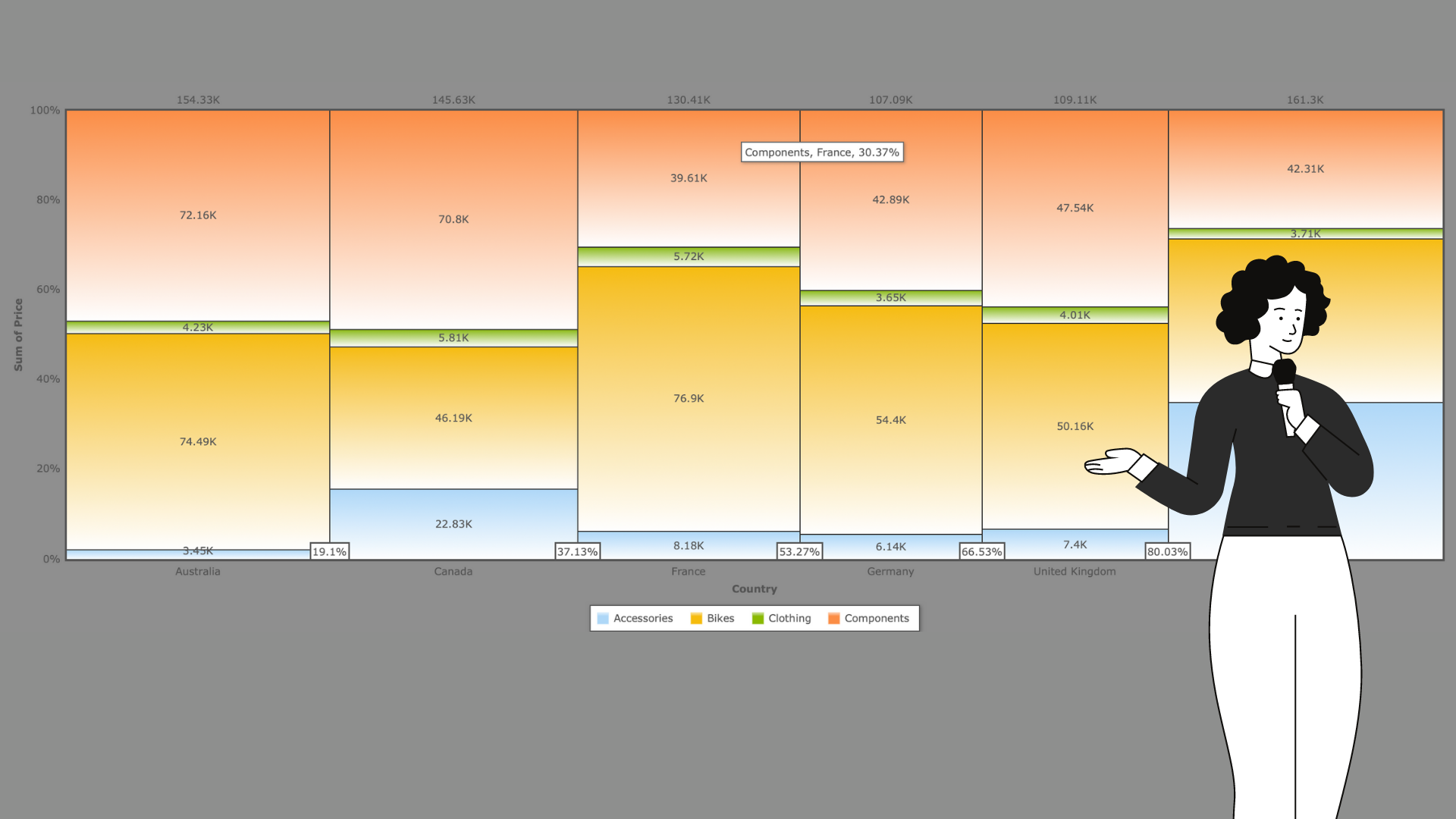
In the chart, I display the cost of producing products of certain categories in several countries and the percentage of the total cost of each category in the country. At this stage of the analysis, the main drawback of the Marimekko chart can be easily detected – it focuses on percentages and shows the ratio between groups, and not their actual difference in numbers. Therefore, if you want to compare specific values, this is not a suitable option. However, my goal was a visual overview of shares to compare what part of the market is occupied by the production of a particular category. Therefore, I can quickly and easily draw the conclusions I need from this type of visualization. The first thing worth noting is that in the overall market, the largest part is occupied by the United States, and the smallest by Germany. (Please note that the data was specifically generated to show the features of the chart and does not carry real information, and this analysis should not be taken as a true representation of the market condition.)
I can also immediately identify the clear leaders in the production of each category: for bicycles and clothing it is France, for components it is Canada, and the United States is the most active producer of accessories. In addition to the above conclusions, you can also name the category that each country focuses on, and also note that the United States most evenly distributes resources for the manufacture of bicycles, components, and accessories.
See the Pen Untitled by WebDataRocks (@webdatarocks) on CodePen.
On the toolbar, you can find the Field List and change the slice. The new configurations will immediately be displayed on the chart.
Above the columns, you can see the total value for this category. Each number at the base of the columns shows the percentage of all categories on its left to the total value. That is, to determine the value for a particular column, it is enough to subtract from the value near all the previous values (on the left).
Also, when you hover over a segment, it will be highlighted and show the axes passing through it, and a tooltip will appear with the value of the particular segment.
I hope this tutorial also took you just a couple of minutes to follow, and everything worked out. And, I hope it gave you some ideas for how to incorporate Marimekko charts into your visualization practice. If you still have any questions, I will be happy to answer them! You can also see a live example of my Marimekko chart dashboard on CodePen.

Yuliia Nikitina is a young and inspired computer science student at the National University of Kyiv Mohyla Academy. She is passionate about data analytics and data visualization and loves to write and share her ideas with the world.
- Yuliia Nikitina


