
This is the first in a series of articles that illustrate how basic design principles can improve information display. The next installment will apply some of these same principles to a visualization dashboard.
“How do you use whitespace?”
This is one of the most frequent questions that I get as a designer, especially from people who need to create information-dense displays like a dashboard or interactive display. Whitespace is the blank area between items on the page, and it is very important in helping information feel clear, organized, and accessible.
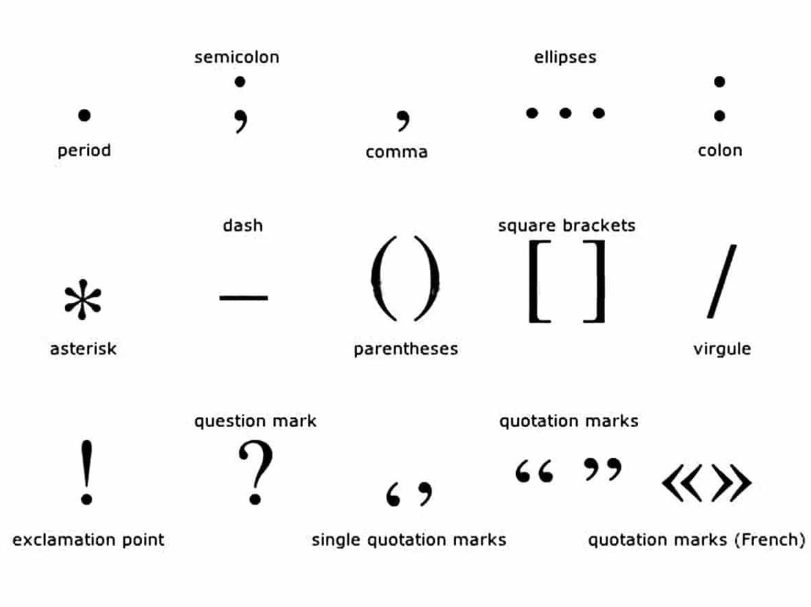
Whitespace is the punctuation between visual elements. In the same way that a pause between notes is sometimes most important part of a piece of music — allowing the listener to really hear, absorb, and respond to the notes — the space between visual elements can set the tone for how a user feels about an information display.Used well, white space gives readers the opportunity to pause and take a breath. It can help the information feel a lot less overwhelming.
As a tool, whitespace can create:
- Clarity
- Sequence
- Structure/hierarchy
- Relationships between elements
- Room to breathe
Let’s take the following restaurant menu as an example:

There are lots of things that make this menu feel crowded and unclear. Making just a few adjustments to the spacing and alignment can help things look a lot more organized.

Let’s look a bit closer to understand what’s going on.
The original menu is divided up into six sections that are so close together that they almost overlap. The uneven shapes interlock like puzzle pieces on the page.

Each section has a heading centered in the column. These establish a vertical flow through the document.

There are also a lot of other things going on.

- The indented text creates wobbly margins. This makes it hard to separate two columns, especially when they are so close to each other, and leaves oddly-shaped white space in between.
- The bold text helps to separate the menu item name from its description and connects it to the price, but the way the prices are positioned makes it hard to tell which column and menu item they belong to.
- The individual menu items don’t feel very separate, due to a combination of items 1 and 2 and narrow spacing between lines. As a result, it’s hard to follow the zigzag reading pattern and actually understand the information.
- The center-justified text creates a waterfall of information, forcing you to start in the center of the column and read from left to right. This feels unnatural, and results in a weaker connection between heading, subheading and menu items. Once you’ve gotten through the waterfall, you then have to zigzag up and down two separate columns (and back and forth across each individual item) to scan the list and find the things you want. With all of that running around, it’s no wonder that it feels exhausting to read!
The updated version makes the following changes:
- Headings justify left rather than center to create common anchor points.
- Subheads justify left to match the heading.
- Increase space before paragraph to separate menu items.
- Remove hanging indent to make a solid, left-justified column.
- Decrease font size by 1 pt.
- Increase line spacing to make it easier to see the shape of the words.
- Move section headers further apart to give them room to breathe.
Now, let’s look at how these changes affect the page.

Headers, subheads, and menu items are all aligned, creating a hierarchy of nested boxes that can be easily read in order. Once you know how the order works, you can skip the headings altogether and just get right into the list of items instead.

More space between the individual menu items makes it easier to tell what information goes together, and the smaller text with larger line spacing feels less crowded and (counter-intuitively) more legible.
The uniform left alignment makes the columns feel more continuous, giving them a more natural reading order, and the section headers better match the document flow. This creates an informal information grid that helps users to scan the information quickly and identify the information that they need. Adding more padding between columns and sections also helps to separate the information and makes it easier to see the document structure at a glance.
And again, here’s the final result:
I didn’t change any design elements here besides the whitespace. Even a few subtle tweaks make a big improvement in how the menu reads. In the same way that editing can clean up a run-on sentence, proper visual punctuation can help your documents to be clearer, cleaner, and more pleasant to read.
Stay tuned for the next installment in this series, where we will apply these same principles to information dashboard design.

Erica Gunn is a data visualization designer at one of the largest clinical trial data companies in the world. She creates information ecosystems that help clients to understand their data better and to access it in more intuitive and useful ways. She received her MFA in information design from Northeastern University in 2017. In a previous life, Erica was a research scientist and college chemistry professor. You can connect with her on Twitter @EricaGunn.
Thanks to Raeedah Wahid for editing.
Originally published at http://ericagunn.com on February 1, 2020.

Erica Gunn is a data visualization designer at one of the largest clinical trial data companies in the world. She creates information ecosystems that help clients to understand their data better and to access it in more intuitive and useful ways. She received her MFA in information design from Northeastern University in 2017. In a previous life, Erica was a research scientist and college chemistry professor. You can connect with her on Twitter @EricaGunn.
- Erica Gunn

- Erica Gunn

- Erica Gunn

- Erica Gunn


