
This is the third in a series of articles that illustrate how basic design principles can improve information display. Previous articles focused on whitespace and establishing page hierarchy, and the next will discuss different considerations for choosing between chart types. Here, we’ll get into the details of how to optimize a chart display.
“Good information design works like a tour guide, telling the user what matters most and where to go from here.”
Every design system is the result of competition between different constraints. You may need to adhere to specific space constraints or charting libraries, support a particular kind of information, or satisfy a strong brand or aesthetic. A good design solution balances these competing influences to support a specific user task. For a chart, the primary task is analytical: a user must be able to read and understand the data. For this reason, data visualization design prioritizes quantitative accuracy and emphasizes clarity and legibility over other considerations. Let’s start with a typical default chart, and see how information design principles can make it better.

1. Data is legible.
In order for a user to complete an analytical task, they must first be able to read and understand the data. This requires an appropriate use of scales and labels, and a clean and simple presentation that does not distort the data or create undue emphasis.
Information is clearly identified.
In order to understand a chart, a user must be able to easily identify the source of the information and what it means. Labels, legends and other indicators are critical to helping the user establish a sense of context for the information displayed.

- All chart scales and axes should be clearly labeled, so that the user knows what they represent. At a minimum, axes must display a title and identify max and min values. For a bar chart, the y-axis should start at zero.
- The user should be able to easily read (or estimate) the data values.
- The chart legend defines what different colors mean and what data the chart represents.
- Ideally, labels should be shown as close to the individual data point as possible, to reduce the mental load caused by needing to repeatedly look up information on the chart axes.
The presentation is as simple as possible, but not simpler.
Charts are information-dense displays that can be overwhelming for a user to process. A clear and uncluttered display helps keep the user focused on the task at hand and allows the real information content—the data—stand out. Be careful not to oversimplify, though, because that reduces the value of the chart. Thinking about the chart in terms of what a user needs to accomplish will help you to get the balance right.

- All chart elements should have a purpose: remove any information that does not actively support the user task.
- Default gridlines, background colors, tick labels and other “chart junk” should not be used, unless they serve a useful purpose. This keeps the chart display clean and uncluttered and puts the focus where it belongs: on the data.
- Removing all but the max and min axis labels would make it a lot harder to guess whether the fourth bar is closer to 40 or 50 units tall. Intermediate labels help divide an axis into manageable chunks, but too many make the chart feel cluttered. There should be enough labels to support the user task, and no more.
- Removing the extra labels also creates space to use a larger type size, resulting in numbers you can actually see (see the visual hierarchy chart version below).
- Using numbers that are easy to divide (multiples of 0.1, 0.5, 2, 5, 10, or 100) can also make things easier: guessing the bar lengths in the chart above would be a lot harder if the max axis label was at 72.3.
Data is not distorted or hidden by its visual representation.
Not all visualizations are created equal. Each visualization is based on a set of encodings that represent information in a particular way. Information presented in a chart should mean something, and it should be as simple as possible to estimate the values that the chart represents.

- The visual form of the data should make it as easy to read as possible. 3D bars add no new information, and they make it harder to estimate the bar height using the chart axis. Removing this distortion makes it easier to read the data value.
- Each chart has different strengths and weaknesses. It is much easier to read the data values in the bar chart above than it would be in a series of pie charts, because length is a more accurate encoding than angle or area. A series of pie charts could make it easier to see the proportion between green and blue, especially if there are only two data points to display, but it would be a lot harder to read the values. A grouped bar (with green and blue bars side by side) would make it harder to see the ratio of blue to green, but easier to compare the second and fourth green bar in the chart. In short, the best chart depends on the kind of information you need, and what kind of legibility you want to prioritize.
- Hidden or overlapping data points should be kept to a minimum at all times. Keep labels out of the chart area as much as possible, and reduce the use of 3D and other effects that block the user from seeing a data point. In a scatterplot, there is always a chance that two or more points will overlap. Depending on the specific use case, using transparency, insets/magnifiers, or other techniques can help to make sure that the user can still see the information that’s there.
- Creative application of style elements helps to make a chart more interesting, but it should not interfere with the interpretation or legibility of the chart. Using gradients, textures, non-mathematical smoothing functions, and other aesthetically-pleasing style elements should be avoided, unless they serve a specific purpose in the chart (or unless the chart is intended as an illustration rather than a data display). Charts use visual elements to encode meaning; it’s important not to add more than there really is.
2. Charts emphasize the most important aspects of the data.
The interface should direct a user’s attention and help them focus on an individual chart or task. A thoughtful UI hierarchy can go a long way toward clarifying a chart display. Many people find charts and graphs to be complicated and overwhelming; good information design works like a tour guide that tells the user what matters most and where to go from here.
Create strong visual hierarchy.
Visual hierarchy uses our brain’s natural processing tendencies to guide a user’s attention through an information display. In the same way that a great piece of art directs your attention, a well-designed chart should help you see what’s important, and what relates to what.

- Visual and typographic hierarchy can be used to push back chart data and labels that are less critical to the user’s initial task of understanding the context for the chart. This lets the chart and axis titles stand out a bit more, and helps the user get oriented faster. More detailed, secondary tasks can usually rely on more conscious focus to look up what the user needs. Secondary information should still be clear and legible, but it doesn’t need to shout; when the user is ready to look for it, it will be there.
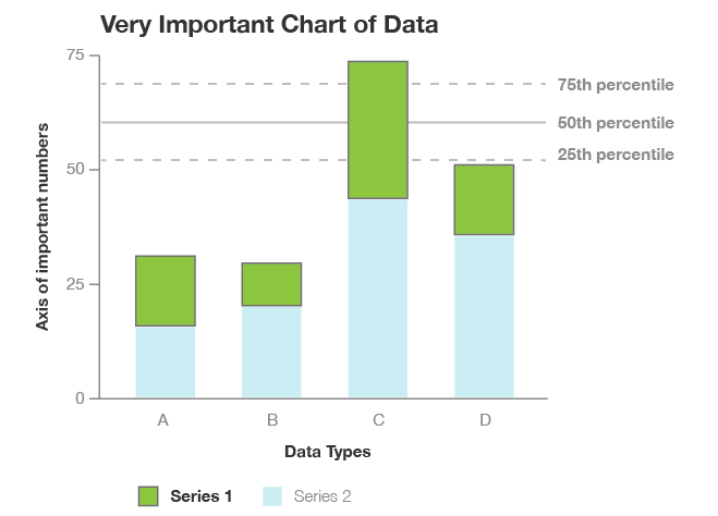
- Reducing the visual weight of supplementary information can help to keep it from taking too much attention from the rest of the chart. In this case, the dotted percentile lines still draw a lot of attention. Depending on how important the percentile information is, it could be helpful to use a thinner solid line, or more closely spaced dots to quiet down that part of the display.
- The strong, bright colors in the bars pull in a lot of attention here, and create a very strong mapping between the chart data and the legend. If there are lots of visual elements or you need to show multiple layers of data in the same chart, it can help to reduce the intensity of the colors for a more balanced view. In this chart, the data bars will always be most important. Sometimes that’s what you need, and sometimes it isn’t. Color can be a very powerful tool for adjusting priority in a data display.
Chart interactions highlight information and support common user tasks.
Sometimes, it can be useful to add interactions that allow the user to adjust the visual hierarchy, depending on different needs. This is especially helpful when a user might need to perform several different tasks with the same chart, or when they might want to see the same data across many charts on a page. The most important part of designing these interactions is to make sure that the visual changes support a specific user task.

- Interactions can be very helpful, but the user shouldn’t have to rely on them any more than necessary. Ideally, it should be possible to read the chart without interacting at all. Tooltips and other interactions are a good way to simplify a chart’s appearance, but they can also conceal data if not used with care. This is especially true if the interaction is hard to discover, or challenging to use.
- Whenever possible, there should be more than one mechanism to select a chart item. This supports different user preferences, and also ensures that the interaction system continues to function when the data elements are very small. It would be nice to be able to click on a bar in the chart to select it and see a value for the data point, but that doesn’t work if the bar is just a few pixels tall. If clicking on the legend shows labels for all of the bars in a series, then the chart is still usable, even when the data values are small.
3. Charts work within the broader design system
This article focuses mostly on the design considerations that are most important for data visualizations, but it’s worth remembering that charts are always displayed in a particular context, and need to match both the style and the interaction expectations of the rest of the application. It’s important to make sure that the chart interactions, style choices, and visual displays match with the rest of the design system, so that the user has a consistent and intuitive experience. Inconsistencies, incongruities and surprises reduce both the quality of the user’s experience and their trust in the application, which can diminish their trust in the data as well. Consistent, thoughtful, and functional design systems are built with a user’s needs in mind, and result in products that they can trust.
Stay tuned for the next installment in this series, where we will begin to look at some of the considerations that go into selecting a particular chart type.

Erica Gunn is a data visualization designer at one of the largest clinical trial data companies in the world. She creates information ecosystems that help clients to understand their data better and to access it in more intuitive and useful ways. She received her MFA in information design from Northeastern University in 2017. In a previous life, Erica was a research scientist and college chemistry professor. You can connect with her on Twitter @EricaGunn.
Thanks to Raeedah Wahid for editing.
Originally published at http://ericagunn.com on February 1, 2020.

Erica Gunn is a data visualization designer at one of the largest clinical trial data companies in the world. She creates information ecosystems that help clients to understand their data better and to access it in more intuitive and useful ways. She received her MFA in information design from Northeastern University in 2017. In a previous life, Erica was a research scientist and college chemistry professor. You can connect with her on Twitter @EricaGunn.
- Erica Gunn

- Erica Gunn

- Erica Gunn

- Erica Gunn


