
This article is part 7 in a series on data exploration, and the common struggles that we all face when trying to learn something new. A list of previous entries can be found at the end of the article. I began this series while serving as the Director of Education for the Data Visualization Society, because so many people were asking to hear more about the process of data exploration and analysis. What began as an exploratory project on the “State of the Industry Survey” data grew into a 1.5-year Career Portraits project that produced the 2023 “Career Paths in Data Visualization” report (DVS member login required). This series illustrates how I approach a new project, and the fact that no “expert” is immune from the challenges and setbacks of learning. Let’s see where this journey takes us!
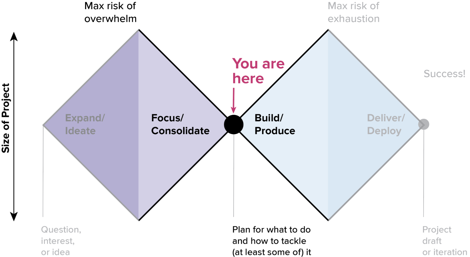
In the previous installment in the series, Jenn Schilling and I had formed a new collaboration to rework my exploratory analysis of the DVS State of the Industry Survey data. After our initial introductory conversations, we needed to get down into the narrowest part of the focus phase: redefining our scope and deliverables in the context of the new project. Once you’ve opened up all of the possibilities and peeked down the many avenues for exploration, there comes a time where you need to pause and decide what you are actually going to build. At this stage in the project lifecycle, your focus should be on getting to the absolute essentials of what needs to happen so that you have a clear path to getting things done.
A lot of people struggle with this part of the process because it requires you to be very disciplined about giving things up and letting go. That can feel harsh or even scary at times. It’s natural to get attached to your ideas and your project, and it can be very hard to leave behind ideas that you’ve invested in. This is one of the best reasons that you should try to keep the initial exploration light and fast. You need to remain flexible enough to pivot before entering the build stage, and it’s a lot easier to make that call if you remember that you’re “just sketching” in the early stages, and avoid becoming too deeply invested in a particular outcome.
I like to compare the focus stage to pruning plants in the garden. It feels cruel at the time, but a good pruning inspires vigorous new growth, and it’s often necessary to keep a plant healthy and happy. If you prefer the traveling analogy that I used in my previous articles, this is the stage where you lighten your pack before beginning that last, hardest climb. Either way, it’s a good opportunity to trim away the things that aren’t working and to make deliberate choices about how to move forward into the build stage.
“I like to compare the focus stage to pruning plants in the garden. It feels cruel at the time, but a good pruning inspires vigorous new growth, and it’s often necessary to keep a plant healthy and happy.”
Of course, everyone is different. Some people are very uncomfortable when ideating and prefer to have a clear plan at all times. For them, getting to the focus stage can feel like a real relief. If you find yourself saying that you “don’t have any good ideas,” it may be that you are too good at the focus stage and need to spend some time ideating and playing with your ideas before jumping straight into focus mode. If you’re someone who tends to overcommit and feel overwhelmed by the size of a project, then taking a moment to put things down can be a lifesaver, because it gives you the space to keep your project from spiraling out of control. It’s worth remembering that there are lots of ways to react to the same situation. Try experimenting with unfamiliar approaches to get around your blocks.
Personally, I don’t like cutting things back, but I do like to focus, and I realize that pruning is crucial to success. It’s really exciting to feel the scope click into place, and it can be such a relief to cut through the noise and end up with a clear plan. Focusing on that desired outcome helps me to push through the cuts that I find harder to make.
It often helps to distance myself from the project a little bit before beginning the focus stage. At this point, I need to let things take on a life of their own, rather than pushing for that one thing I thought I would make. Every project has an identity and a best expression in the world that is informed by its circumstances, and those may be very different from where you thought you’d end up. If you’ve learned things during the journey, it is natural for your plans to adapt and change accordingly. You can always come back to your initial ideas in another project. Your role at this stage is to give this project its best chance to reach its full potential. Assess where things are, cut anything that no longer helps, and focus on how you can best get to done.
Here’s a checklist for getting through this crucial stage:
- Take an honest look at what’s possible—and what’s not. Be realistic about what you can do with the time and the resources that you have.
- Re-focus your scope. You started out with one vision in your head, but you’ve learned some things since then. Trim anything that no longer fits.
- Discard what you don’t need. If you can’t carry it to the finish line, don’t put it in your pack. Be ruthless about what’s really needed, and what can be left behind.
- Be prepared to start over. More often than not, I find that the best way to focus your project is to scrap your initial sketches and start over. You have a different perspective now than you did when starting out, and that can help you to put the pieces together in a completely different way. This is especially true if you’re doing any kind of data analysis; that early work harbors hidden mistakes that will trip you up later, so it’s best to start from the beginning and work it through again.
- Explore new possibilities. When you’re clear on where you’re going, you’ll find new things that you need to do to get you there. This opens up new opportunities and new things to learn. (For those who are not comfortable with the focus stage, identifying new horizons to focus on can be a huge help.)
- Prepare to commit. This next stage is all about doing things thoroughly and right. Sketching and ideating can be lots of fun, but the build phase requires you to get busy and roll up your sleeves. The first diamond is focused on exploration and speed, but the second depends on quality, craftsmanship, and discipline to make your project the best that it can be.
What this looked like in the survey project
As a reminder, this series began with an exploratory analysis of the DVS State of the Industry Survey to understand the tools that people use in different data visualization careers. As I talked to others at the DVS, my initial project was slowly morphing into something different. I was eager to dig in and follow up on a bunch of interesting leads from the tools data, but the survey contains many questions across all areas of data visualization practice, and we thought it might be more useful to map out a general picture of career paths as a first step, and then come back to the details of tool sets used in different careers later. The new project had a much larger scope that wouldn’t have been possible with my limited R skills and manual Excel manipulation. It was really the addition of Jenn’s skillset to the project that allowed us to make that choice.
“We needed to set some realistic goals … switching from the ideation phase to the build phase of the project.”
One of the first things Jenn and I needed to do in our new collaboration was to set some realistic goals for our joint project outcomes, switching from the ideation phase to the build phase of the project. We knew that the new project would require a very different analysis of the dataset, so we began by doing a mini-exploration to identify the variables that we had available in the survey, the key questions that we thought we could answer, and to look at some initial values in the dataset. We mapped out the different options, focusing on the variables and analyses that we felt would best support the careers overview we wanted.

With a clearer idea of the goals and variable space in hand, Jenn and I walked through my odd mish-mash of R code and Excel files to be sure that we understood what we were trying to do, and then we scrapped it all and started fresh. Keeping the old code would only have slowed us down, and it would almost certainly have introduced mistakes. It was a huge learning opportunity for me to see how someone who knew what they were doing in R would approach the same problem. I’d struggled for weeks trying to wrangle the data into the form that I needed (or even to understand exactly what it was that I needed). It turns out that partial pivots and sequential group-by operations are hard to invent from scratch, even though they are very obvious once you know what you’re doing. From the perspective of my learning, the decision to throw out all of my initial work and start over was hands down the most useful part of the entire project. I got to see how an expert approached the problem, and it helped me figure out which fundamentals I’d been missing when trying to learn the software on my own.
“From the perspective of my learning, the decision to throw out all of my initial work and start over was hands down the most useful part of the entire project.”
As we began re-working the code, we also started to get into deeper detail with the dataset. One of the key things I’d glossed over in the initial exploration was an analysis of statistical relevance in the survey results. If there is one mistake that I see most often from inexperienced folks, it is getting excited about a “story” in the data before checking to be sure that the trend you see is reasonably likely to be real. I wanted a sense of the size and types of variation in the data before worrying too much about the interpretation, but we needed to get our feet back on solid ground before we could go any further. Getting ahead of yourself here risks having your whole project fall apart when the analysis doesn’t hold up.
The basic test of statistical relevance is this: “Is the difference I see in my data big enough to be meaningful beyond the measurement noise?” If you would see the same difference when randomly sampling different subsets of the dataset or when measuring a different population, then you’ve got a winner. If the measurement vanishes when you sample differently, then it’s likely just an artifact of your method. Without a real statistical analysis, I had no way of knowing whether a 10% variation between two variables was likely to mean something, or whether it was just a blip in the dataset.
In our particular example, this check was complicated by the fact that the survey has multiple branches, so that different people see slightly different versions of the survey with more focused questions depending on their career area. For example, if a respondent answers that they are an employee, they will see questions about their organization size and other items that don’t make sense if they say they are an independent contractor. For us, that meant that there were multiple respondent populations that needed to be evaluated separately.
Before choosing a statistical method, we looked at the simple response counts across the different career areas and branches in the dataset for each survey question that we wanted to use in our analysis. This gave us a sense of how many respondents we had for each sub-group in the dataset. We flagged anything in red that had counts too low to be valuable, and this assessment reinforced our decision to focus only on the employee branch and a subset of careers. That meant that our Career Portraits would be based mainly on people working as employees and less on those who identified as freelancers, and it would eliminate some careers from our first publication.
This was a difficult decision to make (we wanted everybody to be represented!), but we didn’t think that it made sense to try to compare across the populations and question structures given how varied the response counts were for the different populations. Measuring against fewer than 20 responses for one career group and 700 for another would create large differences in the quality of information reported, and we felt that some of the smaller populations would be better served with separate analyses later on.

Our survey is a broad-spectrum instrument, designed to give a holistic overview of practices in the field. It isn’t a formal research project, and it’s not intended or structured to answer deep, research-level questions. We also weren’t trying to publish a final statement on universal practices in data vis. For that context, it didn’t really make sense to try to pin down a specific statistical error bar for each comparison that we wanted to make, and we didn’t think that doing so would really help people to interpret the final results. Instead, we focused on a general margin-of-error calculation across all questions. This indicated that a 10% difference was the rough threshold for significant variation, and that gave us a rule-of-thumb guideline for interpreting the comparisons that we wanted to make.
Next, we created a list of all the new analyses that we would need to support our reduced focus. I did some manual analyses in Excel to get through the initial explorations for those items and started creating an outline for our final report. Jenn took a stab at moving the tools analysis one step further ahead. With her data science background, she was able to add a clustering analysis to the dataset, resolving one of the items that I knew I needed but didn’t have enough technical knowledge to complete. About a month in, we swapped projects: I dug deeper into her clustering work, and she switched focus to work on the main project, whipping through a huge set of analyses in a few weeks that probably would have taken me a year to figure out.
“There were all kinds of interesting things to tease out of the tools analysis, but we ended up leaving out most of it when we realized how much time it would take to fill in the rest of the report.”
Based on the new analysis and the data coverage considerations, we made much more specific decisions about what to include. We looked at the number of people who answered a question, the amount of variation that we saw in the results, and the relevance of those results to our new project focus. There were all kinds of interesting things to tease out of the tools analysis, but we ended up leaving out most of it when we realized how much time it would take to fill in the rest of the report.
In the end, we discarded almost everything in my initial tools exploration in favor of the new focus we’d chosen. I don’t consider that to be a problem or a loss, and I don’t think that the initial project was wasted effort. We did what we needed to do to understand the dataset, and then we made tough choices based on where we wanted to go. Rather than being discouraged or disappointed by the outcome, I was excited to start fresh on a new project, and grateful for the early explorations that led us there.
In my experience, this is the most common outcome of an early exploration and refocusing stage: If your exploration is effective, then you almost always end up reframing the question that you set out to ask. (That’s why you do the exploration…it’s the whole point!) Collaborating with Jenn opened up possibilities that I didn’t have when working alone, and connecting with people in the #topics-in-dataviz channel on the DVS Slack and other forums helped us to understand what would be most useful to folks in our community. In the end, we decided on a broader overview rather than a deep dive on tools because we thought it would have the most relevance for the people we wanted to serve. I hope that the tools analysis work will come back as part of another project someday, but even if it doesn’t, my meandering journey gave us what we needed to frame the Career Portraits work, and I count that as a win.
Previous articles in this series:
Embrace the Challenge to Beat Imposter Syndrome
Step 1 in the Data Exploration Journey: Getting to Know Your Data
Step 2 in the Data Exploration Journey: Going Deeper into the Analysis
Step 3 in the Data Exploration Journey: Productive Tangents
Step 4 in the Data Exploration Journey: Knowing When to Stop
Step 5 in the Data Exploration Journey: Collaborate to Accelerate

Erica Gunn is a data visualization designer at one of the largest clinical trial data companies in the world. She creates information ecosystems that help clients to understand their data better and to access it in more intuitive and useful ways. She received her MFA in information design from Northeastern University in 2017. In a previous life, Erica was a research scientist and college chemistry professor. You can connect with her on Twitter @EricaGunn.
- Erica Gunn

- Erica Gunn

- Erica Gunn

- Erica Gunn


