
Netflix is cheaper in poorer countries—but cheap enough?
Netflix prices vary widely by country. A Standard subscription costs around $29 in Switzerland, about $7 in India, and as little as $2.84 in Pakistan. At first glance, this looks almost fair: Wealthier countries pay more; poorer countries pay less. But is that actually true once you account for local purchasing power?
This project builds a Netflix index—a relative price measure that sets subscription costs in relation to each country’s GDP per capita. The result partly flips the original picture upside down and sheds light on what economists call third-degree price discrimination: firms segmenting markets and charging different prices in different segments.
All code is available on GitHub.
Absolute vs. relative prices
Price discrimination is not inherently unfair. If a firm charges more in wealthier markets and less in poorer ones, that may simply reflect local purchasing power—a practice sometimes called fair price differentiation. The question is whether Netflix’s regional pricing actually achieves this.
Previous analyses have mostly focused on absolute prices: how many US dollars a subscription costs in each country. Those analyses confirm the intuition that richer countries pay more. But if we also account for differences in living standards, the picture looks quite different.
To make this tangible, consider the two maps below. Both show the cost of the Standard plan across the world, but from two different perspectives:
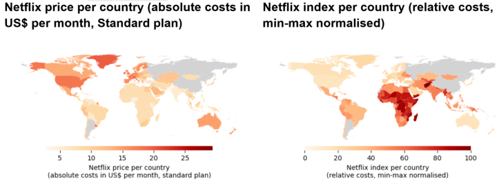
Placed side by side, these two maps are the visual core of the analysis. In the first, the Global North dominates: Switzerland, Liechtenstein, and the US are visibly expensive. In the second, the colouring inverts: Sub-Saharan Africa, South Asia, and parts of Southeast Asia are now the darkest areas, while Monaco and other high-income territories sit at the low end of the index.
Observation (absolute): Countries in the Global North pay more for their Netflix subscriptions.
Observation (relative): The price differences in the absolute view fail to even out the difference in purchasing power. Once we factor in GDP per capita, the relative costs in the Global South are in fact much higher.
The rest of the article explains how this index is constructed.
Data pipeline overview
The analysis combines four main data sources and proceeds in three steps:
- Data acquisition and preparation: Scrape Netflix prices and compare absolute costs across countries.
- Data analysis: Design a meaningful index for the comparison of relative costs per country, accounting for economic differences.
- Data visualisation: Build static choropleth maps and an interactive folium map with a layer toggle.
The remainder of the article follows this structure.
Step 1—Data acquisition and preparation
There are four data sources we bring together in this project. Each is explained in detail below.
- Netflix data: country-specific prices
- Financial data: conversion of country-specific currencies into US dollars
- Economic data: gross domestic product per capita
- Geographical data: mapping country data to visuals
Netflix data: country-specific prices
First, we need Netflix’s country-specific price plans. That is, we need to know the absolute costs for a Standard plan in each country. Netflix offers plans in more than 200 countries, each with its own costs. Extracting this information manually would be a tedious task. Fortunately, we can use web scraping: We write Python code that automatically loads each page, scans it for the relevant information, and stores all price-relevant data. We do so by first analysing Netflix’s website structure for country-specific information. Subsequently, we use web scraping to gather the different prices. The Jupyter notebook found on the GitHub repository walks you through these steps using code snippets.
Out of 249 countries included in Netflix’s country list, we find a Standard-plan price for 245. The four without Netflix availability at the time of scraping are China, North Korea, Russia, and Syria. The raw prices look like 7.99, Rs 800, ARS14,999, and 231,000 VND—a mix of currency symbols, codes, and decimal conventions.
Financial data: conversion of country-specific currencies into US dollars
Our second data source contains financial data: It allows us to convert country-specific Netflix prices from national currencies to US dollars (USD). Such conversion is needed for a cross-country comparison. Doing so requires three substeps:
- Extract currencies and values from raw Netflix data
- Acquire currency exchange rates
- Map Netflix data to currency rates for comparison of absolute costs
First, we want to extract two pieces of information from the “raw” prices we scraped above: (1) the numerical value and (2) its currency. We express the currency using its official ISO code so that we can then automatically map it to currency exchange rates.
In the second substep, we acquire the exchange-rate data. The European Central Bank (ECB) provides daily exchange rates for automated extraction. It includes the most common currencies. However, there are a few smaller countries where we have to resort to other means: Where ECB data has blanks, we scrape XE.com for additional rates.
Third and finally, we map the exchange rates to the Netflix prices. Since both datasets now use the same currency ISO codes, we can again fully automate this process. At the end of this first step, we have a US-dollar equivalent of the Standard-plan price for each country. Argentina is a problem at this stage: Due to hyperinflation and an unstable exchange rate, the converted price lands at an implausibly high value (over $250 per month). To avoid letting this artefact dominate the rest of the analysis, Argentina is excluded from all subsequent steps.
These first two data sources now allow us to compare the absolute costs of Netflix across countries: What do viewers in a given country have to pay, converted to USD? We will later visualise these findings. For the moment, we want to go further and ask: How do these country-specific costs compare if we also consider differences in general cost of living?
Economic data: gross domestic product per capita
Our third data source delivers economic data on the cost of living. More precisely, we use a country’s gross domestic product (GDP) as a measure of its economic power. GDP measures the market value of all goods and services produced in a given year. However, this value, of course, is driven not only by a country’s economic power but also by its size. To account for the latter, we use GDP per capita, which divides GDP by population.
The World Bank provides an API (application programming interface) to access GDP data for each country. That is, we use country codes to send automated, customised requests to the World Bank and obtain an automated response for our specific requests. Basically, the interface allows two computer programs (ours and the World Bank’s) to converse.
We add this economic data to our dataset. Again, you can redo this step using the scripts provided.
Geographical data: mapping country data to visuals
Fourth and finally, we obtain geodata for all of the countries. Technically, we load a long table of geometric objects (polygons) that will tell the program where to draw country boundaries and how to map Netflix data to countries. This will be crucial for the visualisation of our numerical findings.
We use official UN geodata and map it to the existing data points we have using each country’s ISO code. Countries and territories without Netflix are kept in the geometry but have missing price information, so they appear in light grey on the maps.
This concludes the data acquisition and preparation. We now move to the actual analysis: shedding light on the question of how differences in absolute Netflix costs translate into a relative assessment when we consider differences in economic power.
Step 2—Data analysis
We now want to account for economic differences between countries to compare the costs of Netflix plans in a more meaningful way. We do so as follows:
Compute relative costs: Divide the USD Netflix price by GDP per capita for each country.
Create the Netflix index: Log-transform the relative prices, remove an extreme outlier, and min-max scale to a 0 to 100 index.
Relative Netflix prices
With prices in USD and GDP per capita in USD, a relative price is computed for each country:

where pi$ is the Netflix Standard-plan price in US dollars and yi is GDP per capita for country i.
This simple ratio already reveals that the absolute ranking (“who pays the most dollars?”) and the relative ranking (“who sacrifices the largest share of income?”) are not the same.
A scatter plot of price vs. GDP per capita makes this visible:

Two patterns stand out:
Netflix does charge more in richer countries: The regression line slopes upward.
But the slope is shallow. Income increases far faster than Netflix prices do.
In other words, richer countries get a better deal in relative terms: Their higher prices represent a much smaller share of average income than lower prices do in poorer countries.
Creating the Netflix index
Comparing relative costs instead of absolute costs gives us a much better picture. But it is far from perfect. In particular, there are two issues:
- Looking at the initial scatter plot above, we see that the distribution of relative prices is strongly right-skewed: A small set of very poor countries with comparatively high Netflix prices produces a long tail of large ratio values. This makes it hard to distinguish the majority of countries that are currently clustered together.
- The actual numerical value for a specific country is of little interest. Instead, we are interested in comparative results: How does the relative cost of one country relate to the others? Ideally, we would have an intuitive scale so that we can immediately infer whether a country’s costs are relatively high or low.
We address these two issues in sequence. In particular, we construct a Netflix index in two steps:
Removing skewness: Apply a log transformation and remove an outlier.
Adding comparability: Min-max scale the transformed values to a 0 to 100 range.
Removing skewness
First, note that two countries stand out as extreme cases. Argentina was already removed in Step 1 because the USD price is distorted by exchange-rate volatility. Burundi’s combination of the lowest GDP per capita in the dataset and a $7.99 Netflix price yields a relative price far above the rest of the sample. It is therefore excluded from the index calculation as a relative-price outlier. All other countries remain.
Second, a log transformation compresses the right tail while preserving the ordering of countries, essentially reducing the skewness of our data.

Adding 1 before taking the logarithm keeps every transformed value at zero or above. The transform makes the distribution more symmetric and prevents a few very large ratios from dominating the scale.
Adding comparability
We now address the second issue: We are interested not so much in a country’s relative costs per se, but in how this relative cost ranks in comparison to other countries. Hence, we apply a second conversion: It transforms the relative costs into an index from 0 to 100 so that we can immediately infer from a single country’s data point whether it is comparatively low/cheap (towards 0) or high/expensive (towards 100).
We do so by applying a min-max scaler. It takes the lowest value from the dataset as the lower bound and assigns 0 to it. Conversely, the highest value is assigned the upper bound of 100:

The resulting ni is the Netflix index. It indicates how expensive a Netflix subscription is in country i relative to local GDP per capita and relative to all other countries in the sample:
Low values (close to 0) mean it is relatively cheap to subscribe given local income levels.
High values (close to 100) indicate a high subscription cost considering local standards of living.
In the final distribution, Monaco has an index of 0 (the cheapest subscription relative to income), while Afghanistan sits at 100 (the most expensive).
Step 3—Visualising the results
At this point, we have created a long table: It holds more than 200 rows, one per country. One of the columns contains the Netflix index we just computed. But looking at this table does little to convey the actual size and shape of the gap between rich and poor countries. To make the pattern visible, we turn each row into a coloured region on a map of the world. This step covers two visualisations: a pair of static choropleth maps for a first overview and an interactive map for closer inspection.
Static maps
A choropleth map colours each geographic area according to the value of a variable—in our case, either the absolute Netflix price or the Netflix index. It is a natural fit for this dataset because our unit of observation is already a country, and shading each country directly lets the reader spot regional clusters (all of Sub-Saharan Africa lighting up together, for instance) that would be much harder to notice in a table or a bar chart sorted alphabetically.
Two such choropleth maps are produced: one for absolute prices and one for the Netflix index. Both use the same colour scale logic, running from light (cheap) to dark red (expensive), so that the two maps can be compared directly at a glance. The resulting maps are the same pair shown in the introduction; for reference, they are repeated here in a smaller side-by-side layout. In Python, we use the Matplotlib library for this first set of visualisations.
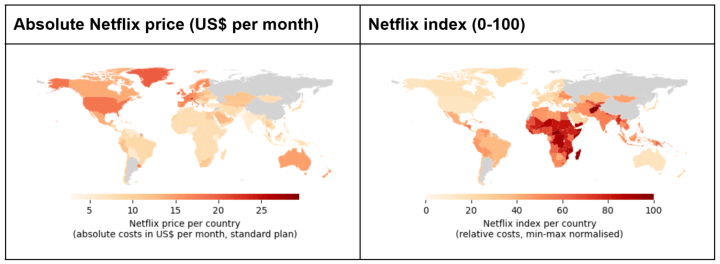
In the absolute-price map, Switzerland and Liechtenstein top the ranking (about $29.37 per month), followed by Denmark, Greenland, the Faroe Islands, and the US.
In the Netflix index map, the top spots are occupied by Afghanistan, the Central African Republic, Malawi, Madagascar, Somalia, and other low-income countries.
Placed side by side like this, the two maps make the core argument of the whole project visually obvious: The countries that are dark on the left (expensive in dollars) are mostly light on the right (cheap relative to income), and vice versa.
Interactive folium map
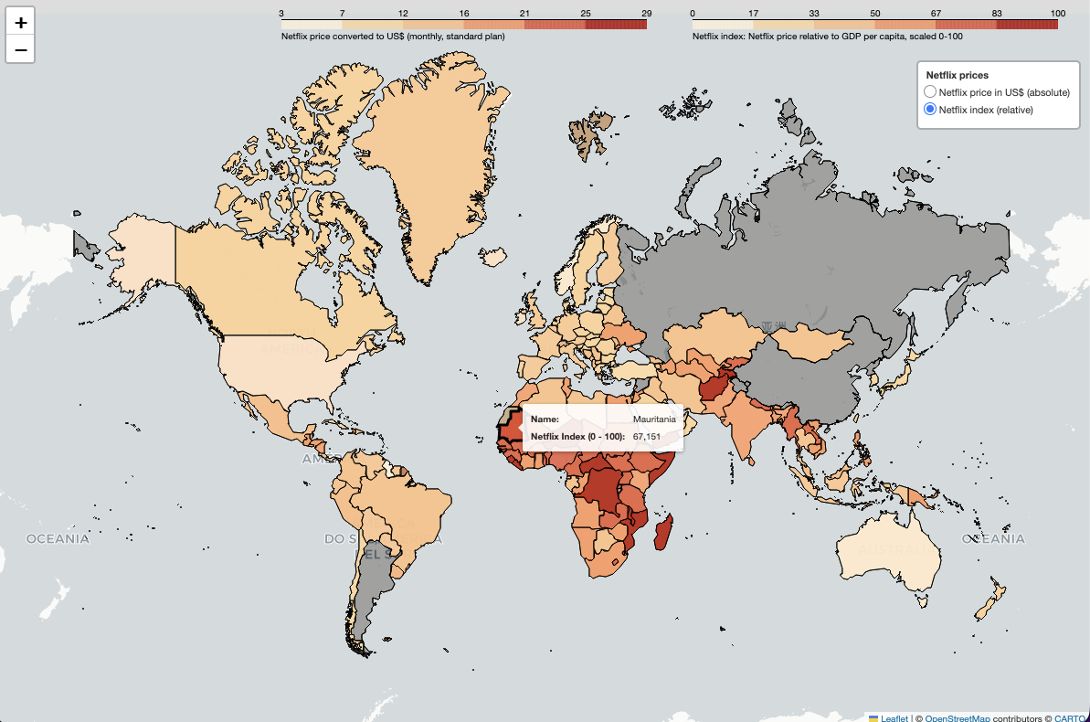
Static maps are useful for the overview, but they only tell part of the story: A colour alone does not reveal the precise price or index value behind it, and it is hard to check a specific country of interest quickly. An interactive map solves both problems. It lets readers hover over any country to read its exact absolute price or Netflix index, and it lets them switch between the two views themselves rather than relying on two separate images.
The interactive map is built with a toggle between two layers: the absolute-price layer and the Netflix-index layer. A viewer can switch between them with a click, which is a more effective way of demonstrating the project’s central finding than any static figure: Watching the colours on the map completely rearrange themselves, from a Global-North-heavy pattern to a Global-South-heavy one, drives home how differently “expensive” and “cheap” can be defined depending on whether purchasing power is taken into account.
For this more complex visualisation, we use the folium library and its plugins.
Open the interactive map in a new tab.
Main findings
Summarising the numbers:
In absolute terms, the cheapest Standard-plan subscriptions are in Pakistan (about $2.84 per month), Nigeria (about $4.64), and Kenya (about $5.40).
The most expensive subscriptions in absolute terms are in Switzerland and Liechtenstein (about $29.37), followed by Denmark, the Faroe Islands, and Greenland (about $19.95) and the US (about $17.99).
On the Netflix index, the highest relative prices appear in Afghanistan (index 100.0), the Central African Republic (95.5), and Malawi (95.3), indicating that a Netflix subscription eats up a comparatively large share of average income.
The lowest relative prices are found in Monaco (index 0.0), Bermuda (5.9), and Macao (8.9), where a subscription is almost a rounding error at average income levels.
The contrast is clear: The countries that pay the most dollars per month are not the ones for whom Netflix is most expensive relative to income. The burden falls disproportionately on low-income countries.
Caveats and limitations
A few things are worth keeping in mind:
Plan differences: Netflix’s content library and plan structure vary by country (for example, ad-supported tiers in some markets). This analysis focuses on the Standard plan where available, but the offering is not identical across countries.
Taxes: Prices are net of VAT or sales tax in some countries and gross in others. Netflix’s own pricing pages are not fully consistent on this.
Exchange-rate volatility: Exchange rates, especially for currencies like the Argentine peso, can change dramatically between data collection and reading. Argentina was excluded as an outlier for this reason.
GDP per capita as a proxy: GDP per capita is a country-level average and says nothing about income distribution. A subscription that looks affordable on average may still be out of reach for many households.
Wrapping up
This project started from a simple observation—Netflix is cheaper in poor countries—and asked whether that is actually true once we look beyond nominal prices. The Netflix index suggests that it is not: After accounting for local purchasing power, subscribers in Sub-Saharan Africa and South Asia pay far more relative to their income than subscribers in Western Europe or North America.
The pipeline is fully reproducible: The notebook scrapes everything fresh from Netflix, the World Bank, and the ECB and XE. The geodata, Netflix prices, and computed index are also stored in the repository so that the analysis remains reproducible even if the upstream sources change.
A natural next step would be to look at how prices have evolved over time or to build similar indices for other global streaming services.

Colin von Negenborn
Colin is a quantitative economist and postdoctoral researcher focusing on game theory and computational modelling. He is particularly interested in questions of fairness, efficiency, and other distributive issues.


