
The $390 moisturiser and the $15 one are sitting side by side at Sephora. The $390 one has a better bottle.
More or less, that is what the data says.
Every skincare product sold in the United States is required by law to print its full ingredient list on the packaging, ordered by descending concentration. The ingredient at the top is present in the highest amount. The one at the bottom is present in the least amount. It is one of the few genuinely transparent disclosures the beauty industry makes, and almost nobody reads it.
I started reading ingredient lists obsessively after my mum kept asking me to buy her La Mer’s The New Moisturizing Soft Cream for $390 from Sephora. The entire product is built around a single proprietary ingredient: Miracle Broth, an algae extract that is listed first. Positions two through six are silicones and petrolatum. The peptides and hyaluronic acid it is also marketed around appear past position 38. You are paying $390 for one hero ingredient surrounded by filler.
To be clear: Low concentration does not always mean ineffective. Some active ingredients are clinically meaningful at 0.1%, and a well-formulated product might place its hero ingredient lower in the list by design.
The issue here is not where the actives appear. It is that the product is sold as though they are the story—named for them, priced for them—when the formula is mostly silicone. The gap is between what the label claims and what the ingredient list confirms.
That gap has a name now. Dupe culture has turned ingredient-list literacy into a mainstream pastime, with millions of people asking whether the $90 version is actually better than the $12 one.
The answer they usually get is a side-by-side texture comparison, someone’s skin looking good on camera. What they rarely get is the formula.
This frustration led me to several questions:
Is this pattern consistent?
Are luxury skincare products systematically poorer value at the formulation level than their affordable counterparts?
And if so, by how much?
To find out, I built a scoring system from scratch and ran it on 16 products, eight head-to-head pairs, each pairing a luxury or premium brand with its closest affordable equivalent in the same category. The result is “Beyond the Label.”
The methodology, briefly
Ingredient lists from INCIDecoder, a publicly accessible cosmetic ingredient database, are classified into four categories: superstars (rare, high-impact actives), goodies (beneficial but baseline contributors), icky (harmful or questionable compounds), and neutrals (functional fillers with no meaningful effect on skin).
From there, I built what I called an Ingredient Quality Score (IQS). The formula weighs each category differently: superstars count three times as much as goodies, and harmful ingredients are penalised at twice the rate at which goodies are rewarded. Crucially, icky ingredients are also penalised based on their position in the list. An irritant at position five of 40—high concentration, genuinely concerning—is weighted nearly 10 times more heavily than the same irritant at position 38, where it is present in trace amounts.
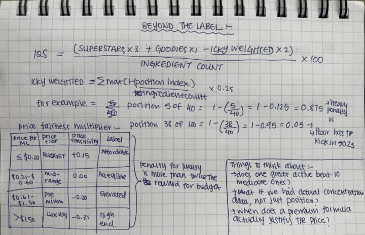
This matters because of a regulatory loophole called the 1% rule. Any ingredient present at 1% or below can be listed in any order, which means the bottom third of most ingredient lists is essentially unordered. To account for this, I applied a floor: No icky ingredient, however late in the list, receives less than 25% of its full penalty weight. Its presence at any concentration still carries risk.
The IQS was then adjusted using a Price Fairness Multiplier to assess whether the formula justifies what you paid. A strong formula at a budget price is rewarded. A weak formula at a luxury price is penalised. Products in the accessible midrange are unaffected.
The result is a single number, normalised between 0 and 100 across the dataset. Normalisation here means the raw scores, which can include negative numbers and decimals depending on a product’s formula, are stretched to fit a readable scale. The product with the highest raw score is set to 100. The lowest becomes zero. Everything else lands proportionally in between. The relationships between products stay exactly the same; only the presentation changes.
That also means 100 is not a claim of perfection. It means the strongest formulation relative to the 15 products it was scored against. If the dataset changed, the scores would shift. Every product is judged within the same competitive field, which is what makes the gaps between them meaningful rather than arbitrary. And those gaps tell a fairly blunt story.
About the sphere—visualisation
Each product in the dataset takes the form of a 3D sphere, built from hundreds of individual crystal shards distributed across its surface. But colour is only part of the visual language. Superstars and goodies glow, while icky ingredients push outward from the surface as spikes, proportional to how prominently they appear in the formula. A product with a strong formulation radiates; one with harmful ingredients at high concentrations appears darker, more irregular, and more heavily spiked.
What the spheres show
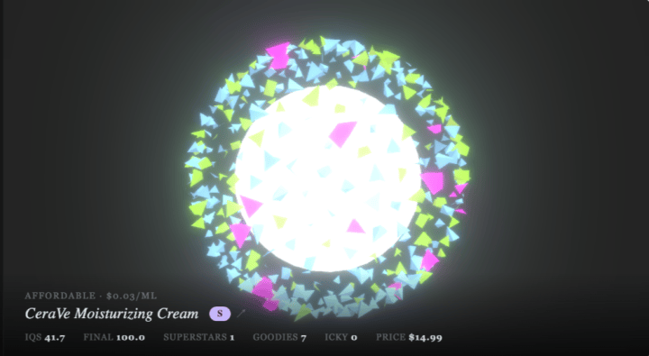
Each crystal shard represents an ingredient: pink for superstars, green for goodies, red for icky ingredients, and blue for neutrals. Hovering over the interactive sphere reveals additional ingredient details.
CeraVe’s Moisturizing Cream scores 100. Not because it is a perfect product in any absolute sense, but because within this dataset, it is the benchmark. One superstar ingredient. Seven beneficial ingredients, including three ceramides, cholesterol, and hyaluronic acid. Zero icky ingredients. At $0.03 per millilitre, it is also one of the cheapest products in the comparison by a significant margin.
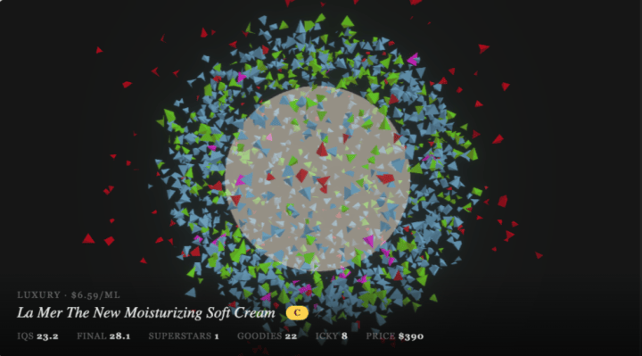
La Mer’s The New Moisturizing Soft Cream scores 28. Its formula contains eight flagged ingredients, including eucalyptus oil, denatured alcohol, fragrance, and four individual fragrance allergens: limonene, linalool, hydroxycitronellal, and geraniol. At $6.59 per millilitre, both the formula and the price conspire against it. The gap between these two products is 72 points. The price gap is roughly 220-fold per millilitre.
The score is not a prescription. It does not account for skin type, texture preference, or the fact that some people genuinely love how La Mer feels. What it accounts for is formulation, and on that measure, the $15 product wins by 72 points.
The viral product problem
Sol de Janeiro’s Brazilian Bum Bum Cream is one of the most commercially successful body products of the past decade. It has hundreds of thousands of five-star reviews. Its scent has become, for many people, the smell of summer.
It scores zero.
Nine icky ingredients, including benzyl benzoate, benzyl salicylate, citral, coumarin, eugenol, butylphenyl methylpropional, limonene, and linalool. Several of these are fragrance allergens regulated under the EU Cosmetics Regulation. Several appear in the top half of the ingredient list, generating high penalty weights. The Price Fairness Multiplier does not help the score, since the product sits in the midrange price tier, where a weak IQS cannot be forgiven by affordability.

Its counterpart in this comparison, Trader Joe’s Brazil Nut Body Butter at $5.99, scores 40.7. The fragrance concern is present here too, with one icky ingredient flagged. But the ratio is different: seven beneficial ingredients against one icky, at a price of $0.025 per millilitre.
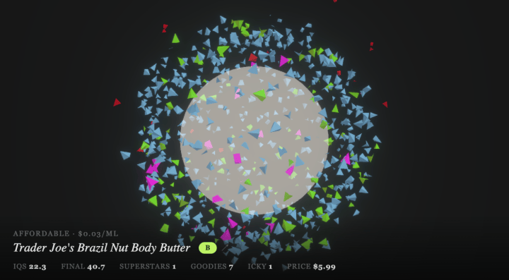
The product that went viral on TikTok scores zero. The one in a grocery store paper bag scores 40.7. This is what the ingredient list already knew.
The prestige question
Two findings complicated the narrative in ways worth acknowledging.
SK-II’s Facial Treatment Essence, one of the most marketed essences in luxury skincare, built around its proprietary ferment filtrate Pitera, scores 11.5. Its formula is unusually simple: seven ingredients, one classified goodie, zero icky ingredients. The problem is that IQS rewards breadth of beneficial ingredients. A product built around a single active, however potent, does not score well under this system because the formula lacks compositional complexity. This is a known limitation, documented in the methodology. The scoring system is better suited to evaluating moisturisers and multi-ingredient formulas than single-active essences.
SkinCeuticals C E Ferulic, one of the most clinically studied vitamin C serums available, scores 90.2. TruSkin’s Vitamin C Super Serum, at a fraction of the price, scores 80.6. The gap is real but narrow. This is the case where the premium product does, to a meaningful degree, justify its price.
Not every luxury product loses. But most do.
What the visualisation does that the numbers cannot
The scores can be presented as a table. The ingredient lists can be read line by line. But neither of those formats communicates what it feels like to hold a $390 jar of something that scores 28 next to a $15 tub that scores 100.
The 3D spheres do something different. Each one is built from hundreds of individual crystal shards, distributed across the surface using a Fibonacci algorithm that spaces them evenly. Each shard represents an ingredient, coloured by category. Icky shards are physically pushed outward from the surface, creating spikes proportional to the number and prominence of harmful ingredients in the formula.
The bloom post-processing pass, a technique borrowed from film and game rendering, causes beneficial shards to emit light. Superstars and goodies glow. Icky and neutral shards absorb it. A high-scoring product radiates. A low-scoring one is dark and irregular.
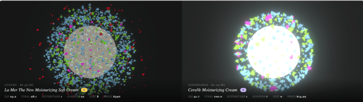
No legend is required to understand the difference between the La Mer sphere and the CeraVe sphere. The visual makes the argument before any number is read. That was the design goal from the beginning: to make formulation quality something you can perceive, not just calculate.
What the industry knows that consumers do not
The ingredient list is public. The ordering rules are legally mandated. The classifications—which ingredients are beneficial, which are harmful, and which are filler—are documented in publicly accessible databases. None of this information is hidden.
What the industry understands, and what this project attempts to challenge, is that almost no one uses it. Packaging design, brand storytelling, influencer endorsement, and retail positioning do the work that formulation transparency should. A $390 price tag serves as a signal of quality even when the formula does not support it, because most consumers lack a framework for interpreting the information already at hand.
“Beyond the Label” is an attempt to build that framework: to make the ingredient list legible, the price comparison honest, and the quality difference visible at a glance.
The $390 moisturiser has a better bottle. The $15 one has a better formula. You already had the evidence. You just needed a way to see it.
Ingredient classifications sourced from INCIDecoder. Scoring methodology, including the full IQS formula, icky position weighting, and Price Fairness Multiplier, is documented in full on the project’s About page. All prices reflect retail data at the time of collection.

Dhruvi Mehta
Dhruvi Mehta is a data visualization designer and analyst with a background in communication design. Her work bridges design, research, and data to create compelling visual narratives and meaningful user experiences.


