
Marco Hernandez is a New York Times graphics editor who was previously a data visualization developer at Reuters in Singapore and director of digital design at the South China Morning Post in Hong Kong. In the following interview, he talks about his perspective of information graphics and design. The responses have been lightly edited with permission from originally published interview on NewspaperDesign.in.
In the changed world of newspaper reading, how do you see the role of both infographics and design?
The earliest versions of something similar to today’s newspapers existed more than 2,000 years ago in the Roman Empire. However, those were very exclusive documents, intended for only a few in high spheres of political influence.
In contrast, today our information flows freely to the public at vertiginous speeds with hundreds of shapes to satisfy the global hyper consumption and sometimes even to deliver misleading information. The media still have the ability to delve into the stories, and produce what no one delivers as newspapers. That’s where the visual stories came in.
Social networks will show you before anyone else a glimpse of what happened in the last hour, or give you a constant taste of what you like/dislike the most in terms of information (often feeding from newspapers). But clever visual stories can take you on a journey of discovery. That’s the power of visual storytelling.
As visual storytellers, we have an incredible set of tools to create those experiences, making newspaper pages exceptional experiences for our readers, or perhaps showing just what they needed to know in the most natural way possible: visually.
How do you foresee the changes that are going to happen in print and web infographics in this mobile era?
I think it evolves at a different pace depending where you are. Many places are still very much attached to print, and their business in paper is still the core of the publication. One thing I do know for sure: not everything should be multi platform. Certain stories are great for web but not for print, some others will do great on a phone only.
Some will explore emerging technologies to create news, but I’m sure there will be a place for print in many places without sacrificing quality, and that’s great too. The work I do has always been screen oriented, but there is something about paper that we all really enjoy.
What are the basics of good information graphics?
I would say that the story should be clear and smart. It isn’t enough to show elegant shapes on a page. You may have a great design, but if there is no good content it’s a shame, to me it is a wasted effort of everyone who worked on it. Content and design go hand in hand.
“You may have a great design, but if there is no good content it’s a shame… Content and design go hand in hand.”
A clear message is also important, after reading the piece I should be able to say, “Wow, I didn’t know about this,” and walk away satisfied, or at least to be memorable, like, “Yeah, you might know, but have you ever seen it this way?” and it lasts for more than a few minutes in your memory. If your piece reaches that, you are simply making the best graphics for me.
What are the trends for information graphics nowadays?
Graphics are finally outgrowing the “teenager” phase of interaction, and that’s great. I encourage people to keep trying new things, go crazy on a personal blog if you want—I enjoy doing it—go and learn how to use the latest techniques and software, that’s cool. Just keep in mind that probably your story doesn’t need any of that. It’s all worth it, but we shouldn’t force our pieces to adjust to trendy waves, maybe one day you will find the right data at the right time, then you will know what to do and how to do it.
How to teach editors/reporters to think graphically?
We all enjoy doodling. At the age of four, most of us were able to grab a pencil to go crazy expressing our thoughts and imagination. That’s evidence that by nature we want to communicate something, express ourselves, and, at the same time, appreciate it.
I believe doodling is natural to everyone. The main difference is the judgment of others, no one enjoys feeling silly if they can’t make their doodle understandable.
Frustration is an incredible brake, maybe you have an idea in your head but you don’t know how to show it visually, but hey, good news, absolutely no one was born Da Vinci. It is kind of like learning how to ride a bike, yeah you may end up in the bushes a few times, but I guarantee you will feel it natural later.
Try to make your colleagues not to feel silly, share your worst doodles to make the environment feel natural just like it was when you were about four years old.
“Share your worst doodles to make the environment feel natural just like it was when you were about four years old.”
The power of doodling will make you think differently, no matter if you are working with heavy data, politics or any other topics. There’s always a way to doodle it, then the brain wires this way of thinking.
Said all that, many people just don’t want to go back to being a four year old. So leave them be, you can’t save them all.
Where do you get inspiration for the graphics?
Everywhere. Sometimes you will be hit by an idea while you’re at the supermarket!
I have my own favourites, of course, there’s a ton of talented people around, but to me social media plays a big role. Instagram and Twitter in particular, I love seeing people show off their skills in 3D, animation, illustration, etc.
I also love museums. Many times some people have already elegantly solved the problem you have, you can try some good old answers for modern problems and you might get it very well. There’s a thin line between creativity and plagiarism, but since our profession takes the best of each world it’s a valid practice, sometimes even celebrated. Isn’t that great?
What is your style of infographic creation?
I think we should not have a defined style, you will inevitably leave your mark on your work, but we should always be looking for the right tool, style or solution according to the story you want to tell. I really enjoy old style scientific illustrations, but sometimes I need a clear 3D render for a story.
That’s if we are talking of style, per se.
If we talk about the process, it’s never the same, but often, it all begins with a little visual spark somewhere in the brain. This can be triggered by a scientific paper you found, a single data set, a story on the news, editors briefings, or at the supermarket while you are shopping.
After that first spark, I always go doodling, many times just for me to plan a raw story sequence.
Then, maybe a few paragraphs in a document to lead the idea, and a different document to put together all the links, sources, annotations and references that I may or may not need later. Never skipping documentation.
Illustrator or Photoshop work well for prototyping, then I show the idea to my editor, and after some adjustments I usually am ready to jump into coding or designing pieces. The process comes and goes [with] a few rounds between editors and me.
Depending on the size of the project, for example a large one, I’ll be working into something very specific, just a piece of the whole story. On the other hand, if it’s a personal small project, I’ll need to take care of every single aspect from research, editing, designing, coding, writing, to finally publishing.
Which was your best infographic (including breaking news) and how did you conceive it?
I like to think that my best graphic is yet to come. But I have work in some that are special to me for different reasons. For example, working for more than a year in the “Forbidden City Series” for The South China Morning Post (SCMP) was special because of the exhaustive research in Beijing, then diving into books, museums, and talking to so many people.

The New York Times coverage of The War In Ukraine (still ongoing) is another massive project, dozens of maps and reports analyzing geographical data, all conducted as breaking news in a live blog.
It’s a big contrast to SCMP when I was able to spend so much time planning and researching. The coverage of the war is now running roughly the same length as I devoted to Beijing’s Forbidden City in 2018, but with the vast difference of adrenaline flowing steadily for months in the form of breaking news.
It’s a big contrast to SCMP when I was able to spend so much time planning and researching. The coverage of the war is now running roughly the same length as I devoted to Beijing’s Forbidden City in 2018, but with the vast difference of adrenaline flowing steadily for months in the form of breaking news.

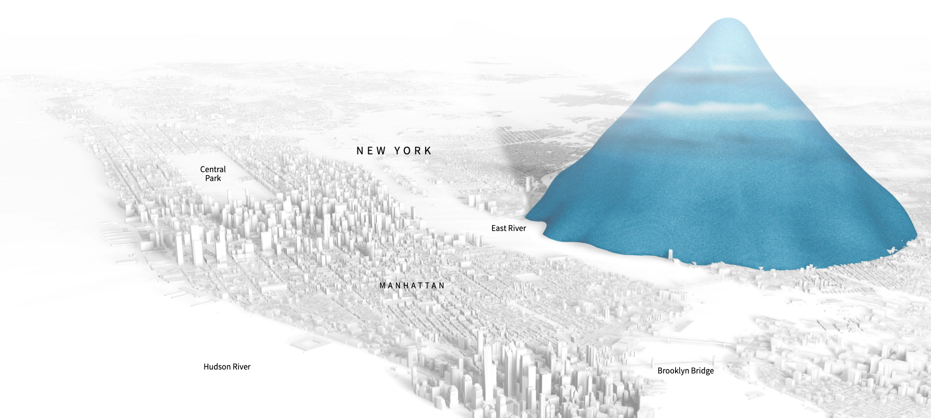
One of my favorite projects, because of the impact, is the “Drowning in Plastic” story I did for Reuters. The project was about visualizing the amount of plastic bottles, and it all started with a number: 4 trillion bottles.
That was the amount of plastic bottles produced between 2009 and 2018, today we have probably made way more plastic and that pile would look even bigger.

The trick here was to connect the reader with the scale of the problem, it was to find a way to show how big the number 4 billion really is. People are not very good at doing mental calculations, one way to do it was precisely to model a stack of 4 billion bottles on a location of preference known to the reader.
I made dozens of models in Cinema 4D, based on a bottle I had on my desk, a common bottle from the vending machine at the Reuters bureau in Hong Kong.

The idea was to create a short video so that it would be the first thing you would see when landing on the page, a counter would show you how many bottles are sold worldwide in the time that you are in that story.
I wanted to add a scale reference from the beginning, that’s why you see a person there, it was like a metaphor that we are all buried by plastic.
Then I realized that I needed something bigger to hold the scale for a minute. A million bottles would completely cover a 2-meter tall man, so he wanted to have another larger object to hold the reference.
I tried different full-scale trucks, and I decided on the garbage truck because it is also a subtle message of the waste that we are generating. For me every detail of this piece has a meaning.

From the top of the story, while you scroll down, you would see bigger and bigger piles of bottles. The video is the amount of bottles sold in a minute, then we go to a full hour, then a day pile, a month, a year, and finally 10 years. I think you get the sensation of “this is a lot,” and then, “look at this–it’s actually bigger,” so you transition from something familiar like your own body size to a city space in a natural way. I have to give credit for that sorting to the amazing Simon Scarr, my editor when I was at Reuters.
I did some calculations of how big the stacks would be once I had the renders ready, that allowed me to plan a little better how I would place the elements and what structures I would need to avoid the problem of the references being completely buried.

For the final frame of the city covered I tried a few different versions spreading out the bottles along Manhattan in real scale, but I decided to keep the same narrative of piles.


And finally, about 22 versions later, we found natural and satisfactory way of presenting a 4-trillion bottles pile over the city of New York:

One other impacting point of all this is that a large amount of that plastic never gets recycled, most of it just gets discarded, even a large part of the recycled material ends up discarded as well.

I did a post with a little more of the technical process if you are curious and want to learn more of it. You can visit the post here.
Did you work on a template or approach every graphic independently?
Either print or web I always have a basic template, a set of basic building blocks to be consistent in style with the publication. I put the effort into the main piece of the story. Later, maybe I’ll tweak the styles a little to make it necessary for the story if needed.
In the past, I also have created such templates for a publication. I think those help a lot for consistency but also to save time to focus your time into the main visuals. In my experience, creating all from scratch is exhausting and takes time from the key features.
Your thoughts on software and human created graphics?
AI such as DALL-E2 or similar can create amazing things. We should take them as one more tool to have handy in case you ever need them. At the moment, you can’t create decent quality visual stories in the news with algorithms; probably in future, but not now.
The analysis behind [the graphics] sometimes comes because of our own curiosities, not because of a math formula, so I‘m confident that we will have more positions to fill into graphics teams in the coming years instead of software doing it for us.
Clever people will find creative ways to use the AI for sure. But our field will be led by human hands for a while longer.
“Clever people will find creative ways to use the AI for sure. But our field will be led by human hands for a while longer.”
Some charts look visually appealing but complicated. Do you think information graphics should be simple and easy to understand?
The readers have little time, even if we are presenting a deep story. We as producers are the ones breaking our heads and burning neurons to present the story.
My academic background is in design, and that is why I think I should spend most of my time on the content of my design. Beauty in a vacuum is a waste of time, my time. And if it is a waste for me, it’s not difficult to guess if it is also a waste for the readers.
Now, easy to understand? I don’t know. Sometimes you want to show the people how complex something is, and depending on your publication, maybe your readers can handle a high level of complexity, maybe even more than ourselves can, so being respectful is also good advice.
So wrapping this up, the key here is to spend more time in planning and documenting your story. It should be as complex as necessary, not oversimplified or unnecessarily complex, just the right amount for the story to continue to be as it best.
How will you differentiate small and big data visualization?
I think the principle is the same. You are trying to communicate something, no matter if your intention is to discover patterns behind big data or just to visualize two to three numbers.
Working with fancy libraries to handle data design annual reports has been in vogue for years. It’s fine if your field is geared towards that, or if it’s useful for a particular newsworthy story. However, we shouldn’t rack our brains to be called data scientists. If you are into news, your business is telling stories and not all stories have to be massive and complex, so in the end there is no big or small, it all comes down to “visualization”—just that.
“We shouldn’t rack our brains to be called data scientists. If you are into news, your business is telling stories and not all stories have to be massive and complex.”
Can you tell us about the different approaches in graphics?
About a decade ago, I was convinced I was into dataviz more than “traditional” illustrated graphics. I have always admired motion graphics designers. Back then I thought, those were their own unique worlds. But through time, I learned that understanding a little better each of these persons with particular skills can benefit your stories.
I’m not saying you need to become a 3D expert to be able to produce that kind of graphics when the opportunity comes. But you should be able to understand the complexity of it if you’re going to work with a 3D artist. Being able to create small things in those worlds would make a big difference.
Maybe an illustrated story, if the data is abstract and goes well with that approach. Maybe you want a clear 3D render if you need to deconstruct an object, so this would go great with a 3D software.
Maybe just dots and lines, plain vector shapes if you have tons of data with a clever analysis.
Maybe you have geodata and there’s a great opportunity to show maps to tell your story.
If you have noticed the pattern, it all reacts to the data you have. I think you should first ask the questions to yourself before making any decisions on tools; the key is to get a short answer no more than a single phrase:
- What’s that main thing I want to show?
- How can I show it?
- What’s the best way to communicate my findings?
- Why should my readers care about this?
A clever guide for infographic designers is the Visual Vocabulary Guide by the Financial Times Staff.
We should always come to a new story without any preconceived ideas about what I want or can do. We should let data define forms and naturally define our toolbox, that way the story will be natural.
Which tools are mostly used in creating graphics and do you foresee any new techniques or tools?
My toolkit includes a diverse range of software. I like the fact that this job brings a new thing every week so I have the opportunity of trying many things.
I use a lot of Adobe software: Illustrator, Photoshop, After Effects… QGIS, Blender and GDAL tools for mapping and data processing, Cinema 4D for 3d modeling. On the coding side, Python and R are good to save the day.
The Times also has a lot of internal tools to make things easier, I love the diversity of the options around. This last year I have made many stories with maps. Every day I find myself processing satellite data, mostly from NASA and ESA.
What are the most important considerations for infographic designers?
From my perspective it should be the answers to the interview you do to your project, basic things like, why am I doing this? Or, what should my readers learn from this? It is very easy to lose focus and get carried away by aesthetics alone. Infographic designers need to be clear that they are not just there to make things pretty, but also useful and smart.
What mistake do less experienced designers tend to make?
They get excited about the post and skip the fact checks. Getting feedback from experts is a difficult but highly necessary process.
I think the way around this is to be patient and open minded to the opinion of those that may know more than you do. We need to become fans of a topic, learn everything you can to communicate the idea. However, at the end we are just mediators between the source and the readers, we need to ask the source for more, do a few more rounds of edits and solve any curiosities before publishing.
Why and how do charts lie?
I notice here a bit of the influence of our friend Alberto Cairo and his book How Charts Lie. I think charts aren’t designed to confuse people if you use them well. I’m sure many people ignore the proper use and try to “improve the graphics,” destroying its fundamentals and causing this effect. A dangerous combination of ignorance-initiative without supervision or guidance.
A way to avoid those terrible situations is to enjoy such readings as Cairos’ books, especially if you are just starting in this world of dataviz, communications, or graphics in general. Some other classics like Edward Tufte’s The Visual Display of Quantitative Information and Isabel Meirelles’s Design for Information among others created a big impact on me and what I do today.
On the other side of the coin, some DO have dubious intentions about what they want to “communicate” or rather influence with their graphic pieces. We must learn that when something sounds so unbelievable is when you have to have a more critical eye; if you start paying attention to the small details, you can discover why that graph shows a different and misleading picture. In other words, before you hit the share button, take a moment to think, could this be a biased image or an sassy lie?
How different is it to visualize graphics for The New York Times?
I have been in newsrooms of all sizes, from small modest regional agencies, medium size national media, and large international. The New York Times is a huge news machine, maybe in a complete whole category shared with a few more companies.
Being here is amazing, I feel lucky to have so many smart people around to ask any question you may have, they always have answers. Sometimes I feel I need to level up to these people, because otherwise, (I think to myself) what are you doing here? No joke, I’m still working on it, meanwhile I’m enjoying it. I feel like a kid on a school trip amazed by everything.
One of the things I frequently think about is the weight of the brand, this is a well known logo, anything you will publish here will be seen by millions all around the globe. That’s a huge pressure on your work. The management and teammates do well in helping you to get over it, but the feeling never goes away.
There is a certain mystique when you see it from the outside, however, when you come here to the NYT and see it by yourself, you realize that this is just people, just like anywhere else. I think the most important thing is how passionate you are about your work, and if your team is also passionate, you would do great things.

TK Sajeev Kumar
- TK Sajeev Kumar

- TK Sajeev Kumar

- TK Sajeev Kumar

- TK Sajeev Kumar


