
Michelle Rial is a San Francisco–based information designer who readily admits she has a slight obsession with charts. Her works of art have been featured in publications such as Buzzfeed, USA Today, Fast Company, Vox, Glamour, The New Yorker, designboom, and many more.
Jason Forrest and I had the great pleasure of talking with Michelle about her recent book Am I Overthinking This? which came out last month from Chronicle Books. In our interview, she offered insight into her process and shared her thoughts about the under-representation of women in data visualization.
Jason Forrest: Why don’t you start by just telling us a little about yourself?
Michelle Rial: I’ve been interested in data visualization for a long time. I tried to break into the field a few times, but have mostly been looking in from the outside. In the meantime, I’ve experimented with careers in advertising, graphic design, and photography, which have all helped me creatively, but something I’ve always loved is conceptual work. A few years ago I started this side project making non-data charts out of objects. I ended up being lucky enough to make a book out of those, which has led to people taking me more seriously in the data world. Or even noticing me, which is something.

Allen Hillery: As an over-thinker myself, I find this book liberating as it allows me to laugh at myself in a way of self-acceptance. When writing this book, was it cathartic or liberating for you?
MR: Not as I was writing it but looking back on it, yes. I can’t remember the way I was thinking about it when I was making the book, but looking back, now that the book is done, I think, “Wow, this actually does help me sort through my problems.”
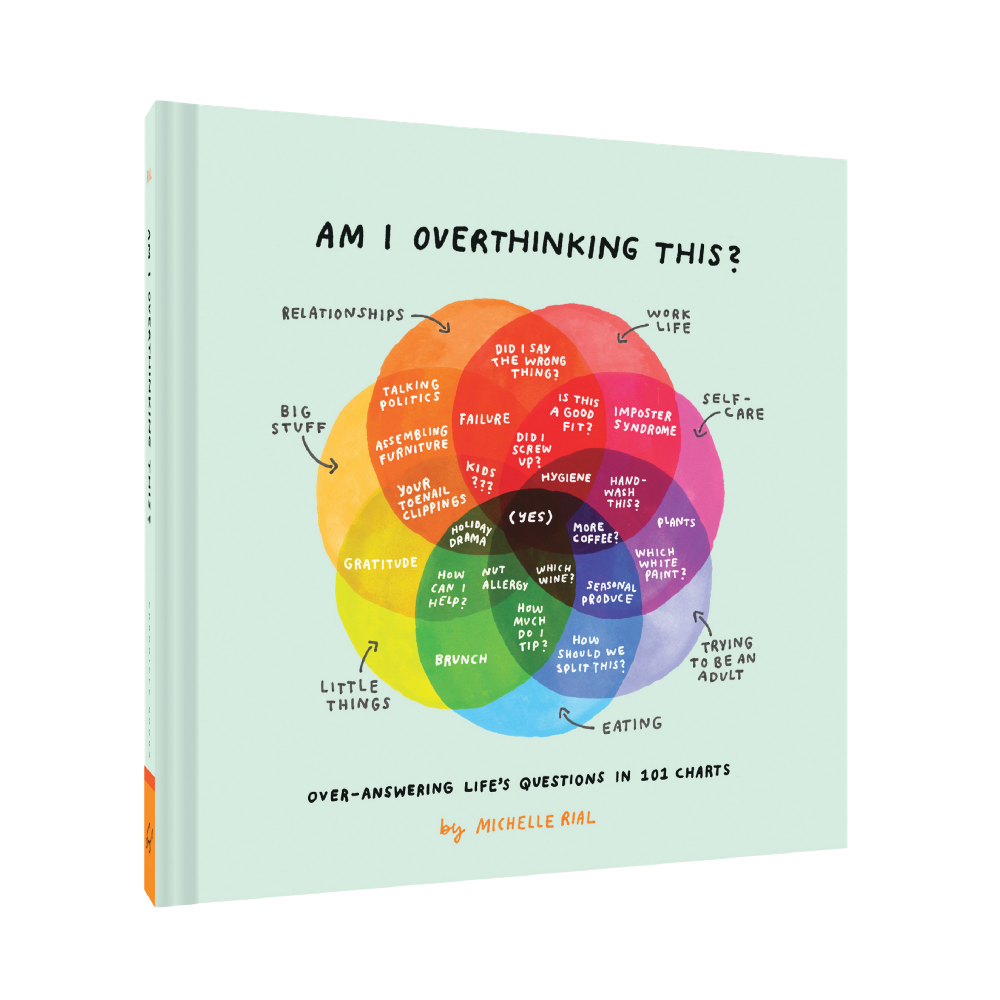
AH: You start the introduction with “This is not a book of charts” and end with “This is also a book of charts.” Is that addressing our perspective on how we view life similar to the glass being half empty or half full?
MR: I meant that it wasn’t just a book of charts. It’s a book of charts, but it’s also a lot of other things. It’s life questions, it’s charts, it’s my own struggle and how I got around it, it’s objects made into explanations of the human condition. I’ve heard from a lot of people that it just makes them feel good, which is nice.
AH: I do tend to overthink at times, and I’ve gotten to the place in my life where I just accept it. I recently have gone through some heavy stuff, and it reminded me of the part of your book where you say: “Pick a path and keep moving.” Did that lesson influence the writing of this book or was it discovered during the journey of writing it?
MR: This is inspired by the last page in the book, which is made out of a plant branch. In that chart (and plant), one bloom lives but the other branches die. You never know what’s going to work out but you have to keep moving and not look back too much.

MR: The theme of overthinking became a narrative when I decided to make a small art show, and then later on, the publisher wanted the charts to be framed as questions. The nice thing that ended up happening is that they kind of answer themselves, so I just tried to represent that thought process. Also sometimes there’s not an answer but you just need some comic relief from the situation.
JF: How does one of your charts begin? What’s the process of making them?
MR: It happens in almost any way possible. When I started with the book, I knew I had to make at least 100 of them, so I went to flea markets and started going around the house looking for objects and putting them on the paper to see what would come from it. Since I’ve been thinking in simplified chart mode for a while, when I see the shapes I start to see things, like triangles, venn diagrams, timelines — the shapes of the objects start to appear in chart form.
I’ve been making different versions for a long time now. One example is where I was eating a watermelon rind. In the camera, you can see I was experimenting with random drawings with the objects and the charts. The rind made this arc, so I realized it matched the popularity of watermelon in the summer and you have the northern hemisphere and the southern hemisphere when you turn it upside down.

But sometimes I have a simple chart and I write that on paper, and I just let it sit. During this process, I might find an object that helps. There’s one chart about going out vs. staying in where I end up adding a cocktail straw and a coffee stirrer to represent going out early in the morning vs. going out at night. It starts as a simple chart but the straws end up adding a special element of recognition and maybe an aha moment.


So in the chart making process, the object can come first and I incorporate ideas around it or I get an idea and find an object to visualize it. “Is This Wine OK?” is an example where I made the chart first. It was about the indecision of knowing which wine to bring. It’s a silly one, but I decided to sell it as a print to raise money for the North Bay fires, since it’s an area of wine industry. I realized I could add a wine stain to the Venn diagram to add an element of recognition, and then decided to make a couple more prints to get more donations. I made another two using a wine opener, and it reminded me of sine/cosine waves. It was a nice feeling to sell them for a cause, and to also know that people wanted to buy them.


JF: So it seems that you really like Venn diagrams. Why?
MR: I actually have to force myself not to think in terms of Venn diagrams. That’s just the first way I think about everything, but I know it doesn’t always work.
AH: Do you think it’s because you’re logical or don’t want to seem too firm or constrained in your thinking?
MR: I just like to find relationships between things. I’m always trying to find the relationship between two things or categorize them. Or think of one thing as something else. It can be annoying.
JF: When did you make your first real-world object chart? Do you remember it?

MR: I don’t exactly remember when. I had tried using actual objects in information graphics but in Photoshop, but those weren’t as interesting. I think the object thing stems from the fact that I just don’t draw that well. At one point, I had to quit my job because of a repetitive strain injury. I couldn’t really use the computer and took a healing break. If I got on the computer that would reverse it all. Then I got this neck injection, and it was supposed to help, but only made it worse.
The one step forward and two steps back with recovery was draining and I was making these drawings that were really ugly, and the drawing wasn’t getting better, so then I put the object in. It started as a random art exercise. Like, I’m just gonna put a pinecone in here and make a therapeutic drawing around it. But then they started to emerge with the charts. I think the first object was a hairpin. I was inspired by them because I buy them in bulk but they disappear. So they disappear, but then I have a thousand of them. That’s a chart!
AH: What is your role as an information designer then?
MR: I’ve been trying to get into actual data viz for a long time. I think this work is information design, but not data viz. I always wanted to come at it this way to tell stories, and “make content” so to say. The entire time I had design jobs, all I wanted was to be able to pitch charts, graphs, and illustrations as content. And in some jobs I was able to do this! But most of the time my main job as a producer or a designer was to take other people’s ideas and make them real. This is an incredible skill, but I feel most satisfied if I can come up with concepts as well. It might be a control issue.

My interest in dataviz goes back pretty far. I wanted to work at New York Magazine because they always had the best infographics. I tried to work there (full time, I was freelancing for them) and didn’t get the job. I had made an infographic as my cover letter and showed it to someone who forwarded it to someone else who happened to work at Glamour. Glamour.com hired me part time and they said it was just translating magazine content to web content. I was asked what I wanted to do if there was time outside of the regular job, and I said: “I want to make charts.” That’s just what my brain wants to do. Several years later, after transitioning to a “producer/designer,” I started designing other people’s content, and then pitching my own. It had to be on brand so I pitched a fashion week infographic to an editor and then started asking fashion editors how many drinks they had at fashion week, or how many taxis they used, etc. Pitching and making content wasn’t part of my job, but I wanted to do it so badly that I did it on the side.
Historically, I have always loved math and this was something I always enjoyed. As a child, my dad used to give me math riddles and show me the beauty of fractals, and it definitely made an impression. I’m also not the best verbal communicator, so that’s probably also why I prefer to communicate visually.
AH: Switching topics a bit to the under-representation of women in the dataviz space. What are your thoughts on this and how does that motivate your work?
MR: For a long time I didn’t even realize I was only paying attention to the “main people” that are talked about in dataviz, like Edward Tufte, Nate Silver, and Nick Feltron, but as I did more work in the space, someone pointed me to Mona Chalabi, and I was like “WHAT?” This is exactly up my alley, and how did I not know about Mona Chalabi? I should have known about her! It was interesting to see the ways in which our work was similar and to have someone that I could look up to in that way. Part of the representation question is the importance of having someone like you to look up to. Giorgia Lupi and Stefanie Posavec also come to mind as we talk.
Another example of an important late discovery was W.E.B. Du Bois. The work is not only beautiful but the images speak for experiences that weren’t otherwise heard or allowed to be voiced. When people don’t (or won’t) listen to you, you show them — and that’s part of what I love about dataviz.
AH: Oh you struck oil mentioning W.E.B. Du Bois! Jason has written a TON about his work and I’ve written an article regarding his work and how the art of persuasion helped him make his points about the progression of Black Americans post-emancipation.
MR: Yes! One additional thing since we’re discussing representation, I’ve been trying to make more charts in Spanish or that resonate with Spanish speakers (my parents immigrated from Venezuela). I know that seeing my culture represented much more in the last few years has made a difference for me personally. Growing up in the South, I did a lot of work to try to extract my family’s culture from my being, which made me overthink every interaction. That’s part of what makes me branch out and consider multiple solutions for the questions in the book (and life in general). Growing up bilingual and attempting to assimilate to a culture outside of that of your parents makes you really inspect traditions and norms as an outsider, which can also be a bit of a creative boost. I think it also gave me more attention to detail in life itself.
AH: What do you think that you can bring to this work as a woman that a man couldn’t? What qualities do you think are introduced by women?
MR: For me personally it might be vulnerability and willingness to share my own “data.” Women are also just bringing their own experiences as women. That sounds obvious, but with more representation, there’s more understanding, more “relatability.” Less feeling like you’re the only one going through this. The more groups represented, the less alone people feel, the more they feel like they matter.
When I look at Mona Chalabi’s work, for example, a lot of it feels rooted in giving a voice to people’s experiences that otherwise wouldn’t have the platform to express that voice. These images are also so easy to share and are able to change or affect a person’s thinking with just one visual. She actively seeks to represent the underrepresented, which is part of why her work is so inspiring.
AH: How has the vulnerability shown up in your work?
MR: The hand-drawn aspect is the first way, it shows some imperfections, that there’s a person behind it. With the clean lines, there’s the idea that “this is the authority, this is fact.” But if it’s hand-drawn it shows there is imperfection, it comes from someone, not like a government document. When I decided to leave the computer and make hand-drawn charts, it seemed so much more authentic than what I was doing on the computer. You can see that I have a super shaky arm and hand. and you can perceive the repetitive pain stuff. I can’t draw a perfect line, but even then there’s this authentic presence of a human. That feels vulnerable and lacking the certainty and confidence of a certain type of masculinity.
“I’ve always been a soft spoken person and it’s something about not feeling the authority to be heard, so whether this is gendered or just a part of my life experience it makes sense that I have chosen to communicate visually to express my thoughts.” — Michelle Rial on representation
AH: Lastly, how has the response been to the book? Where do you think it’s taking you next?
MR: The response has been great. I always felt more pride in the more creatively conceptual charts, but one really simple, kind of messy one went viral and traveled all over the internet. It’s about how it’s not too late to start something unless you’re dead. I’m still seeing it around the internet, redrawn and signed with other people’s names and logos. It’s interesting how the ones I labored over are rarely shared, but this one I didn’t even think twice about has resonated so deeply with so many.
I’m not sure if there’s going to be [another book] but it has opened up more opportunities for me. I felt really boxed in as a graphic designer, and the book (and the real-life charts project) has given me more opportunity to be hired for my ideas instead of my mousing hand. It has helped me do more without the computer. From the beginning, I’ve wanted to make conceptual work and it’s giving me the opportunity to do more of that. That’s all I ever asked for.
Generally, our life experiences help form our perspective, yet utilizing this approach, Michelle has opened up the possibility for understanding from a larger audience. That’s why I love that she doesn’t define the book with a fixed answer. This book has the ability to serve the light-hearted and whimsical to the deep and introspective. Our chat reminded me about another phrase I loved from the introduction — “… A reminder that there isn’t always one right answer — and that, sometimes, the only answer is to pick a path and keep moving.”
Michelle’s book has a way of making us become self-aware of the decisions we make on a daily basis. I love the objects that are being woven into the charts as they play into the theme. It definitely takes storytelling to a whole new level.
One underlying thread that resonated from our conversation was Michelle’s desire to be in the data viz space early on in her career. Her desire to tell stories was always bubbling under the surface.
I wasn’t expecting to hear vulnerability. While discussing this with one of our editors, Alyssa Bell, she thought it was a “very legit answer.” She went on to elaborate “that much like any field that’s been dominated by one group for a long time, one of the best qualities that a new group provides is perspective. A new point of view, a different background, and at times much less hindered by what one’s ‘supposed to do.’ They can instead look at what hasn’t yet been done more easily.”
We at Nightingale have had several discussions about diversity and integration in relation to the topics covered and the articles we have curated. It’s one of the reasons that our publication bears the name of Florence Nightingale. I totally agree with Michelle in the importance of having diverse representation to broaden our breadth of experiences through different points of view.
Jason and I thoroughly enjoyed our conversation with Michelle. I walked away feeling very inspired about her style of storytelling and how she incorporates everyday objects. I loved how she weighed in on representation and the importance of giving a voice or being that voice to convey messages from a different perspective. I invite everyone who is looking to tell a visual story to find your place in data visualization.
Creating transcendent stories that share the importance of data narratives and how they impact our world.
- Allen Hillary


