
Nine Themes for Frame Four
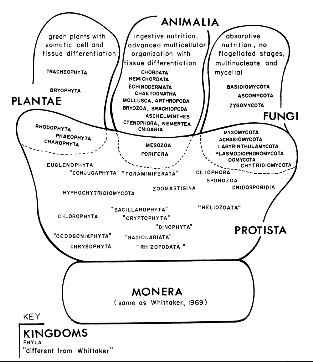
Classification is an intellectual act, performed as often in the name of theology as in the name of science. The classifications proposed here are an attempt to impose useful differences onto a field of infinite examples. In that sense, it is analogous to classification schemes in the biological sciences. In his explanation of contemporary evolution theory, David Quammen describes how the biologists Robert Whittaker and Lynn Margulis recognized the limits of imposing order on the phenomenon we study.
One point they agreed on was that kingdoms of life are hard to define. The lines dividing one kingdom from another are inescapably blurry. … classification is a human endeavor, not an inherent reality of the natural world — it’s a matter of discovery plus decision — and that simplicity is important. [1]
We understand the biological world differently today than we did at the turn of the 21st century. By moving into the Frame Four I described in the previous article, we can discover a richness we have previously excluded from information design history. As an analogy to Margulis and Whittaker’s biological kingdoms [2], the functional themes I propose for exploring the diversity of examples within Frame Four are meant to be pathways to discovery. They are not a new set of boundaries. By viewing design through its functional theme — essentially its problem-solving dimension — we can open a window into the creative ingenuity of the culture that produced it.
I am very fond of the number nine, so I am happy to organize information design into nine functional themes. I will quickly introduce these nine themes, then explore them one by one.
Overview of the Nine Functional Themes In Three Groups

The first group of themes are Cosmology, Maps, Transportation, and Lineage. Examples of these four themes stretch from the oldest surviving visual language to the present day. Human cultures need to locate themselves in a cosmic order. Social systems define themselves by expressing boundaries. Our mobility dictates the recording of pathways. The experience of time beyond one human life motivates a record of ancestry relationships.

The second group of themes are Timelines and Scientific Explanation. These two themes inherit and adapt the pictorial language established by the first four themes. Time is the homogenizer of disparate worlds. The chronological arrangement of events steps outside the boundaries of lineage and presents another theme that can reinforce or challenge cultural narratives: the alignment of events in time. Scientific explanation is the need to understand the physical and natural world. We can find examples of this across all cultures and time periods, including, but not limited to, examples of narratives of continuously progressive experimentation favored by historians of science.

The third group of themes are Economic Trends, Mechanical Controls, and Engineering and Business Process. These functional themes are a response to a change in values that begin in 18th Century Europe at the start of industrialization and continue into the present. The accumulation and visualization of quantitative data become valuable because it is associated with profit. Quantifying energy becomes valuable when we need to control the machines that generate it. Our need to visualize abstractions appeared and accelerate in parallel with our need to manage greater and greater quantities of energy, whether that energy is quantified as dollars, megawatts or person-years.
1: Cosmology and Theological Narrative
The first function of information design is to describe how we believe the universe is organized. Cosmology today is a scientific field that studies the origin and development of the physical universe, building quantitative measurements on mathematical and theoretical models. In Frame Four, cosmology includes all the relationships of human life to sacred space, whether that space is located in the visible universe or in a visualization of the worlds we are contained within. In this sense, cosmology is an explanation of where we come from, our present relationship to visible and invisible forces, and where we are going in the future.
Information design that functions as an expression of cosmology can take many forms, from monumental constructions to small abstract drawings. I begin with the monumental. I want you to look up at the visual composition above the doorway as you enter this medieval church.
A Romanesque Tympanum
The Abbey Church of Sainte-Foy-la-Grande in Conques, France is one of many European churches on the Camino de Santiago (the Way of Saint James), a network of footpaths that lead to Santiago de Compostela, Spain. Waves of pilgrims were encouraged to walk this path visiting sacred relics in each church along the route. The traffic fueled a building boom that employed Romanesque stone carvers who created narrative compositions. The exterior of these churches became picture books to be read by the approaching pilgrims. Looking up at the tympanum above the central doorway, the arrangement of figures reminds the viewer of why they are here — to prepare themselves for the Last Judgment.

The visual narrative is designed to communicate without reference to written language. The pilgrim audience has listened to bible stories and can see how the position of visual groups reinforces their ideas of good and evil. The composition is divided by frames resembling floors and roofs, with the most powerful figure dominating the geometric center of the space.
The design uses hierarchy of size, position, and bilateral symmetry to communicate a vision of Christian cosmology. The arrangements and expressions of the angelic, human and demonic figures are a recognizable code. The central figure raises his hand toward happiness on his right and lowers his hand towards suffering on his left. Each set of figures within the frames create meaning in relation to its opposite on the other side. The pilgrim sees who The Blessed are by seeing The Damned.

The designer of this tympanum had a second audience in mind. A literate monk could read the text inscribed in the frames, seeing O Sinners, know that unless you change your ways there will be a hard judgement [3] overhead as he passed through the doorway. For this audience, the information in the visual narrative is reinforced by the text inscribed in the frames. By recognizing these strategies, we can learn to read the narrative elements encoded on the façade. We learn to see how information design principles shaped the organization of elements in this and similar compositions.
A Mural in a Buddhist Cave
When I stood in front of the painted mural of Wutaishan during a visit to Mogao Grotto in Dunhuang, China, I was expecting to see a religious painting. Instead, I saw a masterpiece of information design that combined landscape painting, Buddhist cosmology, theological narrative, and geography. I was there to see the Chinese Buddhist paintings and sculptures I had read about in art history books. I was expecting to see paintings of Buddhas and bodhisattvas, local legends and scenes of daily life. On the rear wall of Cave 61, I encountered a surprise. I was expecting to see another narrative and what I saw looked like a map of a place.
I walked in front of a mural that is larger than any person’s field of vision, over fifty feet long and twelve feet high. I could see pilgrims and monks in and around the monasteries of Wutaishan (Five Terrace Mountain), a sacred mountain range in north China. Above me, I saw celestial beings descending from the clouds. I was looking at the map of a place, as a pilgrim would see it upon entering the valley, five mountains covered with buildings and connecting paths [4]. I could see the layers of design and could read all this from the images on the wall without, at the time, knowing the legends and theology it was based on.

The entire mural is divided into three tiers, with celestial figures along the top, temples populated by monks and bodhisattvas in the center, and pilgrims and agricultural workers along the bottom. Celestial emanations pierce downward into the middle tier. The top of the central mountain pushes up into the celestial tier.
In addition to this vertical organization, the entire composition presents three superimposed layers: a landscape background on which I could see a foreground of architecture populated by Buddhas, human and animal figures, and a top layer of cartouche containing the names of temples, famous monks and religious sayings. The relative value of the figures is encoded in their size. Laymen are small. Monks are recognizable by their robes and always ahead or two larger than laymen. Celestial beings, descending from the sky or standing where they would be encountered in the mountains, are always considerably larger than monks.

The slanting roofline of the temple buildings drew my eye upward along the pilgrimage road, to the peak of the central mountain. The angles of exposed walls on the monastery buildings reversed as I moved beyond the central peak. Now the rooflines slanted downward, curving the sacred space back towards me. The composition ended on the lower right with the sole symmetrical element, a walled gate similar to the one in the lower-left corner with the reverse orientation.

As I walked along the 50-foot mural I had figuratively trekked over 150 miles through sacred space. I could see and feel the curved space as I walked along the narrow corridor behind a stone screen that prevents someone entering the cave from seeing the entire composition. To see anything at all, I needed a flashlight, as there is no natural light in the cave.

composite image of Wutaishan mural showing its location visually obscured behind the stone screen and the platform that once held multiple bodhisattvas and guardian statues.
Cave 61 is one of 500 caves carved into the cliff and painted from floor to ceiling. What function did it serve to create a narrative map representing hundreds of figures and temples inside this cave, partially hidden behind a stone screen? There are records of who commissioned the cave and portraits of the patrons line the other walls. Some argue that the cave was used for religious ceremonies and the viewer who walked by the mural gained merit by experiencing the virtual pilgrimage [5]. Others argue that to the lack of soot from torches suggest that once the cave was painted, it was never used [6]. Perhaps the act of encoding the sacred narrative onto the wall was the entire function of the design [7].
A Mayan Mural
The murals at the small Mayan city of Bonampak provide another striking example of information design communicating a combination of theological and political message. The murals in a building simply known as Structure 1, were completed in 791. They cover the walls of three rooms that slope inward to a narrow peak, each room roughly three meters deep by five meters long. Such rooms could have held only a few visitors at a time, which suggests a monument visited by privileged members of the city’s ruling class.

The murals have been photographed, x-rayed and analyzed since the 1940s when they became known to people outside the local population. As our understanding of the Mayan writing system has grown, the text on and around the figures has been translated. Despite or perhaps because of all this analysis, there is no agreement among archeologists and art historians concerning the mural’s narrative details [8]. The narrative in Room 2 is the easiest to recognize. Armies engaged in hand-to-hand combat cover three walls, while the paintings on the fourth wall present warriors and their defeated captives over and around the entrance-exit door. Each of the compositions is divided into multiple tiers. The top tier contains symbols for gods and sky creatures. The second tier contains the political-spiritual leaders whose superior rank is communicated by elaborate dress and clear separation from the background, even though the top tier is the most difficult part of the mural to see when standing in the room or seated on the interior bench. The inferior figures on the tiers below are closest to the viewer’s eye-level, lined up along the floor, providing support and context for the figures above.
There is no hierarchy in the size or skin tone. The size of the human figures themselves are all uniform. Their skin tones vary from light to dark brown in every tier. Female figures appear in the top tier of the victory tableau. Their clothing and position on platforms or at the top of steps communicate their position in a social hierarchy, which is further embodied in the physical architecture of the entire city. The most prominent warrior, presumably the ruler of Bonampak at the time of the events, is flanked by in the battle and the sacrifice of victims by three male figures. The same three young men dressing for a ritual performance in Room 1 and performing a dance in Room 3 — providing continuity across the composition. These three young men, rather than the city’s king who appears in two of the three rooms, are coded as the focus of the design through position and repetition.

It is the mural in Room 2 that is most often reproduced. The south wall and two sides depict two battling armies. On the north wall above the doorway, we see the battle’s aftermath: bleeding captives dominated by the jaguar-clad victors. The contemporary viewer needs no context to see the dominance communicated by the standing figure resting his spear on a corpse, looming over the kneeling supplicants. How clearly these figures are framed by the steps they are painted on is itself an enormous contrast to the murals on the other three walls. Upon entering the room, the viewer is first confronted with human bodies grasping, stabbing and wrestling in battle, piled on the invisible ground, with only the jaguar-clad leader at the top, grasping his captive by the hair, clearly separated from the others. Turning away from the battle, the viewer is presented with a tableau of hierarchy restored.

A Victory Stele
The information encoded in this combination of visual relationships — vertical position of the dominant figure, relative contrast of this figure against the background, the vector of a weapon pointed downward, with figures of the victorious and the defeated below — is found in many cultures. Wandering the halls of the Ancient Near East in the Louvre, I find myself in front of the Victory Stele of Naram-Sin, a design that dates from 2254 B.C. recording the victory of an Akkadian king over the Lullubi in present-day Iraq. We can read the design of victory and dominance without reference to the text inscribed in the stone. In fact, there are two texts here in two different Ancient Near Eastern languages — the first commemorating the original event and the second added a thousand years later by the Elamite King Shutruk-Nakhunte, a descendant of the defeated Lullubi. The second text records how the stone was removed to the Elamite capital in present-day Iran, where the museum label informs us it was excavated in the 19th century by a French archaeologist and removed to Paris.

The role of text in these examples is worth reflecting on. The text on the victory stele is speaking to the present and future audience, connecting a political-religious figure to an event. The inscription takes up the negative space outside the visual composition. In the Bonampak murals, the text is also a layer added to an essentially complete visual design. The titles and names for figures are an added layer of information, painted on reserved background spaces, or unreserved space such as the shields of warriors enmeshed in the battle. This last-layer status is further illustrated by the spaces in other parts of the mural that text was never completed. Once we learn that most of what is written are people’s names and titles, we can assume these texts were meant to identify the people depicted to their descendants.
In the earlier example in Cave 61, the cartouches are painted on top of the pilgrimage figures and landscape. The text adds a layer of specificity to the otherwise generic rendition of temple architecture. Perhaps the textual details added authenticity to the composition, communicating to the government officials who supervised and approved the painting, and the monastics and ruling families who sponsored its creation. On the Conques tympanum, the text is restricted to the areas that frame the carved figures. It consists of lines address to a wide audience but perhaps only legible to monastics. In each case, the value of the text is additive but not crucial to the overall information design.
A 20th Century Stone Façade
As I approach Palais de la Porte Dorée from the street, I can make out African elephants on the left and Asian elephants on the right heading towards the entrance doorway.

As I walk up the stairway, images of people, animals, and plants emerge in overwhelming detail from the stone façade.

This façade represents the colonial cosmology of the French Third Republic. The building was designed for the International Colonial Exposition in 1931, an event that turned this part of Paris into a theme park celebrating the value of France’s colonial possessions [9]. The façade was designed and carved by a team led by Alfred Janniot, who specialized in monumental relief sculpture. Janniot studied fragments of the temples of Angkor Vat arriving in Paris from the colony of Cambodia. His art moderne composition combined this form of shallow relief used by Khmer Empire, with Greco-Roman figures and a photo-realist rendering of material details.


The composition wraps the French colonies around three sides of the building, showing colonial subjects harvesting resources from the earth and the sea, then loading these resources onto ships bound for France. The left side of the building represents the Caribbean and Africa. Sugar, vanilla, ivory, palm nuts and tropical wood, wool, phosphate, rice, cacao are gathered by laborers and passed upward to waiting ships. The right side represents Asia and the Pacific. Rice, bamboo, raw rubber, tea, coffee, lead, coal, and fish are lifted upward and carried to France. The representation of France over the entrance — the position of the Last Judgment or the Holy Family in a medieval church, Vishnu or Buddha in the Khmer monuments — takes the form of Europa and her bull (Zeus) attended by Greco-Roman goddesses, surrounded by a cornucopia of harvests symbolizing abundance.

The function of the design is to illustrate the economic benefit of the colonies to France. In this cosmology of a secular state, Greco-Roman symbols are surrounded by a catalog of colonial benefits: the plants, animals, and birds of each region, the indigenous labor, the natural resources to be harvested and modes of production. Words are carved in stone within the composition, naming the colonies and identifying major exports, such as caoutchouc (raw rubber), kola nuts and palm oil.
There are no Europeans in Janniot’s composition by design. Depictions of French colonists and missionaries bringing the benefits of education, medicine, and religion to colonies were assigned to murals on the inside of the museum, as part of the design program for the building. On the exterior façade, everyone is conscientiously gathering ivory, cutting sugar cane, planting rice and mining coal for invisible masters. The result is a cosmology of colonialism expressed through the language of a sacred monument. Flora, fauna and indigenous population are equally exploitable resources, animated by Greco-Roman goddesses [10]. The irony today is that many of the French citizens who visit this monument, which is now the National Museum of Immigration History, are descended from the colonial subjects depicted in the composition.
Next: Cosmology in the Small
We have looked at examples of one expression of Cosmology as an information design theme: the structure of monuments that confront, and in many cases surround, the viewer with a visual narrative. These examples are expressions of grandeur that make up the fiber of an urban environment and shape the messages in sacred spaces. But information about our origins and our place in the universe is also encoded in portable artifacts. Next, we will look at instructive examples where information designers have distilled cosmology into symbolic patterns on a variety of portable surfaces.
Global Information Design: an overview of the series
Global information design embraces the visualizations of both qualitative data such as expressions of social hierarchy, cultural beliefs, and values, and quantitative data, such as economic trends and scientific explanation. We can broaden our view of information design by following the pathways of its intended use. Exploring the history of how we visualize cosmology and timelines, transportation networks and family lineage, is as informative for current data visualization practice as the mastery of programming libraries and cognitive science. Studying examples of information design from many time periods and many cultures helps us understand how we shape patterns of difference into hierarchies and networks to create that chart, story, or graphic from the patterns that connect.
Bibliography
[1] D. Quammen, The tangled tree: a radical new history of life. New York, NY: Simon & Schuster, 2018.
[2] L. Margulis, “Whittaker’s Five Kingdoms of Organisms: Minor Revisions Suggested by Considerations of the Origin of Mitosis,” Evolution, vol. 25, no. 1, pp. 242–245, 1971.
[3] R. Stracke and C. Stracke, “The Tympanum at the Church of St. Foy, Conques,” ChristianIconography.Info. [Online]. Available: http://www.christianiconography.info/conques/tympanum.htm. [Accessed: 30-Oct-2018].
[4] D. C. Wong, “A Reassessment of the Representation of Mt. Wutai from Dunhuang Cave 61,” Archives of Asian Art, vol. 46, pp. 27–52, 1993.
[5] W.-C. Lin, Building a sacred mountain: the Buddhist architecture of China’s Mount Wutai. Seattle, Washington: University of Washington Press, 2014.
[6] R. Sharf, “Art in the dark: the ritual context of Buddhist caves in western China,” in Art of Merit: Studies in Buddhist Art and its Conservation, Archetype, 2013.
[7] A. F. Howard, “On ‘Art in the Dark’ and Meditation in Central Asian Buddhist Caves,” The Eastern Buddhist, vol. 46, no. 2, pp. 19–40, 2015.
[8] M. E. Miller and C. Brittenham, The spectacle of the late Maya court: reflections on the murals of Bonampak. Austin; México, D.F.: University of Texas Press ; CONACULTA, Instituto Nacional de Antropología e Historia, 2013.
[9] D. François and Musée National des Arts d’Afrique et d’Océanie (Paris), Le palais des colonies — Histoire du musée des Arts d’Afrique et d’Océanie. Paris: Réunion des Musées Nationaux, 2002.
[10] P. A. Morton, Hybrid modernities: architecture and representation at the 1931 Colonial Exposition, Paris. Cambridge, Mass: MIT Press, 2000.
Thanks to Jason Forrest.

Paul Kahn’s engagement with visualization of large knowledge structures began with hypertext research projects in the 1980s and continued with the development of diagram techniques for describing information architecture. He taught Information Design History for 7 years at Northeastern University’s Information Design & Data Visualization program. He created Kahn+Assoc., the first agency in France focused on information architecture, preceded by a decade leading Dynamic Diagrams in Providence RI. He served as Experience Design Director at Mad*Pow and now devotes himself to teaching and writing in France. In 2020 he led Covid-19 Online Visualization Collection (COVIC), and has written about insights from the thousands of visualizations created during the pandemic.
- Paul Kahn

- Paul Kahn

- Paul Kahn

- Paul Kahn


