
Why Cornelius Cardew’s legendary 193-page graphic score might not actually be about music
Like many fine art movements, the world of avant-garde music takes both an appreciation of the history of the genre and an interest in the subject to gain a full appreciation of it. While few have extensive familiarity with the edges of the arts, many of the innovations that move culture forward originate from these mavericks that challenge our preconceptions. Cornelius Cardew was certainly one such artist that broke barriers and shaped the music of those that followed him.

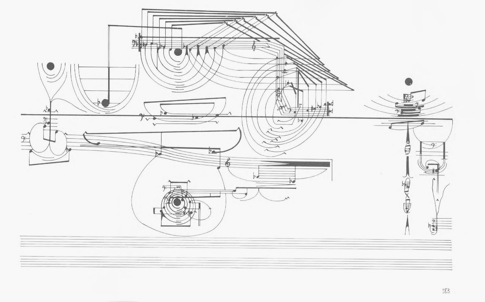
Cardew’s most important work is called Treatise. It has been called the “greatest musical score ever designed” and “something that looks more like a gesture of despair.” It is a 193-page graphic score, which means that it is written to be read visually — not as traditional Western sheet music — but as a drawing for musicians to improvise the music it represents. Just as no two interpretations of a graphic can be the same, no two performances of a graphic score can be the same. If the musicians are true to the score, each performance would feature different notes but would share a similar form and composition.
Graphic scores were not uncommon before Treatise, but it is the depth of the visual and musical sophistication that makes it fascinating. As drawings alone, each page of Treatise is visually interesting and extremely nuanced. But when it is considered as a score for musicians to interpret, then one can see the vast influences that Treatise pulls from. It is this iconoclastic synthesis where I see Treatise as a work of information design.

Treatise is very difficult to describe and even more difficult to learn.
Published in 1967, Cardew provided no instructions for how it was to be interpreted or performed. No meaning was ascribed to the 67 different symbols that Cardew employs across the duration of the score, most of which are not connected to traditional music notation. Treatise is a diagram of concepts that challenge the boundaries of what it is to control sound, to define time, and interpret the symbols around us. It is completely open to interpretation.
Here’s how Carew described Treatise a few years after its composition when he documented his process in “Treatise: Working Notes”:

Yet Treatise is absolutely a set of instructions to be followed. The composition is read from left to right like any traditional score. But unlike a traditional score, Treatise follows a dark “centerline” that runs across each page. The design of each spread flows over two clefs that span the bottom of each page and reminds us that this is a musical score. Numbers are sprinkled throughout, but they are not mapped to any explicit meaning.
Notice Cardew’s careful choice of the word “orientation” in his description above. He challenges the performer to learn his visual language in the opening pages of the composition. Cardew introduces symbols in groups then; over time, they might return in a new way. Below are the first few pages of the composition. Notice how the composition of the design builds on itself from spread to spread:


(Re)Defining the language of sound
Since music is inherently performed in time, the pages should be read in sequence. Lines connect and develop into forms. Forms stretch across pages to create a flow. Read linearly, a visual story begins to emerge. Carew is careful to arrange graphic elements that defy specificity but explore spacial relationships. The composition of form is instructed and a visual language begins to emerge.
The eye follows the centerline naturally. It is heavily manipulated for the duration of the score. It is cut, bent, radiated, twisted, doubled, rotated and teleported. The centerline is a path, a thread, and an idea. The centerline is a horizon; a divider between treble and bass clefs, a median between above and below, high and low. The centerline could represent pitch but isn’t expressly mapped to that possibility. The centerline is an abstracted representation of a journey.


Cardew was inspired by Ludwig Wittgenstein’s Tractatus Logico-Philosophicus which had an equally broad goal: to identify the relationship between language and reality by defining the limits of science. Treatise is a similar attempt to identify the relationship between language and listening while defining the limits of music.
Despite its open conceptual framework, Treatise is remarkably precise. Cardew directs and teaches the performer to understand his visual logic as it develops. The symbols tell the story of the composition as located in a symbolic time-space. Cardew weighs the relationships of the visual elements on each page and relates each event to the compositional whole. In this sense, Treatise becomes a visual symphony.
Perhaps the real genius of Treatise is its between-ness. While Cardew pushes the design to its extreme, the elements still feel like it can be interpreted as music. With enough musical elements in place to still read as a score, the elements, forms, and symbols are transformed in time by provocative arrangements at the edge of musical notation.


The visual representation of music
Musical notation is a system that is used to visually represent aurally perceived music by the use of visual symbols. A graphic score is a drawing that represents a musical composition through the use of visual symbols outside the realm of traditional music notation. Given these two definitions, what is a graphic score if not the information design of sound?

Western musical notation largely originated from medieval Europe and has constantly been evolving and expanding. The abstraction of music notation dates back to the early Renaissance when Baude Cordier designed “Eye Music” as a sort of visual puzzle for the performer.
There is a rich history of composers seeking to expand on traditional notation. Many of these were attempts to add notation for sounds that were outside of the traditional tonal scale or develop new methods of musical performance.

Similarly, other types of drawn sound techniques arose in the sciences. The waveform emerged from mechanical drawing systems in the second half of the 19th century and continued to evolve with the invention of the Cathode ray tube oscilloscopes. This led to other visual investigations, including the graphical sound technology of the 1920s and 1930s in Russia which was tangential to the perfection of optical sound recording for motion pictures.
A few decades later, the synesthetic drawing of sound could be found across the arts and sciences. As the waveform became the widely understood representation of sound itself, musical notation became the specialists’ language of the musician. Since so many cultural norms were challenged during the post-WWII period, it follows that the concept of musical notation would also be reconsidered.
Treatise was born in a post-waveform world.
The making of the greatest musical score ever designed
Cornelius Cardew was born in England to bohemian parents in 1936. When he was 22, Cardew won a scholarship to study with Karlheinz Stockhausen, one of the most important and controversial composers of the 20th century. Stockhausen was very fond of Cardew: “I gave him work to do which I have never given to any other musician, which means to work with me on the score I was composing.”

Cardew was aware of Stockhausen’s diagrams for performing electronic music and helped him draft his compositions. Stockhausen’s diagrams were rooted in the language of frequency and his scores were instructions for performers to use frequency generators, modulators, and reel-to-reel tape recorders to create early electronic music.

That same year, in 1958, Cardew attended a series of concerts in Cologne by John Cage, an American composer-performer who rejected formalism and was building an international group of avant-garde followers. Cage’s compositions relied heavily on indeterminacy in music, allowing for chance events to shape or even define the composition. In order to better coach his collaborators, Cage also experimented with graphic scores of a more playful sensibility.
Both Cage and Stockhausen (and others such as Morton Feldman) refocused the purpose of the musical score away from traditional notation and towards the communication of events happening in time. These scores act as a set of directions for sound-art-making.
The expanding context of Information Design

By the 1950s, information design was already readily apparent across media in general. Diagrams, charts, and scientific illustrations were common in everything from advertising and art to the grand splash that was cybernetics. Designers like Ladislav Sutnar applied modernist design principles towards American business needs in the 1940s and ’50s. Sutnar regularly distilled the fundamentals of design into geometric symbols to specifically communicate complex ideas such as organizational structures or complex industrial processes.
Information Theory and Cybernetics were both established in 1948; both were alive with visualizations of systems, processes, and equations. Claude Shannon published “A Mathematical Theory of Communication,” which defined fundamental concepts on signal processing and communication operations such as data compression. At the same time, Norbert Wiener’s research on feedback systems had a wide-ranging impact on disciplines such as neuroscience, philosophy, and genetics, to name just a few. It seemed the whole thinking world was inspired to define and map previously unexplored complex systems of signals and modifiers.

At the same time, in the field of design, artists such as Saul Steinberg used simple drawings to caricature society. His line drawings were full of clever visual playfulness, his human touch surprisingly theoretical. Noted art critic Harold Rosenberg called Steinberg a “writer of pictures, an architect of speech and sounds, a draftsman of philosophical reflections.”
Information design (by any other name) was essentially everywhere. The rapidly expanding discipline of graphic design, as influenced by modernism, was changing how the world understood and organized information. With this expanded context, it’s easy to see how Cardew had a wealth of conceptual and visual inspiration to draw from.

The composer as designer
After Cardew finished his work with Stockhausen, he returned to England and became a fixture in the contemporary music scene. But like many artists, Cardew needed a day job. After taking a typography course in 1961, he began as an assistant art editor at Aldus Books, then a subsidiary of Penguin.
Cardew was fascinated by design, as he tells us himself at the beginning of a program for the BBC in January 1966 called A Composer’s Portrait — Treatise (click for .mp3):
“The idea of the piece came to me when I was working as a graphic designer in a publishers office. While there, I became more and more preoccupied with designing diagrams and charts. And in the course of this work, I became aware of the eloquence of simple black lines. Thin, thick, curving, broken, and then the various terms of grey, and then the type, numbers, words, short sentences like ornate, literary, art nouveau-ish visual interlopers in the purely graphic context of the diagram.”
According to John Tilbury’s book, “Cornelius Cardew: A Life Unfinished,” Cardew’s interest in typography was transferred to “the limitations which the constraints of the Western notational system imposed on compositional thought.” Then, in his notes from 1963, Cardew writes:
“A composer who hears sounds will try to find a notation for sounds. One who has ideas will find one that expresses his ideas, leaving their interpretation free, in confidence that his ideas have been accurately and concisely notated.”

Was ‘Treatise’ actually designed to be music?
Treatise itself is a dichotomy. It was an attempt by Cardew to define musical ideas that are embodied by visual representations. But unlike many other graphic scores, Cardew went so far with the visuals that I believe he was composing for the imagination of the performer, not the audience.
While Cardew was certainly intent on creating music, his preoccupation with establishing a visual logic outstrips its intended function to guide musicians. Cardew confesses in 1971:
“On the other hand, the score suffers from the fact that it does demand a certain facility in reading graphics, ie a visual education. Now 90% of musicians are visual innocents and ignoramuses, and ironically this exacerbates the situation, since their expression or interpretation of the score is to be audible rather than visible. Mathematicians and graphic artists find the score easier to read than musicians; they get more from it. But of course mathematicians and graphic artists do not generally have sufficient control of sound-media to produce “sublime” musical performances. My most rewarding experiences with Treatise have come through people who by some fluke have a) acquired a visual education, b) escaped a musical education and c) have nevertheless become musicians, ie play music to the full capacity of their beings… but even there it is extremely rare.”
~Cornelius Cardew from “Treatise Handbook,” 1971


Music composition as semiotics
Treatise is the exploration of the infrastructure of musical notation as (re)created by a visual semiotics of Cardew’s own making. Three years after he published Treatise, Cardew collected his thoughts and working notes on the process. It’s a fascinating read. Ideas are broken down, challenged, and recomposed several times.
In his note on July 19, 1963, Cardew writes about the semiotics of the work. “The aim is to make it so that a sign can only follow appropriately after another sign. … In Treatise a sign has to be made appropriate to its context. Like words that exist as various parts of speech: according to its position in the grammar you have to select the appropriate form of the word.”
Another note in July reads outlines his intentions for using certain shapes. “Just as the perfect geometrical forms are subjected in the score to destruction and distortion, corresponding perfect forms can be sought in sound (octaves and simultaneous attacks are two leads that spring to mind) and these destroyed or distorted.”
Here’s a passage from October:

But as exacting as Cardew’s explorations are, his insistence on abstraction regularly contradicts his own process. A few notes later he insists: “Work with your hands on the material … don’t try and set up grammatical rules which you will only ignore in the next page.”
The legacy — and challenge — of ‘Treatise’

In “A Treatise Remix Handbook,” Christopher Williams elaborates on the frustrations in interpretation: “the various notational elements (save the empty staves at the bottom of every page) enter and exit sections of the piece capriciously. Their visual-semiotic meanings change frequently, as for example when a circle acts as a geometric motif on one page and becomes a musical note on the next. Sooner or later, any consistency in the interpretation of a given element is therefore undermined.”
While the contemporary music world was (and continues to be) enamored by Treatise, Cardew eventually came to see it as a failure. No one could play it. It doesn’t have a feasible structure. If each page was five minutes long it would take 16 hours to perform. Each page contains so many ideas that it’s difficult to understand without considerable study before attempting to play it.
But Treatise continues to captivate imaginations. It is regularly performed around the world, and there are scores of Youtube videos documenting some of these performances. In my opinion, many of these performances are as frustrating to hear as they are earnest interpretations of this difficult music. Performing Treatise is exhausting — almost predetermined not to live up to the expectations of Cardew’s visual rigor. Here’s the only “sanctioned” version of the piece, recorded in 1967 by Cardew’s contemporaries: Cornelius Cardew: Treatise
A record label devoted to New Music recorded and presented with the highest standards. Composer series include Berio…www.moderecords.com
‘Treatise’ may not actually be music — nor could ever be just music
Surprise, confusion, discovery, and expansion are all key concepts to understand in Treatise. One can argue that Treatise may be too focused on the detail of composing a visual narrative to ever truly produce a musical equivalence.
It may be more interesting to appreciate Cardew’s compositional feat than to use it as a musical score. One might consider Treatise more akin to a graphic novel, and if so, it might be read as a linear-abstract narrative. It is legible, has an internal logic, and certainly tells a story.
Treatise is a work of such surprisingly focused thought, such a knowing breadth of referentiality, that it can only truly exist between the worlds of the visual and the musical.
Treatise is its own art form.

Special thanks to Paul Kahn, RJ Andrews, and Alyssa Bell for the edits and consideration in general.

Click here to view the entire Treatise score.
Lastly, here’s a great (and telling) review of a contemporary interpretation:
The older I get the more inclined I am to think that life’s not about finding the right answers but asking the right questions. And if you’re looking for interesting (musical) questions to ask, you can’t do much better than Cornelius Cardew’s Treatise. This 193-page graphic score, which occupied the composer for four years, and which performers are encouraged to interpret any way they feel appropriate… is rich, elusive and thought-provoking enough to keep you busy for a lifetime. –Dan Warburton, www.paristransatlantic.com, February 2009

Jason Forrest is a data visualization designer and writer living in New York City. He is the director of the Data Visualization Lab for McKinsey and Company. In addition to being on the board of directors of the Data Visualization Society, he is also the editor-in-chief of Nightingale: The Journal of the Data Visualization Society. He writes about the intersection of culture and information design and is currently working on a book about pictorial statistics.
- Jason Forrest

- Jason Forrest

- Jason Forrest

- Jason Forrest


