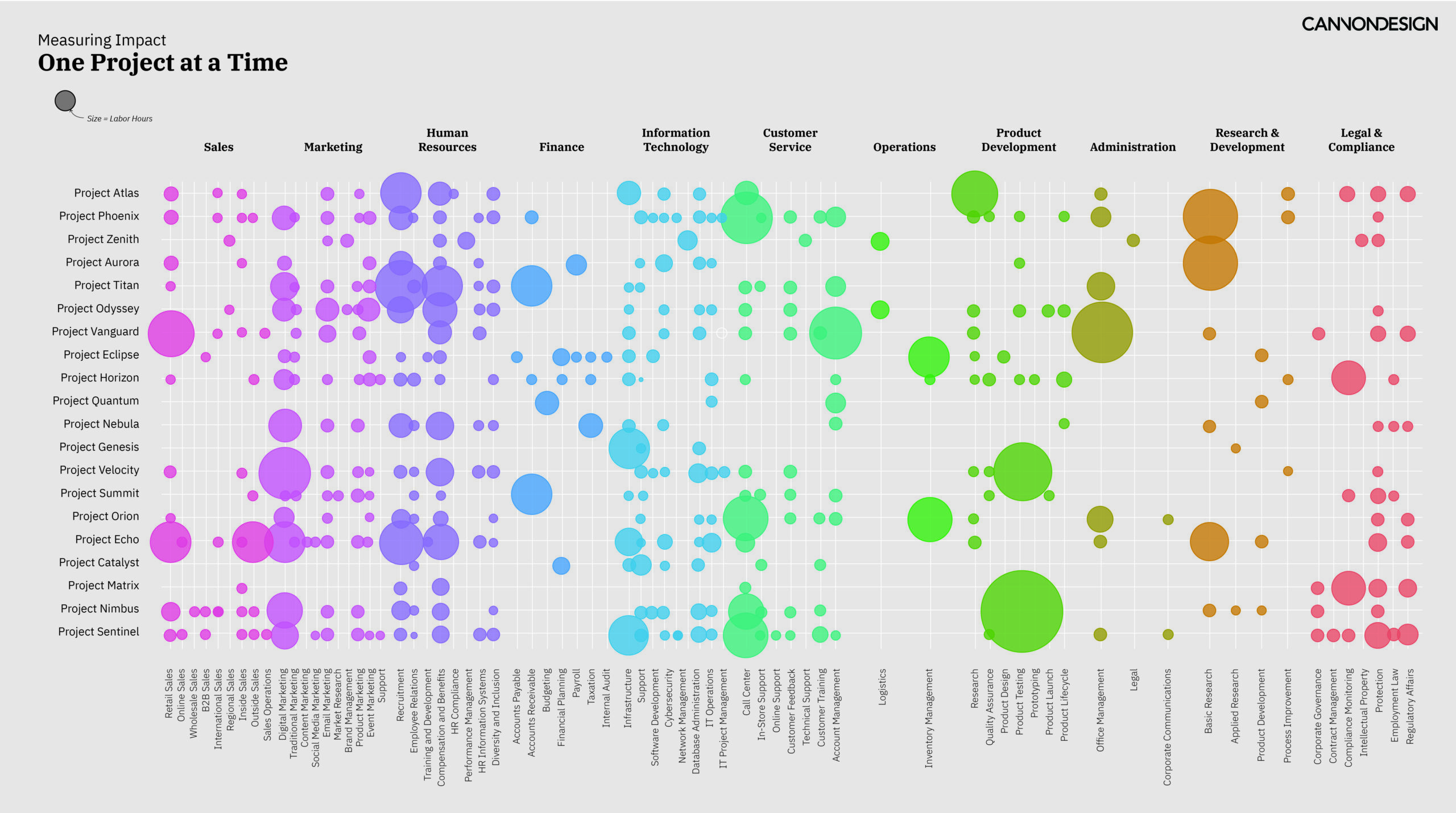
In the business of consulting, our clients rely heavily on data visualization to make sense of complex information and drive decision-making. If you’ve ever interacted with the c-suite of a large institution, you know that capturing their attention and conveying insights effectively can be a daunting task. These executives are whip smart, are inundated with information daily, and their time is precious. Our challenge lies not only in presenting the keenest insights, but doing so in a way that quickly captures their attention, compels action, and leaves a lasting impression amidst the meetings and metrics that define their world. My strategy for success in the c-suite involves an unexpected—and often underappreciated—agent: beauty.
In this context, beauty refers to a practice known as affective design which leverages an emotional response from viewers. Instead of solely focusing on presenting information in a clear and objective manner, affective data visualization uses design to evoke very human reactions such as curiosity, empathy, surprise, even excitement. By engaging viewers on an emotional level, we enhance the impact, engagement, and understanding of the data presented.
This approach recognizes that emotions play a significant role in how individuals perceive and interact with information. By leveraging affective design techniques such as color psychology, visual metaphors, animation, interactivity, and even typography, we can create deeper connections with our c-suite audience by making our insights more relatable and memorable.

Engagement and attention
One of the primary reasons affective design is essential in visualizing business data is its ability to capture the audience’s attention and encourage engagement. In a sea of information, visually appealing and emotionally resonant designs stand out, drawing viewers in and prompting them to explore the data further. By incorporating elements that trigger curiosity, surprise, or intrigue, data visualizations can spark interest and keep viewers engaged, ultimately leading to a deeper understanding of the insights presented. Audiences want to keep looking at things that are beautiful, and as a data visualization designer, that can buy you time to communicate deeply with a viewer.
Retention and recall
Emotions are closely linked to memory, and data visualizations that evoke emotional responses are more likely to be remembered by viewers. When individuals feel emotionally connected to the information presented, they are more inclined to retain key insights and recall them when needed. Affective design enhances the memorability of data visualizations, making them more effective tools for communicating complex information and driving action within organizations. This is especially important for audiences that see and make decisions with data visualization frequently.
Building confident decisions
Critical decisions are made because of insights presented by consultants. But if the boardroom isn’t confident on a course of action, progress will slow, milestones are missed, approvals can be delayed, and eventually the work may need to be redone. By evoking specific emotions such as trust, empathy, or excitement, data visualizations can shape how individuals interpret and respond to the information, leading to more informed and effective decision-making.
Ultimately, the goal of consulting is to deliver value to clients. Clear, insightful, and visually appealing data visualizations contribute to client satisfaction by facilitating understanding, fostering collaboration, and driving positive outcomes. Our challenge is not just to present insights, but to do so in a way that captivates, convinces, and compels action. This is where the power of beauty, in the form of affective design, emerges as a transformative force.
Melissa is a creative professional who hovers at the intersection of design, technology, data, urbanism, and visualization.


