
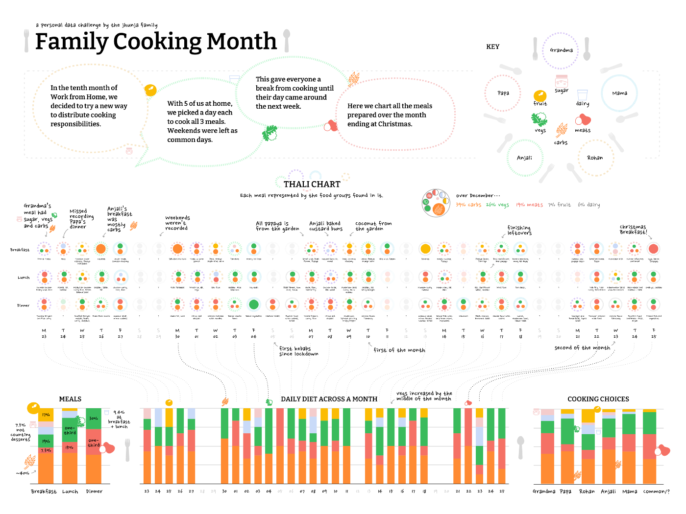
At Gramener, we each took up a personal data challenge over the month of December 2020. Since my family at home had been fighting over how to share efforts in the kitchen, I chose to track the food we cooked at home across three meals everyday. At the end of the month, I visualised our meals as ‘Thali Charts’ inspired by Dear Data and a fascinating history of public awareness campaigns on diets.
Here’s a look at the chart I made and the process that led to it.
Here’s a zoomable view of each section of the chart for easier reading:


The challenge: family food fight
Under lockdown, our family had to adjust to living together again like many others. Chores became a major pain point with each of us having our own busy schedules. Cooking was the worst. My mother has always done most of the cooking, leaving her with less time for her own work. A good while into the lockdown, we set up a timetable for all five of us at home to balance the load of cooking. My sister, a culinary school aspirant, is also proficient in the kitchen and can put together a full meal. Till then my dad, grandmother and I would only occasionally help out, cooking the few dishes we knew. There was a lot of friction about “not knowing where ingredients are kept,’” “too many vegetables being used up,” or “the meal not being healthy enough.”
The timetable wasn’t maintained for long. With work and studies picking up, my mother ended up cooking most meals again. This December we tried a new way. Each of us was assigned a day in the week to cook all three meals. Each of us could decide what to cook and when to prepare it. With weekends being shared days, the advantage was that we’d be free from cooking for the whole week after our day was done.
To check how the system was working to maintain balance (or peace), we documented each of the three meals we cooked, every day over a month. Would we have a healthy diet with everyone cooking what they liked?
The data
We recorded meals in a spreadsheet after every couple of weeks. The idea at the start was to check which meals each of us remembered. I thought this would reflect just how important particular meals were. This didn’t work well since some of us could barely remember what we’d cooked a couple of weeks ago. Later, I wrote down the meals myself each day.

To figure out how healthy our diet was, we picked a few components to track. These were the parts we felt made our meals more or less healthy
- Carbohydrates
- Meats (eggs, meats and fish)
- Dairy
- Sugar
- Vegetables
- Fruits
Each meal was tagged if it included a major part of any of these components. For example, French toast was tagged with dairy, carbohydrates, and sugar.

Thali charts
The next step was to visualise all our meals and begin to identify patterns. I designed a diagram that represents an Indian Thali. Each Thali chart represents the major food components of a meal. The diagram also identifies the cook through the plate pattern assigned to each one. Each food component was given a particular colour as well.


The shape of the Thali chart draws inspiration from a traditional Indian way of serving food. A ‘thali’ is typically a large plate with many small bowls for dal (pulses), curries, sabzis (dry vegetable dishes), and dahi (curd). It is served with a portion of rice, chapatis or puris, and pickles or chutneys. Thalis can range from two bowls to 50, depending on the occasion.
The Thali offers a clear visual representation of the components of a meal. I chose this familiar symbol for the Thali Chart.

The timeline and other stacked bar charts were created using default visuals in Google Sheets to find patterns — how each of us cooks for instance.

Note: The Thali Charts and the overall layout were created in Sketch, while the stacked bar charts were created in Google Sheets and imported as SVG.
Interesting patterns
While the data wasn’t exact or granular, we did find interesting patterns in our cooking:
- My mother never cooked a sugar-heavy dish.
- Although my grandmother is generally accused of leaving her vegetables on her plate, she cooked about the same amount of meats as my mother.
- My father cooked the most vegetables.
- I was recorded as cooking with more fruit, mainly because of my green papaya salad recipe!
- We had a few fully vegetarian meals and some carbohydrate-heavy ones. The chart is now a good reference of ideas for healthier meals to cook!

Summing up a month’s diet, we ate:
- Three parts carbohydrates
- Two parts vegetables
- One-and-a-half parts meat
- and about half a part each of fruits and dairy

Thali chart takeaways
While Thali charts are not precise representations of our diets, they did give us a better understanding of what we were eating. We chose to track just six food groups, leaving out food components like oil and salt, which might be important if someone at home has cholesterol or hypertension issues. We didn’t track weekends either, or the uncontrolled amount of Christmas sweets that got eaten! We’re taking the tracking more seriously in the month ahead and we should have another chart ready soon.

While every household may not be able to distribute cooking the same way, Thali charting might help your family make better food decisions. Thali charting seems to fit somewhere among popular diet tracking methods such as using apps like MyFitnessPal or reporting to a dietician. It could be set up in the kitchen to engage everyone in the family through a Dear Data-esque activity, helping your family track the food groups that concern you.
In an Indian household, a meal often consists of a wide range of dishes. Curries and vegetables are a mix of many different ingredients and mapping a diet can be difficult at home.


From daily allowances to rules of thumb
Adding to it all, Indian textbooks still carry diagrams of the food pyramid to explain a balanced diet. It remains quite a challenge to figure out if our meals fit this pattern and how to adjust them.
Health campaigns and diet visualizations have a long history influenced by the agricultural industry and the political motivations of their time. Back in 1894, the USDA published its first food recommendations through a Farmers’ Bulletin, suggesting a diet for males in a similar manner as recommendations for livestock. Early diet guides highlighted a particular number of food groups. The familiar food pyramid made its debut in Sweden in the 1970s. It focused on displaying a variety of foods, moderation of items, and the right proportion of servings. The American Food Pyramid included a range of daily allowances for each food group as well.
Over time, the design received specific modifications. In 2005, the stacked pyramid was changed to one with vertical segments to avoid the misconception that some foods were to be prioritised over others. MyPyramid simplified the guidelines by leaving out daily allowances which were difficult to follow.
Modern health campaigns have ditched pyramids for pie charts and switched detailed information on portions for rules of thumb and metaphors. The latest MyPlate campaign reminds people to include five main components of food in their meals.
Here are a few design explorations I made as part of my undergraduate thesis project on delivering nutrition advice based on this direction. The Thali chart follows this approach and offers a way to compare components across meals using a symbol that is familiar in the Indian context. It would be interesting to see how diet visualizations could be rooted in other food cultures.
This article is dedicated to my parents who met in design school and my sister who just started her first year of crafts college. I wouldn’t have needed to make this if each of us was less opinionated and if we all liked food less.
A second generation designer, Rohan Jhunga lives with his family in Pune, India. A graduate of the IDC School of Design, Indian Institute of Technology, Bombay, he currently works at Gramener. He writes about data storytelling, design tools for visualization, educational games, and nature trails.
- Rohan Jhunja


