
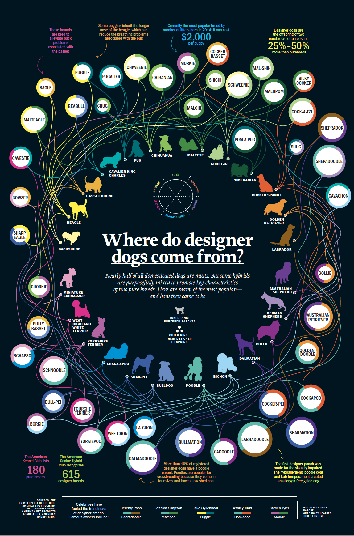
For TIME’s annual Answers Issue in 2014, the graphics department was tasked with presenting data-driven visual solutions to both simple and complex questions, and compiling a double issue. Some queries included, “What’s the most dangerous intersection in America?” or “Why don’t people get heart cancer?” We wanted a fun, colorful splashy pet page in the mix, so we thought that the new(ish) breeds coming up to solve such things as allergy problems and behavioral issues could fill the bill.
After discovering there were over 500 designer breeds (all wonderful-sounding tongue twisters like Shelestie, Bolosilk, Havamalt, or Pookimo), our intrepid author and researcher Emily Barone wrestled with the combinations and organized them beautifully into a spreadsheet that I could work with and visualize, listed in columns by Mate 1, Mate 2, and New Breed. I wanted to create density so I silhouetted the pups, arranged in a circle by breed group, and plotted 90.
Drawing the lines from mate to new breed was challenging, but I wanted them to be organic and flowing, not rigid or clinical with right-angled pointers.
Later we added a few celebrity hits and factoids to fill it out more, and we referred to it as the big “fur ball!”

Different treatments:
We developed several treatments. The most successful version was the big poster-like one (the lead image) as it has multiple entry points, holds up as a single visualization, and shows how varied and broad the breed combinations can get.
On the phone users tapped a group of dogs, then scrolled through the breeds as the variations lit up.

I didn’t produce this animation, but this was another way to show the visualization:
This work also appeared in the volume ‘Visual Storytelling: Infographic Design in News’, edited by Liu Yikun and Dong Zhao, published in Australia in 2015 by The Images Publishing Group Pty Ltd.

With 20+ years experience in media and publishing, I have worn the hats of Art Director, Designer, Graphics Producer and almost everything in between. Using whatever tools at hand—text, data, illustration, photographs, motion and sound— I enjoy exploring and navigating the world through graphics. With both my own and other artists’ original work, I love to tell data-driven visual stories with a detailed eye, and I’ve gotten some cool awards to boot!
- Heather Joneshttps://nightingaledvs.com/author/heather-jones/

- Heather Joneshttps://nightingaledvs.com/author/heather-jones/

- Heather Joneshttps://nightingaledvs.com/author/heather-jones/


