The brutal killing of George Floyd made me rethink many things. Racism is a global problem, but this incident reached a tipping point that drove thousands of people to protest around the globe. The protests in Europe were not only held in solidarity with demonstrations in the United States, but also–more importantly–they served to raise awareness of discrimination and systemic racism in Europe. This extended focus on racial injustice in society felt new and different in Europe, so I decided to take the opportunity to contribute to this movement.

Source: https://www.hiphopinjesmoel.com/achtergronden/blacklivesmatter-in-hiphop/ 
Source: https://www.netzpiloten.de/black-lives-matters-was-man-jetzt-tun-kann/
Data Collection
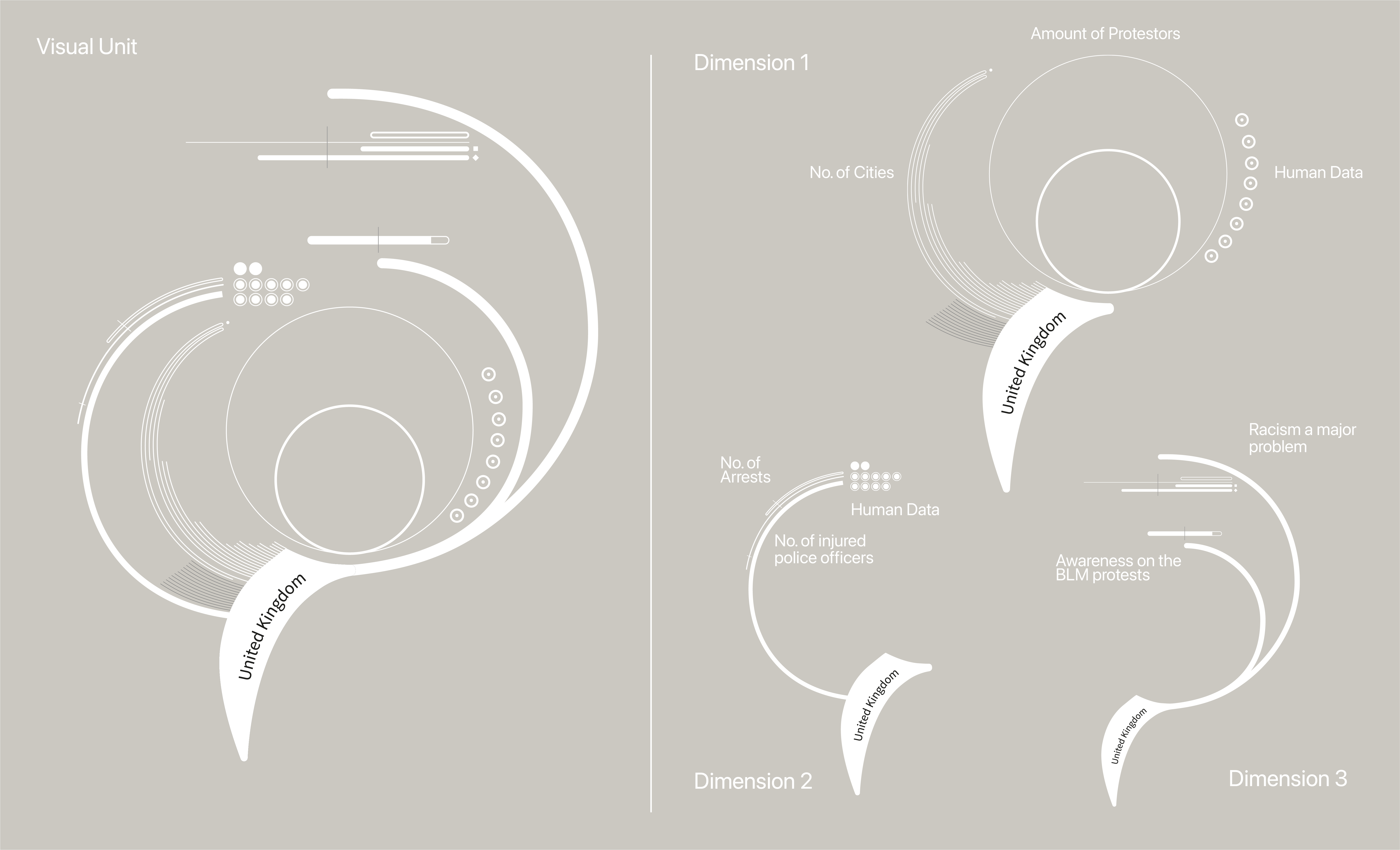
Limited dimensions of the protests were captured. For example, there were visualizations of the number of protestors or the number of cities in which demonstrations were held. But these did not provide any insights on HOW the protests were actually held in the different countries. I set a goal for myself to collect data on various dimensions and provide a broader range of information combined in one visualization. As the data was not collected and provided on official websites by each country, I undertook a long process of data research. The events of the BLM protests were presented in numerous newspapers, so I was able to draw fundamental datasets from there. For my primary data research, I collected data in a qualitative data elicitation.
In the process, I focused on the exploratory and explanatory aspects. In the exploratory process, I collected a range of different datasets to gain deep insights of the topic and analyze the data in its richness. Then, I used explanatory measures to find patterns and noteworthy messages to visualize. Reflecting on the substance of the topic, ranking countries did not initially seem to produce much value or provide insights on the demonstrations by showing the number of protestors on a map. After all, the goal of the BLM demonstrations were not about beating other countries in numbers. However, it is impactful to see so many people standing up for the BIPOC community and to get a sense of how the demonstrations were held through the experiences of individuals from six European countries. Therefore my goal became to present a wider picture of the demonstrations and their atmosphere.
During data collection three themes emerged: fundamentals, safety, and awareness. First, the demonstrations were not only about George Floyd, they were also about injustice and police violence. As a result, I sought data about the atmosphere of the protests: how safe the demonstrations felt. Human data on how safe each person felt comprised the data dimension of safety. Further, I found a statistic about European awareness of the BLM protests. This third dimension of data brings down a round figure. Concerning the aspect of storytelling, this dataset creates a thought provoking end of my data visualization.
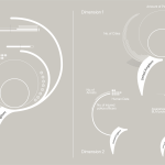
Here is a stripped-down overview of the charts I created to surface insights from the datasets:

Next, I collected human data via a qualitative questionnaire. I interviewed six different people from six different countries and ethnicities that all attended the protests. I chose countries based on geographical location, size of country, and the availability of data. Further, I wanted the interviewees to represent a variety of ethnicities, genders, and nationalities. I was not seeking quantitative data, but rather providing insight into a range of viewpoints. Now that I had defined the data, I could start visualizing.


Data Visualization
Inspiration can be obtained from various phenomena in nature. Tropical and exotic plants, especially, have many layers and complex structures to reference. The hierarchical order is an inherent feature in nature, just as in data visualization. Multiple visualization forms find their roots in nature, like the tree diagram. When you look closely at various flowers and plants, you can’t help but notice the symmetrical and geometrical order. The structure in nature can be explained on the basis of the Fibonacci sequence, as it follows mathematical regularities. The flower serves as an inspiration for forms, orientation, and details. The radial arrangements of flowers can also be found in sunburst diagrams and many other radial charts. I chose a visualization that observed the flower in an abstract way. For this project I paid specific attention to the structure of the flower and used this as the skeleton of my data visualization.


I designed the dataviz as an interactive installation where three glass panels each presented one thematic dimension. I chose this format to emphasize the aspect of multidimensionality, in order to demonstrate the complexity of the movement. As such, the dimensions can be observed separately, and as a whole, depending on the perspective of the observer.


This data visualization offers a multi-dimensional perspective on the Black Lives Matter demonstrations, exemplary of six European countries. Each of the six visual units of the data visualization represented one European country.
Due to the pandemic, the physical experience of my installation was limited. Hence, I collaborated with a web developer, Pepe Bellin, and he helped me transfer the concept into the digital world. It was important to me to maintain the interactivity of the data visualization. The entire project was coded in d3.js.

The website is in the first phase. Only one function of interaction is currently possible. The viewer can visualize each country individually. Through the transitions from one country to another, the viewer can quantify the change in the data values. In the next phase, we are implementing another function of interactivity to allow the user to see several countries at the same time and compare them.
The website has a streamlined structure and guides the reader through the key to understand the graphic and then to the interactive visualization. Finally, the website links to all the sources that were used to create the data visualization in order to ensure transparency.
This project was my first data visualization. It excited my interest in the world of information design and a new, intense drive to learn more, seek further inspiration, and try new methods!

Alena is a 22 year-old graphic designer who graduated with this project in BA Communication Design in Berlin. Since then, she has been lecturing for an extracurricular course at the SRH University Berlin in Graphic Data Visualization. This September she will start her Masters in Data and Design at the Elisava University in Barcelona.
- Alena Lorea