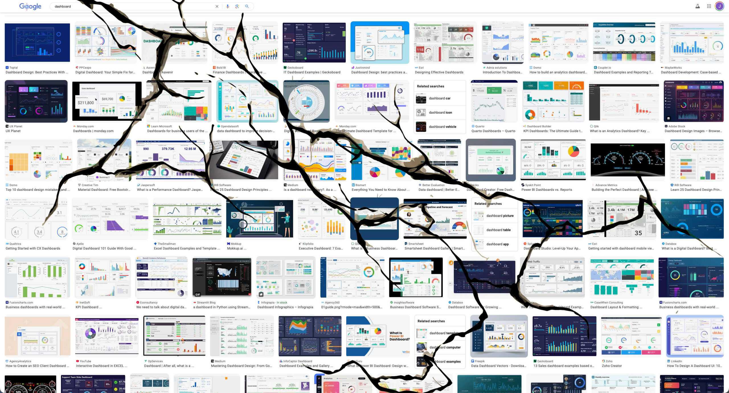
The value of dashboards has eroded. When executives hear the word “dashboard” today, they envision standard charts in BI platforms—obligatory elements for meetings rather than catalysts for insight.
Business leaders once championed dashboards as windows into organizational performance, but they became too familiar, too technical, and the value diminished. As evidence, one look at the relationship between those with roles in “business intelligence” in comparison to the business leaders they serve shows the massive gap in seniority, influence, and wages.
How did this happen? Let’s discuss these 3 ideas:
- Dashboard rot devalued BI
- Data people were never trained in design or communication
- D3.js is complicated
Dashboard rot devalued BI
Business leaders scrambled to use data to inform the C-suite, and in the process, multiple layers of the organization had their own dashboards. When BI software became a premium license, it was only a matter of time before enterprises began counting which dashboards were used and which had never been used. The overwhelming under-utilization of dashboards across an organization led to the term “dashboard rot” which is a fundamental misunderstanding of what the value was in the first place. It’s like counting all Word documents in an organization vs what is published. The value has always been in the insight, not in the number of documents.
The way BI software was monetized ended up devaluing its own importance. Dashboards became an IT cost-center in many regards instead of a strategic advantage. It became a burden in the organization, and in many organizations, “reporting” was seen as boring and a potential waste of time.
Thinking of the value of BI differently, if a dashboard can make a $1M decision easier, is it worth $1M? If, over its lifetime, it supports a $5B company for running its business daily, does that still make it worth $1M or more? On the contrary, organizations don’t think of investing in software in the same way: software is a strategic advantage, but dashboards are just the cost of doing business.
Data people were never trained in design or communications
Maybe part of the reason why dashboards instill a certain amount of hesitation is because most are not well designed. Many people working in analytics come from data science, data engineering, or data analysis backgrounds, and those fields lack significant design or communications training. While it is impossible to say all dashboards are badly designed, I’m certain that most people who create dashboards do not consider themselves to be “good designers.”
There’s a big difference between the kind of high-level graphic design we see in advertising or in consumer apps and the kind of important tweaks that could easily elevate most dashboards. In fact, most dashboards can probably get a significant lift by adjusting the language used in titles and labels alone.
The success of data literacy programs proves the importance of training people in more than just foundational data visualization practices. This shift—if we can make it one—from data towards communication might see the value returned to business intelligence, ushering in a new generation of thought partnership between analytics professionals and organizational leadership.
D3 is complicated
The reason why BI software exists is because custom coding charts was difficult. When D3.js was invented, an entirely new way to draw shapes in the browser created new opportunities to visualize data from simple charts to multidimensional interactive tools. But developing charts with D3.js was far from straightforward and pushed it into the domain of software development.
While it is not the fault of D3 that dashboards have lost their zest, the complexity of doing this work opened the door for faster (and therefore cheaper) tools to take its place. Many frameworks to create interactive charts for business sprang up each with their own tradeoffs, each focused on their own flavor of front-end, and in the process, the software design was assigned to the UX designer. I’m a former UX designer, and I can tell you definitively that data visualization and data communication simply does not exist in user experience design—despite the fact that almost all software design is a visualization of data.
Maybe it’s time we drop the idea of dashboards and focus instead on data communication? By adopting this shift we might just recontextualize the power of data.
There’s a lot here to discuss, so please let me know what you think!
This article originally appeared at: https://www.linkedin.com/pulse/word-dashboard-broken-jason-forrest-agency-aco1e
Jason Forrest is a data visualization designer and writer living in New York City. He is the director of the Data Visualization Lab for McKinsey and Company. In addition to being on the board of directors of the Data Visualization Society, he is also the editor-in-chief of Nightingale: The Journal of the Data Visualization Society. He writes about the intersection of culture and information design and is currently working on a book about pictorial statistics.


