
Ever since the Data Scientist was proclaimed the sexiest job of the 21st century, other predictions abound as to what might be the next must-have role for your data analytics team.
The Data Artisan!
The Analytics Translator!
The Data Storyteller!
The Analytics Engineer!
And yet there is a role, a skill set, that appears to have remained undiscovered.
Do you want to make information easier to find and identify insights faster? Do you need to transform screens filled to the brim with data vomit into focused and logical information spaces that are easy to navigate and explore? What about a consistent, shared language — for both visual and text elements — that doesn’t get lost in translation between data visualization consumers and creators?
Well…. you just might need an Information Architect.
Information architecture: a definition
The IA Institute defines information architecture as:
The practice of deciding how to arrange the parts of something to be understandable.
Okay, but what do information architects actually do?
In their foundational book Information Architecture for the World Wide Web, Morville and Rosenfeld define four main components of information architecture:
- Organization systems. How content is grouped. This could be at the information level, such as categories and taxonomies, as well as spatial organization of page elements.
- Navigation systems. Elements and features to help users move around and browse content, such as navigation menus.
- Searching systems. Allow users to find specific content using queries, or reduce the displayed content based on user-selected options.
- Labeling systems. The language used to describe content, content categories, options, and links. Matching the audience’s language requires using familiar language with a shared meaning. It includes both text-based and visual language (such as icons).
Before designing the information architecture (or any of its component systems), the first step is to understand your audience, their tasks, and the their information requirements — the information they need in order to complete their tasks. Based on those you can develop key task flows: the most common sequences or paths users will take to accomplish their tasks.
All of these — audience, tasks, information requirements, and flows — are crucial inputs for the information architecture design process. They can help you create organization, navigation, search, and labeling systems that are both usable and useful to your users.
Information architecture work has tended to be more commonly associated with websites, but it’s just as important for data interfaces. For information spaces, especially complex ones, an effective information architecture can provide the structure users need in order to easily move through that space towards finding the information they seek.
Form may follow function, but neither will be enough without a logical and well-thought-out structure.
Information architecture in dataviz: an illustrated example
One of the most common types of business dashboards also happens to be a great example of ineffective information architecture design in dataviz.
The key performance indicator (KPI) dashboard.
If I asked a bunch of dataviz designers to draw the worst KPI dashboards they’ve encountered, the most common variation would probably look something like this:

This dashboard can easily, non-controversially, be put into the please nope category. It has all The Bad Things. A gauge chart. A stoplight color palette. Even the typography hierarchy could use some major help.
Here’s a different take on the same KPI dashboard.

Most practitioners would agree that this design is much improved. The chart encoding is now optimized to communicate variance from target and the color choice helps direct the eye to periods that were underperforming the target.
But, from an information architecture perspective, these two designs are almost identical. They also cause the same problem.
Because information architecture is so tied to users and their goals, you need to define these first in order to evaluate the information architecture design. In this case, since you don’t have access to ask them directly, you’ll be making some educated guesses about the target audience and their goals. So, let’s say your target user is everyone’s favorite: The Executive Leader.
Using the Questions to be Answered framework, I’ve defined the executive’s primary question as: what areas of my business are underperforming?
The underlying task needed to answer this question would be to identify the KPIs that are not meeting targets. This is a search task, based on a numeric value — the difference between actual performance and target.
Once those KPIs are identified, our users may also want to know: why are these KPIs underperforming? Or more specifically, what are the drivers, impacts, and other context related to my underperforming KPIs?
The information architecture of the two example KPI dashboards is simply not a good fit for the executive’s questions and related tasks.
Why? Let’s take a look at the information architecture design. If you abstract out these two dashboards into wireframes, you can see they have similar information elements, arranged almost identically.

The information architecture within each KPI tile is shockingly similar, despite how different they look. In both designs, each KPI card has these elements:
- KPI name
- Details about the KPI (such as date period)
- Actual value for the current period
- Comparison between actual and target for current period
The second design includes one additional information element — a trend of the variance to target over the last 12 months.
When you step back from the individual tiles and look at the page-level layout, the IA design is identical. Both use the matrix organizational scheme.

The best and worst thing about this type of organization scheme stems from its very nature. It’s designed specifically for optimizing user choice and freedom.
Outside the dataviz world, you’ve probably encountered this information architecture structure when searching for a product, or even browsing categories, at your favorite online retailer. Search results are often displayed in a matrix structure. For that type of search task, it helps users to have as much choice and control as possible over how search results will be displayed.
In the KPI dashboards, it doesn’t work quite the same way.
It might seem like a great idea to put All The Things on a single one-stop page. But consider how a viewer would visually navigate content that is presented in this way. It creates an experience that’s much closer to reading than seeing.
Wireflows are a useful tool for describing the information architecture of data experiences. By combining wireframes with user flows, the wireflow lets you map the paths both within and between pages.
As with their page layouts, the wireflows are pretty similar for both of the KPI tile dashboards. Below is the wireflow I created for the first design. Looking at the structure and the flow together, it’s easier to understand how users would navigate the content of this page. Of course, not all users would follow the exact same path, but most people from Western cultures would start with the title and subtitle at the top, and then move on to scan each row of KPI tiles.

This type of information architecture can also be described as a flat, single-page structure. The single-page structure means that the user is presented with all the available information in this one place. That’s it. There’s nowhere else to go, no buttons (or charts!) to click for more stuff. Of course, this isn’t always a bad thing.
The flat structure can be a problem, though.
Because there’s no grouping or prioritization among the KPI tiles, they are perceived as equally important and equally (un)related. Presented in the matrix layout, each tile competes for attention equally, making it difficult to know where to look first.
Sure, a motivated user may go on to scan each of the tiles, or even try to find all the red underperforming KPIs. But they would still face the initial confusion and need to invest considerable cognitive effort to complete their task.
And just imagine the case where all KPI’s are missing target. It would be hard to see anything but a sea of red, much less be able to decide which KPI to prioritize.
Ironically, the design principles that this type of KPI dashboard are optimized for — consistency and order, within each tile and between tiles — also exacerbate the weaknesses in the information architecture.
Redesigning the information architecture
Selecting better data encodings, color palettes, and even improving other visual details, will only get you so far in improving the data experience for your users. You’ll be able to make much more impactful changes by focusing on the information architecture first.
So let’s take a look at what an information architecture makeover might look like.
Redesign 1
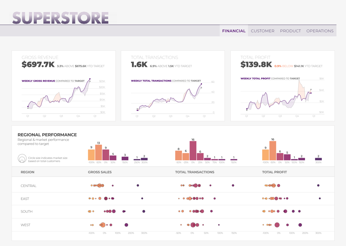
This first iteration goes from one screen with all the possible KPIs to several screens, each focused on an area of the business.
For the purposes of this fictional example, I included four pages: financial, customer, product, and operations. The financial page (pictured below) is now focused on only three KPIs from the original dashboard. They all relate to top-line financial performance — revenue, orders, and profit.

The KPI cards at the top of the page provide the highest level information needed to answer those key questions I identified earlier:
- Did we meet goal?
- How much did we miss (or exceed) the goal?
- Has this changed over time?
Below that, the regional performance section provides additional context, helping users see if any specific market is driving the top-level performance.
The executive can still review performance for all the most important KPIs, but can now do so in a more structured, focused way. If done well, related KPIs should still be available on the same screen. This approach lets you provide a holistic context-rich view of a business facet or topic, while reducing distraction from less-related KPIs.
This is an example of a broad and shallow (though not completely flat) information architecture.

The wireflow for this first redesign shows how the user could complete their task using the new information architecture.
- Within each page, the user would first look at the performance summary for each KPI, and then may proceed to look at the regional performance below.
- Once satisfied with their understanding of financial performance, they would move on to look at other pages.
Of course, some users may follow a different sequence of page navigation, based on their own personal priorities. That is one of the benefits of this information architecture structure. It provides users flexibility and the ability to more easily locate the KPIs of most interest, while also lending itself to looking at each page sequentially to get a view of all business facets.
This is a type of flow that would work well for a periodic performance review, such as a monthly or quarterly business meeting. Think slide deck. You wouldn’t throw everything on one single slide. So why would you confine all your KPIs to one single screen?
When using this structure, it’s a useful exercise to consider how you would structure the narrative of a slide deck. What would each slide focus on? What order would you present the slides? What would the key takeaway be for each slide? What questions would you anticipate, or what discussion would you like to see around each slide?
Use all of this information to help you categorize your KPIs, and identify the elements needed to provide context for each.
Redesign 2
This second iteration also has multiple screens, but it takes a much different approach, using data-driven navigation to provide depth for a more exploratory experience.
The KPIs are organized into a hierarchy structure, with a focus on product performance. The first page is centered around the highest-level indicators of product performance: revenue and profit. This page is designed to help users identify interesting product categories for further analysis — ones that have either significantly overperformed or underperformed.
Using the scatter plot, users can navigate to the second screen, where they can explore performance for a selected category in more detail.

This second-level, drill-down screen includes additional KPIs, as well as a more detailed granularity. It shows individual products in the selected category and the additional dimension of customer segment.
The KPIs on the left of the page can be scanned to see an overview of product performance for the selected category. Users can also select any of those KPIs to explore the more granular product and customer segment-level performance in the beeswarm plots.
There are many ways to organize a KPI hierarchy. In this example, the KPIs are divided into summary and detail level in terms of lagging and leading indicators. If a drop in sales or profit was the ultimate outcome, what are the underlying changes that may have contributed to those changes in top line performance?
This second design iteration is a good example of a narrow and deep information architecture structure.
This structure still answers those primary questions I identified earlier, but with a different focus and goal — understanding the financial performance of products.
Your slightly narrower, reframed question might be: which product categories are driving growth and which are driving losses? Then you can go deeper to explore why a particular product category might be performing poorly (or performing well).

The wireflow, once again, can help you visualize the flow and structure of the design.
- The first page provides a high-level summary of overall financial performance, as well additional detail of product-centered performance with two levels of categories (the broader categories of furniture, technology, and office supplies, as well as more detailed subcategories within those).
- The navigation between the two pages allows users to move deeper into more details of a selected product category.
- The interactive feature on the second page allows users to zoom into details of a selected KPI within the same page.
Notice that all of the KPIs on the second page were in your initial one-page wall of KPIs. It could be argued that this structure and flow would not be ideal for the executive who wants a quick at-a-glance view of the whole business. And yet, how useful and actionable is that one-page view, when it doesn’t provide much context?
This type of deep navigation structure may not always be the best fit for the executive leader — but it certainly has its use cases. Consider your own data and business goals, and whether it makes sense to organize them into a hierarchical structure of summary and detail KPIs.
When using this structure, sort KPIs based on how zoomed in or zoomed out they are. Then consider, what is the most zoomed-out information, that would still be useful? What is the most zoomed-in level? Also think through the path from the user’s perspective. What is the key question, and what are the likely follow-up, more detailed questions?
You can use all of these to define the scope, content, and structure of each page, and how best to enable moving within and between pages.
Redesign 3
So you really, really need to put it all in one page? Well, you can still optimize the information architecture for that.
First, start with a recap of the key question, and the tasks you are aiming to support with this design:
- Did we meet goal for all our KPIs?
- For each KPI, how much did we miss or exceed the goal?
To support answering those questions, users should be able to quickly and easily complete these tasks:
- See which KPIs are missing target
- Identify the KPIs that are underperforming target the most
- Locate a specific KPI
This third iteration uses a table to structure the content on a single page.

It may not seem like much of a change to simply take the content out of the individual KPI cards and put it all into a table, but it will actually make it a whole lot easier for users to complete those tasks you’ve identified.
First, by sorting the KPIs based on their variance from target, users can now scan the table from the top down and quickly spot the worst performers.
To focus on an individual KPI, users can read across a row and see additional details and context, including a trend of variance to target over the last 12 months. With this structure, you could also provide the ability to navigate to more detailed information for each KPI.
To make it easier to locate a specific KPI, users can select to sort the KPIs alphabetically.
The information architecture structure of this design could be described as a shallow (but not flat!), single-page structure.
The way content is organized on the page, using the table layout as well as sorting, creates a visual hierarchy that enables easier visual navigation within the display.
The wireflow highlights the structure and flow in this single-page design.

This type of information architecture is a great solution for cases when stakeholders insist that everything needs to be on single page. However, its strength really comes from the way it supports comparison and ranking of KPI performance. It’s best used when there’s some standardized reference point to which each KPI’s performance can be compared. This could be a goal, a budget, or even a comparison to some baseline, like growth over previous year.
When using this type of structure, first consider whether it would be meaningful to compare performance among different KPIs. It is certainly a powerful way to provide an overview of overall business performance, and to help users quickly see the areas of their business that are underperforming the most. But it’s crucial to make sure that the comparison measure is meaningful and easy for your users to interpret.
These are just three possible ways to redesign the information architecture of the KPI tile dashboard. These iterations highlight how deeply changing the structure will change the design itself. Each of the three structures provide a completely different task flow within each page and between pages.
It’s often said that great design is invisible. I’d argue that out of the three — structure, function, and form — structure is the least visible.
The more visual elements of your design, such as color, charts, or text, may reveal the contours of the structure. But the structure itself isn’t something you’re likely to notice or think about much, unless (or until!) it’s something you do think about a lot.
And then you see it everywhere.
Ironically, a lack of structure is even easier to see (to the practiced eye).
I started out by talking about the need to hire information architects on your data team. But the truth is, anyone can learn to see more structurally, even architecturally.
Or, as Christina Wodtke so eloquently explains it:
“Information Architecture is a way of thinking for me. It is a way of approaching any problem: thinking about products, making sense of the world around me.”
Want to learn more?
Most writing on information architecture does tend to be focused on more general digital products, so it won’t have much specifics to data visualization design. But these are all excellent resources to help you start thinking and designing with an information architecture perspective.
Articles:
- Information Architecture Basics on usability.gov
- 8 Principles of Information Architecture by Dan Brown
- Architects Everywhere by Jorge Arango
- The Difference Between IA and Navigation by NN group
And some books:
- Information Architecture: For the Web and Beyond by Louis Rosenfeld, Peter Morville, and Jorge Arango
- How to Make Sense of Any Mess by Abby Covert
- Pervasive Information Architecture by Andrea Resmini

Lilach Manheim is a human-centered information designer. She is also a lover of puns and cats.
- Lilach Manheim


