
This is the third installment of a year-long data visualization journey. If you want to read the second part before jumping in, here’s the article about my movement-themed data collection!
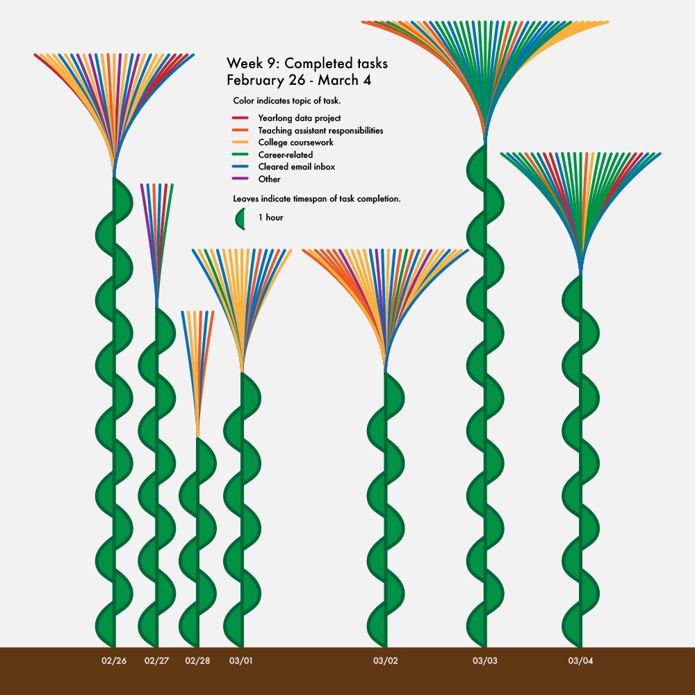
For this timeframe, I collected data about work. My gut told me that I should start by measuring how much I get done every day, since the goal of work is usually to be productive. As a metric, I counted how many tasks I completed for the first week, including what the task was and what time I finished it.

To celebrate the accomplishment of completing tasks, I represented my data as blooming flowers. Each long, thin petal is a task I completed and the color shows the type of task. Upon review, I was proud to see that I cleared my inbox at least once a day for the entire week. I pride myself on responding to people in a timely manner, and this was a gratifying way to illustrate that I’m meeting my goal!
The second facet of this visualization is the height of the stems. Because I tracked when I completed each task, I thought it would be interesting to represent the span of time between when I completed the first task of the day and the last task of the day. Each leaf is one hour of time, so for the first day, there were 14 hours between the completion of my first and last tasks. Visualizing this aspect of the data shows that the span of time I spend completing tasks does not necessarily correlate with how many tasks I complete. For instance, the amount of time between the completion of my first and last tasks is the same for days four and five, but I clearly completed more tasks on the fifth day.
I was intrigued by the lack of pattern in the time span of my tasks, so for the second week of work data I tracked when I was working and what type of work I was doing. I was hoping to gain a little more clarity about how much time I actually spent working because I know that I often work in spurts with significant breaks in the middle, which wasn’t reflected in my previous data. I also wanted to see the separation between time spent on daily and weekly tasks versus time spent working on longer-term goals, since my previous visualization only counted a completed task when it was entirely finished.

This visualization is a pretty straightforward schedule, with each row being a different day and the time progressing from let to right. In order to make the data points as clear as possible, I put a break in the timeline from 2am-8am because I never did work during that time. One thing I noticed when creating this visualization was that I occasionally work on other tasks while in class or large group meetings. To represent this, I tried a few different overlapping techniques, but ultimately decided to split the rectangles in half so that they could occupy the same space on the timeline.
An unusual trend that surfaced when I completed this visualization was how much time I spent on career planning and preparation during this week. I realized that this happened because I attended the National Institute for Computer-Assisted Reporting (NICAR) conference from March 3–5, sending me on a data journalism conference-induced whirlwind of trying to figure out what I’m doing post-graduation. Another anomaly in this work schedule is the time I spent working on my tiny exhibit, which was a virtual exhibition called Isolation Celebrations that I was selected to curate. The exhibition was scheduled to go live the week after this data was collected, so I was making my final preparations.
The end of this visualization showed a large chunk of time during which I worked on my senior thesis. Since the following week was the last week before I had to submit my complete rough draft, I kept note of how my thesis work progressed.

The form of this visualization really encompasses how I was feeling as I wrote the final chapters of my thesis — increasingly stressed, but pushing myself to be productive. The outer ring shows my mood and ability to focus, which varied widely throughout the week. It also provides a countdown until my draft was due, from seven days to one day. The inner ring shows my productivity levels which, despite my boundless anxiety about finishing, did increase substantially as the deadline loomed closer. Retrospectively, I shouldn’t have been as worried as I was, but hindsight is 20/20!
After collecting productivity-related data for three weeks, I wanted to look at work from a different angle. To expand beyond myself as an isolated individual doing work, I collected data about my work environment, including where I was and who was with me.

When creating this visualization, I wanted to focus on grounding myself in my work environment. To emphasize this, I purposefully didn’t include any indication of how long I was working for or what kinds of tasks I was completing. Without this information, the data forces the reader to focus on the way my environment and I move. For instance, on the first day, I switch environments a few times, from the rec room to the kitchen, my parents’ room, and back to the rec room again. On the other hand, when I work in rooms with heavy foot traffic, like the kitchen and living room, my environment is constantly changing around me as people walk in and out. The last string of purple ovals even show me listening in on a webinar while my family and I make lunch in the kitchen!
In the end, quantifying how and how much I work has allowed me to see how much I commit myself to what I do. I love what I study and try my best to make the most of every opportunity, even if it means 14-hour days or finishing in the early hours of the morning. These visualizations have also shown me how much pressure I put on myself to succeed, which both motivates and tires me. I hope that with these new insights, I’ll be able to better balance my drive to be productive and my need to take care of myself.
Now that my four weeks of work vizzes are complete, I’ve begun collecting data for the next theme: entertainment. I’m updating my personal data collection journey weekly on my Twitter, Instagram, and TikTok, so if you’re too anxious to wait for the articles, check it out! While I continue through the four weeks until my next installment, I invite you to follow along or even try some data collection of your own and share it with someone. Until next time, stay tuned!

Emilia Ruzicka studies data journalism at Brown University and will graduate in May 2021. Her current work includes a year-long personal data collection project, a podcast about the USPS, and her newly-completed senior thesis. Find out more at emiliaruzicka.com.

Emilia Ruzicka is a data journalist, researcher, and editor who recently completed their M.A. in Media, Culture, and Technology at University of Virginia. They are currently pursuing freelance projects, including a blog and travel newsletter, while they search for their next full-time position. Outside of data viz, Emilia loves to visit museums, make art, and talk about the USPS. If you have a project proposal, story tips, or want to find out more, visit emiliaruzicka.com.
- Emilia Ruzicka

- Emilia Ruzicka

- Emilia Ruzicka

- Emilia Ruzicka


