
While Otto Neurath invented the Isotype in Vienna in 1925 and guided its evolution to international acclaim, he was not successful in the United States. Unfortunately, his method of pictorial statistics was not readily taught in schools and is not (yet) practiced today.

But it turns out that isotype charts were prevalent in US government documents in the 1930s and 1940s. If you look for them, you can find isotypes sprinkled all over the US during this time — they just weren’t made by Otto or Marie Neurath. No, the growth and popularity of pictorial statistics in the USA are thanks to a different under-recognized figure in design history: Dr. Rudolf Modley.
Born in Vienna, Rudolf Modley was involved as a student volunteer in the earliest days of Neurath’s Museum of Society and Economy. After years of service, Modley eventually moved to the USA to serve as Neurath’s proxy at the Museum of Science and Industry in Chicago, but had ideas of his own and began designing isotype charts by himself.
A young man on his own in America, Modley’s life then follows the path of many first-generation immigrants — he saw an opportunity and worked hard to take advantage of it. The rise of the New Deal in the early 1930s saw many government agencies looking to pictorial statistics to visually communicate their plans to an eager American population. Of course, the officials in the US government looked to Rudolf Modley’s company conveniently named “Pictorial Statistics, Inc” to do so.
He worked tirelessly to bring pictorial statistics to the common American as a new method to understand the increasingly scientific world around them. It only makes sense that he took this new form of communication to the biggest mass media at the time: newspapers.
“Makes The Reading of Statistical Information A Pleasure”
Modley’s star was on the rise as a result of his work with the US government. A February 1938 issue of The New Yorker indirectly announced Modley’s plans when they wrote: “He and his staff will take on any sort of research of graphs [with] Telefact, a feature which he is preparing for newspaper syndication.”
Later, in his 1952 book Pictographs and Graphs, Modley writes about charting in newspapers: “Another difficulty in charting for newspapers is the speed with which the charts must be prepared. The research and finished artwork must be done in a day or two, which puts tailor-made charts beyond the reach of many newspapers. For this reason, several methods for making timely charts available in syndicated form have been tried. As early as 1937, Telefact, a graphic syndicate, made its appearance. Its charts dealt with general social and economic subjects, and, during World War II, with information pertaining to the war. Designed to be used over a period of time, they were topical without following the latest news as a newspaper would.”

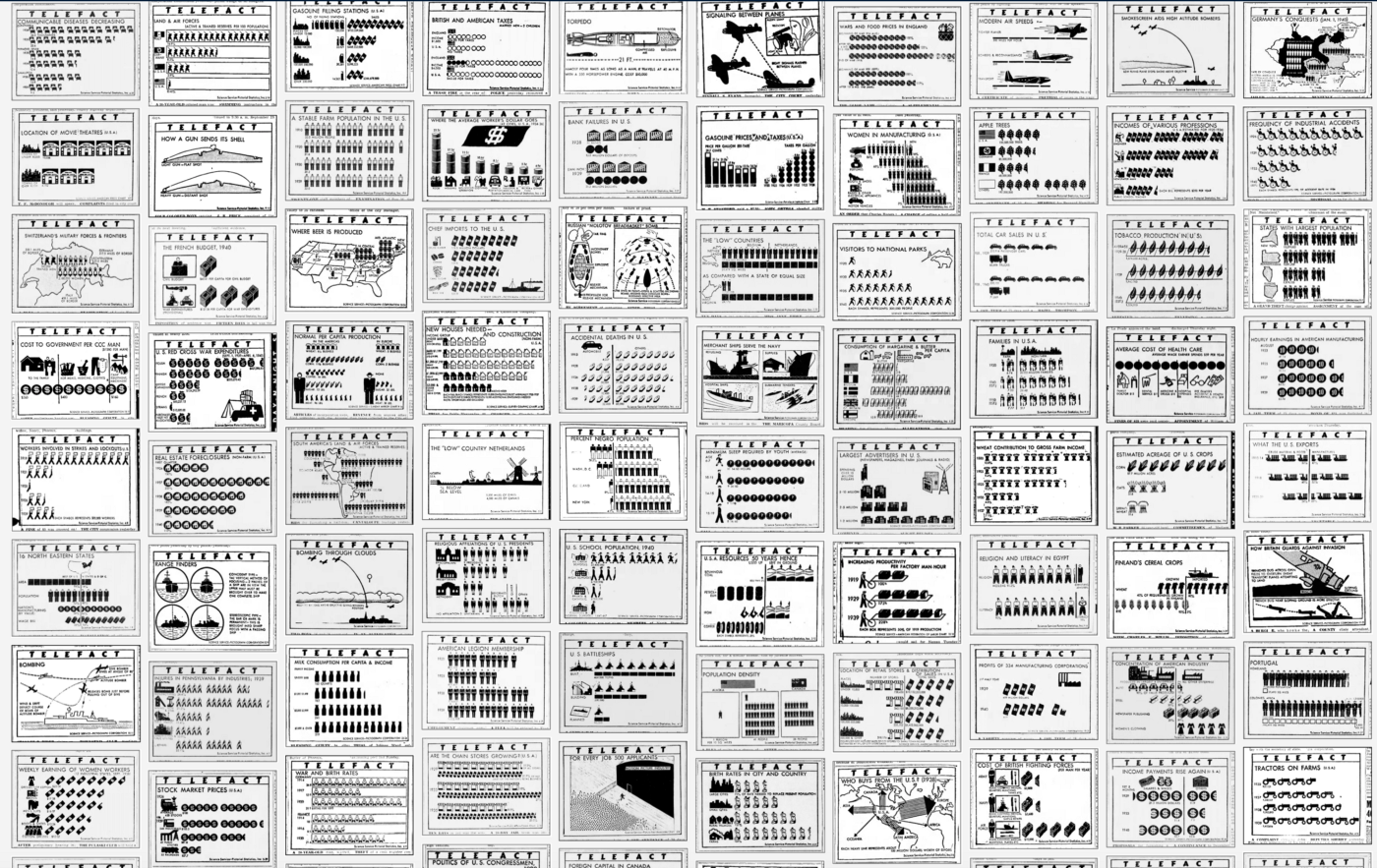
Telefact was syndicated widely across the USA, and featured in newspapers in Minnesota, South Carolina, Virginia, Arizona, Utah, and many others. As you can see on the left, they were inserted wherever space allowed, and visually competed for the reader’s attention with advertisements and headlines.
In his 1938 article “Pictographs Today and Tomorrow”, Modley says: “… another effort has been made to have pictographs penetrate even into remote areas by means of a syndicated newspaper feature called Telefact, which presents a fact of social or economic importance each day… The pictograph technique opens up new possibilities of influencing and shaping public opinion. It makes possible the presentation of factual material in simple terms and to an audience which is much larger than any yet reached by factual information.”
A Treasure Trove of Charts
There are quite a few Isotype practitioners that have been overlooked but Rudolf Modley is the most known among them with a surprisingly large body of work that is very poorly documented.
Imagine my surprise when searching newspapers.com to find not 2–3 mentions of Telefact, but over a thousand. So far I have manually collected more than 480 charts from daily newspapers with double this amount created from 1938–1945.
The scale of the find is what is so surprising. With so many charts to scan through, we see so many design ideas explored by Modley and his staff. Not only can we see how different subjects are presented using this charting method, but we also can see how the design templates of Isotype have been applied to various types of data.

This laboratory of pictorial statistics feels different from most Isotype examples that we know from books and exhibitions. While many Isotypes are part of a broad study or education focus, Telefacts were designed to be immediate and independent. The concepts that are communicated in Telefacts are naturally interesting but independent of any larger story, acting like bite-sized snippets of economic trivia.

This was exactly the point. It is easy to see Modley’s agenda in the marketing of Telefact as well as in the charts themselves. This project was designed to help people learn the facts — but more than that — to help common people leverage the world of science and statistics in their normal lives.
Of course, Modley was also just as interested as exposing them to Pictorial Statistics as well. He writes in his 1937 book How to Use Pictorial Statistics:
“Numerous textbooks on subjects as varied as history, geography, and biology have been extensively illustrated by pictograph technique. While it is thus assured that the coming generation will be used to the method, another effort has been made to have pictographs penetrate even into remote areas by means of a syndicated newspaper feature called Telefact, which presents a fact of social or economic importance each day.”
How To Present Hundreds of Telefacts Charts When We Can Barely Focus On One?
I found myself wondering what to do with all this content. While I find the charts compelling, I also find the act of scanning through them equally interesting. But I kept wondering how I could help other people have a similar experience? Our dwindling attention span is hard to navigate, so I kept asking myself what was the best way to get this work out into the public and allow them to learn more from it?
I decided to create a Tumblr to share my work for a few reasons. First, Tumblr allows for a very intuitive experience where the user can see the charts as a group and also as individuals. Each image is meta tagged, so these charts will now be searchable among the vast quantity of SEO optimized images on Tumblr. But most importantly, these images will now be indexed by Google, so they will be publically available and accessible.
Please check it out: https://modley-telefact-1939-1945.tumblr.com

Looking At A Few Telefact Charts
There’s a lot to love in these charts. Not only do we see the progenitors of the everyday infographic that we see in our newspapers and magazines today, but also a snapshot of what life was like in the late 30s and into the WW2 era. Let’s take a look at a few interesting charts:

Many charts use standard isotype methods to visually display statistics but also reduce them to a more immediate understanding of the content. This chart uses simplified ‘guide pictures’ to indicate the split between farmers and non-farmers. The chart compares the urban and rural incomes with the corresponding number of children in each.

This telefact chart contains very little text but breaks one of Neurath’s main rules by including the numbers along with the pictorial representation of the number. This is a significant divergence from the Isotype practice, but at the same time adds a significant layer of meaning needed to communicate to a general audience. The basic numbers presented are simple and give substance to the charts.
As for the chart, it is interesting to see just how much water there is in an average egg. The ‘waves’ of water are visually interesting as they are used in a sort of horizontal stacked bar-chart, with the solid, non-water segment showing the rest of the percentage. The use of the wave to denote water is an interesting exercise in symbol abstraction, as the quantity of water in a stick of butter does not map to our understanding of an ocean. Somehow it still works.
Of note is that each Telefact has the month and day included in the right corner to show exactly when it was to be published. Unfortunately, they do not include the year.


The ‘unit arrow’ diagram on the left is another isotype chart type popularized by the Neurath’s and was used throughout their careers. It’s clear that Modley regularly kept a close eye on their work and, for better or worse, continued to build on their ideas.
In the chart on the left, each arrow represents the millions of dollars in exports and easily shows exactly where the US sells its goods. In order to squeeze so much information into such a small area, Modley creates a massive simplification of the map shapes in a semi-geometric fashion. Modley experiments with this kind of geometric simplification throughout this period of his work.

Otto and Marie Neurath occasionally used the power of analogy to focus the audience to consider data in a certain way as best used in the chart “Only an Ocean In Between”. In the chart on the upper right, however, Modley uses a similar idea to compare the wind velocity for five major cities as the distance it takes to blow the leaves off a tree. The power of analogy is particularly very strong, and while Modley didn’t use this technique often, it is especially powerful in the right context.

In terms of subject matter, Modley knew salacious subjects would help to attract attention. This chart of fatal accidents — complete with almost 30 little dead guys — used repetition to grab attention and a basic title to seal the deal.

In the end, this is ultimately a conventional pictograph, with little Isotype influence. That’s not inherently a bad thing, as an overview of the hundreds of Telefacts shows a huge quantity of these types of pictographs interspersed between more complex charts and diagrams.
Pictographs are easy to understand and require less visual sophistication by the audience. By using so many basic pictographs it shows a willingness by Modley and his team to focus on the data and not over-do it. Certainly creating these charts each week/day was a huge amount of work, so standardizing the process for creating the charts was just as important as knowing when to move on to the next one.

This map is again very much in the mode of what you’d see created by the Isotype team. The chart’s learning objective is to compare population density with recreational areas. While well-intentioned, it is unfortunately not a very successful chart as it is too crowded and not well labeled.
In collecting so many Telefact charts it also becomes an important opportunity to learn from Modley’s failures. Understanding when a chart is successful, and when it is not, helps us understand how to bring these ideas into our own practice. In the chart above, Modley tried to cram too much into too small an area creating a messy design that is hard to visually read.
I’d invite everyone to interrogate the design of each of these charts for the same purpose of learning what works and what does not.


We can also study these charts to see exactly how Modley’s efforts began to diverge their Isotype origins. Both charts above are quite different from what the Neuraths were designing yet are still sophisticated designs.
The chart on the left, “How Many People One Farmer’s Work Feeds”, speaks about the benefits of modernization and mechanization, the changes in American culture over a century, and hints at the role of agriculture in international trade. On the bottom row, Modley literally draws a blank as to what the future holds. This is a provocation; not a projection into the future, but a dare to the audience to learn more in order to shape it. By crafting a design that focuses on the possibilities, it departs from the normal isotype objective of illustrating the statistical ‘known’.

The “S” design of the chart on the right is typical of some other charts that Modley invented. It was created as a way to display a process happening over time but visually compressed into a small space. Modley uses a similar design in a book called the “New York Primer” which came out the year before, so it is a design concept he was exploring at the time.
Exploring these design concepts is important as it shows that contemporary information designers can (and should!) continue to explore new design patterns based on Isotype to further their communication needs. Rudolf Modley’s team was constantly experimenting, just as his earlier text has said, by “open[ing] up new possibilities of influencing and shaping public opinion.” This also proves that Modley wasn’t “merely” an imitator, but a practitioner on his own merit.


These two Telefacts also show how Modley was experimenting with graphic design concepts as well. The chart to the top left, “Salaries Above $300,000” rides the line between data visualization and design sloganeering. It shows another reoccurring subject of Telefact charts, the breakdown of jobs in Hollywood. The chart’s label assuming a graphic that drives the appeal of the whole design.
“For Every Job 500 Applicants” to the top right shows an entirely different illustration of a 1-out-of-500 statistic. Each dot is a person that is restrained behind a barrier while a solitary silhouette strolls up to the studio entrance. Black is used to grab the audience’s eye while a sort of isometric view provides the compositional structure.
Both of these Telefacts would easily attract attention in a crowded newspaper layout. By studying these works we see other ideas in exploring the aesthetic possibilities in Isotype designs, opening us to the possibilities beyond Neurath, Arntz, and Modley.
The Importance of World War II to Telefact


WWII was extremely important for the Telefact series as quoted by Modley at the beginning of this article. The war provided loads of information that would have been very interesting to Americans. Modley’s Telefact charts were there to explain details of the mechanisms and fighting techniques; feeding a public hungry for news of loved ones serving in the war.
While many Telefacts were still providing pictorial statistics, diagrams helped to decode the complexity of the new technology of war as well as help explain how Americans could contribute in their own ways. Certainly, we see a rise in cross-section diagrams that help explain the components of everything from bombs to bombers, and houses to air-raid shelters. The diagrams spanned a variety of styles, likely created by different artists on Modley’s team.


What’s interesting is that this move to diagrammatic information design occurs before Marrie Neurath’s books for children. It’s interesting to consider that both designers began a more illustrational approach to designing information, rather than just statistics, after the war. While Marie Neurath certainly had much more of a focus on creating charts and illustrations for books after her emigration to England in 1941, the Isotype team had a split focus on exhibition design and institutional education during the 1930s. Otto Neurath’s focus on ‘learning through the eye’ was certainly a reality by the post-war period, with many primary books lavishly illustrated by the time. Perhaps the importance of statistical education took a more general back seat to more qualitative information design as the world refocused on an optimistic future.
The Grunge of News: Aesthetics & Business


I also want to take a moment to celebrate the beauty of the grungy ‘realness’ of newsprint. Cheap paper, bad lithographs, ink slip, punctured and torn paper, and plain old dirt are all present in these reproductions.
The process of creating syndicated news graphics would have been purely physical at the time. Images would have been drawn by hand or reproduced photographically. The text might have been set by hand or optically produced likely about 4x larger than printed. The reproductions would have been mailed weekly to papers around the country allowing each to then prepare for local printing. It is all gloriously messy, made even more so by the digitization process of scanning, adjusting for contrast, and sharpening the rough edges of the not-so-sharp image.
We could also consider the Telefact a kind of “science comic” as the method of creation and distribution would have largely been the same for both. Telefacts were distributed by Science Service, a newspaper syndicate begun by two journalists dedicated to “pioneering the dissemination of accurate, accessible, and engaging news of science to the public primarily through the mainstream media through its syndicate service.” We can easily consider Telefact to be their version of the funny papers.
Modley was sincere in his quest to get pictorial statistics into modern practice, and in 1943 he published his first collection of over 1,000 icons. The book Pictorial Symbols collected his pre-made icons as seen throughout the Telefact series in order to equip those who wanted to make their own charts. Prices for charts, icons, and custom icons were very reasonable, with your custom selection of icons priced at $.05 cents for the first 50 icons, then $.01 cent each after that (50 icons would cost the equivalent of $30 USD today)
Turning the book Pictorial Symbols over reveals a full-page ad for Telefact on the back cover. Nested at the bottom is the announcement of the acquisition of the Telefact series by McClure Newspaper Syndicate, which ultimately spelled the beginning of the end.


McClure Newspaper Syndicate would have been one of the largest companies in the business, distributing 10,000 features with combined sales of $100 million a year. Lasting more than a century in business, McClure was one of the biggest distributors of comics, bringing everything from Rube Goldberg to Batman and Robin to thousands of papers every day. That kind of reach, with those kinds of resources, would have been attractive to Modely. While it is clear that Modley and his team continued their involvement with the series for at least two more years, we see less pictorial statistics and more traditional charts begin to appear in the series in 1945.


For those familiar with Isotype, the chart at the above right, “Expected Cut In War Production Program,” would have literally been the antithesis of Neurath’s teachings. The very invention of the Isotype concept was in opposition to the scaling of icons to show their quantity. It’s clear that by this point Modley was likely not present in the creation of the Telefact series as he would never have supported such a chart. That same chart also illustrates the end of the war, which ended up being a significant complication as well.
The syndication of newspaper content had been booming since the turn of the century, but as the war began its last year, many newspapers cut back their pages to contribute towards war rations. After the war, the rise of televisions provided a new challenge that reduced newspaper sales further. In my research, I could not find any Telefact charts after 1945.

Rudolf Modley continued to work in pictorial statistics for many years afterward. He published a number of books about graphic communication and also collaborated with historians to explain American and European economic history.
Communication With All People Everywhere
As the post-War world embraced multi-national collaboration and standardization, Modley found himself collaborating with celebrity cultural anthropologist Margaret Mead. Their 1968 essay Communication Among All People Everywhere in Natural History Magazine outlines their shared interest in cataloging all manner of icons and methods of visual communication as an emerging Lingua franca.


As Modley had been documenting icons for decades already, another famous designer, Henry Dreyfuss, also sought his assistance in compiling icons for a similar project. In an act of cosmic completeness, in the late 1950s, Modley enlisted Marie Neurath to help collect a wide survey of icons from many industries. The two collaborated for years sending icons and letters discussing their work. Dreyfuss published his Symbol Sourcebook: An Authoritative Guide to International Graphic Symbols in 1972 to widespread acclaim. It’s an incredible book, unique in many ways, and includes an introduction by Buckminster Fuller, as well as a 2-page spread introducing Isotype written by Marie Neurath.

Collecting icons must have fulfilled Modley, who continued to work on his own Handbook of Pictorial Symbols right up until his death in 1976. The earlier collection in his Pictorial Symbols book from 1942 was expanded with the help of Gerd Arntz and extended to include over 3,250 wayfinding and Olympic icons. It’s an awesome resource issued by the low-cost Dover Publications (which is still readily available used for under $5).
The book begins with an essay by Modley called “Introduction to Graphic Symbols”. It seems only fitting to finish this essay by noting the reverence he held for Otto Neurath as evidenced in his writing. There it is, right on the first page, “The modern techniques of graphic presentation of facts and figures were developed by Otto Neurath in the early 1920s in Vienna. If you learn these techniques, you too can use graphic symbols to set forth complex facts in simplified, more easily understood and more easily remembered form.”
Modley, at the end of his life, performs the ultimate pivot, from Otto Neurath to you. Practicing this kind of isotype/pictorial statistics was just as possible then as it is today. Rudolf Modley’s mission as pictorial statistics teacher and Neurath evangelist rings true to the very end.
There are so many examples of isotype and pictorial statistics to take inspiration from. What better place to start your learning journey than by scanning through several hundred Telefact charts?
Go find them at: https://modley-telefact-1939-1945.tumblr.com


Thanks as always to: Georges Hattab, Alyssa Bell, and RJ Andrews for their editorial help and support.
Several of the essays cited in the above article have also been recovered from original sources:
Pictographs Today and Tomorrow, Rudolf Modley, Public Opinion Quarterly, 1938
Communication Among All People Everywhere, Margaret Meade and Rudolf Modley, Nature Magazine, 1968
Handbook of Pictorial Symbols introduction, Rudolf Modley, 1976
The author is especially indebted to the work of Hisayasu Ihara for their pioneering research on Rudolf Modley. If you are interested, I’d urge you to read more:
Rigor and Relevance in the International Picture Language, Rudolf Modley’s Criticism against Otto Neurath and his Activity in the Context of the Rise of the “Americanization of Neurath method”, Hisayasu Ihara, 2009
This article comes as part of a series on Isotype and derives mainly from research on the Isotype design process created by Otto and Marie Neurath with Gerd Arntz. My goal is to teach people about the techniques and mindset of this data-driven design team, in order to inspire new information design concepts today.

Jason Forrest is a data visualization designer and writer living in New York City. He is the director of the Data Visualization Lab for McKinsey and Company. In addition to being on the board of directors of the Data Visualization Society, he is also the editor-in-chief of Nightingale: The Journal of the Data Visualization Society. He writes about the intersection of culture and information design and is currently working on a book about pictorial statistics.
- Jason Forrest

- Jason Forrest

- Jason Forrest

- Jason Forrest


