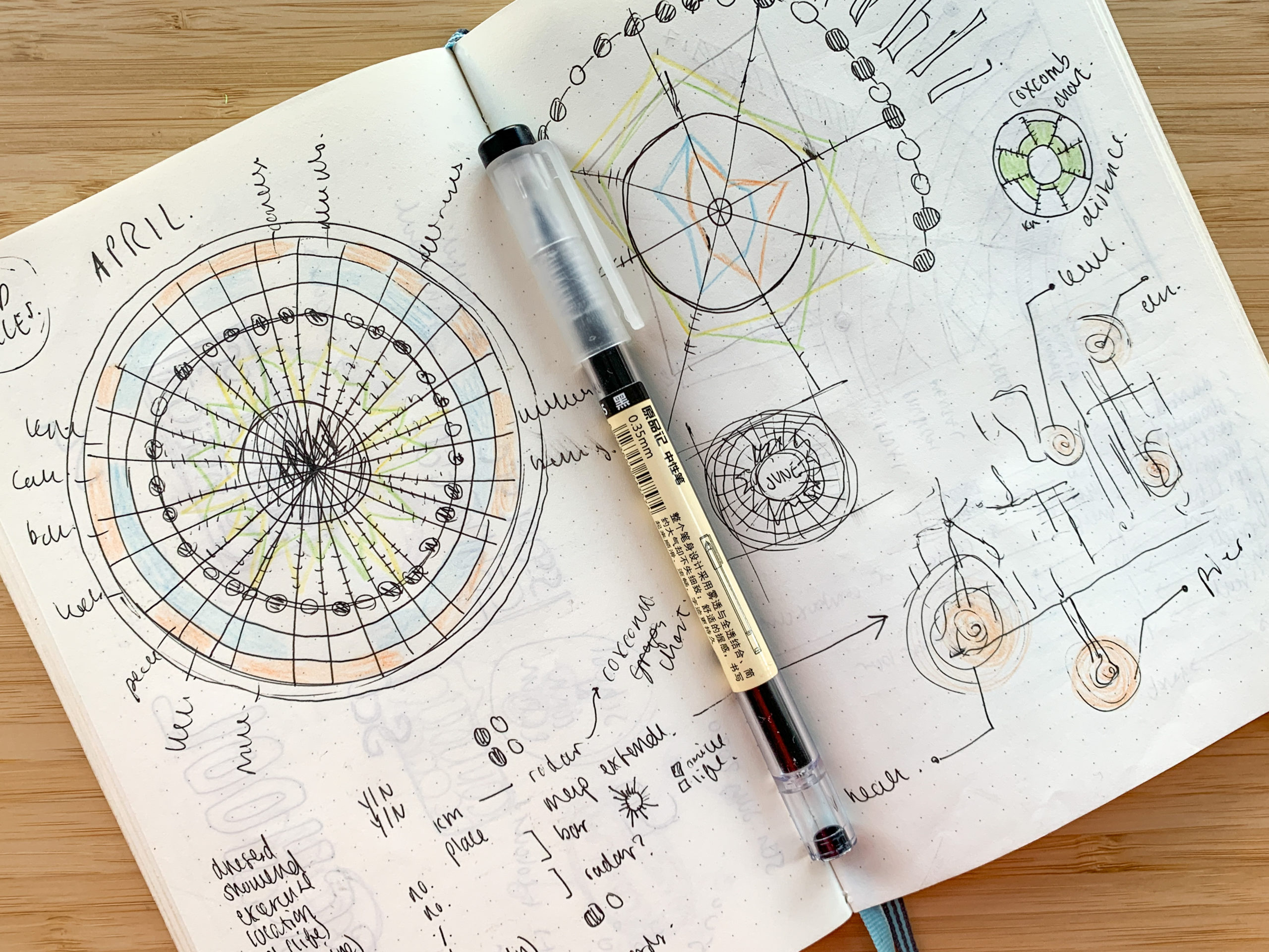
This content originally appeared as part of The ‘Gale, Nightingale’s biweekly newsletter.
Chesca is a London + Brighton based data visualisation designer and photographer (and a member of the Nightingale editorial team!). For more of her work, check out @databychesca and @chescajane on Instagram.
1. All of your visualizations from now on have to follow the aesthetic of a certain decade (1930s, 1970s, etc.). What decade would you pick and why?
1700s cartography…. so beautiful and detailed! I love how people have visualised the world throughout history, especially when technology wasn’t as advanced.
2. Your mission, should you choose to accept it, is to make a chart expressing something about your life using only objects currently around you (computers and pen/paper not allowed). Look around you—what would you use to make your chart, and what data would it reflect?
The amount of books I read in a month before isolation vs. the amount of books I read in a month during isolation…

3. What is one visualization that has inspired you?
Georgi Grechko’s Salyut 6; I love how he’s hand drawn and visualised the entire 96-day flight program of The Salyut 6 mission. I’m also fascinated with astronomy.

Claire Santoro is an information designer with a passion for energy and sustainability. For 10 years, Claire has worked with governmental agencies, non-profit organizations, and higher education to accelerate climate action by communicating complex information in an engaging, approachable way. Claire holds an M.S. in environmental science from the University of Michigan.


