This content originally appeared as part of The ‘Gale newsletter.
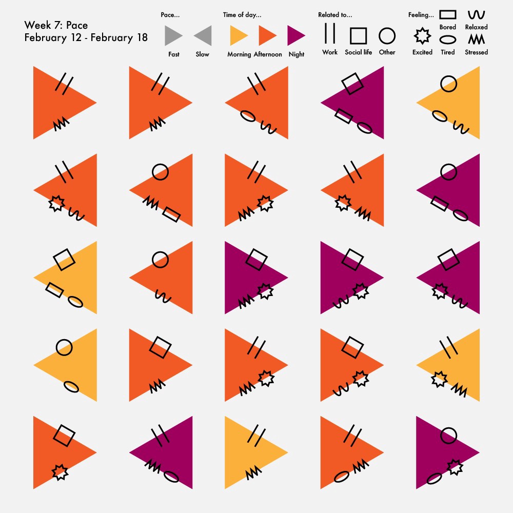
Today, we’re getting to know one of our regular Nightingale writers, Emilia Ruzicka. Emilia studied data journalism at Brown University (and just graduated since this was initially published in The ‘Gale!). Her current and recent work includes a year-long personal data collection project chronicled in Nightingale, a podcast about the United States Postal Service, and her senior thesis. Find out more at emiliaruzicka.com or follow her on Twitter @EmiliaRuzicka for regular updates.
1. If you could be any type of chart, what would you be?
I’d be a network diagram because I feel that I’m constantly drawing from a wide range of resources, skills, and processes to create my work. In addition to showing how interdisciplinary tasks can be, a network diagram also represents how individuals are interdependent on both a small and large scale. This has felt especially relevant as the COVID-19 pandemic continues and I prepare to leave university.
2. If you were stuck on a desert island, what viz would you want to create and what would you use to make it?
I would use a chart to track the populations of edible flora and fauna on the island, both so that I can figure out how to feed myself and to ensure that my makeshift lifestyle is sustainable for the island ecosystem. Ideally, I’d search for some wood scraps or tree bark to use as a canvas and then either etch it using a rock or paint it with crushed fruit.
3. What is one visualization that has inspired you?
Giorgia Lupi has been a longtime inspiration of mine, but her collaborative project with Kaki King calledBruises — The Data We Don’t See is something I come back to again and again. It reminds me that data is personal and data visualizations don’t have to be confined to predetermined formats. Bruises also represents a few dataviz firsts for me: the first time I saw a data visualization displayed as a piece of art (at the Cooper Hewitt, Smithsonian Design Museum) and the first time I heard data sonified. Both of these firsts play a significant role in how I make data representations now and I like to be reminded of what sparked my excitement about dataviz.

Claire Santoro is an information designer with a passion for energy and sustainability. For 10 years, Claire has worked with governmental agencies, non-profit organizations, and higher education to accelerate climate action by communicating complex information in an engaging, approachable way. Claire holds an M.S. in environmental science from the University of Michigan.


