

Hello! I’m a student, data journalist, and designer with a love for all things dataviz. In accordance with annual traditions, I spent a lot of time thinking about my New Year’s resolution this year. Because the COVID-19 pandemic has kept me confined to my family’s home since March, I wanted to take more control of my everyday life and learn more about myself in the process.
I was inspired by Dear Data: a personal data collection project that Giorgia Lupi and Stefanie Posavec conducted for an entire year. In March, I did a three-week version to track the immediate changes to my communication style after evacuating my college’s campus. I decided to follow in Lupi’s and Posavec’s footsteps and collect a different piece of personal data every week for a year, but since I don’t have a partner, I added a twist.
Each week for fifty-two weeks, I’ll collect a different data point about my habits, activities, or attitudes, but those data points won’t be chosen at random. Fifty-two can be evenly split into thirteen groups of four, so each chunk of four weeks will have a theme. These themes can be anything: from entertainment to energy or color to connection. The important part is that those four weeks of data collection will be connected and (hopefully) reveal a greater truth about my relationship to that topic, which I’ll be able to share!
For the last four weeks, I’ve been collecting data about food. I started by tracking when I eat. I simply wrote down the time that I started and finished eating every meal. I also added little notes next to the time if there was anything that directly impacted the timing of my meal.

Because I recorded specific times instead of just how long I spent eating, I was able to organize this data visualization just like a typical hourly schedule. This layout revealed a few things immediately. First, dinner is by far my most consistent meal of the day. I’ve never been one to skip meals, but I know that I often prioritize doing work or attending meetings over having a meal at a “normal” time. However, since I eat dinner with my entire family, it’s at approximately the same time every night. My lunches show the opposite trend — they vary widely both in timing and length, likely because I am most busy during the middle of the day. I tend to just run down to the kitchen for a quick bite between meetings or working on assignments instead of taking the time to have a heavy meal.
Another thing I noticed is that I don’t snack as often as I’d imagined. I thought that I ate at least one snack a day, but during the week I recorded my mealtimes, I only snacked on three days, including one day when much of my eating was fueled by stress.
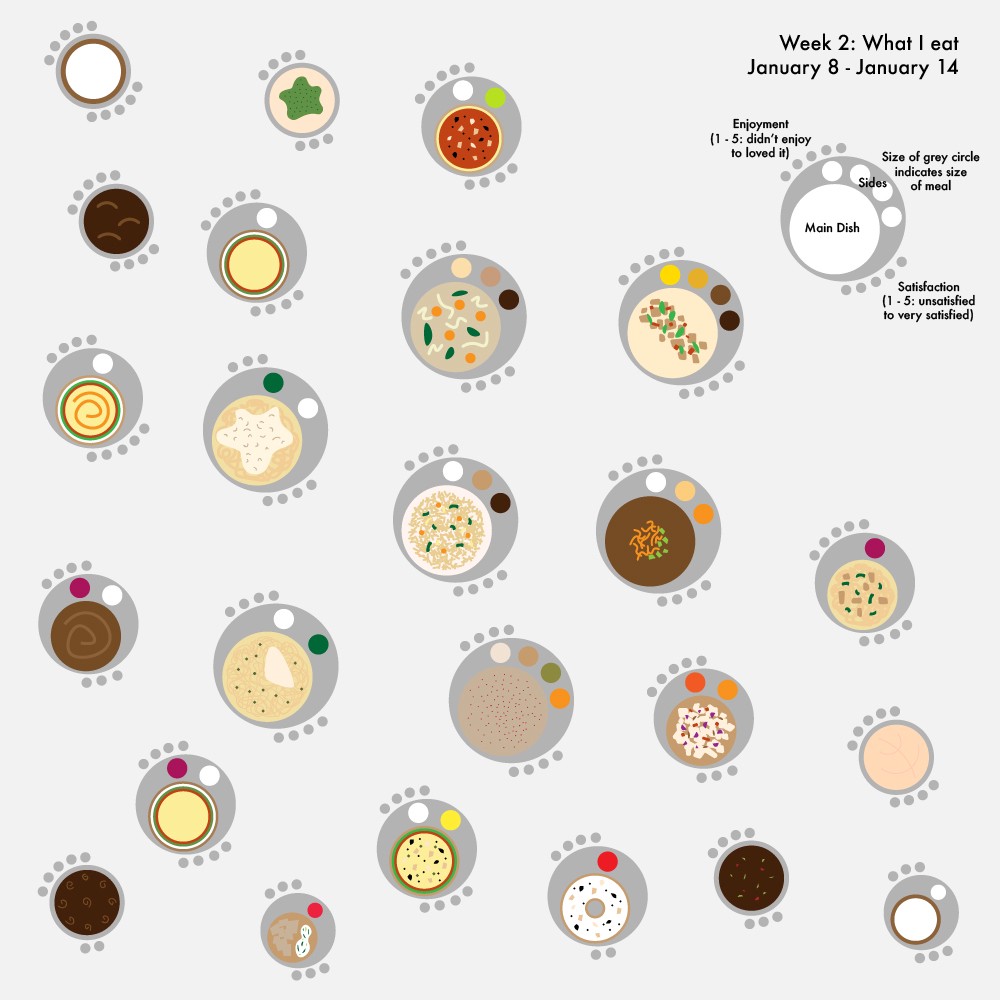
Moving into week two of data collection, I wanted to see in more detail what a typical week of meals looked like. I anticipated a relatively wide variety of dishes, as I do my best to eat a healthy mix of foods. I also challenged myself to be a bit more illustrative with my visualization, so I decided to draw simplified versions of each of my meals. These little drawings were made possible because I wrote down what I ate and the main colors of the foods, as well as how much I enjoyed the meal and how satisfied I felt when I was done on a 1–5 scale.

Overall, my meals were more monochromatic than I would have liked, though this may be in part because I standardized the size of the sides for aesthetic purposes instead of making them proportional to the meal that I had. Despite this flaw, the format of this visualization did allow me to size the “plates” of food by how large the meal was. Large plates primarily went along with dinners, while medium and small plates encompassed breakfasts, lunches, and snacks.
The data for week three were by far the most challenging to track. I tried to write down every conversation I had with another person that involved food, including the topic and participants. This was difficult because I live in a house with my two parents and five siblings, which adds up to a ton of conversations! I found myself tracking conversations in my head as they flowed organically and writing them down when there was a break or lull instead of trying to take notes in real time.

As is apparent from all the solid circles on this visualization, the vast majority of my conversations about food were with my family. Occasionally food would come up while chatting with a friend or neighbor, but because I cohabitate with my parents and siblings, I’m far more likely to talk to them about meal plans, how something tastes, or simply what’s in the fridge.
I also noticed that the blue rings, which symbolize conversations where someone gave their opinion about a food, tended to cluster together. Two big clumps of blue rings can be seen on January 16 and January 19, which coincided with a baking itch that I decided to scratch. On each of those two days, I baked a different kind of pie and most of the blue rings were compliments about my handiwork!
After reflecting on my first three weeks of data collection, I chose to make my last week of food data collection slightly more reflective. During week four, I wrote down all of the thoughts I had about food and when I ate within the web of those thoughts. This manifested into a noticeably different type of visualization than the first three weeks.

When I examined my week four data to make this visualization, I realized that all of my food-related thoughts could be placed into four categories: feeling hungry, craving a particular food, thinking about my next meal, or telling myself that I should take a break to eat. I represented each of these thoughts with a leaf on a stem. That stem can either be cut off by eating (a flower) or by ending my day (an unadorned stem). It’s also possible for me to eat a meal without actively thinking about it in advance, which is depicted as a flower in the dirt.
This visualization suggests that after I think about food two or three times, I usually decide that a meal is in order; however, there were occasions throughout the week where I thought about food five or even six times before giving in to my mind’s insistent messages. Once again, I noticed that all of my snacks came at the end of my days, as opposed to in between lunch and dinner, which is when my younger siblings typically insist on a treat.
These last four weeks of personal data collection have allowed me to examine my relationship with food in a unique way that revealed some surprising trends. I’m not as much of a snacker as I thought I was and I eat fewer greens than I had imagined. I’m also pretty responsive to my body’s signals for food, which was a welcome revelation!
With the first four weeks of data collection finished, I’ve already begun the next theme: movement. I’m updating my personal data collection journey weekly on my Twitter, Instagram, and TikTok, so if you’re interested in following along with my visualizations in real time, look no further! In the space between this article and the next, I invite you to follow along or even try some data collection of your own and share it with someone. Until then, stay tuned!

Emilia Ruzicka studies data journalism at Brown University and will graduate in May 2021. Her current work includes a year-long personal data collection project, a podcast about the USPS, and her senior thesis. Find out more at emiliaruzicka.com.

Emilia Ruzicka is a data journalist, researcher, and editor who recently completed their M.A. in Media, Culture, and Technology at University of Virginia. They are currently pursuing freelance projects, including a blog and travel newsletter, while they search for their next full-time position. Outside of data viz, Emilia loves to visit museums, make art, and talk about the USPS. If you have a project proposal, story tips, or want to find out more, visit emiliaruzicka.com.
- Emilia Ruzicka

- Emilia Ruzicka

- Emilia Ruzicka

- Emilia Ruzicka


