
This content originally appeared as part of The ‘Gale, Nightingale’s biweekly newsletter.
Building on her former position as a literature teacher and five years as an art director in a creative agency, Julie is currently an independent data and information designer, as well as the Creative Director of Nightingale Print Magazine. She has a tender point for data-humour, data-collage, and other creative data-shenanigans that she exercises on her Instagram @datacitron. You can also follow her on Twitter or see her work on Behance.
1. All of your visualizations from now on have to follow the aesthetic of a certain decade (1930s, 1970s, etc.). What decade would you pick and why?
Well, my visualizations already follow aesthetics from past decades, but if I had to stick to one in particular, I would probably pick the ‘30s or the ‘50s. I’m so in love with their bold colors, the quirky collages, and the dashing fonts. I also admire how in those decades, designers could have so much fun, never compromised on the creativity and sharpness of their designs but still seemed able to reach and engage to such a broad audience. This is probably the best lesson they can offer to us. I have a lot of inspiration from these periods but if I had to pick some names, I would say Saul Bass, Edward McKnight Kauffer, who I’m currently obsessed with, and probably John Heartfield as well.
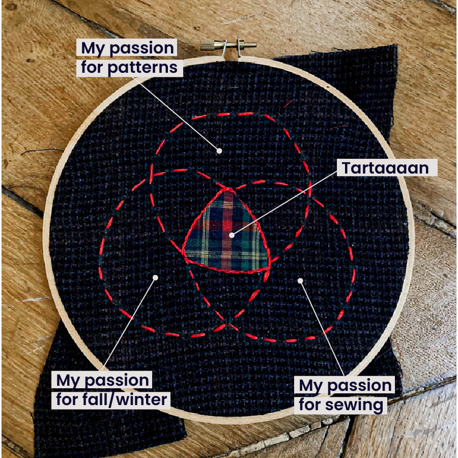
2. Your mission, should you choose to accept it, is to make a chart expressing something about your life using only objects currently around you (computers and pen/paper not allowed). Look around you—what would you use to make your chart, and what data would it reflect?
Mmmh… I do a LOT of sewing—this is really one of my passions and my most time- and resource-consuming hobby, so I’d really like to do a chart about it! Probably one showing how, at the first sight of tree leaves turning orange, I turn my entire apartment into an ocean of tartan for the fall/winter season.


3. What is one visualization that has inspired you?
Can I pick two? The two data visualizations that inspired me the most I believe are “Writing without Words” by Stefanie Posavec and “Poppy Field” by Valentina D’Efilippo. Not necessarily because of their style or anything, but I discovered these two dataviz at my first-ever training on data visualization, and I remembered seeing them back then and it just clicked: “This is what I want to do with my life!” And now I’m here, enjoying every second of it!
Claire Santoro is an information designer with a passion for energy and sustainability. For 10 years, Claire has worked with governmental agencies, non-profit organizations, and higher education to accelerate climate action by communicating complex information in an engaging, approachable way. Claire holds an M.S. in environmental science from the University of Michigan.
- Claire Santoro

- Claire Santoro

- Claire Santoro

- Claire Santoro


