
Visualizing 3iap timesheets for 10 dataviz client projects. How much time goes into researching, data-wrangling, designing, and building different types of data visualizations?
Every client asks, “How long do you think that will take?” I’ve built software for a long time. I used to resist even answering the question. I’m a Fred Brooks acolyte and appreciate all the unforeseen ways that a complex project can go sideways. I don’t mind it anymore though. It’s an important part of setting expectations (which make for happy projects and happy clients). And, for anyone who’s worked for a fixed fee, it’s important for understanding if a given project will be profitable. So, not only do I attempt to estimate timing for every project, I also track the actual time to see if I’m right.
One of the challenges for estimating — and expectation setting — is having a track record of similar projects to reference. If you’re a larger shop, with a long history and full portfolio, you have an information advantage. Smaller, independent shops, or freelancers, earlier in their careers, don’t have this advantage so it can be difficult to estimate. Or, even worse, it can be easy to give into the pressure from occasionally overzealous clients fixated on budget line-items (“You’ll spend how long on research?!”).
My goal here is to even out that informational asymmetry, and give a detailed reference of time and effort involved in producing (fairly complex) data visualizations.
3iap’s time-tracking dataset
I started 3iap in 2020, focusing full time on data visualization services for clients. Since then I’ve done a variety of projects, covering the full spectrum of work you might encounter as a dataviz consultant (e.g., research, analysis, data-wrangling, metrics, design, and engineering). And I’ve kept a close record of the time spent on each project.
As of early 2022, I’ve logged ~1,550 hours of (paid) dataviz work (in addition to sales / marketing / paperwork / etc., +300 hours of general product consulting to pay the bills, and an obscene number of untracked hours on silly side projects). For reference, this is ~25 paid hours per week from October 2020 through February 2022.
Below I’ll share some findings about how that time was spent, in addition to highlighting 10 specific projects that represent a range of different dataviz work.
How much “dataviz” work goes into dataviz?

Roughly 60 percent of the total time was spent directly designing or engineering visualizations.
Design + Engineering

31 percent of the time was spent on ‘design,’ which can include everything from story discovery, typically bouncing between exploratory analysis and sketching story concepts with a pen and markers (four percent), mocking up specific charts in Figma or Google Sheets (six percent), prototyping different design approaches in Observable (three percent design, three percent engineering), and even the occasional copywriting (two percent).
On seeing this, I was surprised that “Slides” are my second highest ‘design’ activity (six percent) — I suspect this is due to inefficiency of the tool itself, whereas Figma can be componentized and coded dataviz can be automated, Keynote involves a lot of manual pixel pushing.
29 percent of the time was spent developing visualizations, typically in Javascript (19 percent), but also occasionally in Data Studio (four percent). This time also coincides with data-wrangling activities, building pipelines to prepare datasets for visualization.
Note, the design-to-engineering ratio might not be representative for others in the field or of a specific project. My background is computer science, so there’s a selection bias toward more technical work. Prototyping designs in code is also part of my design process, which blurs the lines further. Also, most 3iap projects are either engineering OR design, not both. For a more representative ratio, Interactive Scientific Storytelling and Complex Report: Analysis & Presentation Design were projects that involved both design and development.
How much “non-dataviz” work goes into dataviz?

This leaves 40 percent of total time on other activities. This remaining time is mainly split between research, client communication, and data wrangling. (All of which are insanely important, but this might be unintuitive from clients’ perspectives.)
18 percent of the total time was spent communicating with clients, users and stakeholders, digging for stories and trying to make sure everyone is on the same page. This includes meetings (eight percent), and documenting designs, plans and code (three percent), and the rest is email and Slack. While this might seem excessive, communication is a crucial part of the process; a few hours of up-front meetings, mind-reading and documentation can save days of rework. For that reason, a significant portion of communication time coincides with other activities. For example: seven percent of total hours were tagged with both “communication” and “design,” which might include co-design exercises with clients or design reviews.
As expected, at 16 percent, data wrangling and analysis takes a significant chunk of total time. This includes data prep, which I’ve categorized as fairly mindless data engineering or spreadsheet maneuvering (nine percent) or data pulls (three percent). More interesting data work was more fragmented: ~two percent of the time was exploratory analysis (e.g., for storytelling), ~one percent of the time was spent designing metrics (e.g., exploring different calculations that might best tell a given story) and another one percent was creating mock datasets (e.g., to compensate for data security constraints or clients who are slow to provide real data).
Research / Discovery was six percent of the total time. The bulk of this was spent talking with clients, and coincides with meetings, email, and Slack. It also includes things like industry research, reviewing related academic literature, and whatever materials the client has available.
Four percent of total hours were tagged with both “communication” and “research,” which might include client mind-reading exercises, user interviews, or other types of qualitative user research. This is probably the highest-impact time spent in any project. It might seem unintuitive, but in my experience, the fastest path to a compelling data story isn’t necessarily in the data itself, it’s talking with the people behind the data.
Chaos / Overkill

For certain projects, I also track a category that I call “chaos,” which is time lost due to client shenanigans. This includes things like adding new scope on a fixed-fee project or revisiting early decisions that lead to rework. This was eight percent of total hours.
The inverse of this category is “overkill,” where I become overly excited about an idea, fall down a rabbit hole, and devote way more time to it than is reasonable or sane. This was four percent of total hours.
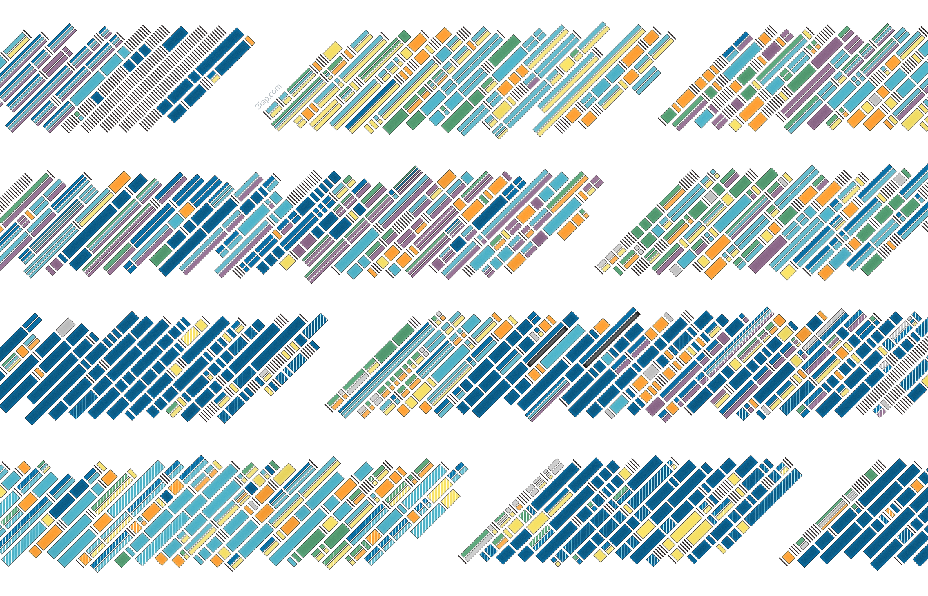
10x 3iap dataviz projects – timing and details
The previous findings covered overall statistics for all 3iap projects. However, it can be helpful to see how time is used on individual projects. For each of the projects below I’ve tried to share enough about the scope of the project to understand the requirements, as well as overall statistics on how the time was spent. There’s also a timeline showing how the types of work evolve throughout the course of a project.
1. Analytics Product Design System (14 Days)
Long-term client asked 3iap to redesign their SaaS analytics app.

A long-term client asked 3iap to redesign their large, complex SaaS analytics product (covering 200+ distinct metrics). There were three parts of the project: 1) a design system of chart components and supporting elements that can be mixed and matched to answer a wide range of analytics questions, 2) detailed designs of four different narrative reports, showing how the design system can address deep dives into various analysis topics, and 3) API designs and technical specifications for similar flexibility / composability when accessing the data from the backend. Because this was a familiar client and topic, there was little research or data wrangling required.
2. In-Product Chart Component (11 Days)
3iap developed an interactive chart component and automated testing framework within the client’s existing codebase.

The goal was to not only deliver the component, but also develop a template for how other charts could be reliably developed and tested within their environment. The component itself was fairly simple, the challenge was making it work (reliably) within their system. This project was fairly chaotic. In addition to last-minute scope creep, startup codebases aren’t known for their quality or engineering practices. No judgment here, but this added significant drag!
3. Complex Report: Analysis & Presentation Design (24 days)
Analyzing a complex and novel topic, new to 3iap and the client, designing appropriate visualizations, then telling a cohesive story within a 51-slide deck.

This involved researching a new topic for the client, designing and developing novel visualizations, working closely with their data engineers to develop a novel set of metrics, several iterations of analysis, developing a framework to generate charts demonstrating the analysis, then designing a deck to tell the whole story. While this is the most research / analysis heavy project in the batch, these activities still only made up 38% of the total time (26% data + 12% research).
4. Embedded Reporting Tool Design (12 Days)
SaaS startup client with a unique dataset asked 3iap to design, prototype and user-test their in-product analytics UX.

The project involved researching their industry, offering and dataset, designing metrics to reflect the activities they wanted to track, designing and prototyping 4 “live reports” across Figma and Data Studio, facilitating user tests, and adapting accordingly. The client was the ideal balance of engaged, open-minded, and data savvy. They also had data available on day one. The project went smoothly and finished ahead of schedule.
5. Scrollytelling Infographic (13 Days)
Developed an interactive scrolly-telling visualization in Angular.

This was a fairly straightforward development project, implementing the clients’ designs for an 11-section scrollytelling infographic based on a small, static dataset. The main challenges were an unfamiliar environment (3iap’s first angular project) and fine-tuning the animated transitions (to be expected from this format). There was a small amount of chaos in the form of surprise scope and changing design decisions.
6. Exploration Dashboard Prototype (7 Days)
Self-serve exploration dashboard in Data Studio, unpacking multiple themes in a familiar domain.

The goal was to translate a fairly detailed static report template (usually ~53 slides) into a Data Studio dashboard that supports basic, self-serve exploration for end users. The result was seven interactive mini-reports, each covering a different theme, with two-to-three subsections and about 20 charts each.
7. Complex Survey Exploration Tool Design (18 Days)
Designed tool for visualizing combined results of a large-scale research project, including exploratory dashboards and narrative deep-dive reports.

This project started in a deep, dark jungle of chaos. The client sent five different datasets, fresh from SPSS, combined into a single 1.3GB Excel file, a 32-page draft report of their research, and very little other guidance. This involved a significant amount of data cleaning just to get started. Then identifying key use cases for the tool and exploratory analysis to find six major story themes from the data. Each theme became a comprehensive, interactive live report. This also involved major exploratory functionality, including a geographic component (prototyped across Observable and MapBox) and universal filtering. Another source of chaos was ongoing scope additions. All of the above pushed the timeline several days past the estimate. Having said all that, while this project should have been total chaos, it actually smoothed out over time. Although the clients were hands-off, we were able to divine their priorities and keep them engaged and aligned along the journey.
8. Interactive Scientific Storytelling (24 Days)
Designed and developed a tool for visualizing long-term clinical trial results.

3iap handled this project from first concepts through final code. This started with understanding the client’s domain and research, walking them through pen and paper concepts and coded prototypes, then finally developing the visualization as a standalone React app. Implementing the design direction in a way that was performant on older iPads (a specific requirement) meant some heavy technical lifting. Ensuring the results were “true to the science” had implications for design and data wrangling (e.g., an auditable metric calculation pipeline). The main sources of chaos (and missed estimates) were extremely late access to data (designs were based on mock data estimated from their provided materials) and last-minute added scope.
9. Interactive Text Content Explorer (8 Days)
Developed an interactive text content explorer using client’s designs and static data.

This was a quick React app based on the clients’ designs. It involved some unusual interactions, but it had a static dataset and few moving parts, making it relatively straightforward. The main sources of chaos were late data and last-minute added scope.
10. Complex Dataset Exploration Tool Design (26 Days)
Visualization and product design, providing a common interface for discovering and visualizing hundreds of similar (but, not identical) high-dimensional datasets.

This project was truly exciting and truly chaotic! It required significant visualization, information, and product design. The domain was intrinsically complex, involving high-dimensional data, many moving parts, and an endless list of edge cases to consider. In addition to the inherent complexity, the designs needed to be reviewed and approved by committee — specifically a group of smart, strong-willed and occasionally mercurial stakeholders. So, in addition to imposing a high communication tax, requirements evolved and expanded significantly throughout the course of the project. Despite all this, the project was a blast. The dataset was unique, interesting, and had a clear path to social good. And the clients, despite committing every possible design-client cardinal sin and client-from-hell cliche, were at least thoroughly engaged in the work and approached their mission in earnest.
Other fun facts
Estimation Accuracy

I did structured estimates for seven projects, based on clients’ initial requirements.
- Five of six projects had at least minor scope creep from the original requirements (the red segments above). For the four projects that were “fixed fee,” all of them added scope beyond the originally agreed “fixed scope.” This isn’t to say they were acting in bad faith, it’s just hard for most people to anticipate everything they need up front. Either way, this demonstrates the need to approach “fixed fee” projects with caution.
- The estimates for the “original scope” were generally pretty good. There was only one project where I substantially underestimated the work. This was a time and materials project, so this was in the client’s favor. Both of the projects that overshot the estimates were due to additional scope added later.
Data Delays

One major source of chaos was waiting for data. Out of the six projects requiring a predefined dataset, three were delayed by ~three or more weeks. One of the projects “finished” several months before the client sent a final dataset.
Invoice Delays

A source of emotional chaos was waiting on clients to pay invoices. Out of fourteen invoices, only three were paid on time (i.e., within one day of the due date on the invoice).
Calendar days versus work days

Projects require more calendar days than full, eight-hour work days. Typically a given project required less than ten hours of work each week. Most calendar time for a project is waiting on clients (e.g. for data, or feedback).
Data and Methodology
The timesheet dataset for the 10 dataviz projects and methodology notes are available here.
Takeaways
- Only 60 percent of time spent designing and developing dataviz was spent “designing” or “developing.” Research, communication, and data wrangling are a significant — and important — part of the job.
- Estimates and time tracking can help set realistic expectations for time and effort required, with clients and yourself. Both of these practices can be enlightening in other ways: Estimates are invaluable for proactively uncovering misalignment and time tracking can help you optimize your time…and minimize wasting precious, finite minutes of your life pixel-pushing in Keynote.
- Plan for chaos and scope creep. Chaos can be minimized, but not avoided. You can solve some of this in your discovery process, by trying to get expectations out of stakeholders’ heads and onto paper. However the best place to handle this is in your contract, either by setting clear boundaries on scope and provisions for overages, or by favoring time and materials when there’s significant uncertainty.
- Working time !== calendar time. The projects above were delivered on time (or early!), but it was rare for any one project to require more than thirty hours of work in a given week. Most calendar time for a project is waiting on clients (usually for feedback or data). The benefit is you can either weave together multiple projects in parallel… or leave yourself slack time for silly projects like this!
If you enjoyed the article, please join the conversation on Twitter!
⏱️⏱️⏱️How much time goes into researching, data-wrangling, designing, and building different types of data visualizations? @elibryan shares advice (gleaned from analyzing ~1,550 hours of paid #dataviz work) and he visualizes timelines from 10 projects https://t.co/ERzj6kNHo2
— Data Visualization Society (@DataVizSociety) May 26, 2022

Eli Holder is the founder of 3iap. 3iap (3 is a pattern) is a data, design and analytics consulting firm, specializing in data visualization, product design and custom data product development.
- Eli Holderhttps://nightingaledvs.com/author/eli-holder/

- Eli Holderhttps://nightingaledvs.com/author/eli-holder/

- Eli Holderhttps://nightingaledvs.com/author/eli-holder/

- Eli Holderhttps://nightingaledvs.com/author/eli-holder/


