
I was on holiday recently in the Welsh border town of Hay on Wye, when I came across a book that instantly caught my attention.
Learn to Draw Charts And Diagrams Step by Step by Bruce Robertson. Brilliant.
As both a child of the 80s, and the CEO of Geckoboard, a company that specializes in data visualization, this felt like fate.
So that night, while the kids were asleep, I read it cover to cover.
And although the 1980s are not that long ago — in industry terms reading this book felt like opening a time capsule from some forgotten past.
So for your delight and betterment. Here are six things I learned about data visualization from a book published 34 years ago.
1: We really do take computers for granted
Here’s a page on computer generated charts, which gives away the fact the book was published right at the dawn of the PC revolution (1988). It’s shocking just how much the world has moved on.
Although computers were considered acceptable tools for generating simple pie charts and bar charts, more complex visualizations like coloured maps still needed the human touch.
“Computers are ideal for creating accurate plotting of the data from which you can then redraw the chart.”
And even if you did have an expensive computer that could handle a coloured chart, you were likely limited by the quality of your printer, anyway.
“The main defect of generating charts by computer is the inability of most printing attachments to draw the resulting chart. The example shows how badly the machine draws smooth curves and applies clean tonal areas.”
I don’t know about you but I’d never really considered how professional charts were drawn before computers.
The answer: A lot of hard work and array of tools: ranging from the humble scalpel through to elaborate mechanical devices like the planimeter for measuring area.
2: You needed a lot of kit
From an array of pencils, pens and compasses…
… to proportional dividers or projectors, which you may have used to scale a chart up or down.
If you needed to add texture, there was no fill bucket. Your ‘go-to’ would be a section of dry-transfer sheets, which you would need to layer onto your drawing, and cut out with a scalpel. The same process was used for lettering.
And watch out you didn’t get any dust on your dry-transfer sheet — this would make them unusable.
And woe betide you if you needed to draw an ellipse or spiral. A perfectly drawn curve would require more than a basic knowledge of geometry.
3: You needed a good workspace
Today, designers have become so used to working remotely, it’s strange to think that 30 years ago, this is what your desk might have looked like.
Practical advice included:
- “Never use your work surface as a cutting board”
- “Don’t sharpen pencils over your work” and
- “Cover your work when you finish each day.”
(Even though I work from a computer, this section definitely prompted me to sort out my own workspace!)
4: The principles of good design haven’t changed
Good design comes from considering your users.
As antiquated as some of the tools and techniques in this book are, the data visualization principles and best practices are rock solid.
At the core of Roberton’s advice is the need to take a user centric-approach, (my generation is sometimes guilty of thinking we invented this idea).
At the start of any data visualization task, you need to ask “What is the chart for?” and “What do your readers need?”
As Robertson says, “Before beginning to plan your chart, ask yourself the question: “Who am I talking to?”
And on that point of view, his appraisal of pie charts hasn’t aged a day: “difficult to calculate”, “difficult to label”, and “difficult to show small differences”. Though in fairness, he does list the exceptions where they are appropriate. (“Good for revealing the division between two parts.”)
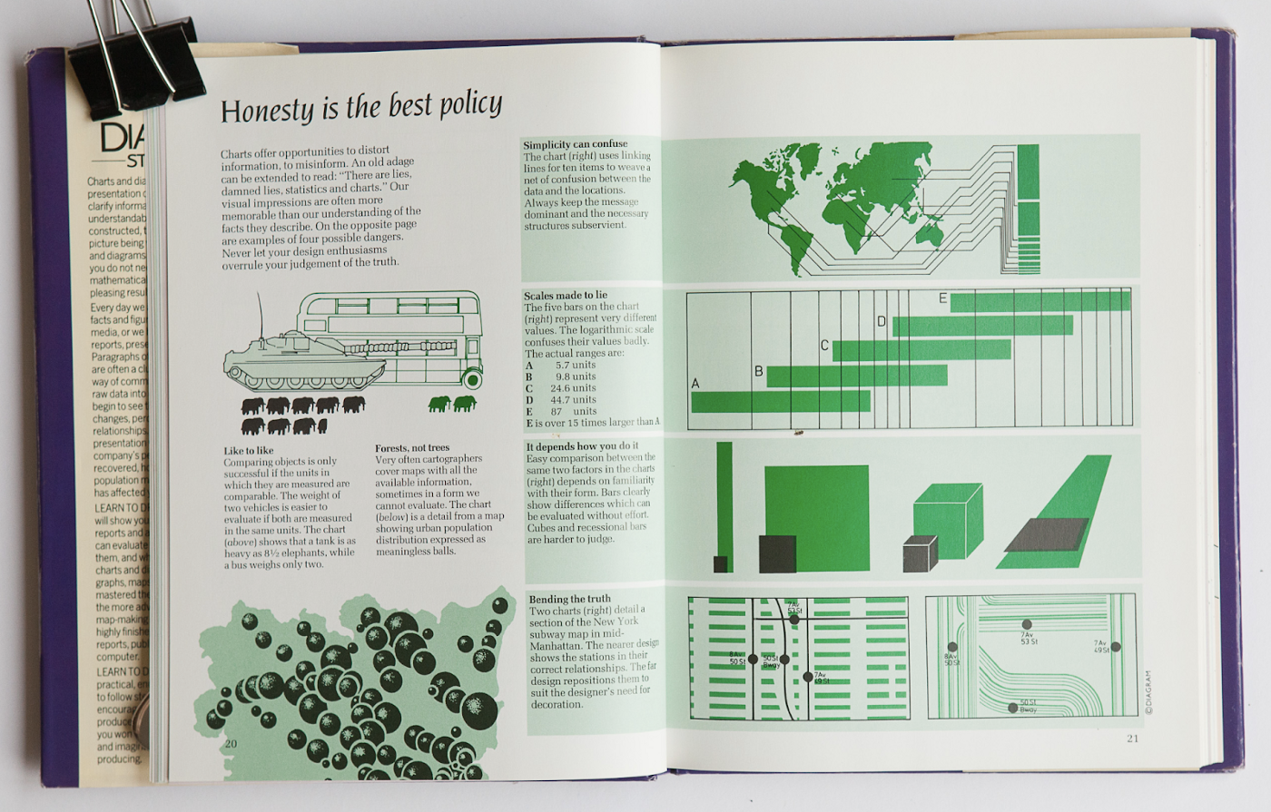
5: Honesty matters
Perhaps in an age of dubious advertising, fake news, and Presidents editing maps of hurricanes with sharpies, this lesson is more valuable than ever.
“Our visual impressions are often more memorable than our understanding of the facts they describe… Never let your design enthusiasms overrule your judgment of the truth.”
I couldn’t put it better if I tried. Of course that doesn’t cover the case of those deliberately trying to mislead.
6: Visualizing data to be displayed on the wall is different design challenge
On behalf of Geckoboard, I particularly appreciated this section on “Displaying your charts.”
I’ve read most of the popular books on data visualization, and I don’t think I’ve ever seen anyone talk about how to design for a ‘display’, without a surrounding narrative. In other words: a standalone chart or dashboard on the wall, where there is no speaker to draw your attention to the important factors.
“Visibility,” “legibility,” and “intelligibility” are all concepts you need to think about differently when your chart is going to be displayed this way.
In summary…
Sadly (but perhaps unsurprisingly!) Robertson’s book is now out of print. If you can find a copy, I’d highly recommend it. It was written by someone at the top of their craft, whose words still ring true:
“Modern technology is no substitute for intelligence”
If I could save one book on visualizing data from a fire it’d be this one.
I’d also love to hear from people who worked on charts and data visualization in this era.

Tom Randle is the CEO of Geckoboard, a company that makes it easy to build and share live KPI dashboards. Originally a UX Designer, Tom’s passionate about helping people access and understand their data, so it genuinely supports important business decisions. In his spare time, he can be found tinkering in his workshop.


