
When I first entered the information design space, I was eager to expand my knowledge of data (visualization) design and the wide range of disciplines it draws from. I read books on visual perception and color theory and attended workshops on data presentation. And while the texts and sessions varied in topic and scope, a common theme emerged: The goal of data visualization is to break down data into bite-size information and present it in the simplest way possible.
Now, almost a decade into my data visualization design journey, I have begun to question this practice and consider what happens when designers make the complex appear simple. In this article, I discuss the problem of oversimplification in data visualization and show how it can obscure (data) complexities that should be communicated.
The problem of oversimplification
We live in a complex world, and the visualizations we design should accurately and empathetically represent and celebrate the phenomena being explored (or explained). However, many practitioners in the field argue that the primary goal of data visualization is to present data in a way that is easy to understand and interpret. Now, such a goal seems not only productive but also laudable. But there is a seedy side to simplification that can result in designs that conceal important information, encourage overgeneralizations, and constrain creative expression.
Giorgia Lupi, an information designer and data humanist, explores the theme of oversimplification, among others, in her article Data Humanism: The Revolutionary Future of Data Visualization for PRINT. She argues that, for many, part of the allure of visual design and, by extension, data visualization is its ability to simplify data. Indeed, there is something to be said for being able to reduce data into easily digestible visual representations. But do not be fooled by a designer’s “effortless” ability to make data look simpler than they are. Every decision a designer makes is deliberate and influences how their audience perceives the data and the real-life stories the data represent.
Looking at several examples will help to illustrate this point. For brevity, I focus on three types of oversimplification: data aggregation, chart choice, and artistic license.
Data aggregation
Data aggregation is the process of expressing data in a summary form. When aggregating data, choices are made about what data elements should be minimized, emphasized, or removed altogether. Although data aggregation often occurs before a designer gains access to a dataset, data visualization designers and developers are increasingly being tasked with cleaning and preparing datasets before analysis begins.
Thoughtful aggregation can make data easier to analyze—for instance, when your data are too granular or large to answer a question. However, if not approached with care, data aggregation can severely limit your ability to meaningfully make sense of your data. As an example, consider the case of “Underrepresented Minorities” (URMs) in Science, Technology, Engineering, and Mathematics (STEM).
According to the National Science Foundation’s National Center for Science and Engineering Statistics (2021), URMs are persons from groups whose representation in science and engineering education or employment (in the United States) is smaller than their representation in the United States (US) population. This includes individuals who identify as
- Black,
- Hispanic,
- Latinx, or
- American Indian or Alaska Native.
Say you are a newly appointed Vice Provost for Institutional Analysis and Planning at a university in the US. Your first goal as Vice Provost is to better understand the state of racial (in)equity in undergraduate engineering degree completion. You ask your lead analyst to calculate degree completion rates for 2020-21 by race and ethnicity for the following groups: White Students, Asian Students, and URMs (which is standard practice). Your analyst provides the following summary information:
- URM Completion Rate: 54 percent
(920 out of 1,700 Black, Latinx, and Indigenous students graduated on time in 2021) - Asian Completion Rate: 76 percent
(1,520 out of 2,000 Asian students completed their degrees on time in 2021) - White Completion Rate: 71 percent
(2,130 out of 3,000 White students completed their degrees on time in 2021)
The analyst also points out that when they performed a quality check, they noticed disparities in completion rates by individual URM groups. Curious to learn more; you request that information as well. After generating a report that presents degree completion rates disaggregated by all available race and ethnicity groups, a slightly different picture emerges:
- Black Completion Rate: 40 percent
(200 out of 500 Black students completed their degrees on time in 2021) - Latinx Completion Rate: 60 percent
(720 out of 1,200 Latinx students completed their degrees on time in 2021) - Indigenous Completion Rate: N/A
(The university did not graduate any Indigenous students in 2021, nor do they currently have any Indigenous students enrolled.) - Asian Completion Rate: 76 percent
(1,520 out of 2,000 Asian students completed their degrees on time in 2021) - White Completion Rate: 71 percent
(2,130 out of 3,000 White students completed their degrees on time in 2021)
Here, creating an aggregate “URM” designation that groups Black, Latinx, and Indigenous students together masks variability in completion rates between students from different backgrounds. If the Vice Provost had decided to use data from the first report produced by the analyst, they would have never known that the engineering department did not graduate any Indigenous students during the 2020-21 school year AND that the Black student completion rate is substantially lower than the completion rate for Latinx students.
By combining data for different subgroups into one larger one, a false sense of understanding is created about all students who are lumped into the “URM” category. This, in effect, erases the diversity of experiences, perspectives, and (potential) needs of those students. Indeed, by that line of reasoning, one could make an argument for further disaggregating the “Asian” category so as not to marginalize those Asian ethnicities that are often overlooked or not prioritized in conversations about STEM equity.
I want to be clear that careful data (dis)aggregation is not a means to an end but a step in the sensemaking process. And the process of (dis)aggregation should not occur in a vacuum, nor should it be understood as static. Rather, it should be a (context-specific) liberatory practice that facilitates more comprehensive data stories and creates opportunities for differentiation and insight.
Now, I will turn to discuss chart choice.
Chart choice
Choosing the best visualization type is a challenge all designers face. Fortunately, there is a long history of research (e.g., Cleveland & Robert 1984 (paywalled), 1985 (paywalled); Pandey et al. 2015 (paywalled)) showing that certain types of charts and graphs are easier for audiences to understand. However, a designer can also choose a chart—intentionally or irresponsibly—that conceals data complexity or implies a misleading pattern or trend. Eli Holder and Cindy Xiong’s (2022) recent study explores how design choices can inappropriately convey and reinforce discriminatory messages.
Through four experiments, Holder & Xiong (2022) show how visualization design can influence viewers’ perceptions about the subject presented. More specifically, they found that study participants were more likely to attribute differences in (social) outcomes to personal characteristics (e.g., people with better outcomes work harder than people with worse outcomes) when presented with a visualization that hides within-group variability (like a bar chart). On the other hand, participants were less likely to agree that differences in the outcomes presented were due to personal characteristics when they saw a visualization that emphasized within-group variability (like a jitter plot).
Let me offer an example to illustrate this critical finding.
For more than half a century, ethnic and racial differences in educational outcomes have been the subject of much debate (Coleman 1968 (paywalled); Jencks & Meredith 2011 (paywalled)). These educational disparities (like the test score gap) have largely been framed in Black-White terms, with many (falsely) interpreting these differences to mean that Black students are academically and intellectually inferior to students from other backgrounds. One question that is often of interest to parents, educators, and policymakers is whether there are differences in reading test scores between students who identify as Black versus those who identify as White.
Imagine you are the lead educational analyst for a school district. Your boss, the Director of Research and Policy Analysis, wants to know whether there are differences in the third grade reading test scores of Black and White students in the district. You run the numbers and find that the average reading score for Black third graders in the district is 148.48, and for White students, it is 172.90. You produce the following (horizontal) bar graph and present it to your boss:

Your boss looks at the chart and offhandedly remarks, “Looks like Black third graders can’t read.” You pipe up and say, “That is not true.” Your boss turns to you and asks, “How do you know?” Being the amazing analyst you are, you also produced a jitter plot showing the distribution of reading scores for both Black and White students, where the full range of values (e.g., minimum, maximum, and mean) can be seen:

Now, your boss sees the fuller picture and realizes that, yes, on average, Black third graders scored lower in reading than their White counterparts. However, some Black students scored higher and others lower.
Bar charts conceal how spread out a dataset is and overstate the appearance of differences between groups. And while their simplicity and widespread familiarity make them easy to digest at a glance, bar charts can be an irresponsible choice for presenting quantitative data that are grouped into discrete categories, especially if there is considerable variability in the outcome being displayed. In other words, visualizations that reduce a dataset to a single number can have the unfortunate consequence of misleading audiences at best and reinforcing stereotypes and societal biases at worst.
Although the implications of Holder & Xiong’s (2022) study are significant for research and practice, they should have a profound impact on how educators and experts approach training future data visualization designers. Choosing visuals that oversimplify a dataset is often the result of a lack of experience with data and knowledge of the visual expression of data. All designers should be exposed to and have a thorough understanding of the variety of ways data can be (re)presented and encoded. This includes design considerations beyond conventional visualization approaches and popular charts that are standard in analytics and business intelligence tools but do not always fully capture patterns or trends or are not well suited for telling complex stories.
My goal here is not to convince all of you reading to replace your bar charts with a jitter plot. Rather, like Holder & Xiong, I hope to impress upon you the “duty of care” designers owe not only to themselves but also to the public when it comes to (re)presenting data.
One final topic I will talk about in this article is artistic license. And by artistic license, I mean creative expression.
Artistic license
Creative expression in data visualization is a touchy subject. Many believe that creative expression and data visualization are inherently incompatible and design choices that deviate from “best practices” should be banished to the realm of data (or computational) artistry. For instance, Stephen Few, an information designer, has written about this topic on his blog, Perceptual Edge, in a now infamous post titled Does Art Play a Role in Data Visualization?. In the piece, Few argues that we, as data designers, should use the term “art” when referencing data visualization with caution. And I agree. But where he and I differ is in our understanding of visual design conventions or what he calls “aesthetics.”
According to Few, there is no place for artistic license in “effective” data visualization; the creation of visuals and graphics should remain an objective, science-informed endeavor. That said, Few does recognize the importance of aesthetics in data visualization, but only because the design conventions (i.e., what works and does not) he employs in his work are rooted in “scientific research.” But what Few and others who adhere to this philosophy fail to acknowledge is that nothing operates in a vacuum. Everything—including scientific research—is influenced by time, culture, and current understandings of how the world should work. So, who is to say that data artists and data designers who experiment with more artistic forms of visual communication are not simply at the forefront of scientific developments that will lead to new norms in visualizing (or envisioning) information?
The tension between creative expression (form) and usability (function) extends beyond the theoretical to the practical realm. Current data visualization practices encourage sameness—copies of what others have designed. This has resulted in some designers becoming de facto technicians, blindly following “best practices” without questioning or tailoring them to fit their specific needs. Now, I am not suggesting that we throw caution to the wind and create works of art that do not communicate a story or allow the audience to discover their own story. What I am arguing for is a data visualization design practice that relies on evidence-based techniques grounded in scientific research— that acknowledges different ways of knowing and being— but embraces creative expression, such as experimenting with different encodings and visualization types.
An example will help to illuminate this point.
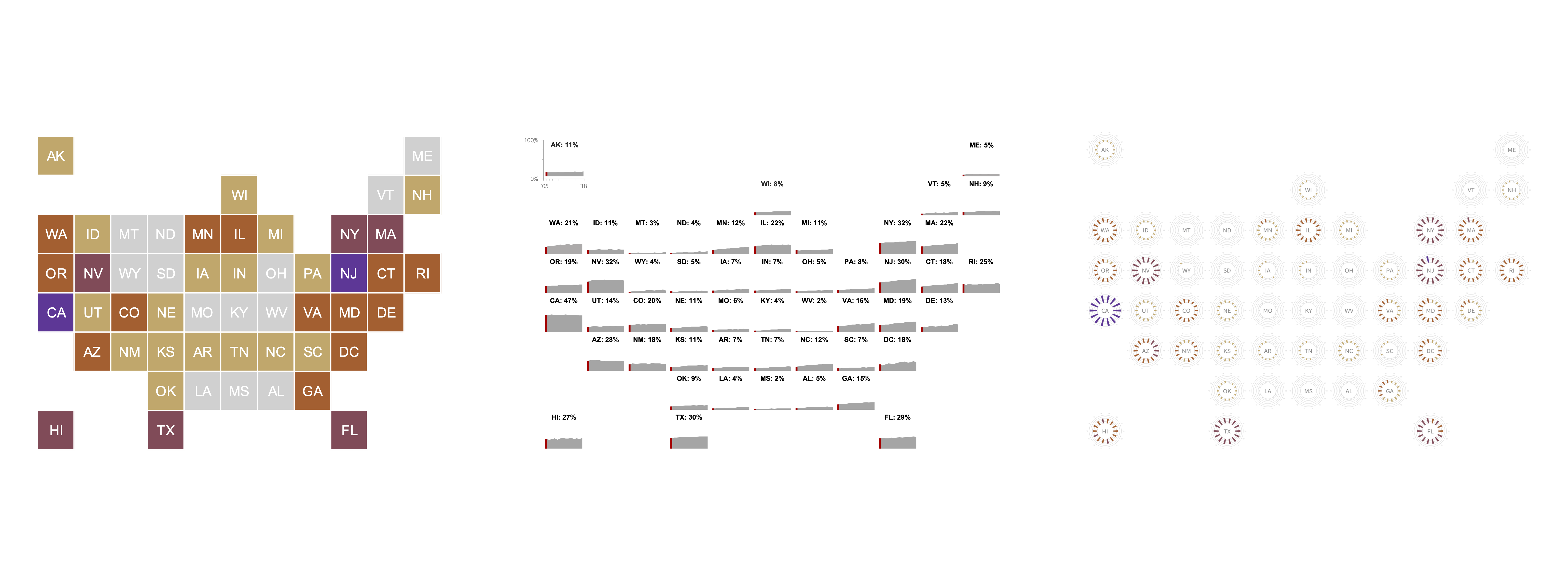
Children living in immigrant families continue to be a growing segment of the US child population. In 2018, one in four—or 18.4 million—children in the US were born in another country or lived in a family with at least one foreign-born parent.
Say you work as an information designer at an organization focused on immigration policy in the US. Your executive director requests that you create a visual that allows viewers to see where most children in immigrant families live. Using Kids Count Data Center data from 2005 to 2018, you produce two tile grid maps (one map using 2005 data, the other 2018) and stitch them together in a GIF animation:
Original Design: GIF of Two Tile Grid Maps

A tile grid map is a popular and effective way to present geographic data while giving each region (or state, in this case) equal visual weight. But there are other ways to present trend data that do not require animated transitions between two static visualizations.
In keeping with the “tile grid theme,” your next design brings an interactive element (i.e., scroll bar) to the visualization as well as a small multiples area graph. Users can click on the arrows of the scroll bar or use the slider to “activate” a red vertical line that highlights the current year’s percentage. Each tile also has a label showing the state’s name and the current year’s percentage.
Alternative #1: Interactive Tile Grid Map with Area Graphs
While interactivity can increase understanding, designers should not assume that viewers will (or should) click or hover to make sense of the presented data. Further, because many data points are displayed, forcing interaction via a scroll bar, in this case, can become burdensome for people with mobility impairments. Not to mention, the interactive element adds a level of granularity without much value. In other words, even without a data value label (that changes with each year), viewers can still see how values in the outcome change over time and judge how much using the map legend.
For your final piece, you produce a static visualization that uses the tile grid map as a foundation and blends popular visual encodings with a non-traditional chart type
Alternative #2: Tile Grid Map with Radial Column Charts
Here, a radial column chart is placed in each tile, and individual bars on said chart(s) represent a single year in the dataset, ranging from 2005 (one o’clock position) to 2018 (twelve). Instead of displaying values for specific years, each chart has a series of concentric rings representing 10 percent, ranging from 0 percent (innermost ring) to 50 percent (outermost ring). Moreover, the length of each bar is proportional to the percentage it represents, and viewers do not have to rely solely on bar length to decode the visualization. Color is strategically used to highlight and define regions with more (or fewer) children living in immigrant families.
My goal in discussing creative expression is not to suggest that all designers should aim to be more “artistic” in their approach or that visualizations with an “artistic” aesthetic are inherently better. Rather, the simplified setting of the example underscores how a dataset can be visually (re)presented in different ways. Some designs may resonate with your audience. Others, not so much. Experimentation, however, offers an opportunity to thoughtfully examine our design choices and decision-making and create more meaningful visualizations that will help your audience uncover new knowledge or come to a new understanding of the presented data.
We are at a critical juncture in the history of information design. Rising interest in data and growing familiarity with the tools and skills needed to present data offers the opportunity for, as Lupi puts it, a second wave of visualization that is experimental, unique, and “connect[s] numbers and graphics to what they really stand for: knowledge, behaviors, people.” This article only scratches the surface of the issue of oversimplification and the influence it can have on how we—as designers—choose to visually (re)present life. I will leave you with a quote from an essay titled Seeing Your Life in Data (paywalled), penned by Nathan Yau, a statistician and data visualization expert. One line in the piece perfectly captures my attitude towards the current moment and perhaps was (at the time) a foreshadowing of what was to come, “Data often can be sterile, but only if we present it that way.”

Ama Nyame-Mensah is the founder of Analytics Made Accessible, a data consulting firm. She helps teams and organizations explore, analyze, and communicate their data more effectively. Ama is committed to translating data into compelling stories and making analytics more accessible.
- Ama Nyame-Mensah

- Ama Nyame-Mensah


