
This is part 8 in a series of articles that illustrate how basic design principles can improve information display. The previous article reviewed chart choices for a dashboard redesign. Here, we’ll use an everyday example to step back a bit and look at how functional task and visual appeal should work together, and where they sometimes contradict.
About a year ago, I was asked to comment on using a version of this chart for a client dashboard.

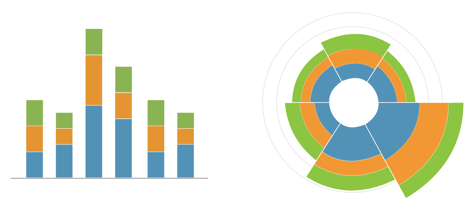
The person requesting the review called the chart a rose diagram based on the name in their software library, but I don’t believe that they used an area encoding, so I think it is actually just a stacked pie chart stretched around a circle, and not an actual rose diagram. If you look at the chart closely, you will see that it contains exactly the same data as the (much more readable) stacked bar chart, but the requester was feeling pressured by a client to add the rose diagram to the dashboard because it needed to be more “fun.”
If you’ve read my previous article, you already know how I feel about fun in data vis. If adding some visual interest doesn’t conflict with the primary purpose of the chart, then I’m all for it. Visual flair is fine in its place, as long as it doesn’t interfere with the job of a chart in this context: to support a user task. In an analytical setting such as a business informatics dashboard, I take a pretty hard line on this distinction.
In my experience, the request to make things “more exciting” usually has less to do with meeting an end user’s need than it does with enforcing compliance — it’s often middle management’s first answer to the question, “how do I get people to actually look at this thing that we spent so much time and money creating?” As often happens, examining the underlying need rather than the request often reveals a much more interesting question of company culture, combined with the perceived relevance and usefulness of the information presented, and is almost always better addressed in a different way.
As a designer, it is your job to care more about your user’s comfort and ability to successfully complete their task than you care about your own aesthetic impulse. To me, wavering on that commitment is self-indulgent, especially in the type of task-focused work where you will find most data vis. There’s always a balance to strike here, but when you choose to put your own creative urge before your user’s needs, then you are making art, not design. There is nothing wrong with art: it is a beautiful and valid pursuit that illuminates and enriches the human condition. We could all use more art in our lives — at the appropriate time, and in the right context.
There is real value in using aesthetics to create an experience or inspire a comparison that someone might not otherwise get from a chart: work that pushes the edges of what counts as “data” and whose perspective matters can provoke important conversations about bias, representation, and the dominant power structures that undergird our definitions of truth. I personally delight in indulging and encouraging the eccentric perspective; it just depends on the situation.
Of course, aesthetics and function absolutely can (and absolutely should) work together toward the same goal. Aesthetic appeal performs a critical function in making design that delights, which is something that we should all strive for, even in a business dashboard. Analytically-focused solutions that dismiss design as unnecessary “window-dressing” often overlook its functional contributions. Disregarding the human experience of your users will always diminish the quality and success of your work.
Great design means finding that elusive area of overlap where function and form align to create something that supports a task and considers the needs and desires of the human using it, in the context for which it is intended. Function that disregards form is simply not as good (or as useful) as a design that takes the user into account. In cases where the aesthetic impulse overrides the primary purpose of the chart, you’re more likely to create frustration than delight.
To me, the primary function of a dashboard is to be able to read the data, not to be excited by its visual form. The user can and should be excited by the content, because it gives them valuable information in a digestible form that they might not get another way. But the dashboard itself does not need to be exciting, and certainly not — I say this with a shudder — “sexy.” It just needs to help a user complete their task, as seamlessly and pleasantly as possible, and preferably without any inconvenient obstacles, frustrations, or other unnecessary arousal. Making a chart harder to read actually works against that aim.
I do not see the role of a data vis designer as that of a gatekeeper, separating good charts from bad, and telling my clients or users what they should want. My job is not to tell people to eat their broccoli and like it: it is to ensure that the visualizations I build do the best possible job of helping my users succeed, and to deploy every skill in my toolbox to support their needs.
Let’s take a look at some of the pitfalls and stumbling blocks that this particular chart puts in the user’s way, as soon as they try to engage with the chart and actually read the data that it contains.

Uncertainty about scaling. Should I read values as area, or as radius? How can I tell? Florence Nightingale’s original rose diagram used area to scale the chart elements, but people are terrible at estimating areas, particularly for distorted or irregular shapes. As I mentioned before, this chart actually appears to be a radial stacked bar, which would use a length encoding that scales radially out from the center. Without getting into the code for scaling the data, it’s hard to tell what it’s doing. Most people will try to use radius as a proxy for area when they estimate values anyway, so a radial version would probably be the better choice, but the bottom line is that the user simply can’t tell without more information. A good legend and clear chart labels are critical here.

Comparing proportions. It is incredibly hard to compare irregular areas that have very different sizes or shapes. Consider the difference in how you perceive the relationships between the blue and green areas when you view them as radial stacked segments compared to slices in a pie chart (a visualization that is itself notoriously bad for comparing proportions).

Radial distortion. The hardest thing about radial/polar graphs is that the circumference of a circle gets bigger as you go out, and it gets bigger faster than the radius. No matter how you encode the information (length or area), people will tend to misjudge the importance of some arcs — it’s just a question of which direction the distortion goes. Length encodings will unduly emphasize the outer rings, where the area grows faster than the data because the arc width is larger. Area encodings will emphasize the inner rings, where the radial distance increases quickly because the arc width is so small. Both scaling methods create distortions, and you can see how much this affects your perception of the chart by comparing the same data side by side (the gridline values are meaningless here, and only serve to guide your eye). I don’t believe that we do our users any favors when we grab their attention with a flashy chart that also makes it harder for them to do their job. As a user of your dashboard, it is my job to read and digest a lot of information as quickly as possible, and to use it to make correct and informed decisions. In this context, I care most about speed, accuracy, and precision. A visualization that causes me to trip over visual artifacts or easily misread the numbers will quickly transform my emotion of delight at the novelty of the chart into one that all designers should work to avoid: frustration.
In a more casual environment where there is less emphasis on accuracy and the ability to ingest data quickly,¹ the area-scaled rose diagram might actually be more successful. If the goal is a quick general overview that minimizes small differences (supported by the exaggerated sizes of the area mapping), grabs the user’s attention, and provides an interesting visual display rather than ensuring legibility of the data, then the rose diagram could be a reasonable choice. The original rose diagram is famous for having done just that, and it’s not an exaggeration to say that it helped to change medical history — for the better. There is also a clear rhetorical bent to this visualization choice, and someone who wants an undistorted view of the data is well advised to beware.
Let’s say that you are determined to go ahead with the rose diagram. For your context, the chart’s novelty is worth the price that you pay for a less accurate visual form, and you (or your client) really, really believe that this exciting new chart does exactly what your user needs and wants. Are there things that we can do to make this chart better? Absolutely.
Minimize distortions where you can. Adding a white center circle helps to reduce radial distortions by avoiding those tricky center wedges where the difference in scaling is largest. The distortions are still there, but at least they are smaller. Note that the empty center pushes me more toward interpreting the chart as a radial stacked bar, though, which may or may not be correct.

Provide cues to tell the user how to read the chart. The biggest challenge with a novel visualization is that people simply don’t know how to read it. For some people, new things are exciting. For others, they are disconcerting, overwhelming, or even scary. Depending on the analytical skills of your user group, an unfamiliar visualization might actually scare people off rather than pull them in. Show these users how to read your chart. Even something as simple as adding an axis can help.

Reinforce the visual encoding with values whenever possible. Most of the problems with this chart come from the user trying to estimate values. If you remove the need to “eyeball it,” you improve the accessibility of data in the chart. The user’s overall impression of the data might still be somewhat distorted by the chart, but the numbers are right there to fix it and support understanding.
Include interactions or annotations that clarify the visual form and reduce common confusion. Let’s face it: you know that this isn’t the best chart for its analytical purpose. Once you’ve acknowledged that and understood its limitations, you can actively counteract them with thoughtful design. Create affordances (such as interactions) that provide additional support for user tasks whenever possible, and make sure to include clear signifiers to indicate that an action is available as well. The designer who requested my initial review did an excellent job of adding labels and interactions to support interpretation of an otherwise difficult chart, which made the design much more usable than if they had just relied on the chart alone.
Use styles to clarify the chart. Going with a less accurate visualization(voluntarily or otherwise) doesn’t mean that you simply throw in the towel and walk away. As designers, this just means that you have more work to do. There are several things you can do to make a weak visualization more readable. Even small decisions like adding lines between the chart wedges can strengthen groupings and help to clarify how the chart should be read. Dust off your UI skills and play around a bit: there’s probably something you can do to make this chart work better.

Explore alternate visual forms. Once you’ve decided to prioritize novelty, next comes the due diligence. Are there alternate encodings that would keep the novelty, but improve the visualization and reduce the conflicts between function and form? Here’s where you get to be creative: put on your design/data vis hat and get to work riffing off the basic structure of the chart to find other solutions that might fit the bill.
To me, these last two options are where the real fun and creative opportunities lie for data visualization designers. Shaking things up is not about simply choosing a chart that no one has seen before, but in thoughtfully optimizing that chart for the task it is meant to serve.
Incidentally: the team working on this dashboard did decide to use the requested chart in their initial implementation, but during usability testing, it emerged that users were confused and could not read the data (even with detailed labels to support the task). We’ll take a look at some of the alternatives in more detail a future installment, to illustrate how different chart options support users in different ways, and how we can choose between different chart types by focusing on the user task. In the meantime, you might also want to look at this article on balancing client expectations by Benjamin Xiao.
[1] Note also that this context means that a user is less likely to pause and check the values listed in the chart, and so any distortions added by the graphic are more likely to escape notice and may go uncorrected.

Erica Gunn is a data visualization designer at one of the largest clinical trial data companies in the world. She creates information ecosystems that help clients to understand their data better and to access it in more intuitive and useful ways. She received her MFA in information design from Northeastern University in 2017. In a previous life, Erica was a research scientist and college chemistry professor. You can connect with her on Twitter @EricaGunn.
- Erica Gunn

- Erica Gunn

- Erica Gunn

- Erica Gunn


