
This article is part of a series that illustrates how basic design principles can improve information display. In the last installment, we thought through the purpose and context for a dashboard that we are redesigning. Up next, we will dive into revamping the content. Today, we’ll examine the charts themselves.
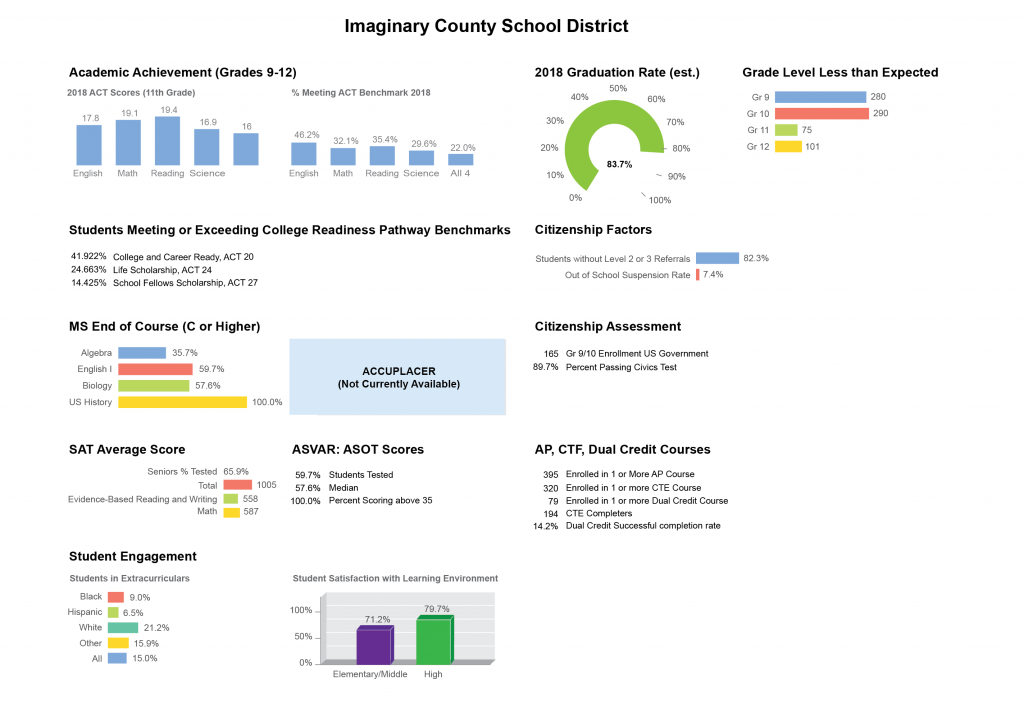
Before beginning a redesign, it’s good practice to take a moment to pause and look closely at the original chart choices to get a sense of what is (and isn’t) working well. We laid out some good, basic considerations for optimizing the styling of chart displays in a previous post, so here we’ll focus more on applying those recommendations in context and commenting on the charts that were used in the dashboard we began redesigning in Part 2. First, we’ll look closely at individual chart choices, and then we’ll step back to see how they work together as a whole.
Do the chart choices make sense?
The designer of this dashboard has stuck mostly with bar charts, which are familiar to most people, have high quantitative accuracy, and can support users in comparing values and proportions. In general, this is a good, safe choice. Bar charts are also amenable to annotations and various other “upgrades” that can help when we want to add more comparisons into the charts, so they can be a very flexible starting place. The last article discussed several pieces of additional information that a user might need to make sense of this data. It remains to be seen whether simple bar charts will still be the best choice when we think through all of that information and the tasks needed. For right now, bar charts make sense.
Bar charts are familiar, reliable, and safe. Likely because of this, they are often dismissed as boring. One of the great myths of dashboard design is that if you just “jazz up” your dashboard a bit by picking fancier charts, people will automatically want to spend more time there, just looking at things. In my opinion, that’s a lot to expect to result from your choice of charts, but we’ll leave that discussion for another day. For now, we’ll focus on the things that, to me, are more successful in improving user engagement because they make the dashboard itself more useful. We talked about content in the last article. Today, we’ll focus more on clarity and function.
I only mention the “boring” factor here because I suspect that’s what led to the more questionable charting choices in this display: if you’re just trying to make a bar chart more exciting, you could try making it 3D.

Or, you could try bending it into a curve, to look like a race car speedometer. (Nothing says “exciting” like a speedometer display, with its implicit message to “go faster!”)

Neither of these choices is criminal, but I am skeptical that they are really improving the display. Both charts make the data harder to read, and they don’t add any extra information that the user might find helpful. The 3D chart, in particular, feels kind of random and out of place because it’s the only one like it on the page. The speedometer display does at least have the advantage of a more compact aspect ratio, compared to a single, long bar. The dashboard designer has done a good job of labeling values to offset the inherent difficulties in reading these different charts. While these visualizations are not really doing any harm, I don’t think that they are helping much, either. Let’s take a closer look at some of the difficulties that these charts introduce.
3D charts are easy to pick on, because they introduce cues that can fool our perceptual system into misreading the chart. Unlike some hard liners, I do think that there are some cases in which the use of 3D visualization is justified. When introduced carefully and with the proper constraints (and with controls to support users in interpreting a more sophisticated chart), that third dimension can sometimes provide an additional comparison that is otherwise difficult to achieve.
This is not one of those cases. Here, the 3D aspect is simply a catchy visual style: it doesn’t add anything helpful to the contents or comparisons in the chart. It does make it harder for a user to see how the bars line up with the y-axis. To help illustrate this, I’ve added three thick gray lines to the top of the tallest bar: one at the front, one in the middle, and one in the back. Any one of these could be reasonable anchor points to read chart values from.

The way the axis labels are drawn, the new gray lines help us see that it is the front face of the bar that we should use to read values, because that’s the one that intersects the labeled axis. That surprised me, because it disagrees with the chart gridlines, which are anchored to the back of the bar. To read the chart, the user needs to mentally add two new comparisons, which I’ve shown as magenta bars and a dotted line.
As long as the user gets all those imaginary lines lined up right and correctly judges their intersection and the resulting lengths, there is no problem: all three magenta lines are the same, and the user will be able to read this 3D chart. The problem, of course, is that most people won’t be able to accurately judge that intersection. It is a much harder task than doing the same comparison in 2D, and it’s one where your own vision system works against you, introducing all kinds of distortions and visual artifacts as your brain tries to process what’s going on.
What if the user misjudges the intersection point? How much difference will it really make? Quite a lot, in fact. In the second version below, I’ve simply extended the solid gray lines to hit the axis plane at different points. I’ve swapped the drawing so that the line from the front of the bar hits the axis in the back, and vice versa. The front line hits the back axis just below the 75% gridline, while the back line hits the front axis at just below 100%. Assuming that there are no other sources of error from the 3D display, simply adding in these errors from mis-applying the 3D projection could make a difference of almost a quarter of the value represented in the chart. To me, that’s a pretty big deal, and the 3D is simply not giving us enough value to make the tradeoff worthwhile.

Notice how much complexity one small design decision added to this chart. what if the designer had chosen to put the tick marks on the back panel, to be read off the back of the bars instead?

Notice how much simpler that one adjustment makes things. It reduces the sense that the chart is 3D, but it becomes much easier to read once the axis lines actually match the gridlines drawn in the chart. Even if you’re stuck with a particular chart, you always have design decisions to make. Even small things can make a huge difference in how difficult a particular chart is to read, and understanding why something is broken always makes it easier to fix.
The user will also encounter different difficulties when reading the speedometer display. Here, there is no 3D representation to throw off our perception, but the reference points are a lot harder to read than in a standard bar chart. Notice that the graph starts at zero and ends at 100%, but it doesn’t use the full size of the circle. It doesn’t look like quite three-quarters of a circle, either, so it’s probably some arbitrary value set based on how the final chart looks. My guess is that this is done for aesthetic reasons, and to allow the chart to accept values over 100% (not recommended, but a common request). Here, I’m adding in some guide lines to make the endpoints a little bit clearer.

Without getting out a protractor, I’d guess that the angle between those end lines is about 60 degrees, so the chart arc spans about 300 degrees, or about 83% of the total value. It’s an interesting coincidence that that’s almost exactly the same value that’s shown in the chart, but the two should be unrelated — unless someone made a mistake in the math somewhere when scaling the chart. For now, we’ll assume that the initial graph is correct, and that this is just a coincidence.
By not using the whole circle, the chart introduces a discrepancy in scaling, which the user will have to overcome when estimating values. The arc drawn here is drawn as about 60% of a circle but represents 80% of the total measurement of 100%. Confused yet? The chart designer has thoughtfully helped us out by adding ticks for those last few values, which makes it a lot easier to read the value where the green bar stops. But the bar will still hit 100% before the arc makes 100% of a circle, which makes the visual impression misleading. If I just glance at the chart without checking the axis values, I read this as just over half a circle, but it’s actually more than three quarters of the way to 100%.
Technically, the speedometer is actually a distorted bar chart, and its values should be read as a lengths rather than angles, but I don’t know of any good way to estimate arc length reliably by eye, and always revert back to comparing the ratio of angles for the bar to the chart max to estimate the value for charts like this. The green bar is at 250 degrees, the 100% tick is at 300 degrees, which implies a ratio of 0.8. There’s a lot of estimation and math involved here, which increases the difficulty (and decreases the accuracy) of reading the chart.

A side note: this is why I personally continue to prefer pie charts over donut charts. Even though I’m aware that the additional area in the center of the pie distorts my sense of size, I find it infinitely easier to try to guess an angle when I can see the center of the chart, and that is always easier for me than trying to interpolate some kind of arc length to compare. I know that many other experts disagree, and that there has been some research into this contentious issue, but I suspect that this tendency to measure by angle is the root of many people’s preference for pies.
It’s also interesting to note what I had to do when I wanted to accurately guess the angle values: I had to find the center of the white circle in the center of the graph. What I’m really doing in this case is trying to put an imaginary line on each flat end of the green bar, and then figure out where they intersect. All the other noise in the chart (and especially that center label) make it much harder for me to guess the center precisely.

And again, we might ask ourselves: how much difference does this make? How much uncertainty is the unmarked center really likely to add to this graph? Fortunately, it’s pretty easy to tell. By drawing my imaginary reference lines from each of the different centers to the 100% tick and the point on the arc closest to the zero value, I can see how much variation there is from misplacing the center. By laying these three pairs of lines on top of each other, I’d guess that there’s a variation of maybe 5 degrees, possibly 10 if you account for variation on both ends. Not as severe as last time, perhaps, but significant nonetheless. I expect that it would be much larger if I were forced to estimate without actually drawing any lines, because each annotation I add helps to anchor my vision and improve estimates of the remaining values. At least for me, eliminating or cluttering that center point of reference makes it much harder to read the values.

Fortunately, our thoughtful dashboard designer has at least partially addressed concerns for both charts by including labels so that the user doesn’t need to read directly off the chart. This goes a long way toward answering the most urgent accuracy concerns, but it should leave us wondering: why show the chart at all? Visualizations are complicated to make and can be expensive to produce, and we should always insist that they pull their weight. What is the visual doing for us if it’s likely to distort the user’s perception and add inaccuracy to the data?
The answer here seems to be mostly adding visual appeal, and drawing attention to the chart. It would be far better to include a visually appealing chart that does not appear to contradict the numbers that you’re supposed to see. When we get to the point where the chart is just window dressing, we should ask ourselves whether the visualization could be doing more, or whether it should be removed altogether. That’s a question that we’ll return to in a later installment, when we get to the full redesign. For now, let’s take a step back and take a look at the dashboard as a whole.
Do the charts work well together?
There are several factors that affect how a user will group and understand information on the page. Whitespace is a key item, but chart type, colors and styles are also powerful cues for creating relationships.

Similar charts (may) imply relationships
When I first glance at the dashboard, I see vertical bar charts that are displayed side by side, which supports the user in comparing bars from one chart to another. There are several strong cues telling me that these two charts should be related:
- The two charts are grouped together under a single heading, in their own section of the page.
- They are spaced closely together, so that they almost look like one continuous chart.
- They are shown next to one another, and the axes are lined up.
- These are the only vertical bars on the page (except for the student satisfaction chart, which has very different styling).
- All of the bars are blue, which is different from every other chart in the dashboard.
All of these items reinforce my assumption that I should automatically compare values between the two charts. But notice that the axis scales are not the same: one is in points, and the other is in percentages. So we shouldn’t really compare values between these two charts at all! There’s nothing wrong with putting two similar charts next to each other, but we should be aware that users will be looking at subtle cues in the visual design to understand how to group things together, and that small things like this can lead to unintended meanings. We want to make sure that the relationships are as clear as possible, and that we’re not implying groupings that don’t exist.
It’s interesting that the designer chose to mix vertical and horizontal bars. I suspect that this was due to label length and vertical space considerations, but I’m not 100% sure. It may also have been an attempt at visual variety. Both bar chart versions work, and I don’t know of any rules that govern mixing them, but it’s good to remember that it will always be easier to compare vertical to vertical and horizontal to horizontal charts, and that our brains tend to assume that visually-similar items are related. If that’s not what you’re going for, then you might want to introduce other cues that weaken those perceived relationships (position charts differently on the page, reinforce alternate groupings, use different colors for bars in chart 1 and chart 2, make titles more prominent, etc.).
Amer and Ravindran published an article in 2010 explaining how a common optical illusion can distort length comparisons between different orientations of bar charts. Including labels and gridlines is a simple fix, but it’s an interesting result that’s worth considering when building a dashboard where a user might need to compare between charts.
Color is a strong grouping agent
Another thing I notice right away is the use of color. The colors are quite bold and strong, but their application seems to be arbitrary: red does not mean “English” in every chart. There does seem to be a rule that says that the color order should be blue, red, light green, and then yellow, but that order is violated in the Student Engagement and Student Satisfaction charts, and it’s not immediately clear why. It is common to re-use colors from chart to chart, so I wouldn’t think much of it if the order was always the same, but it feels intentional that the order was broken in the Student Engagement chart, especially since a new color was introduced right in the middle of the standard sequence.
The only other place that the darker green shows up in the display is in the second Student Satisfaction bar, but there does not seem to be any reason for linking those data points. It also looks like the two dark greens are a slightly different color, but they’re so close that it could be hard to tell, depending on your device’s display settings. The purple used in the Student Satisfaction chart does not show up anywhere else, or match any of the other colors in the dashboard. The fact that the Student Satisfaction chart is styled so differently than the rest of the charts makes it seem less related to the other information — or possibly more important.
It’s good to keep in mind that color is a strong grouping indicator for most people. Even if you don’t intend to create relationships, people are likely to seek them out. Having a simple, clear order helps to reduce that tendency, because users can easily check whether there is a relationship. Once an order is established, people will start to look for and try to create explanations if you break it. Having a color code that “sometimes” holds is often more confusing than not having one at all. This is a huge headache for dashboard design, because colors are often assigned automatically when the data changes, and it’s very hard to control what a user will actually see on a given day. There are no easy answers to this conundrum, but it’s good to remember that color is one of the most powerful items in your toolbox, and you want to make sure that you use it effectively.
Questions to consider
These are just a few of the first things that I notice as I start looking at a dashboard. Really, I’m just paying close attention to what I see, noticing the connections I’m making, and deciding whether or not those assumptions turn out to be correct when I examine the data more closely. I’m paying attention to what puzzles me and where I might be making mistakes. Overall, I’m trying to better understand the strengths and weaknesses of the current design. There are lots of other factors that will come in as we add more layers of information, but it’s good to have a basic sense of where you’re starting from before diving in.
To sum up, here are a few of the questions that I’m asking myself as I start to look at a dashboard for the first time:
- What do I see first? What’s most prominent on the page? Should it be?
- What do I notice at a quick glance versus through a deeper look?
- What kinds of connections am I making between different charts? Do those assumptions seem to match the designer’s intent? Are the visual cues I’m picking up on intentional clues left to help me out, or random artifacts left by unexamined design choices?
- As I start to read the content more closely, when am I surprised? What mistakes did I make when I first glanced at the page, and why? (Note that I don’t believe that every mistake can or should be prevented, but it’s helpful to pay attention to what they are and when they occur, because that helps improve the design.)
- When do I want to reach for a ruler as I’m reading a chart? Are there places where I just can’t tell what’s going on? What kind of annotations or guidelines would help me out? How am I anchoring my estimates when reading the chart?
- Why do I think the designer made these choices? Is there something that they were trying to do here, and was it successful? Is there a better way?
- How does the dashboard feel as I’m reading it? Is it structured and logical, or jumbled and confused? Can I tell right away what’s going on?
- Do the chart choices make sense for the kind of data that they’re showing, and for the kind of task I need to do? Are they supporting me in reading the data, or are they getting in the way? Are there better options, or additional things that I want or need?
- What kind of annotations, interactions, or other information could help me out?
Recommendations
- Don’t add distortions. Choose chart types that add something to the display, and make sure that it isn’t confusion!
- Beware unintentional groupings. Make sure your design choices work together to help the user, and don’t send them looking for relationships that don’t exist.
In the next article, we’re going to take a brief detour to think about chart choices and how those relate to user tasks, to inform how we compare the different chart options when we start to redesign.

Thanks to Raeedah Wahid for editing.
Originally published at http://ericagunn.com on Jan 10, 2021.

Erica Gunn is a data visualization designer at one of the largest clinical trial data companies in the world. She creates information ecosystems that help clients to understand their data better and to access it in more intuitive and useful ways. She received her MFA in information design from Northeastern University in 2017. In a previous life, Erica was a research scientist and college chemistry professor. You can connect with her on Twitter @EricaGunn.
- Erica Gunn

- Erica Gunn

- Erica Gunn

- Erica Gunn


