
This is the second installment of a yearlong data visualization journey. If you want to read the first part before diving in, here’s the article about my food-themed data collection!
Over the course of the last four weeks, I’ve been collecting data about different types of movement in my life. Just like the first visualization I did with my last theme, I started with a literal interpretation of “movement” before moving on to more conceptual definitions. When I think of moving, I think about walking places, especially because COVID has understandably limited travel, so I decided to record every time I walked to a different room of my house.

I had a ton of data at the end of week five because I recorded not only rooms I intended to go to, like my bedroom or the kitchen, but also rooms that I just happened to pass through, like the foyer or sitting room. Due to the sheer amount of noise in this dataset, I decided to only visualize the times when that room was my destination. This decision led to cleaner data and told a more specific story that gave me some insight into where I spend most of my time.
It’s obvious from the floor plan that I spend a large share of my days on the third floor in my bedroom, my bathroom, and the rec room. I have a table set up in the rec room where I attend virtual meetings, zoom into class, and do all of my work, so it didn’t surprise me that the rec room was a frequent destination. However, something that popped out at me after making this visualization was how often I visit the dining room. The dining room is where we keep the fancy table and chairs, but we almost always eat at the kitchen table instead (hence why I was in the kitchen so often). But I realized after making this that since the pandemic started, my family has set up the dining room table as a puzzle station: my frequent visits were to work on the puzzle with my siblings.
My inspiration for week six’s data was to attempt to monitor more localized body movement. Each time I stretched, I wrote down what part of my body I was stretching, whether or not I cracked a joint in that area, and a quick note about why I stretched. This ranged from just waking up to being stiff and even just stretching because I was restless.

The layout for this viz is simple, but it revealed localized data without extraneous labels or explanations. Upon review, it did not surprise me that I stretched my back the most often, as that tends to be a body part that I pay attention to more than others because of some physical therapy I did for back pain in middle school. One point that did surprise me was that I only fidget on the lower half of my body. This may be because I like to move a little during Zoom classes, but when my camera is on, anyone in the meeting can see the upper half of my body. Fidgeting with my legs and ankles keeps my restlessness covert.
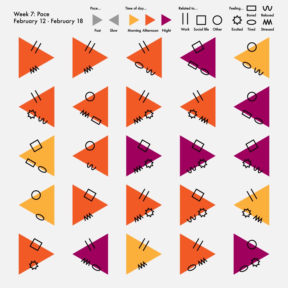
During week seven, I started to explore somewhat more creative interpretations of the “movement” theme. I wanted to record the pace of my days — whether they went by quickly or slowly, and how that impacted my mood. This exploration forced me to be more aware of what I was doing in order to record as much data as possible.

At first, I was unsure how to display this data because it was more abstract than my last two weeks’ had been. However, since the data was abstract, it was an interesting opportunity to experiment with more abstract visualization styles as well. In this viz, each triangle is a time when I noticed that the pace of my day was either unusually fast or unusually slow. I picked triangles because they imitate the “play” symbol.
What struck me about this visualization was how often I felt a wide range of emotion despite the pace of my day. “Bored” was the only feeling that exclusively appeared during slow-paced moments. All other emotions appeared during both slow- and fast-paced times, which shows how versatile emotions can be.
For the final week of the movement theme, I was excited to explore more conceptual data, so I settled on recording times when I felt emotionally moved. I knew that I needed to track more than just how I was feeling, so I also wrote down any physical reactions I had when I felt moved, like smiling, having a tight throat, or welling up with tears.

Once again, with abstract data, using more symbolic visualization techniques makes a fun experiment. The droplet shape of each data point looks like a teardrop when the point is up (negative emotion) and the upper part of an exclamation point when the point is down (positive emotion). The size of the droplet also corresponds with how long the feeling lasted — the bigger the droplet, the more time I spent with that feeling.
The most glaring trend in this visualization is how many times I was moved in a positive way compared to the very few times I was moved in a negative way. Though there are many crises to confront right now, seeing how often I felt grateful, loved, and comforted reassures me that there is still hope for things to get better. Another important trend I noticed was that the vast majority of the instances when I felt moved happened while having a conversation with another person. This shows how much I rely on human connection, even though I’m still confined to my house to keep the people I love safe.
Overall, this second set of data collection has taught me that my life is more dynamic than I expected. I often feel stuck because I haven’t been able to physically go to as many places as I used to before the COVID-19 pandemic, but I’m still constantly walking around, moving my body, changing pace, and reacting to those around me.
After wrapping up my exploration of movement, I’ve already started collecting data for the next theme: work. I’m updating my personal data collection journey weekly on my Twitter, Instagram, and TikTok, so if you’re raring to see my visualizations as I make them, check it out! While I continue through the four weeks until my next article, I invite you to follow along or even try some data collection of your own and share it with someone. Until next time, stay tuned!

Emilia Ruzicka studies data journalism at Brown University and will graduate in May 2021. Her current work includes a year-long personal data collection project, a podcast about the USPS, and her senior thesis. Find out more at emiliaruzicka.com.

Emilia Ruzicka is a data journalist, researcher, and editor who recently completed their M.A. in Media, Culture, and Technology at University of Virginia. They are currently pursuing freelance projects, including a blog and travel newsletter, while they search for their next full-time position. Outside of data viz, Emilia loves to visit museums, make art, and talk about the USPS. If you have a project proposal, story tips, or want to find out more, visit emiliaruzicka.com.
- Emilia Ruzicka

- Emilia Ruzicka

- Emilia Ruzicka

- Emilia Ruzicka


