
Design is a plan to create something that will be beneficial to people. Design involves considering both the form and the function of the final product. When design is done well, the user does not even notice it. Good design makes products easier to use, and design applied to data visualization makes graphs and charts easier to understand.
Design involves thinking a lot about the user throughout the process of creating something. You may have heard of the term “design thinking.” This is a framework used in design to solve complex problems in a user-centric way. The design-thinking process ensures great experiences and outcomes for the user.
The six phases of design thinking, according to the Nielsen Norman Group, are empathize, define, ideate, prototype, test, and implement. Empathize and define help us understand the problem. Ideate and prototype help us explore solutions. Test and implement help us materialize the final product.
When a product is created within the design-thinking process, the user is considered in every step, resulting in a product that is thoughtfully designed to meet their needs.
Design thinking is an example of a design process, and it’s the framework I’ve adapted into my dataviz design process.
Why use a design process for dataviz?
A design process offers value to people working in the field of data visualization by focusing on the user to find out what they want and need to enable or enhance their data-informed decision making.
Design processes are beneficial because they are user-centered. They start with understanding the user and their needs and end by testing solutions with the user to get feedback. A design process encourages innovation and collaboration.
Not only that, but a design process also provides a step-by-step framework for completing a project, like creating a graph or chart.
A design process also streamlines your work because you don’t have to figure out each step for every project, you follow the same steps each time. Instead, you can think more about the design itself, the message, and how to best communicate your message.
Design processes focus attention on the user, so they also result in better final products, in our case, better data visualizations, because the final audience is considered at each stage of the process.
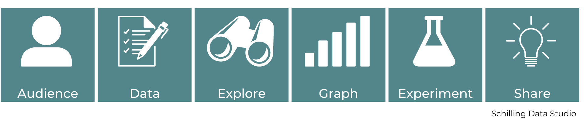
The Dataviz Design Process

Step 1: Audience
The first step of my dataviz design process is to think about the audience.
Who are they? Are you making something for the general public? Or is it for a specific group of people, like business managers or policy makers? This first question helps you to identify specifically who is in your audience.
What do they already know? Does the audience have background knowledge on the topic or do they need to be given that context? What perspectives and pre-existing ideas are they going to bring about the data?
Think about how your audience feels about data. Are they comfortable looking at data? Or is this going to be something new for them? How data literate are they? This second question helps you figure out the additional support you may need to provide to your audience and assumptions they might bring to the viz that you’ll need to address.
Then ask: what do they need to know? What information are they looking for and how is your data viz going to provide it? Is there something you want them to do after viewing the data viz? This third question helps you figure out what you want to tell the audience and will provide guidance for later steps in the process.
These questions help you identify key characteristics about your audience that will guide you through the rest of the process.
Step 2: Data
The second step of my dataviz design process is to define the question you’re trying to answer and find (or be given) the data.
Before seeking out data, you need to figure out what question you’re trying to answer. Go back to the audience step – what do they need to know? Try to be as specific as possible with the question and topic.
For example, maybe you’re creating a dataviz for the general public on climate change. Climate change is a broad topic, and the general public is a broad audience. So, how can you narrow that down? Maybe you can focus your audience down to people in a specific location, and perhaps you choose your local area. Then you can pick a topic within climate change that is relevant to your area. For example, where I am, drought is an important issue. So, the question may become, how are drought conditions changing in my area and what can people do about it?
Once you have your question, you can search for your data. When searching for data, it’s important to find reputable and reliable sources. Usually government agency websites, nonprofit organizations, and large news organizations are good places to look for reliable datasets. You can also use Google Dataset Search, data.world, Data Is Plural, and Kaggle to find data for a project. When you find a dataset, try to figure out its original source and make sure it’s trustworthy. Be sure to document your data sources so you can share them with your audience for transparency.
In other situations, you may be given the data and topic from a client or colleague. In this case, this step may be a little shorter. But it’s still important to write out the question you’re trying to answer. Don’t skip this step! Like your understanding of the audience in the first step, you’ll return to this during the rest of the process. It’s also super helpful to have a clearly defined question that will guide the rest of the process and help you identify what is in scope and out of scope for the project.
Step 3: Explore
The third step of my dataviz design process is to explore the data. To begin this step, you need to understand what’s available in the data. What are the variables? It can be helpful to create a data dictionary, if one does not exist already.
A data dictionary is a list of all the measures or variables in a dataset with their data type and a short description or definition of what they represent. This is particularly helpful if you’re working with data you’re not familiar with or on a topic that is not familiar to you. This also helps you keep track of the available variables, which will be important later as you begin graphing the data.
You’ll also want to examine each variable for missing data. It’s important to know if there are missing records in your dataset and figure out a plan for how to handle missing data points. There are a few options here, the two main options I use are to filter out or remove the missing values or show the number or proportion of records that contain missing data. If a large number of the records in the data are missing values, you might need to look for an alternate data source or just not use the variable that is missing a lot of data. Sometimes you may not be able to find the data, which is an important finding in and of itself that could be included as part of the dataviz. Check out this Nightingale article about working with data from indigenous populations.
Once you have a good understanding of what’s available in the data, it’s time to start exploring the data itself by making some simple graphs. As you graph, pay attention to what you notice and what patterns you see. The next step in this process is “Graph.” but it’s important to make some simple charts in the Explore step as well because you can’t get a good understanding of the data without doing some visualization. These simple, rough graphs allow you to understand the data and start finding key takeaways.
Step 4: Graph
The fourth step of my dataviz design process is to graph. Now, you just did a little graphing in the explore step, but here you’re going to focus more on what graph will work best and how the graph communicates the data.
So, how do you know which type of graph to use? When selecting a graph, you want to think about the audience, the type of data you have, and the message you want to convey as you decide which chart to use. Here are some tools for figuring out which type of graph to use: From Data to Viz, Depict Data Studio – Chart Chooser, and Visual Vocabulary.
In this step, you’re focused on trying out different types of graphs. This is a rough version of the final data viz, so you’re not trying to make something perfect. But with each graph you make, you do want to ask: how does this graph communicate the data?
Think about how easy it will be for the audience to understand the data and the message in the data. Also check back in with your question from the Define step: does your graph answer the question? Your goal is to make it as easy as possible for the audience to see the important takeaways. This brings us nicely into the fifth step of the dataviz design process.
Step 5: Experiment
The fifth step of my data viz design process is to experiment.
In this step, think again about the audience – is the dataviz telling them what they need to know? Is the graph you chose something they will be able to understand easily? Will they get the key message and understand the story?
During this step, you can ask a friend, colleague, or perhaps a subset of your audience to look at the draft graphs you made in the previous step and ask them for feedback. Ask them to tell you where their eyes focused and what key takeaway they understood.
In this step, you don’t need a perfect graph to share. You just want the minimum viable product, a rough draft. Try not to worry about having it all perfect at this point. You’re looking for feedback on how it can be improved and what elements could be added or removed.
If you have more than one type of graph, you can experiment with different options. Show different people different versions and see which one is most effective at communicating the message you found in the Explore step and answering the question you wrote in the Define step. Once you have some feedback, you can add or remove elements to your data visualization that will improve it.
The last part of this step is to check that your dataviz is accurate and true – is all the data correct? Is the message or finding correct? Especially if you found your own dataset, do a little research to see if other sources (like research articles or news articles from a reputable source) have similar conclusions.
Most members of your audience will take the information in your dataviz at face value and assume it is true, so it’s really important to make sure that all of the numbers are correct.
Step 6: Share
The final step of my dataviz design process is to share the dataviz. You can also consider sharing your data sources so the members of your audience who want to go deeper can do so.
Once you’ve experimented with different graph types and incorporated the feedback from the experiment step, you’re ready to refine your visualization and share it with your audience. Notice how your audience engages with the viz – do they get your key takeaway?
As you notice how your audience engages with your dataviz, think about how it can be refined. How could it be made clearer so the audience understands the message more easily?
Finally, reflect on what you’ve learned. After you’ve presented your data, take some time to think about what you learned about how your audience interpreted your graphs. Think about what you could change in the design in the future to make it even more engaging and effective. Your audience will be more likely to engage with a well-designed chart, paying attention and trying to understand a graph they feel has good design.
Summary

I described most of the steps in this process as if you were working alone, and dataviz can be quite a solo activity. However, if you’re working with others, it’s great to do this process together. It can be particularly helpful to brainstorm ideas about the audience together and all agree on the data and question together to make sure you’re all on the same page. It’s also great to collaborate with others on the rest of the process as we all bring our own perspectives to data analysis and visualization, as someone else will likely see something different than you. If possible, it’s useful to collaborate with a subject matter expert for the data or topic you’re using – this can be particularly helpful during the Audience, Data, and Experiment steps.
Data visualization is a creative and iterative process. There’s not one right way to visualize a dataset, and you may not always go through these six steps in this exact order. Sometimes after exploring your data, you may find that your data isn’t right for the question you’re trying to answer, so you’ll have to go back to the Data step. Other times, during the Experiment step, you may find that your audience isn’t getting the right message from your graph or they’re getting confused or distracted. Then you’ll have to go back to the Graph or maybe even the Explore step to refine your visualizations. You can always move back and forth between these steps, and you’ll revisit the Audience step at every stage to check in and see if your dataviz is meeting your audience’s needs.
Following the dataviz design process will streamline your work, save you time, and result in a visualization that is user-centered and therefore more effective. You’ll know that you’re making an impact with your work when you create data visualizations using this process!

Jenn Schilling is the founder of Schilling Data Studio, a data visualization training and consulting agency. She has a decade of experience applying data science and data visualization in a variety of industries, including supply chain, market research, and higher education. Jenn loves telling compelling stories with data and teaching others how to create impactful visualizations.
- Jenn Schillinghttps://nightingaledvs.com/author/jenn-schilling/

- Jenn Schillinghttps://nightingaledvs.com/author/jenn-schilling/

- Jenn Schillinghttps://nightingaledvs.com/author/jenn-schilling/

- Jenn Schillinghttps://nightingaledvs.com/author/jenn-schilling/


