
The purpose of data visualization is to provide a layout that relays lots of information quickly. Good visualizations help the user understand complicated data without allowing the design to get in the way. Any text accompanying the graphics should be easy to read to the point that it almost disappears.
In this article, I will be explaining how to pick a highly readable and aesthetically pleasing typeface for your project. I will focus primarily on small text, that is, text in a data visualization that is meant to explain the layout, including labels, callouts, and sources. In order to serve a wider audience, I will only recommend free Google fonts, though there are many good paid options.
Highly Readable Fonts
Highly readable fonts take less brainpower to interpret. Visualizations with good typography have a consistent rhythm. They look like a cohesive unit. Good typography doesn’t grandstand — it explains the content without getting in the way of the user’s experience. Copy should be minimal, parred down to the essentials for comprehension of the graphical elements.
To understand how type is “highly readable” at small sizes, let’s look at a few elements of type.

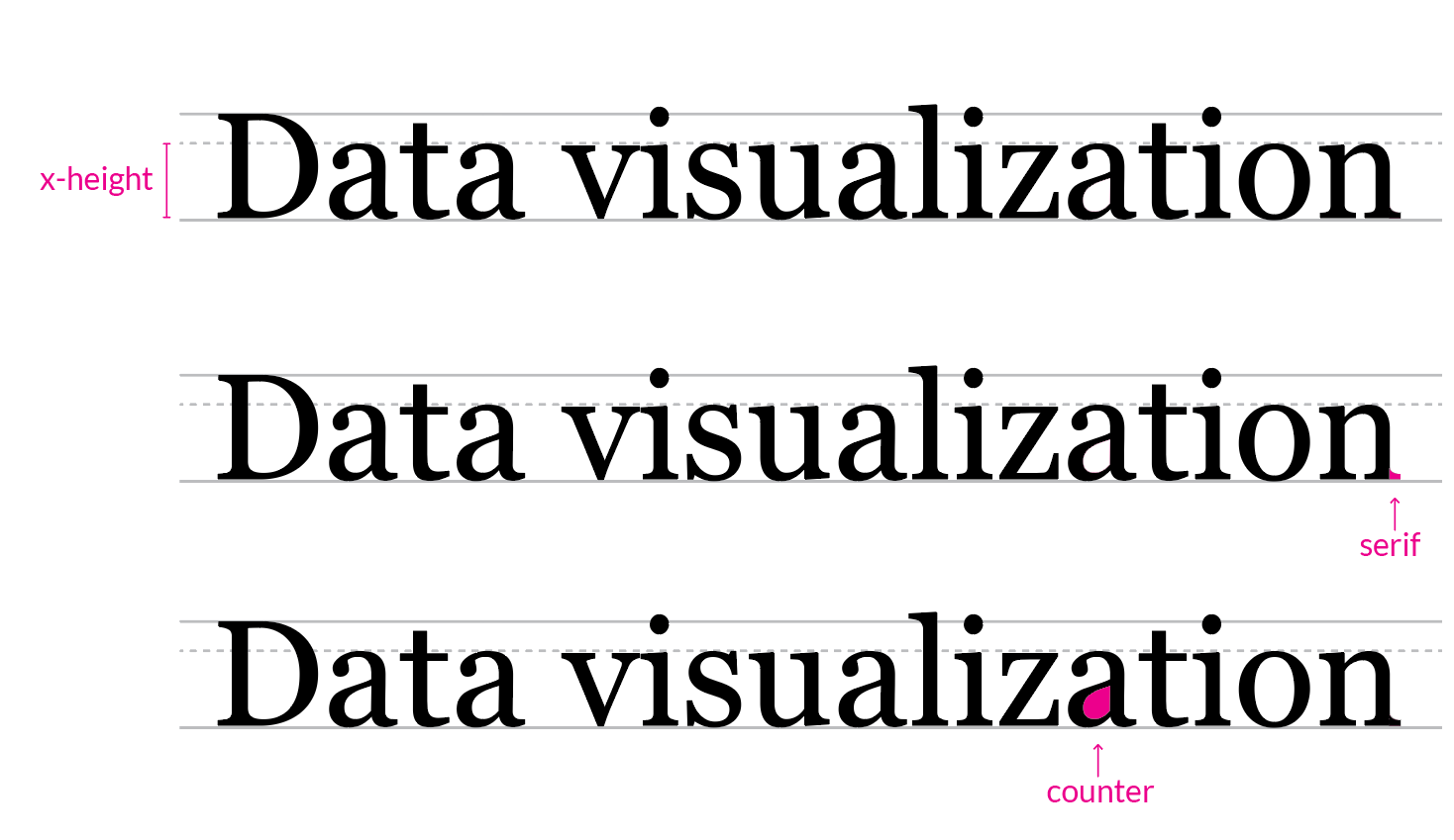
X-height
X-height is the height of the body of the lower case letters minus any ascenders or descenders. Because lowercase letters sometimes have different heights, this height is measured using the letter “x”.

The x-height directly affects how readable fonts are at small sizes. For instance, take a look at the graphic above. All of these fonts are 10px. Which typeface do you find most readable? Gill Sans and Athelas have smaller x-heights, making the text more difficult to read. Open Sans, Noto Sans, and Lato have larger x-heights, lending to easier readability at small sizes. When choosing a font for data visualization, opt for a typeface with a large x-height.
Note also, Lato has a good x-height, but shorter line-length. If your visualization has an x-axis with limited space for ticks, you may want to consider a more condensed typeface like Lato.
Counter
The counter is the empty space in letters such as “p” and “o”.

As the text above says, the shape of the counter affects readability at small sizes. The eyes should roll easily over the letterforms. Your viewer should not have to spend time figuring out if the letter is an o or an e. Fonts with distorted counters render poorly in small sizes. Whimsical fonts such as Marker Felt should be avoided. Note how difficult it is to read dense fonts like League Gothic and Futura Condensed at small sizes. This is because the counters are elongated when the font is squished. When choosing a font for your visualization, look to use a font with a stable, open counter.
Serifs
Serifs are the little swooshes or feet around a letter form.

Serifs are often avoided in labeling content because the extra flourishes sometimes muddle the view of the letterform. The first three lines above are serif fonts. Compare those to the last two typefaces which are sans-serif (without serifs). In these examples, the sans-serif words are easier to decipher. While some serif fonts are passable at smaller sizes, if you are unsure, then skip them and opt to use a sans-serif typeface.
Using Numbers
Typeface numeric values are either proportional and tabular.

Proportional numbers are designed to look good when used in the text. Tabular numbers are designed to work with data. Tabular numbers take up the same amount of width per character. If you line the figures up, you will see that they fall into equally spaced columns. Tabular numbers are easier to read in visualizations.
Open Sans is a tabular typeface that centers numbers within the column space. Lato, however, offsets the number in the column space. Why is this important?

Because that little bit of awkward space requires your brain to work to understand that this is a continuous string of numbers. We can eliminate that work by choosing a typeface with tabular numbers and even spacing.

Watch out for old style numbers. Raleway is a beautiful typeface that is commonly used for text and logos, however, it doesn’t work well for labeling data visualizations. That’s because it uses old style numbers instead of lining numbers. Look how the 3, 5, and 4 descend below the baseline. This treatment is not only hard to read in a visualization, but it also looks somewhat jumbled outside of the text.
Typographic Design Systems
A typographic design system, as used below, is a declaration of font sizes, weights, and line heights to be used in a layout. Systems help to ensure visual consistency across a project. Here are five systems to try in your design. The suggested pairings below use open-source Google fonts. Please note that the screenshots are not true-to-life font sizes due to the rendering of images on this page.
Example 1: One font/One size
The “One font/One size” typographic system uses a single typeface with a continuous set size, resulting in a universal visual texture. This subtle approach is good for laying out dashboards or when adding graphs to a business report. Importance can be noted by using a heavier font weight or shades of gray.
Use in the wild: An example of this technique is the Google Trends dashboard. Google Trends uses Roboto typeface for both the header and the labels. The dashboard separates content by using a card-based layout. This card uses one typeface and one font size throughout the composition.

The following chart uses the “One font/One size” system with Lato at 14px font size and 18px line-height for all text in the graphic:

Font used: Lato is a good data visualization typeface because it is highly readable at small sizes. The font has clean counters, a moderate x-height, and tight, but not distorted, letter spacing. The numeric values are tabular and evenly spaced for ease of reading. The bold weight can be distinguished easily from the regular weight, however, the semi-bold doesn’t have enough distinction from regular or bold and should be avoided. Lato was released on Google Fonts in 2015 and is currently the 3rd most popular font on their site.
Example 2: One font / Big header
The “One font/Big header” typographic system uses a single font with a header that is larger and bolder than the rest of the content. A bigger header stands out, helping users quickly understand what the content is about.
Use in the wild: The Washington Post uses a “One font/Big header” system in the visualization below. The font is ITC Franklin Pro typeface (available for purchase). Note their use of all caps for the navigation. The designer keeps the font family and size consistent so that the navigation feels like it belongs with the rest of the layout.

The following is a use case of the “One font/Big header” system. This example uses Assistant typeface in 24px for the header, and 14px for the rest of the content.

Font used: Assistant is a crisp, modern typeface that works well in design because of its simple, open aesthetic, and rhythmic letter sizing. The numbers are well balanced and have no gaps or compromised letterforms. Assistant is an open-source font family that builds off Source Sans Pro. The project is open to collaboration and accepts contributions to the GitHub repo.
Example 3: Two fonts / Heavy & light
The “Two fonts/Heavy & light” typographic system uses two sans-serif fonts with complementary x-heights and letter spacing. The header is set to a heavy weight, the content is set to a light weight.
Use in the wild: Reuter’s “The Rohingya Crisis: Life in the camps” data visualization uses a heavy & light typeface combination. The designer used Reuter’s proprietary typeface “Knowledge” for the header. The data labels are Source Sans Pro available from the Google Fonts library. As a side note, notice how “Negative for E. Coli” is grayed out to draw attention to the first three metrics.

The following chart uses the “Two fonts/Heavy & light” system. Headers are large and bold, while the rest of the content is set in a light weight. The mix of heavy and thin fonts provides contrast separation, helping the user to identify important sections of the composition.

Fonts used: The header text uses PT Sans bold — a strong, rounded typeface with a generous x-height. PT Sans and PT Serif were developed for the Russian alphabet as a comprehensive font to encourage printing and reading in the national language. In addition to Cyrillic scripts, PT Sans supports Latin, Greek, Arabic, and other forms. The family also includes a PT Sans Caption style which was designed specifically for small type and works well for long notes or sources sections.


The content is set in Noto Sans, a clean font, with slightly condensed letter spacing, compensated by clear circular counters and a generous x height. The tabular numbers include a sturdy number “1” with a wide foot, giving a solid appearance to the number structure.
Noto Sans is part of a larger family of Noto typefaces. There are over 100 different typefaces in the group, with the purpose of providing “visual harmony” across multiple languages and script forms. This makes Noto Sans a particularly good option for multilingual visualizations.

Example 4: One serif / One sans-serif
The “One serif/One sans-serif” system uses two fonts — one serif and one sans-serif.
Use in the wild: Below is a screenshot from the New York Times article “Coronavirus in the US”. The title uses NYT Cheltenham and the data labels use NYT Franklin, both proprietary fonts created for the New York Times. The labels have two components: a larger, more prominent state name and a smaller, less prominent number. The use of these two styles creates a pattern that helps the viewer decode information quickly. Which catches your eye? The state name or the number?

The following example of “One serif/One sans-serif” system uses Merriweather at 22px with a line height of 26px for the header. Source Sans Pro is used for the rest of the content.

Fonts used: Merriweather is a slightly bubbly font with thick and thin stroke widths of medium contrast, making it suitable for headings, but not for small text. The font weight used above is black, the heaviest weight. Source Sans Pro is used for the content. Source Sans Pro was specifically designed for user interfaces.
Gray-scaled text can be used for creating patterns (as in the NYT piece above), for demoting an element’s visual importance (as seen in the Reuter’s piece above), or for fading large chunks of less prominent information, such as the sources or notes section.
Example 5: Serif for reading/Sans-serif for labeling
With the “Serif for reading/Sans-serif for labeling” system, the header, sub-header, and any article copy is should be set to a serif typeface. This thinking is based on a long standing debate in design theory of whether serif fonts are easier to read for long passages of text. For maximum readability, keep line length to less than 60 characters.
Use in the wild: The New York Times does a particularly good job of mixing their NYT Cheltenham serif typeface for reading with a NYT Franklin sans-serif typeface for labeling data. Even though these are two categorically different typefaces, they work together because the letterforms have complementary counters, large x-heights, and similar stroke-widths at matching weights.

The following graph shows the “Serif for reading/Sans-serif for labeling” system using Lora for the header and sub-header, and Libre Franklin for the labeling content.

Fonts used: Lora is a Google font optimized for screen, but also works well for print projects. The chart text is Libre Franklin, a Franklin-based typeface, meaning it belongs to a group of fonts inspired by the original Franklin Gothic typeface designed around 1910.
Final Thoughts
The fonts and systems above are interchangeable. The following is a list of typefaces mentioned:
These are the fonts mentioned for headers and copy:
Good typography practices start by understanding how the components of letterforms lend themselves to high readability. I hope this approach helps you find a type design system that works for you.
What are your favorite fonts to use in data visualization? Let me know below and thanks for reading!
Data Visualization Specialist, Designer, Engineer, Storyteller.
- Tiffany France


