
Lee este artículo en español aquí.
Before people began creating data visualizations with Tableau, Illustrator, R, and all the software that makes it easy for us to do dataviz these days, they used various hand techniques and tools to represent the data. With these techniques, they developed many of the graph types we currently use. Now, though, it seems unlikely that any of us would want to use a pencil, paper, and ruler to accurately draw a range-bar or radial diagram. However, I believe that using hand techniques maintains additional meaning: beyond how impractical it may seem, it invites deeper reflections for the person who is doing the visualization.
Cotton Viz Challenge
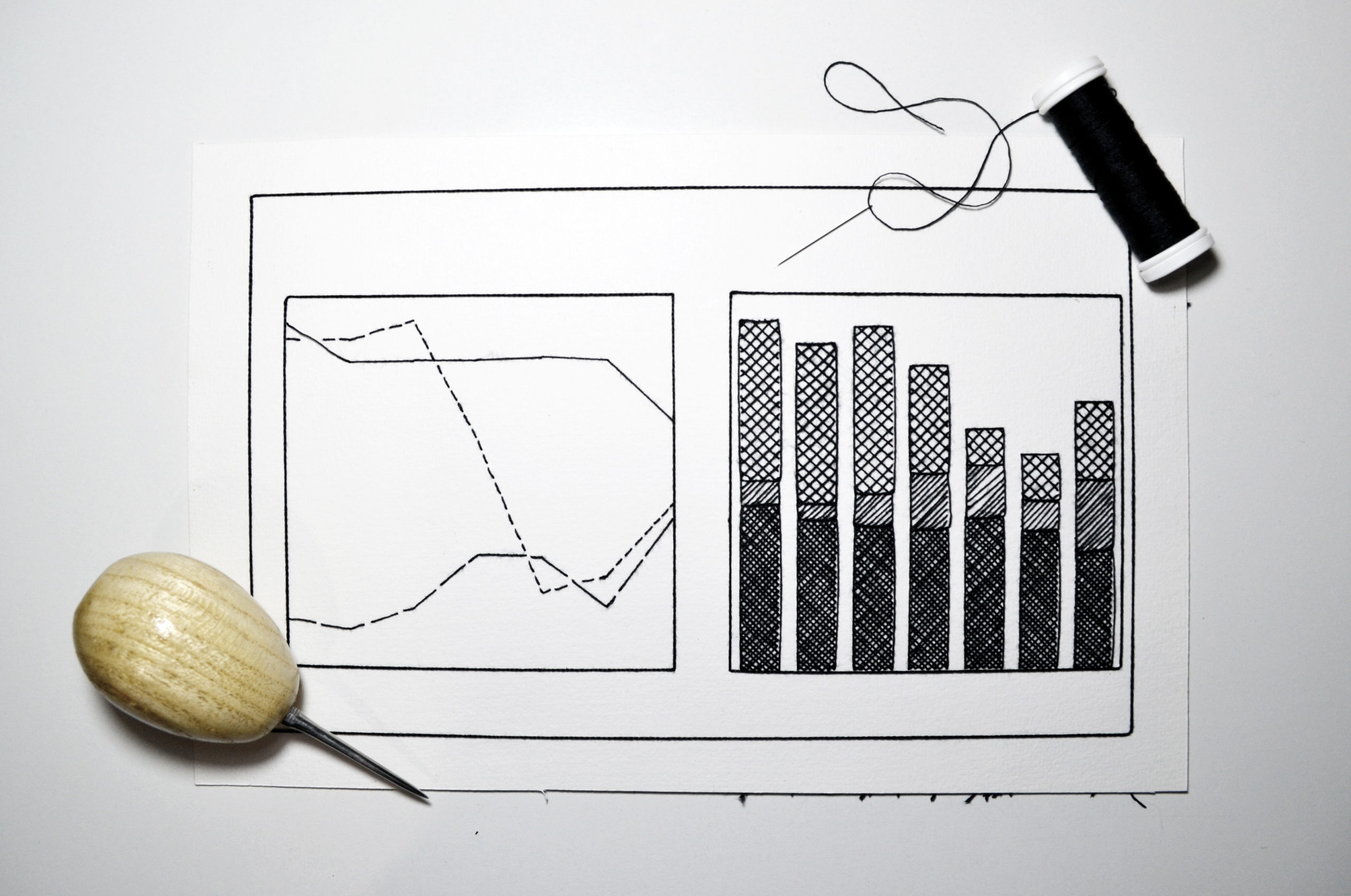
I remember when I read on the Royal Statistical Society blog, “Mary Eleanor Spear #dataviz Competition for Kids and Adults!” I must confess that what excited me the most was that children could compete, and I wanted to experience a child’s creative freedom. The competition involved recreating a chart made by Spear, a pioneer woman in data visualization, that illustrated the yearly US supply of cotton from 1942 to 1948, including consumption, exports, stocks, and total supply.

I consider myself new to data visualization, so I tend to select projects that capture my attention by providing an opportunity for new learning. Several aspects caught my attention in the Cotton Viz Challenge. One of them was the relationship with a woman’s work. The subject of cotton also excited me, as an enthusiast of textile techniques. Finally, the creative freedom encouraged by the challenge left me wanting to participate.
Usually, my inner amateur with data visualization seeks to unite concepts, materials, and techniques with the topic being addressed. I researched Mary Eleanor Spear for the Cotton Viz Challenge since I wanted to know how she had made her visualizations. I realized that she had made them by hand.
Process for making a visualization by hand
This Nightingale article written by Ben Jones helped me to understand the technique behind Spear’s work. The brief review of Spear’s books was inspirational. She included all kinds of advice on creating compelling graphics using hand tools and instruments. I was impressed.
I am pretty obsessive in my visualization work about ensuring that my methods relate to the subject I am trying to represent. Spear had already motivated me to return to hand techniques, and the Cotton Viz Challenge theme inspired me to grab cotton yarn and paper to recreate, stitch by stitch, Spear’s work. That’s right, I recreated the original aesthetics of Spear’s range-bars using embroidery! Of course, I did not realize the amount of time it would take, but embroidering the data allowed me to reflect more on data visualization during the process, which I would hardly have done if I had made the charts in a digital format.

Embroidering data allows you to go through thoughtful processes
In Mexico, the collective Agujas Combativas carries out data activism using embroidery. The following is from its postulates:
“… this textile practice (embroidery), previously considered domestic, decorative and exclusively feminine, becomes an opportunity to spend time with information, to look at it from different angles and explore the forms it can take.”
Unlike data processing with software, hand techniques, including embroidery, can raise awareness about the topics as a result of the time that must be spent working with the data.

This was true for me with the Cotton Viz Challenge. Each stitch made was time spent with the information. Just as Spear did with her pantograph, I spent time with my needle and thread. Indeed, the tools that Spear used illustrate how different things were in her time, how much time and effort it took to do things that are now so simple. Embroidery is not very different. There is time and effort involved, but beyond that, it encourages the person making the visualization to go through a process of reflection that sometimes, with the immediacy of digital processing, no longer happens. I find it valuable to try this slow process, visualization with hand techniques, at least once.
The metaphor of the database and visualization
After finishing my embroidered data visualization, I was shocked when I turned it over and could see the disorder of the stitches on the back.

Tidy and untidy. Front and back. Have you ever faced databases that you must clean and order so that the software can generate the visualization in a better way? The backward embroidered sheet seemed to me like a metaphor for that database and helped me to realize our role in dataviz: we order. In my case, the front of the sheet had all the stitches organized neatly in line with the message of the data. But I had the power to modify the messiness of the stitches on the back and to change the reality of the information—thus, my responsibility, our responsibility.
I like to keep the final embroidered data visualization upside down to remind myself of that data clutter and the power I have to organize the data however I want. In the end, the paper I used for the embroidery did not have a rigid guide; I could direct my needle anywhere. Being aware of this allowed me to take a more critical and thoughtful approach to choosing the form that the data would take in the visualization.

Conclusion
We are used to being inspired by the visualizations made by digital data processing. Sometimes, though, I think they all look very similar, so I like to do exercises that put the traditional data formats in tension. In my opinion, data visualization should involve critical reflection, which I believe we can get from the methods we use to visualize data.
In the case of the Cotton Viz Challenge, it would have been more practical to use my computer to make the visualization, achieving precision and exact replication. But sometimes, I think we lose the relationship with the information while visualizing digitally. As a community of data visualization creators, we have a responsibility to understand the information we are handling and how it will be viewed. Spear talked about “the considerable difference between looking at a graphic and seeing it,” a piece of advice that she extended to all those creatives with the complicated mission of getting the public to see and understand their graphics. However, to fully understand a graph, I believe it is essential as data visualizers to move to media that encourage us to take the time to become aware of the information that we are about to visualize.
I believe that when we create data visualizations, we carry a huge responsibility since, in some way, we are visualizing realities that will impact the realities of other people. That is why my invitation is to spend more time with the information. I do not expect that after this, everyone will be embroidering giant databases. I only believe that the data analysis process should occur together with the visualization process. Hand techniques can be an ally for this since they allow an individual to reflect in real time on the information.

I'm a Mexican designer—a data visualization enthusiast. My projects are diverse, but I am mainly interested in data physicalization. I am currently doing a master's degree in Design Theory and Criticism, where I research different approaches to Data Visualization through Design. Rethreading & Retracing.
- Liz Bravo

- Liz Bravo


