
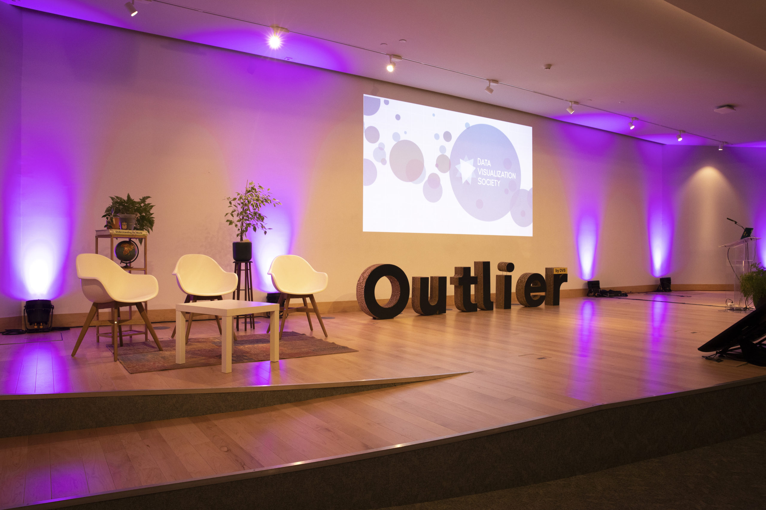
The Data Visualization Society’s third annual Outlier Conference, held between May 3 and May 5, 2023, took shape (for the first time) as a hybrid event in Porto, Portugal, and also virtually. The conference featured inspiring talks, panels, networking opportunities, and plenty of peacocks from the nearby Jardins do Palácio de Cristal.
Over 500 data-viz enthusiasts tuned in to more than 30 speakers from around the world. After the conference, we asked attendees to share their experiences and feedback. Here are some of their reflections:
* * * *
A Virtual Attendee—And Newcomer to Data Viz—Didn’t Want Outlier To End
My name is Marta Pinto, I am a Biomedical Engineer from Portugal. I am currently in the Netherlands where I decided to move to continue my studies by doing a PhD in medical image analysis to improve the detection of breast cancer. I am a researcher by profession but a creative soul in my free time; I like to take artistic photos, do watercolor paintings and also dance salsa. I discovered the field of data visualization by the hands of Sara Sprinkhuizen (thank you Sara!) when she joined a machine learning course I was taking and explained to us how a visual can help to go the extra mile when showing our results.
This was an eye-opening day for me: joining knowledge and design together in a kind of scientific/mathematical way? Sign me up for that! Or better yet, that made me somehow, somewhere sign up for the virtual Outlier conference. (As much as I would have loved to attend the conference in person, a PhD is happening here, people! And you should know it. I lost count of how many PhDs were at the conference. It was great to see that I was actually not an outlier. Well, not yet at least—see what I did there?)
But ok, let’s get back to the actual Outlier experience. I will start with a challenge for you: how would you describe the Outlier conference in two words? Personally, I would say, PURE JOY.

It was nothing like I had expected. I am used to academic-type conferences, where the slides are what they are and the message is super technical. But here? Here, it was like being transported to new realities, new topics, and new knowledge—session after session! From getting “into the box” (and out of it) with Shirley Wu, to “breaking the box” with Alli Torban, the conference showed so much diversity that I just had to breathe it all in.
Through the screen of my computer, I was also part of it, connected with all these different people through the Slack channel created for the event, or the chat box in the website. Also, this community is so welcoming! From nicely commenting on the talks to providing insights and extra links to blogs to access work from the speakers, and beyond. It was such a collaborative and spontaneous environment. If I felt connected, included, and mind-blown through a screen, I can only imagine what the in-person attendees felt. Particularly, when learning about Rodolfo Almeida’s “A Country Out of Breath” project, or John Burn-Murdoch’s session about making charts with impact and how to transform them into a piece of communication.
“If I felt connected, included, and mind-blown through a screen, I can only imagine what the in-person attendees felt.”
Nevertheless, it was also overwhelming. On the first and second day, I finished the conference with 36 to 40 Google Chrome tabs opened with all the resources I found interesting, including personal websites and blogs that were shared. This conference also had a twist: There were European and American sessions! So, the conference could actually continue past your dinner time (or you could watch it later of course, which I did not do because I was too curious).

For me, it was also quite interesting on the first day to see that at some point in the agenda for the event – there was just a block with an empty title. These blocks, called “unconferences” were designed so that anyone could suggest a topic for people to gather and discuss. I found it insightful and nice to share ideas and different points of view but also to learn with people already in the field. Lastly, I also really liked the concept of the “Lightning Talks,” where a topic would be pitched for about five minutes. It made the content super easy to process and left me feeling curious and wanting to know more.
To be honest, I cannot recall anything unpleasant. It was one of the first time in which I really did not want a conference to end. Outlier 2024, you can expect me in person next time!
– Marta Pinto, PhD candidate at RadboudUMC in the Netherlands, has an interest in visual communication and the power of effectively communicating complex concepts to both experts and non-experts in the field. She recently began exploring the realm of data analytics and data visualization.
Finding a Community in an “Unconference” Session About Data Activism
As a longtime DVS member, I’ve been attending Outlier since the very beginning. In previous years, I was struck by how Outlier, despite being online, was able to facilitate not only deeply informative sessions on the main stage, but also foster moments of community engagement and conversation through the creation of Unconference Sessions. These Unconferences could be led by anyone about anything, and in years past I’ve both attended and facilitated a variety of these amazing activities, including sessions for data journalists, data sonifiers, freelancers, and early career data visualizers.

Though I did not facilitate an Unconference Session myself this year, attending Outlier in person allowed me the opportunity to go to Vivian Andreozzi’s Unconference about data activism. As a data journalist, I’m constantly asking myself what impact my work has on the world and how I can maximize the positive potential of what I do. With every dataset analyzed, visualized, and communicated, my hope is to inform those who have questions and perhaps lead them to make decisions that will benefit their community, no matter the scale.
Given my background, Vivian’s session seemed like the perfect way to meet others who approach their work with the same ethical grounding and social conscientiousness to which I aspire. Despite appearing at first like it would be a small session of only five to 10 people, the group quickly ballooned to nearly 30 people sitting in an oblong and rather lumpy circle of chairs. With Vivian’s guiding questions, we quickly dove into a discussion about our work, the impact we hope to have, and the struggle to both create work that facilitates positive change in the world and find the people and organizations willing and able to support that work.

In the end, we were shooed out of Room 3 of the Super Bock Arena because we had to be out of the conference space by 6 p.m. local time; however, conversations continued after the session and throughout the rest of the conference. I was struck by how many people were willing to spend precious time in Porto thinking about how to foster social change and better the world through data visualization. I often find that data journalism can be lonely work: late nights, dead leads, and days of data cleaning can be frustrating and exhausting. Yet, in an unassuming side room of a conference, I found a community of activists and friends offering support, advice, and hope that we can truly change the world, one chart at a time.
– Emilia Ruzicka is a data journalist, designer, and producer. They work at the intersection of research, storytelling, and Justice and specialize in building data-driven narratives.
Two Attendees Compare Their In-Person and Virtual Experiences
Pre-conference impression
Zunaira Rasheed (in-person) – I had a good pre-conference experience. The extra logistical information from DVS—like the list of local restaurants—was very helpful. I also went to a get-together the night before the conference, so I had a few familiar faces to say ‘hi’ to the next day.
Sophie Sparkes (virtual) – My pre-conference impression wasn’t great. I was apprehensive that big chunks of the agenda seemed to still be in draft-mode a couple of days before Outlier started.

Best bit
Zunaira – Meeting and connecting with people who are not the most active and prominent on social platforms. I had no idea how varied the data visualisation field is! Plus the Outlier app made planning everything easy.
Sophie – (Aside from actually being able to attend a conference with a baby in tow!). All the reaction emojis during talks. They were a reminder that other people were watching the same talk, at the same time, on their own screens, somewhere in the world.
Worst bit
Zunaira – For someone who is not very extroverted, networking got very overwhelming. I felt particularly awkward trying to tag along with people for meals or drinks.

Sophie – My worst bit is the flip-side of Zunaira’s best bit: meeting people. Specifically, being able to quantify how many people I didn’t meet. Seeing that two-thirds of attendees didn’t say ‘hi’ in the Introductions channel on Slack gave me a sense of FOMO that I would never have had in a physical conference hall.
Post-conference impression
Zunaira – How quickly the recordings were put up was very impressive! It felt nice to see posts, pictures, and comments on social platforms from the people you met about the shared experiences.
Sophie – I was blown away! It was a hybrid event that actually worked. Mixing in-person and remote speakers with pre-recorded content and live Q&As made for a first-class feeling virtual experience.
– Zunaira Rasheed is a data visualisation and Tableau developer, and she’s very particular about tea.
– Sophie Sparkes is a data viz community manager and lives by the motto ‘you can never have too many cups of tea.’
Data Art’s Raised Profile Raises Questions Over Its Nature
It was important to me to go to my first Outlier conference in person. After a few years in government and journalism, I just made the jump to freelancing and I needed ideas and conversations, and connections to help me on that journey. I hadn’t thought much about the talks, but as an artist of sorts, I felt pleasantly surprised and engaged by the recurrent theme of data visualisation as art.

In a nascent industry like data visualisation, there is a lot of talk about arbitrary rules of right and wrong that should or shouldn’t be set in stone. Perhaps as a counterpoint, Outlier 2023 reached for that most intangible and indescribable thing, expressed in the fragility and vulnerability of Shirley Wu’s work and the unplanned beauty that randomness adds to Nadieh Bremer’s motifs: creativity itself.
This pushed me to rethink what data visualisation is. I design for mobile and desktop, but it doesn’t have to be that way. Whether it’s on a website, in print, in an art gallery or for sale at a craft fair alongside woodwork like speaker James Smith’s Visual History of Formula 1, the common thread is a storytelling experience. We organise information to formulate visual messages.
But this ignores aesthetics. I find that my most impactful work is not what matters most, but what I can make prettiest. And while over time I’ve come to appreciate that not every dashboard has to have the emotional power of a Rothko, if it does, well, it will be the most memorable dashboard you’ll ever look at.
Outlier’s most poignant moment was when Rodolfo Almeida played the sound of heartbeats and breaths that picked up speed in line with Brasil’s soaring COVID-19 deaths, filling the atmosphere of the room. The way it engaged us to consider the difficult pandemic experience turned the theatre from a room full of individuals to a community shared in its grief. That’s art as far as I’m concerned.

So is it data art? ‘Data art’ is more focused on aesthetic qualities than message. Once you remove the story, leaving nothing but the purity of sensory experience, the initial idea is only present implicitly or if the artist goes out of their way to explain it. Fundamentally, an artist loses control over the meaning of their work when it enters the public sphere and they put their faith in others to interpret it – something a data visualisation practitioner could never allow. I find it jarring to tell a story in a gallery, a space where too often art becomes artefact so it can be scrutinised and ogled.
But I am starting to question these distinctions. A few days before Outlier I was in the Galician Centre of Contemporary Art (CGAC) in Santiago de Compostela, Spain, watching a video of Benvenuto Chavajay ritually playing a musical instrument traditional to his indigenous ethnic group of Guatemala at memorials he erected to 13 protestors murdered by the military. It was a somber performance decrying injustice. If you think of each victim as a humanised datapoint, is it much different from data storytelling?
Shirley Wu unashamedly treads the fine line between abstraction and substance. In her keynote, she explained her personal story of the Asian American experience and the political fire that drives her creative soul. At the same time, the materials and physical qualities of the art she showcased had such visual appeal in their own right. She has taken up the elusive space between art’s charm and data’s rationality.
Now I am reconsidering the physical space my work is viewed in and I want to look for ways to add human interaction. I think more speakers should use the conference talk format as an opportunity to present their work in a new space rather than discuss impersonally something that happens on a computer monitor. We are so concerned with recording and archiving what we produce, but give it enough years and all my web content will be broken, so as Hans Rosling captured so well, let’s not overlook performance in the here and now as a medium.
–Giacomo Boscaini-Gilroy is a freelance data visualisation developer and storyteller based in London, formerly building interactive maps and charts at the Office for National Statistics and the New Statesman.

Nightingale Editors
Our Nightingale editorial team currently consists of Alejandra Arevalo, Brian Cort, and Teo Popescu. Reach us at Nightingale(at)Datavisualizationsociety.org
- Nightingale Editors

- Nightingale Editors

- Nightingale Editors

- Nightingale Editors


